Showing posts with label Sunday Best. Show all posts

Sunday, November 13, 2016

Maps of the Fortnight


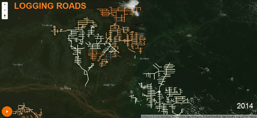
If you are looking for a little escapism at the end of this momentous week then how about undertaking a virtual hike along the Grand Canyon. Earlier this year Pete McBride and Kevin Fedarko walked 875 miles along the Grand Canyon. National Geographic has created a wonderful story map which allows you to follow this epic journey on a fantastic interactive map.

As you scroll through Hiking the Grand Canyon you get to follow the route of this 70 day hike on a gloriously rendered map of the journey. As you progress through the hike the map includes stunning video footage and photos that the two hikers captured on their expedition. Text overlays also keep you up to date with the trials and tribulations experienced on this epic adventure.

The map itself provides a beautiful oblique relief view of the National Park. The map even changes color as you progress through the story. Check out the wonderful rendering of snow as Pete and Kevin battle the elements on their wonderful adventure.


Another way to escape might be to step back in time and explore the streets of 1920's New York on Google Maps. The Fantastical Beasts Magical Map uses the power of Street View to transport you through space and time to a New York where Muggles and wizards stand on the brink of war.

Using the Fantastical Beast Magical Map you can explore a number of locations from the new Harry Potter prequel movie 'Fantastic Beasts and Where to Find Them'. The movie is set in 1920's New York and the map allows you to step inside and view some of the movie's most important locations using Google's 360 degree panoramic imagery.

This isn't the first time that J.K. Rowling's magical world has appeared on Google Maps. Fans of Harry Potter can also explore Diagon Alley on Street View. If you use Google Maps to slip through the secret door in the Leaky Cauldron pub you will find yourself transported to Diagon Alley on Street View.


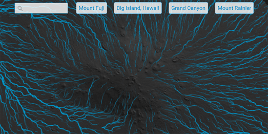
The Digital Elevation Model from Hell is an Esri relief map which shows areas of low elevation as they might appear if the gates to hell are thrown open. On this map the molten crevasses of the Underworld have consumed anyone who hasn't taken the higher ground.

If you scroll to the bottom of this Esri Story Map you can view the molten color gradient used to style this DEM. This molten color gradient is similar to an effect which you can duplicate with Mapbox Studio. Mapsmith has a nice tutorial which explains how you can create a map inspired by neon signs by overlaying different colored polylines on top of each other. You can view Mapsmith's completed Neon Map here.

Sunday, October 30, 2016

The Elevated Maps of the Week


The development of WebGL and vector map tiles has led to some interesting experiments in visualizing elevation and depth data on interactive maps. For example this week we saw a couple of creative mapped visualizations of bathymetry and Lidar data.

Contours.org has used historical depth data of Scotland's lochs to create a series of 3d WebGL maps of four of Scotland's biggest lakes, including Loch Ness.

The depths of most of Scotland's lochs were not measured until the mid-Nineteenth Century. The first real systematic survey of the lochs was started in 1897 by the oceanographer Sir John Murray. From 1897 to 1909 Murray carried out 60,000 soundings and produced the first ever detailed charts, with depth data, of Scotland's major lochs.

Contours.org has digitized the bathymetry data from Murray's survey for four of Scotland's lochs and created 3d bathymetry maps. These maps allow you to explore the bathymetry contours of Loch Ness, Loch Lomond, Loch Levan and Loch Morar in 3d. Contours.org also allows you to view the bathymetry contours of each loch in 2d overlaid on an aerial map.


The Cartographic and Geological Institute of Catalunya has developed a prototype terrain explorer for their 2 meter Digital Elevation Model of Catalonia. The Institute's Relief and Shadow map, created from Lidar data, uses vector map tiles to allow you to interact in real-time with a relief map of the area.

Using Relief and Shadow you can explore the DEM model of Catalonia in an interactive Leaflet & Mapzen powered map. The map includes an impressive tool which allows you to color the terrain by elevation and by the direction of the sun. This tool allows you to change the appearance of the map in real-time by painting within an interactive compass rose.

Using the color-picker tool with the interactive compass rose you can paint the terrain on the map to highlight different elevation data and different directions of light. The center of the compass rose represents lower elevations on the map and the elevations become higher as you move out towards the circumference.

Relief and Shadow is partly based on Mapzen's Sphere Map Demo. You can learn more about how Mapzen developed their 'sphere maps' tool on this Mapzen Sphere Maps blog post.

The recent addition of the extrude property in Mapbox GL means that Lidar data can also now be visualized in 3d on a Mapbox map. Over the last few weeks we have seen extrusion used in Mapbox GL to map 3d buildings. Next week on Maps Mania we will look at how this extrude property can also be used with Lidar data to create 3d visualizations of elevation data.

Sunday, October 23, 2016

Maps of the Week


Last week Mapbox revealed their new extrusion properties for data layers in Mapbox GL JS. These new extrusion properties allow you to create 3d buildings (extruding buildings by their number of floors) or other 3d data visualizations on a map using your own data layers.

Robert White has already used Mapbox's new 3d buildings option to create this impressive Vancouver Zoning Map. Robert's map not only has 3d buildings but also uses data styling to color those buildings and other map features to show Vancouver's distinct city zones.

Using the map you can explore how & where Vancouver uses zoning within the city. You can also see how this zoning has an effect on the building heights in Vancouver's neighborhoods.


Andy Woodruff has invented a kind of hydrodynamics physics engine for interactive maps. It allows him to create an animated map which visualizes water drainage flow for any location on Earth.

In the Rain on the Terrain Andy tries to answer the question of where water would flow if you poured it over the terrain at any location on the planet. His solution is essentially to use elevation data to find the lowest adjacent location for any given location. Drop some water at this location and it will find the path of least resistance and move to the adjacent location with the lowest elevation.

Repeat this process and you can plot a long path of the least resistance, moving downhill. If you then animate a polyline along this path you can create a map of flowing rivers. Andy's map allows you to visualize the animated flow map of drainage for any location on Earth (based on his simple algorithm). The map also includes some quick links to zoom the map to a number of locations with interesting terrain.


Recently National Geographic has started using Leaflet.js to provide interactive versions of the beautiful supplemental posters issued with each months National Geographic magazine. The September poster, exploring life in the Pacific Ocean off British Columbia, is available to view in the British Columbia Supplement.

The October print edition of the National Geographic includes a double sided poster about Colonizing Mars. The art side of the poster depicts a possible human colony on the red planet. It explains some of the technical difficulties which would be faced in establishing a Mars colony and shows what such a colony might look like.

The map side of the poster is a new map of Mars based on imagery and data from NASA's most recent missions to the planet. If you are interested in maps of Mars you might also enjoy National Geographic's article on the history of mapping the planet, What Mars Maps Got Right (and Wrong) Through Time.

Sunday, October 09, 2016

Maps of the Week


My favorite map this week doesn't involve any cartography but it does use the navigation tools that we have come to know from interactive maps. OneZoom is an interactive map which allows you to explore the complete tree of life on Earth. It uses an interactive map interface to visualize the evolutionary relationships between every species living on our planet.

Each leaf on the OneZoom tree of life represents an individual species. The branches represent the lineage of these individual species. The points where the different branches diverge on the tree of life show where different groups have split from one another. At each divergence point you can see the geologic time of when it is believed this divergence took place.

Red leaves on the OneZoom tree of life are those that are currently under the threat of extinction. When you zoom down to the individual leaf of a species you can click on that leaf to learn more about the selected animal from its Wikipedia entry.


A Day in the Life of the Trimet is an impressive animated map which allows you to a view an animated playback of any day on Portland's bus and light rail network.

Using the map you can select to create an animated playback of any day and any combination of bus routes on the Trimet. You can even see how many people were on each bus during the map playback of your created transit animation.

By creating an animation of the movements of buses over the course of one day you can really see how the frequency and speed of the buses rises and falls over a day. The number of buses on the Trimet begins to pick up around 6 am. Conversely the number of buses on the network drops sharply after 10 pm. You can also clearly see the number of buses peaking during the afternoon rush.


USAID has created an interactive map to show where and how historical U.S. foreign aid has been given to countries around the world. The Foreign Aid Trends map visualizes where U.S. foreign aid has been spent from 1946 to 2014.

The map allows you to view the total amount of foreign aid given to individual countries by year, funding agency and by assistance category. These data filters really allow you to explore where and how U.S. geopolitical and military influence has waxed and waned around the world since the Second World War.

For example, if you select to view just the military assistance category and animate through the whole date range, you can see how the focus of U.S. military aid has shifted over the decades. Immediately after World War II most U.S. foreign military aid was given to European countries. In the sixties and early seventies a lot of this military aid budget was being spent in Southeast Asia. Since the 1980's you can see how a lot of U.S, military aid has been focused on the Middle East.

Sunday, October 02, 2016

The Greatest Sports Maps of the Week


With the Ryder Cup about to experience a climatic finale it only seems right to lead off this Maps of the Week round-up with a brilliant Street View tour of the 2016 Ryder Cup golf course.

Google Maps, Ubilabs and Turner Sports collaborated to create this truly impressive immersive tour of the Hazeltine National golf course. The Hazeltine Explorer provides you with a first hand experience of all 18 holes of the Hazeltine National and allows you to virtually explore the tees, fairways and greens on Google Maps Street View.

The Hazeltine Explorer includes a video flyover and a short description of all 18 holes. There is also an audio guide to each hole, with a few tips on how the Ryder Cup players might approach playing each hole.


Over 35,000 people completed last Sunday's Berlin Marathon. You can see how every one of those competitors fared in an animated map of the race, created by the Berliner Morgenpost.

The Berlin Marathon 2016 map animates every single runner in the Berlin Marathon on top of a map of the race's route. As the animation plays out you can watch all 35,827 of the athletes as they complete the course. You can even filter the runners shown on the map by gender or by their home-towns.

Sunday, September 25, 2016

The Maps of the Week


The Berliner Morgenpost is a creator of consistently great mapped visualizations. Their map of last week's Berlin election is another superb example of how spatial data can be presented and analysed on an interactive map.

The 2016 Berlin Election map shows the election results in every electoral ward in the city. If you click on a party name in the map legend you can also see the ten districts where that party got its highest share of the the vote. For example, if you click on 'AfD' you can see that the anti-immigration party got its biggest share of the vote in seats which were in the old East Germany.

You can view the Berliner Morgenpost's analysis of the vote by using the links running along the bottom of the map. The 'Rechtruck' link, for example, shows a choropleth view of the AfD's vote share across the capital. This shows that the party actually performed reasonably well across the whole city and only failed to get below 5% of the vote in 33 of the 653 electoral areas.


This week also saw the release of a new travel time interactive map, from Urbica, called Galton. The map can help you discover how far you can walk or drive in ten minutes within major cities around the world.

To find out how far you can walk or drive in ten or twenty minutes you just need to move the black dot on the map to the starting point of your journey. The dark blue area will then show you how far you can walk (or drive) in ten minutes. While the light blue area shows where you could walk in twenty minutes.

The travel time algorithm used by Galton uses the Open Source Routing Machine with OpenStreetMap map data to work out the travel time distances. The project code of Galton is open and available on GitHub. You can also learn more about Galton and how it was developed on the Urbica blog.


Dark Sky provide hyper-local weather information with its iOS and Android apps. It also provides a desktop weather map which includes a seven day forecast of weather conditions around the world.

The Dark Sky Weather Map provides the option to view global weather conditions on an interactive 3d globe. The map includes a number of different weather layers which allow you to view a seven day forecast of temperature, precipitation and wind speed around the world.

The Dark Sky 3d weather visualization uses OpenLayers with the Cesium WebGL 3d globe engine. The Dark Sky Weather Map also includes an option to embed the weather map and 3d globe on your own website or blog.

Sunday, September 18, 2016

Maps of the Week


Bath Strava Metro 2015 is a very impressive mapped visualization of Strava cycling data in the city of Bath. One of the most impressive aspects of this map is the number of options it provides to explore all aspects of the data, and what this reveals about cycling in the city.

The map allows you to explore the roads with the most and least cycling traffic. If you zoom in on the map numbers appear which reveal the total number of cyclists recorded on each section of the city's roads. If you click on the numbers you can view more details about cycling traffic on this section of road, such as the number of cyclists traveling in each direction, and the average speed of cyclists (in both directions).

You can learn more about the map and how it was made on the Bath: Hacked blog.


China is busy building the infrastructure to connect central Asia with the rest of the world. In One Belt, One Road the Financial Times explores some of the construction projects being designed to transport people and goods within the region and further afield.

The map uses the Mapbox GL story map template to scroll and pan a map of the region to show the various railway lines, roads and gas pipelines that have already been constructed or are in the process of being built. These construction projects include gas pipelines between China and Central Asia, the China to Pakistan highway and new high speed rail lines throughout the region.


The European Space Agency's Star Mapper is a map of 59,921 stars from the Hipparcos Catalogue. ESA's Hipparcos undertook the first space mission entirely dedicated to astronomy. During its mission Hipparcos measured the position, motion and distance of more than 100,000 stars.

One cool feature of the Star Mapper is the 'Motion' animation. If you select the Motion option you can view an animation of the stars moving across the night sky, in 1,000 year increments. You can also select the rewind button to observe how the stars appeared in the night sky in the past.

Sunday, September 11, 2016

Maps of the Week - China


This Maps of the Week round-up has a distinct Chinese flavor. China's diplomatic and territorial pursuits in the South China Sea and in the Pacific have been explored this week in two well designed interactive maps.

China has provided over $1.9 billion in aid to Pacific Island countries in the last ten years. You can view how much Pacific Island countries have received in aid from China on this new interactive map from the Lowy Institute. Chinese Aid in the Pacific provides information on Chinese aid projects in the Pacific islands region since 2006.

The map uses scaled markers to indicate the amount of Chinese aid received by each Pacific Island country. The map sidebar also allows you to filter the amount of aid provided by type of aid and by the sector funded. If you zoom in on the map you can view details on the individual projects which have been funded by the Chinese, including details on the amount of aid provided and a description of each funded project.


The conflicting territorial and maritime claims of China, Taiwan, Brunei, Malaysia, the Philippines and Vietnam in the South China Sea continue to affect diplomatic relations in the region. The potential for oil and gas exploitation, conflicting fishing rights and the control of major shipping lanes means that there are major disputes over both maritime boundaries and the ownership of islands in the South China Sea.

The Center for Strategic & International Studies has mapped how governments in the South China Sea are using shipping vessels, traditionally used for maritime law enforcement, to reinforce their territorial claims in the Sea. In Are Maritime Law Enforcement Forces Destabilizing Asia? the center has mapped a number of incidents in which countries have used coast guard and other maritime law enforcement agencies to try to assert their sovereignty in the Sea.

Sunday, September 04, 2016

Maps of the Week


Climatemaps visualizes the weather over the course of a year around the whole world. The map animates average global monthly climate data from 1961-1990 to show you when every location in the world has its hottest, driest or wettest weather.

You can select from a range of weather layers from the drop-down menu (including precipitation, cloud cover and average temperatures). You can then view the weather data animated on the map through a whole year (you might need to let the animation play through a couple of times before the layers load completely).


A new crowd-sourced tool plans to monitor deforestation and other environmental damage caused to the planet around the world. Map for Environment uses OpenStreetMap mapping tools with satellite imagery of known logging, industrial agriculture, dam, and fracking locations to help map how these industries are effecting the environment.

If you log-in to Map for Environment with an OpenStreetMap account you can begin to help map logging roads, the spread of industrial agriculture, dams and fracking sites. You can also view the work already logged on four animated maps. For example you can observe the huge spread of logging roads in the Congo Basin on the animated Logging Roads map. This map uses historical satellite imagery to show the spread of logging roads in the Congo Basin over recent years.


Speigel has created a fascinating visualization of the regional variations in the German language. More than 670,000 people throughout Germany were asked which words they used for 24 common terms. The regional differences in their answers were then plotted on an interactive map.

To create the Alltagssprache map Germans were asked what words they used for various terms, such as pancakes, meatballs and chatting. The interactive map plots where Germans used different words for these common terms. The different colors on the map show were the various different words were used. The opacity of each color shows how common a particular word was used at that location,

You can use the forward and back buttons at the top of the interactive map to browse through the visualizations of each of the 24 tested in the language survey.

Sunday, August 28, 2016

Maps of the Week - Maps in Motion


The Nature Conservancy has created a mesmerizing animated map showing where birds, mammals and amphibians will need to migrate to in order to maintain hospitable climates as global warming takes effect.

Migrations in Motion uses data from climate change projections to model potential habitats for 2,954 different species. The animated map visualizes the migratory flow of these species, showing how they would need to move from their current habitats to the projected locations.

This amazing animated flow map layer is based on the equally amazing Earth Wind Map and Chris Helm's adaptation of the Earth Wind Map code. You can learn more about the science behind the Migrations in Motion map on this Nature Conservancy blog post.


The London Underground is the beating heart of London. It is also its venous system, carrying its people, its lifeblood, around the city.

Tube Heartbeat is a map of traffic on the London Underground. It is an animated flow map which shows how traffic at individual stations rises and falls over the course of a single day. As the animation plays the map of the London Underground beats like a living heart as the people of London travel to & from work, and across the city.

Running totals above the map show the total number of arrivals, departures, interchanges and the total number of journeys throughout the day. You can also select individual stations on the map to view a chart of these same totals for an individual Underground station over the course of an average weekday.


GPlates is a 3d animation which shows how the Earth has evolved over millions of years. The map shows the Earth's shifting plate tectonics from 240 million years ago up until the present day.

As the animation plays you can watch how the post-Pangaea Earth formed, as that super-continent drifted apart. The current land mass is shown beneath the shifting tectonic plates. You can therefore observe how the positions of the continents and countries we know today have moved around over the centuries due to the rifts in plate tectonics.

GPlates includes an option to view the same animation on top of a 2d map. It also includes controls which allow you to adjust the speed of the animation playback.

Sunday, August 14, 2016

Maps of the Week


The Urban Fabric Map is a great new interactive map tool which allows you to compare side-by-side the building footprints of different cities around the world. Comparing the building footprints of cities in this way can reveal interesting differences in the street layouts and building densities of different cities across the globe.

The Urban Fabric Map uses OpenStreetMap building data. This map data is displayed using a custom created Mapbox style.

In the screenshot above I have compared San Francisco with London. The comparison reveals the clear grid like pattern of San Francisco's streets compared to London's more organic street layout. A building count is also displayed above each of the two maps. This reveals that San Francisco has around three times as many buildings in the same sized area as London. This is despite the fact that the Golden Gate Park is a prominent feature on the San Francisco map.


If you've ever dreamed of becoming a property tycoon then you might want to practice your real-estate skills on Next.Land. Next.Land is a multiplayer city building game built on top of an interactive map of the real world. The object of the game is to buy buildings, upgrade your properties and earn a fortune from your rental returns. The full game is scheduled for release in early 2007.

However you can get a sneak preview of the game on the Next.Land Demo map. In the demo game you can explore 30 real-world locations on the interactive map and become familiar with the basic game-play features. The maps are built on OpenStreetMap and SRTM data. Each of the locations feature 3d buildings which you can purchase (if you have enough money). Unfortunately in this demo of the game you can't save your progress.


The Met Navigator is a wonderful indoor map of the Metropolitan Museum of Art in New York. It provides an independent floor-plan of the Met's Fifth Avenue museum..

One reason that the Met Navigator works so well is that the level of detail shown on the map is dependent on the zoom level. The more you zoom in on map the more detail is shown on the floor-plan. If you zoom in completely on a gallery you can even view pictures and details on each of the individual exhibits.

The map was created with the Meurs Navigator library. There is nothing here, however, that you couldn't easily achieve using any of the other popular mapping platforms.

Sunday, August 07, 2016

Maps of the Week


My favorite map of this last week has to be Brand New Subway. Not only does Brand New Subway let you create your very own New York subway system it also works out how many passengers your network would attract,

Brand New Subway allows you to tear up the New York transit map and start from scratch. You can build subway lines anywhere you like in the city and place subway stations where ever you want. As you create your new map Brand New Subway will even estimate how many passengers will use your map and how much each fare is likely to cost.

When you add a station to the map a number of data sources (census data, jobs data, existing transportation demand, etc.) are used to estimate the station's ridership. The same data is used to estimate the daily ridership on your whole new subway system.


Greece is home to around 57,000 refugees. Most of them now live in over 40 refugee camps dotted around the country. This American Life sent a team of architects and engineers to map and investigate life in a few of these camps.

Hockey & Baseball Refugees is an online documentary exploring the situation faced by refugees living in Greek refugee camps. These camps are housed in an abandoned beach resort, an Olympic baseball stadium, an air force base, a highway rest stop and the grounds of an old psychiatric hospital.

The Hockey & Baseball Refugees documentary uses a collection of aerial views, oblique views and architectural drawings to provide visual tours of the five featured camps. These visual representations of the camps are accompanied by photographs and videos documenting the conditions in the camps.


Earlier this year Mark Evans created a wonderful mapped visualization of commuting flows in the USA. These hypnotic animated maps show workers traveling to and from American cities. Mark has now created a similar visualization showing the commuting flows in English & Welsh cities.

Mark's new Commute Map of England & Wales replicates the U.S. map, only this time it shows where people commute from into towns and cities in the UK. Using the two drop-down menus above the map you can select a region and then an individual city or town.

After you select an individual location the map animates the commuting flow into the city in the morning and then the commuting flow as workers return home in the evening. The four locations where the most workers commute from are indicated by the colored moving dots on the map.

Sunday, July 31, 2016

Maps of the Week


Esri has releaseded a great interactive presentation exploring Rio de Janeiro's preparations for the 2016 Olympic Games. Ready or Not, Let the Games Begins examines the impact on Rio, both positive and negative, of the infrastructure developments being made for the games and how these changes are affecting the city and its citizens.

The interactive is divided into five main sections looking at; the impact of construction projects, the displaced people living in the favelas, the spread of the Zika virus, pollution and security issues in the city.

Because the presentation is created by Esri many of these issues are, of course, illustrated with accompanying interactive maps. The interactive uses a story map format, so that as you scroll through the presentation the maps automatically update to illustrate the accompanying text. I particularly like how Map Swipe is used in some of the maps to automatically reveal and compare different base map layers.


Fifty years ago Charles Whitman killed 14 people and wounded 32 others at the University of Texas. The Texas Standard has interviewed nearly 100 survivors of the UT Tower Shooting, including professors, students and reporters. You can listen to the interviews and view archival newspaper reports & photos about the shooting on the Texas Standard's new Tower History website.

Out of the Blue: 50 Years After the UT Tower Shooting features a prominent interactive campus map of the University of Texas at Austin. The map markers allow you to listen to eye witness accounts of the UT Tower Shooting. As well as allowing you to listen to the interviews many of the markers include textual reports and archival photos.

The map itself is a really nicely designed custom map of the campus site. It has been made interactive using the Leaflet.js mapping platform.


Eighteen of the top Twenty neighborhoods for job access in New York City are in Manhattan. If you live in Manhattan there are an average of 4,128,263 jobs accessible within one hour by public transit.

You can use the Rudin Center's NYC Neighborhoods: Mobility and Economic Opportunity interactive map to view the number of jobs available within one hour of travel in each of NYC's neighborhoods. If you select a neighborhood on the map you can view a basic isochrone layer showing the neighborhoods in range of 30, 45 and 60 minutes of travel on public transit.

You can also view details on the number of jobs accessible within 60 minutes of travel and the types of job (by industry). The information panel includes other details about the neighborhood, such as the population total, median income and the unemployment rate of the selected neighborhood.

Sunday, July 24, 2016

Maps of the Week


The Sandby borg ring fort in Öland, Sweden was the site of a violent massacre in the 5th century and is currently being investigated by Swedish archaeologists. The archaeological website of the Sandby fort now includes a wonderful 3d map featuring a reconstruction of the fort and fort houses.

The 3d map of the Sandy borg fort includes overlays which allow you to view the locations of some of the archaeological discoveries found within the fort complex. If you use the links along the bottom of the 3d map you can view where objects have been discovered in 'house 4' and 'house 40'.


If you've been caught up in the huge Pokemon Go craze then you need to check-out the PokeVision map. Most of the third-party maps created for Pokemon Go use crowd-sourcing to show the locations of Pokemon and Pokemon gyms. PokeVision does not use crowd-sourcing to find nearby locations of Pokemon. It actually shows you the location of all the Pokemon near you in real-time.

The map doesn't have the most impressive map design but it is a brilliant hack of the Pokemon Go app. The map shows the locations of Pokemon near your location in real-time. Each Pokemon shown on the map also includes a timer which displays how long the Pokemon will remain at that location.


This week This is Cleveland released a really beautiful custom designed interactive map of Cleveland.

If you zoom in on Downtown Cleveland on the Cleveland Map you should easily be able to find local points of interest. In particluar the most well known venues and landmarks in the neighborhood are picked out on the map with some gorgeous pictorial representations.

This is Cleveland say they will soon be adding lots more detail to  the map in other neighborhoods in Cleveland.

Sunday, July 17, 2016

History Maps of the Week


Mapping Gettysburg is an interactive map about the most decisive battle in the American Civil War. The map allows you to learn more about this important event in American history through eyewitness accounts, original photographs and views of the site as it is today.

At the heart of Mapping Gettysburg is a vintage map of the battlefield from the Library of Congress. This map of the 'Field of Gettysburg' was made soon after the battle and shows "the movements of the respective armies ... compiled from the personal observation of eye-witnesses of the several battles".

Overlaid on this vintage map of the battlefield are markers which allow you to browse photographs of some of the soldiers who fell in the battle, letters and diaries from some of the soldiers, historic photos of the battlefield and modern views of Gettysburg National Park.


The POLIN Museum of the History of Polish Jews has released a fascinating interactive map exploring the plight of the city's Jews under Nazi occupation during the Second World War.

The Right Address: Hiding Jews in Occupied Warsaw tells the stories of Warsaw citizens who helped the Jews during World War II. The main navigation method used to access the stories is a vintage map of the city which allows you to select these stories by neighborhood.

Pick a neighborhood from the main map and you can view a close-up of the neighborhood. This map includes the choice to view a modern map of the city overlaid on top of the vintage map. Each neighborhood map includes a description of the neighborhood in the 1940's and a brief account of Nazi activity in the area. It also includes accounts of how individual Jews and families were sheltered by non-Jewish citizens at addresses throughout the selected neigborhood.


In 1840 Greene Street, with 14 brothels, was the center of New York City's sex industry. Since then the street has gone through many changes.

You can learn more about the long and ever changing history of Greene Street on A Long History of a Short Block by the NYU Development Research Institute. This multi-media interactive uses vintage maps, historical photographs, videos and sound to recount the many changes that Greene Street has undergone in its varied history.

You can view many of the vintage maps featured in A Long History of a Short Block by jumping straight to the 'Maps' section from the main menu. However, if you proceed through the chapters chronologically, you can view the maps embedded within the street's historical narrative. These embedded maps also include map markers, featuring historical information about Greene Street and its wider neighborhood.

Sunday, July 10, 2016

Maps of the Week


This week saw the release of two very well designed interactive weather maps, VentuSky and MeteoEarth.

VentuSky allows you to view a mapped forecast of the weather for any location in the world for over a week ahead. One of the most impressive features of VentuSky is the wind speed option which visualizes wind direction & speed on the map with animated streamlines. As well as wind forecasts the map allows you to view forecasts for temperature, cloud cover, precipitation, air pressure and snow cover.

You can also view animated wind direction and temperature forecasts on a 3d globe, courtesy of MeteoEarth. The globe provides worldwide temperature, precipitation, cloud cover, wind and air pressure forecasts using data from the European Centre for Medium-Range Weather Forecasts.


Another impressive 3d map released this week visualizes baseball home runs on top of a 3d model of San Diego's Petco Park. The Petco Homers map shows where all the home runs in the 2015 season were scored.

You can filter the home runs shown on the map by team and by time of day. You can rotate and zoom the map to find the best angles. The map even includes a number of quick links which will rotate the map to the umpire's view, the view from right-field, or the views from the Omni or Marriot Hotels.


One of my favorite maps this week uses the Leaflet mapping library to provide a complete visual guide to the taxonomy of life. Lifemap is an interactive map which allows you to explore the taxonomic classification of over 800,000 different species.

The map works like other interactive maps - as you zoom in on the map more detail is revealed. With Lifemap this means that as you zoom in on a taxa the groups within that classification are revealed. In this way you can carry on zooming into the map and the tree of life until individual species are revealed.

The 'pro' version of Lifemap, provides an exhaustive National Center for Biotechnology Information taxonomy (more than 1.1 million taxa) and links to the NCBI webpage for each taxa.

Sunday, July 03, 2016

Maps of the Week


This year is the centenary of the Battle of the Somme, the largest battle of World War I on the Western Front. It took place between 1 July and 18 November 1916 and more than a million men were wounded or killed.

The Living Legacies Engagement Centre at Queen's University Belfast has released a story map of the battle, looking in particular at the key events involving the Irish Raised Divisions (36th Ulster & 16th Irish). 4dSomme uses the Esri Story Map library to explore the history of the battle, the importance of field-surveyors & cartographers to the battle and the key events involving the Irish Raised Divisions.

This story map makes great use of modern 3d aerial maps of the River Somme overlaid with vintage military maps to plot the advances and retreats of the Irish Raised Divisions during the battle. Vintage photographs and Google Street View imagery are also used throughout to illustrate some of the important locations in the battle.

The final interactive map in 4dSomme allows you to view a number of the vintage military maps overlaid on top of a 3d map of the region. This map also allows you to overlay the changing positions of the British and German front lines on top of the vintage military maps.


Back in January Emy Analytics released the Building Heights in London map. They have now released a new interactive map which incredibly shows the heights of nearly all buildings in England.

Building Heights in England uses data from the Environment Agency's open LIDAR data to color building footprints in all of England by the height of each building. You can use the map's search function to zoom the map to any location in the country. You can then click on any building on the map to find out its exact height and its area size.

The Building Heights in England map also provides a statistical breakdown of building height data for England's top 25 urban areas. If you select one of these urban areas from the map menu you can view information in the map sidebar on the number of buildings in the area, the density of buildings and a histogram which shows a breakdown of all buildings in the area by height.


Esri has released a great cascading Story Map exploring the achievements of the geographer, naturalist and explorer Alexander von Humboldt. In Alexander von Humboldt's Whole Earth Vision Esri uses vintage maps, 3d maps and historical images to help explain the scope and importance of Humboldt's discoveries in South America.

The story map looks in particular at Humboldt's attempt to climb Ecuador's Chimborazo Mountain and his exploration of the Orinoco River. As you progress through the story map Humboldt's achievements, observations and contributions to science are illustrated with historical maps from the David Rumsey Collection, Humboldt's own diagrams and Esri's interactive maps.

The Esri story map of Humboldt's Whole Earth Vision concludes with a final section which explores the legacy of Humboldt's work and his influence on other scientists, writers and statesmen.

Sunday, June 26, 2016

Maps of the Week


Choice and Chance is an impressive and harrowing mapped visualization recounting the events of June 12 in the Pulse nightclub. The visualization uses a 3d map of the nightclub to illustrate a number of first-hand eye witness accounts of Omar Mateen's murder of killed 49 innocent people.

At the heart of this interactive report is a three.js powered 3d map of the Pulse nightclub. The 3d model of the nightclub is used as the backdrop to a narrative account of some of the events that happened after Omar Mateen entered the club. As you progress through the narrative the 3d map rotates and zooms to explore some of the first-hand accounts of the harrowing events which took place that night.

The eye witness accounts and the realism of the 3d map of the club make this visualization particularly upsetting. The use of different colored lighting effects adds even more realism to this retelling of the nightmarish events that took place in the Pulse nightclub on June 12th.


In the middle of the Twentieth Century new highways were driven through a large number of American cities, ruining the character of many neighborhoods for ever.

The Institute for Quality Communities at the University of Oklahoma has put together a series of historical and modern aerial images to show the impact of mid-Twentieth Century urban renewal on American cities. 60 Years of Urban Change allows you to compare historical aerial images of a number of America's biggest cities with aerial imagery of the same areas, showing how they look today.

By comparing the modern and historical aerial imagery it is possible to see the impact of the mid-century construction boom on many of these cities. New highways, parking lots, housing projects and mega-structures were built at the expense of small lots of integrated streets and tight communities.


You can now create a little Street View based movie showing your house being destroyed by aliens. A new website, promoting the release of the new Independence Day movie, allows you to view your house on Google Maps Street View, after it has been destroyed by an invading army of aliens.

Just enter your address into Independence Day - My Street and you can view a little Street View scene showing the alien inflicted destruction at your address. Pan around the Street View scene and you can see fires burning, smoke rising and darkened skies. Look up and you might also spot a fleet of UFO's flying around overhead.

This amazing Street View interactive is possible because of Google's undocumented Street View depth library, You can make use of this depth data in Street View yourself with the GSVPanoDepth library, developed by 0xef.