Showing posts with label New Zealand. Show all posts

Tuesday, July 04, 2023

Maps with New Zealand

New Zealand is often omitted from maps of the world. A fact which has inspired the subreddit Maps Without New Zealand and the Tumblr page World Maps Without New Zealand, both of which collect examples of maps that don't include New Zealand.

One reason that New Zealand is often omitted from world maps is that lots of them are centered on or near the Greenwich meridian, which means in most map projections New Zealand is shown as a small landmass in the bottom right-hand corner of the map. New Zealand can therefore be very easily cropped off the map by careless editors. 

The best way to ensure that New Zealand is not cropped off the world map is to ensure that it is used as the center point of all map projections. This is very easy to achieve using Engaging Data's Country Centered Map Projections tool.

World maps centered on New Zealand

Using Engaging Data's tool you can simply click on New Zealand to place it at the center of the world map. You can even select from a number of different map projections (Orthographic, Mercator, Mollweide, Equirectangular or Gall Peters) to see how that affects New Zealand's prominence in the world.

Another way to place New Zealand at the center of the world map is by using Mercator: Extreme. Mercator: Extreme is an interactive map which can create a Mercator projection of the Earth using any selected location as the North Pole. Mercator: Extreme even allows you to view your new New Zealand 'north pole' map using a number of different map layers, including a satellite view layer. 

Of course both Mercator: Extreme and Country Centered Map Projections are not restricted to maps centered on New Zealand. You can center either tool on any location in the world. Both map tools can therefore be used to explore how maps distort our view of the Earth, depending on where they are centered and depending on which map projection they use. 

Friday, May 13, 2022

Mapping Rising Seas

NZ SeaRise is an interactive map which reveals how rising sea levels might effect locations around the coast of Aotearoa based on different climate change scenarios. Using the map you can view the likely impact of sea level rises at 7,434 sites around New Zealand (covering every 2km of coastline).

Because New Zealand suffers from a lot of techtonic activity mapping the impact of sea level rises in the country also involves calculating where coasts are moving up (uplift) and down (subsidence) in relation to sea level. NZ SeaRise includes data on the likely rate and direction of vertical land movement for every 2 km of Aotearoa's coast. 

The colored dots on the map show the projections of vertical movement around the coast. If you click on one of these dots you can view a graphed projection of sea level rise at that location until 2150 or 2300. This graph uses different colored lines to show the projected sea level rises under different climate change models. 

If you want to know how rising sea levels could affect other locations across the world you can use Climate Central's Coastal Risk Screening Tool. This interactive map allows you to see which areas around the globe are most threatened by sea level rise and coastal flooding. The map uses coastal elevation data with the latest projections for future flood levels to model how rising seas will impact all coastal communities.

Thursday, December 03, 2020

New Zealand in 3D

I've often thought about how I might go about creating an interactive 3D map of Middle-earth. Unfortunately that particularly feat is currently beyond the reach of my limited mapping skill-set. Which means for now I have to settle for browsing New Zealand 3D and imagining that I am actually navigating the world of the Lord of the Rings.

New Zealand 3D allows you to explore all of New Zealand's amazingly beautiful national parks in 3D. This collection of stunning WebGL powered maps includes 3D maps of Rakiura, Fiordland, Mount Aspiring, Westland Tai Poutini, Aoraki, Arthur's Pass, Paparoa, Nelson Lakes, Kahurangi, Egmont, Abel Tasman, Whanganui and Tongariro National Parks. 

New Zealand 3D was developed by Felix Palmer from his own amazing 3D WebGL mapping library, Procedural GL JS. Procedural GL JS is a JavaScript library for creating 3D WebGL maps. Using the library it is easy to make 3D maps for the web, which load very quickly and which are optimized for mobile devices. To learn more about the capabilities of Procedural GL JS you might want to have a look at the library's documentation.

Saturday, October 17, 2020

How to Win an Election

It turns out that stopping an epidemic and saving people's lives is very popular with voters. At least that might be one interpretation of the 2020 New Zealand election. 

Yesterday the New Zealand Labour Party, led by Prime Minister Jacinda Ardern, won a landslide victory in the country's general election. At the time of writing the Labour Party even has a chance of winning an unprecedented overall majority, something that hasn't happened in the country since New Zealand introduced a Mixed Member Proportional representation electoral system in 1996.

You can view the results of yesterday's election on the New Zealand Herald's interactive map. In How New Zealand's New Parliament Looks the newspaper has published an electoral grid map which represents each electoral area as a colored square.

On this map each electoral area is represented by a square colored to show the party of the candidate currently winning the vote count (red squares for Labour, blue for the National Party and green squares for the Green Party). The color of the top left-hand corner of a square shows which party won the seat in 2017. If you click on a square you can view the number of votes cast for each candidate and for each party.

Monday, August 17, 2020

Stealing Indigenous People's Land


The Invasion of America is an interactive map of Native American land cession between 1776 and 1887. During this period the United States seized over 1.5 billion acres from the indigenous people of the USA.

The Invasion of America map includes a powerful animated timeline feature which allows you to view how the United States grew westwards by seizing Native American land through treaties and executive orders. This animated map, showing how the United States managed in a little over one hundred years to take nearly all Native American land, is a very powerful visualization of what must count as one of the biggest injustices in human history.


Unfortunately it isn't the only injustice enforced on indigenous people by invading colonists. In New Zealand, between 1865 and 1909, the Crown took 18 million acres of New Zealand land from the native islanders.

New Zealand Made includes an animated map which shows the loss of Māori land from 1865 to 1909. In other words the map shows how an entire race was deprived of its land and culture. As well as this large animated map New Zealand Made includes 70 other maps which show each of the iwi (Māori tribes) lands held before 1865. Clicking on these smaller maps will lead to more information on the land lost by the selected iwi and how it was acquired by the crown.

Monday, June 22, 2020

Maps with Zealandia


The vast majority of the continent of Zealandia sank beneath the oceans around 23 million years ago. Originally Zealandia was part of the supercontinent Gondwana (along with South America, Antarctica, India, Australia, Arabia and Africa). Zealandia broke away from Gondwana between 83–79 million years ago. The vast majority of it now sits beneath the Pacific Ocean and Tasman Sea. Only the islands of New Zealand and New Caledonia remain above sea level.

It is only in the past decade that Zealandia has begun to be classified as a continent in its own right. You can now explore a number of interactive maps of Zealandia thanks to GNS Science’s Te Riu-a-Māui / Zealandia research programme (TRAMZ). Their new E Tūhura - Explore Zealandia mapping portal allows you view the whole of Zealandia - even the 94% of it which now lies at the bottom of the sea.

The interactive maps featured in E Tūhura, include a tectonic map (showing the plate and microplate boundaries of Zealandia), a bathymetry map (showing the shape of both solid land and the seabed) and a geoscience data map (featuring a number of different GIS map layers).


During the Early Permian period, Gondwana collided and joined with Euramerica (a paleocontinent made up of south Europe and North America) to create the super-continent Pangea. Pangea existed during the late Paleozoic and early Mesozoic eras, before it began to break apart about 175 million years ago. Of course there weren't any country borders on Pangea. However the land mass that was Zealandia would probably have been attached to what we now know as Australia

Pangaea Politica by Massimo Pietrobon is an interesting (if fanciful) map which overlays modern country borders on a map of Pangea. The map is at best a guesstimate of where modern countries might have been on Pangea. There are some obvious errors, for example the map includes the country of Iceland, a volcanic island which didn't exist when Pangea was around. However it is still good fun to imagine which modern countries might share borders today if Pangea had never broken apart.

Thursday, January 02, 2020

Smoking New Zealand


Yesterday the residents of South Island, New Zealand woke to a new decade. They also woke to the smoke of the Australian bushfires. Smoke from the apocalyptic bushfires in Australia has now blown across the Tasman Sea as far as New Zealand. That is a distance of over 2,000 miles. It is roughly the distance from New York to Dallas or from the UK to Romania.

The smoke can be seen drifting across the Tasman Sea on satellite imagery from Japan's Himawari-8 satellite. You can explore this satellite imagery for yourself on Zoom Earth. Zoom Earth displays near real-time and historical satellite images from both NOAA's GOES satellites and Himawari 8. The Zoom Earth map includes a date control which enables you to view imagery for any day or time.

Another good source for near real-time and historical satellite imagery is the RAMMB/CIRA Slider website. This tool allows you to create animated GIF's from satellite imagery from GOES-16 and Himawari-8. The slider uses the latest available imagery from both satellites to allow you to create small animated movies of the Earth.

GOES-16 is in geostationary orbit over the Earth’s Western Hemisphere. It therefore provides great satellite imagery of the Americas. Himawari-8 is in geostationary orbit at 140.7 degrees East. It provides near real-time imagery of Australia, New Zealand, Japan and eastern China.

Wednesday, November 07, 2018

Mapping New Zealand Population Growth


All sixteen regions of New Zealand have experienced population growth in the year ending 30 June 2018. In many of these regions international and internal migration was responsible for a large part of this growth. Lots of people want to move to New Zealand. Presumably not all of them are Silicon Valley billionaires preparing for the apocalypse.

You can compare the effect of natural increase and net migration on New Zealand's regional population growth on this Estimated Resident Population Change interactive map from Stats NZ. The map allows you to compare side-by-side the effect of natural increase and net migration on each regional council area. In the Tasman and Gilman regions net migration accounted for as much as 90% of local population growth. While in the Gisborne and Southland regions net migration was responsible for only around 50% of population growth.

You can read more about the data behind the map and the areas of New Zealand which experienced the highest growth in population last year in Stats NZ's report Migration drives local population growth.

Tuesday, July 17, 2018

The Māori Map of New Zealand


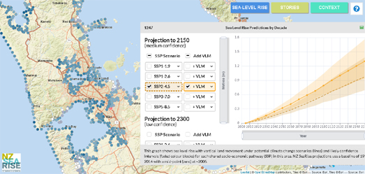
Andrew Douglas-Clifford has created an interactive map of New Zealand with Māori place-names. The Te Reo Māori Web Map is a Mapbox map of New Zealand which shows the Te Reo place-names of New Zealand towns, cities, lakes, rivers, mountains and other notable locations.

The map uses the Te Reo place-name data from OpenStreetMap. This meant that in order for the map to work in the whole country Andrew had to spend months adding Māori names as alternate language names in OSM. If you like the Te Reo Māori Web Map then you can buy a print of a similar static Te Reo language map of New Zealand from Andrew's website.


Earlier this year the New Zealand Herald created an interactive map which colors place-names depending on whether they are English or Māori. The Our Place Names map reveals that North Island is dominated by Māori names and South Island is dominated by English place-names.

The map is made using data from Te Pūnaha Matatini, Dragonfly Data Science and Te Hiku Media. They used algorithms to identify Māori words in the New Zealand Gazetteer of place-names. If you hover over a place-name on the map you can view the actual name.


Apparently most automated voice systems struggle to correctly pronounce many Māori place-names. To rectify this problem Vodafone and Google created an interactive map to crowdsource all the place-names that Google Maps manages to mispronounce. Anyone can drop a pin on the Say it tika map to show a location where Google struggles with the correct Māori pronunciation.

If you click on a place-name's marker you can listen to how Google Maps pronounces the name. If Google gets it wrong then you can drop a map pin to inform Google of its mistake. All these highlighted place-names will then be sent to Te Taura Whiri i te reo Māori (the Māori Language Commission), who have promised to teach Google the correct pronunciations of Māori place-names.

Saturday, June 02, 2018

Maps with New Zealand


You might have heard of the Reddit group Maps without New Zealand. The group's members believe that New Zealand is a real country and exists somewhere in the southwestern Pacific Ocean.

If you haven't heard of New Zealand before, it is a fictional country which was invented by the fantasy writer J.R. Tolkien. Based purely on the existence of a Reddit group called 'Maps without New Zealand' I believe that there exists an obvious desire in some people to view a map of the Earth which includes the fictional land of New Zealand. I have therefore decided to release my own plug-in for the Leaflet.js mapping platform. A plug-in that can be used to add the fictional country of New Zealand to any interactive map.

Maps with New Zealand is a very simple plug-in. If you use it with Leaflet you can add New Zealand to your own maps. The plug-in simply adds a small inset map to the bottom right-hand corner of a Leaflet map. This small inset shows an imagined map of Tolkien's fictional country. A map which I believe might have actually been drawn by the author himself.

Thursday, March 08, 2018

Mapping Māori Place-names


The New Zealand Herald has created an interactive map which colors place names depending on whether they are English or Māori. The Our Place Names map reveals that North Island is dominated by Māori names and South Island is dominated by English place-names.

The map is made using data from Te Pūnaha Matatini, Dragonfly Data Science and Te Hiku Media. They used algorithms to identify Māori words in the New Zealand Gazetteer of place-names. If you hover over a place-name on the map you can view the actual name.

Unfortunately the New Zealand Herald don't have any theories about why there is such a clear difference between the two islands. It would be interesting to know why North Island has far more Māori names than South Island.

Sunday, February 18, 2018

Emoji Map Search


Air New Zealand has invented a new way to explore New Zealand. Just Tweet your favorite emojis to Air New Zealand and they will send you a personal interactive map of fun places to visit in New Zealand.

If you use the #EmojiJourney hashtag and three emojis in a Tweet then Air New Zealand will send you a link to a Google Map of New Zealand featuring recommended things for you to see and do - based on your choice of emojis. For example if you send a wine glass emoji, a bike emoji and a ski emoji you will be sent a link to a map showing wineries, great places to cycle and places to ski.

If you don't want to use Twitter you can just go to the #EmojiJourney map and search the tourist map of New Zealand by selecting your favorite emojis. You can even get your own emoji map by simply appending emoji symbols to the end of the map's URL.


Emojis can also be used as a simple universal non-written location coding system. For example, What3Emojis is a revolutionary new way of addressing the entire world using the only common language of the entire human race, the emoji.

With What3Emojis the Earth is divided into 4m x 4m squares which are randomly assigned a unique three-emoji combination. If you want to share your location with someone else all you need to do is send them the three emojis assigned to that location. They can then enter the emojis into What3Emojis and be shown that location on the interactive map. Simple!

Friday, November 17, 2017

Mapping Earthquake Prone Buildings


The New Zealand Herald has created an interesting mapped tour of Wellington's Earthquake Prone Buildings. The map shows the location of the 95 Wellington buildings which have unreinforced masonry and the 699 buildings which are earthquake prone. The map also identifies hotspots where unsafe buildings are located in areas with large numbers of pedestrians.

The map effectively uses Mapbox GL to provide a bird's eye view of Wellington with 3d buildings (the earthquake prone buildings are colored red on the map). This 3d view of the city is combined with a story map format so that the Herald can take its readers on a tour of the city's vulnerable buildings and dangerous hotspots.

The map uses extrusions to display the 3d buildings. This is neatly combined with the story map format to give a real sense of flying over the city's buildings. This tour of the city is supported by the Herald's analysis of the city's earthquake prone buildings and the danger that they pose to the city. This analysis appears in the scrolling map side-panel.


In New Zealand all buildings need to be assessed by law to identify which buildings are earthquake prone. The New Zealand Herald were able to use this data to create their map of Wellington's earthquake prone buildings. In the United States the Oregonian had to take a different approach in mapping the Oregon buildings most prone to earthquake damage.

In 1974 Oregon enacted its first statewide building code. In 1993 western Oregon adopted its first seismic standards. Franz Rad, a professor of civil & environmental engineering at Portland State University, argues that these dates provide a "broad-brush look at the vulnerability of buildings".

Earthquakes: How Vulnerable are Portland’s Buildings? uses Portland building age data to assess which buildings are most earthquake prone. Building footprints are colored on the map to show buildings constructed before 1974, those constructed between 1974 & 1993 and buildings erected after 1993. You can therefore use the map to assess the ('broad-brush') vulnerability of any Portland building to earthquake damage.

Sunday, September 10, 2017

This Map Speaks Māori


If you get upset about all the World Maps Without New Zealand then you might want to spare a thought for Māori speakers. Even though Google Maps includes New Zealand apparently its automated voice always seems to mispronounce Māori place-names.

To rectify this problem Vodafone and Google have released a new map to crowdsource all the place-names that Google Maps manages to mispronounce. Anyone can drop a pin on the Say it tika map to show a location where Google struggles with the correct Māori pronunciation. All these highlighted place-names will then be sent to Te Taura Whiri i te reo Māori (the Māori Language Commission), who have promised to teach Google the correct pronunciations of Māori place-names.

Most of the locations with Māori language place-names in New Zealand have already been added to the map. If you click on a place-name's marker you can listen to how Google Maps pronounces the name. If Google gets it wrong then you can drop a map pin to inform Google of its mistake.

Tuesday, December 29, 2015

Vintage Map Styles - Remix Edition


Earlier this month Mapbox unveiled a new vintage map style created with Mapbox Studio. You can learn more about Mapbox's Vintage map and how it was created on the Mapbox blog.

The map uses background textures and bathymetry data to replicate how many vintage maps used detailed styling on the oceans surrounding bodies of land. The Vintage map also uses a color scheme designed to mimic the worn discolored paper of many antique vintage maps.


Jonah Adkins was inspired by the Mapbox Vintage map style to create his New Map of the United States (Github). You can view the map itself live here. Jonah is also responsible for the equally pretty Back 2 School interactive map. The Back 2 School map style is based on an old map of North America that Jonah found in Charlottesville.


Another remix of the Mapbox Vintage map style has been created by Nathan McKinley. The New Zealand Vintage Map style is based on an old Japanese map of New Zealand. I particularly like the interactive map insets of Wellington and Auckland on Nathan's map.

Sunday, May 17, 2015

Mapping God & Money in New Zealand


The New Zealand Herald has mapped religious belief and the Deprivation Index in each New Zealand neighborhood in order to determine if there is any correlation between prosperity and a belief in God.

The God and Money map shows the percentage of residents who indicted that they had no religion in the 2013 census. If you mouse-over a census tract on the map you can view the percentage of people who said they had 'no religion' and the percentages who indicated a belief for each of the main religions. When you mouse-over a census tract you can also view the area's Deprivation Index score.

The Herald claims that there is a correlation between money and a belief in God. They argue that the maps shows that 'religious New Zealanders live mainly in poor suburbs, with rich Kiwis increasingly turning their backs on God and religion'.

Tuesday, March 24, 2015

Take a Virtual Tour of Hobbiton


Mapillary, the crowdsourced alternative to Street View, now includes photos of Hobbiton in the Shire. This means that you can now take a virtual tour of Hobbiton, stroll along Bagshot Row and visit Bag End (the legendary home of Bilbo Baggins, Frodo Baggins, and later Samwise Gamgee and his wife Rosie Cotton).

Except of course the Hobbiton in question is really the Hobbiton movie set in New Zealand. Even so I'm sure the new Mapillary imagery will appeal to fans of Tolkein's novels and Peter Jackson's movies.

Mapillary provides crowdsourced imagery of locations around the world. Users of the Mapillary Android and iOS app can take photographs which are added to the Mapillary photo map of the world. The Mapillary map can then be browsed by anyone wishing to view photographs by location.

All of the street view imagery on Mapillary is available under the Creative Commons Attribution-ShareAlike 4.0 International License. Mapillary also provides a developer API which is free for non-commercial and small scale use.

Thursday, March 19, 2015

Mapping Sunlight


This interactive map, from Dumpark, reveals the average number of hours of direct sunlight received each day throughout Wellington City in New Zealand.

The number of hours of direct sunlight is affected by topographical features, such as hills, and physical objects, such as buildings and trees. To measure the number of hours of direct sunlight Dunpark used data elevation models of Wellington City combined with building footprint data of the city.

The Hours of Direct Sunlight map shows the yearly average number of hours of direct sunlight received each day. It is also possible to view layers showing the average number of hours received in the mornings and in the afternoons.

Monday, January 05, 2015

The School Antipodes Map


One of my favorite Google Maps of all time is Ze Frank's Earth Sandwich. Anyone who has ever looked at a map or a globe has wondered at some time what country lies at the opposite end of the world from their home.

Ze Frank's map allowed you to center a map on your location and discover what is on the other side of the Earth on another map. Ze Frank's map no longer works but you can now use the Antipodes Spain/New Zealand School Map instead.

In fact the Antipodes Spain/New Zealand map allows you to do much more instead - if you live in Spain or New Zealand. Anitpodes maps are disappointing for most people around the world - as most people discover that their anitpode is actually in the sea or an ocean.

The Spanish and the Kiwis are lucky because they are actually antipodes of each other. The Spain/New Zealand School Map takes advantage of this to try and foster partnerships between schoolchildren from each country. Enter a Spanish or New Zealand school name into the map and you can discover the school which is their nearest antipode. The map even provides the address of the school on the other side of the world so that the kids can send letters to their counterparts across the world.

If you don't live in Spain or New Zealand you can still use the map to discover your antipode.

Monday, December 01, 2014

What New Zealanders Earn


The New Zealand Herald has mapped the annual incomes of every household in the country. Using data from the 2013 Census of Population and Dwellings the Annual Household Income Map is a dot map showing the distribution of income levels throughout new Zealand.

The map provides a number of quick links to zoom the map to New Zealand's major cities. The dots on the map are color coded to reflect the level of income, with red dots indicating higher annual incomes and blue dots lower incomes.

The dots on the map are randomly placed within city blocks so they therefore can't be identified to specific households. However if you zoom in on an urban area the dots do provide an interesting visualization of the wealth distribution of New Zealand's towns and cities.