Showing posts with label Belgium. Show all posts

Sunday, November 20, 2022

Mapping the New Manure Action Plan

Belgium newspaper De Tijd has carried out an awesome geographical analysis of the Flemish government's Seventh Manure Action Plan (MAP7). Under European Union directives Belgium must reduce the amount of nitrates and phosphates which are being washed into Belgium waterways from agricultural fertilizers. 

By 2027 all bodies of water must achieve a 'good' status. The new Manure Action Plan proposes introducing a set of measures to reduce over-fertilization and its polluting impact on Belgium's inland water. One of these proposed measures is extending the width of the buffer zone which must exist between watercourses and agricultural crop-land. 

In Where are the thousands of hectares of endangered agricultural land? De Tijd has mapped out the impact of extending the current 1 meter buffer zone to 3 meters or to 6 meters. By mapping out Belgium's crop-land and its watercourses De Tijd is able to show how much crop-land is lost under different sized buffer zones. 

Buffer zones between crop-land and watercourses are essential to reduce the washoff of fertilizer into rivers and streams, therefore reducing the amount of nitrates and phosphates that end up in Belgium's inland waterways. However increasing the size of these buffer zones obviously decreases the amount of land which can then be used for growing crops. 

De Tijd's analysis shows that the current 1 meter buffer means that just over 4,700 hectares are removed from agricultural land in Flanders. Increase the buffer zone to 3 meters and almost 14,000 hectares are removed from possible crop-land. Increase the buffer zone to 6 meters and almost 30,000 hectares are removed from possible agricultural land. That is around 4.4% of all Flemish agricultural land.

Using De Tijd's interactive map you can explore where in Flanders the increases to buffer zones will have the biggest impact on available crop-land. De Tijd also goes on to show which specific crops would be most affected by the MAP7 proposals. 

Monday, June 13, 2022

The Poor & Poor Health in Brussels

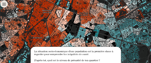
The investigative journalism magazine Médor has undertaken an extremely detailed examination of the health of Brussels. In Bruxelles Malade they explore the extreme inequality of health and health care provision in the capital of Belgium. 

Through a detailed analysis and mapping of health, economic and housing data Médor shows how the poorest neighborhoods in Brussels suffer from low incomes, poor health and high pollution. Despite Brussels being one of the richest cities in Belgium nearly a third of its inhabitants live below the poverty line. 

By mapping out the BIM rate (levels of health insurance benefits) across the city Médor shows how the residents in the northwest of Brussels are in most need of health insurance assistance. Conversely, those people living in the southeast of Brussels are more privileged and less in need of assistance.

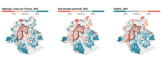
By exploring other demographic and economic data Médor explore how income, housing and employment all have a direct impact on the health of the residents of Brussels. Where you live in Brussels can also affect what kind of health care that you receive. Residents in the poorest neighborhoods of Brussels receive poorer dental care, less cervical cancer screenings and are more susceptible to diabetes than residents in the richer neighborhoods. In general those living in the poorest areas have less access to preventative medicine than those in the richest areas.

Médor also maps out the levels of access to green spaces across Brussels and the levels of air pollution. It shows how the poorest neighborhoods also have the worst access to green spaces and have the worst polluted air. Just two more factors that contribute to the inequality of health in the capital city.

Friday, September 17, 2021

Brussels' Grand Canal Plan

The Brussels–Charleroi Canal runs through the city of Brussels for about 14km.This canal was once an essential part of the city's industrial infrastructure and was home to thousands of warehouses, factories and other businesses. However following the arrival of the automobile and the de-industrialization of the city in the second-half of the 20th Century the canal fell into disuse. Consequently many of the industrial businesses along the canal moved elsewhere or simply went out of business. 

Following de-industrialization the canal sides in Brussels became dominated by abandoned industrial buildings and brown-field sites. This fall in local employment in turn led to a deterioration in the local housing stock. So eventually the Brussels canal became synonymous not with industrial prosperity but with poor housing and low-income groups. 

Brussels however has a plan to revitalize and improve the neighborhoods on the Brussels-Charleroi Canal. The 'Canal Plan' includes a set of objectives to create new housing, attractive public spaces, and more economic activity on both sides of the canal. You can learn more about the specific development proposals in the Canal Plan in L'Echo's wonderful overview of the plan.

In Can the Canal Plan Relaunch Brussels? L'Echo uses maps, photos, drone imagery and 360 degree panoramic presentations to showcase some of the Canal Plan's visions for revitalizing Brussels. The newspaper's presentation includes an impressive satellite view fly-over of the canal. As you scroll through L'Echo's article a 3D satellite map of the city pans along the the canal, illustrating the prominent position that the canal occupies in Brussels. As the map pans around the city the accompanying scrolling text explains the Canal Plan's development proposals for each part of the city. 

L'Echo's article also includes a number of panoramic aerial views of the canal. These 360 degree drone images use map markers to provide a more detailed account of some of the Canal Plan's specific development ideas. Select one of these map markers and an information window will open with more information about how the area will develop and an artist's impression of the finished development.

Friday, July 16, 2021

European Flood Maps

Over recent days high levels of precipitation across parts of Central and Northern Europe have led to devastating levels of flooding. This has resulted in a number of deaths in Germany and Belgium, while parts of Luxembourg, the Netherlands and Switzerland have also been effected by dangerous floods. Since Monday a persistent area of low pressure has caused heavy rainfall across Germany, Belgium, Switzerland and the Netherlands. This has caused many rivers to burst their banks and dozens of people have been killed in the floods.

Germany's Flood Portal shows the current state of flooding in the entire country. The site includes a national river gauge map which visualizes river levels across the country. This map currently shows high water levels in western parts of North Rhine-Westphalia. The Flood Portal website also provides links to the German Weather Service's weather warning maps and to a German Flood risk map.

Switzerland's national mapping service includes a flood alert map layer which allows you to see where lakes and rivers in the country currently have a flood alert. This layer colors rivers and lakes to show the current flood hazard. There are currently flood alerts on many lakes and rivers in Switzerland, including Lake Geneva and Lake Neuchatel. 

In Belgium the government's flood service Waterinfo Belge includes a current situation map. This map shows the current measurements for river gauges and a short term and longer term forecast of flood levels. If you navigate to the home page of Waterinfo you can view all the latest flood warnings for the country, as well as the current warning levels for tides and rainfall.Water levels in South-Eastern Belgium remain dangerously high.

Saturday, May 29, 2021

A Day in the Life of the North Sea

The Belgian financial daily newspaper De Tijd has published a data-driven story about the huge amount of human activity that can be seen in the North Sea. The area of the North Sea off the Belgium coast is one of the busiest seas in  the world. In fact Belgian territorial waters are so busy that the North Sea off the Belgian coast sees more marine traffic than both the Panama Canal and the Suez Canal. 

To help illustrate the huge amount of marine activity which takes place off the coast of Belgium De Tijd has created an animated map which visualizes 24 hours of marine traffic, using data from marinetraffic. On this animated map different colors are used to show four distinct types of marine vessel. In the story The North Sea is Teeming container ships are shown in yellow, the blue vessels are fishing boats, dredgers are shown in red and other types of ship are shown in gray. 

The North Sea off the Belgian coast is very shallow and contains many sandbanks. As you progress through De Tijd's story the navigable sea routes off the Belgian coast are added to the map. Look out for the red boats on the map which show the dredgers constantly working to keep these sea routes navigable.Keep scrolling and the dredging dumps, where the dredgers tip the sand and silt cleared from the sea routes, are also added to the map.

Of course boating is not the only human activity taking place in the North Sea. As well as this animated map showing 24 hours of marine activity 'The North Sea is Teeming' includes maps which show the major wind farms off the Belgian coast, the location of protected nature zones in the North Sea, and the locations of gas, electricity & telecommunication pipes & cables. Towards the end of De Tijd's story another map is used to show that underwater noise pollution in the North Sea is loudest off the Belgian Coast. With all this marine activity going on it is easy to see why.

Wednesday, May 05, 2021

The Brussels Melting Pot

20% of all migrants in the world live in just 20 cities. One of those cities is Brussels. In fact Brussels has the second  highest percentage of foreign born residents of all the cities in the world - after Dubai. 

Brussels has 2.1 million inhabitants. Around 6 in every 10 of them were born abroad. About 184 different nationalities make up the population of Brussels. Like in many cities people of the same nationality often live in the same neighborhoods and communities. You can explore where Brussels' foreign born communities live in the Brussels - A Lovely Melting Pot data visualization. 

Brussels - A Lovely Melting Pot includes a number of small multiple dot maps showing the geographical distribution of some of the different nationalities living in the city. The interactive data visualization also includes a single dot map showing all the nationalities on one map. This combined map shows that the foreign nationals living in southeast Brussels are mainly from the other EU countries. African foreign nationals tend to live in the northwest of the city and Turkish foreign nationals live in the north. 

Brussels - A Lovely Melting Pot doesn't include any economic data. It would be interesting to compare the geographical distribution of foreign nationals with economic indicators, such as average incomes and property prices. While looking at the overall distribution of where different nationalities live in Brussels I can't help making some assumptions about where the city's richest and poorest neighborhoods are located.

Thursday, September 24, 2020

Mapping Noise Pollution with Noise


Noisy City is an audible data visualization of noise pollution in the Belgium city of Brussels.

Like most noise pollution maps Noisy City uses a heat map model to visualize the intensity of the noise pollution in different locations. However what I really like about Noisy City is that it also uses real noise to indicate the levels of noise pollution in different parts of the city. Hover over a location on the map and turn on your speakers and you can listen to a representation of the noise levels at that spot in Brussels.

Using real noise to help convey the levels of noise pollution found around the Belgium capital is a clever idea. I also like the animated noise meter which reveals the number of decibels of noise pollution which can be found at each selected location.


One in every four people in Europe live near a road which is responsible for noise levels in excess of 55 decibels. The NOISE Observation & Information Service for Europe map allows you to explore the levels of noise pollution across the continent. The interactive map provides an overview of the levels of noise pollution created by road traffic, railways, airports and industry.

The NOISE map allows you to explore noise pollution levels from four separate sources. Using the map sidebar you can navigate to explore noise levels across Europe from roads, rail, airports or industry. Each of these four separate noise pollution maps provide you with an overview of average noise levels for locations across Europe during the day or at night.

If you click on a location on the NOISE map you can discover the number of people exposed to average noise levels of 55 dB or higher for the selected source of noise pollution. The map will also tell you how many people in the selected country are exposed to noise levels of 55db or above.


The OSM Global Noise Pollution Map uses OpenStreetMap data to estimate the levels of noise pollution across the world. At the heart of the OSM Global Noise Pollution Map is the very clever but simple idea of assigning noise pollution levels based on OpenStreetMap tags.

Map features in OpenStreetMap are assigned a tag which describe what has been mapped. These tags can also be assigned a value. For example all roads are tagged 'highway' but are also assigned a value such as 'motorway', 'secondary' or 'residential'.

The OSM Global Noise Pollution Map use these tags and values to assign a noise pollution level based on general assumptions. For example highway, trunk, primary and secondary roads are deemed to be noisier than normal street or service roads. The OSM Global Noise Pollution Map also assumes that other mapped features, such as railways and retail & industrial zones, will also generate different levels of noise pollution.

Saturday, July 18, 2020

Train Tracking Live


Zugverfolgung is a live real-time train tracking website which allows you to view trains moving in real-time in Germany, Austria, Switzerland, Belgium and the Netherlands.

Select a country on Zugverfolgung and you can view an interactive map of the chosen country's train network, on which all the trains currently in service can be actually seen moving live on the map. If you then click on one of the moving trains on the map you can view the train's scheduled timetable. You can also click on individual stations on the map to view that station's current departure boards.

Zugverfolgung includes a search option which allows you to enter an individual train number or station name to zoom straight to that train or station on the map.

If you are a fan of live real-time maps of train networks then you might also like:

Train Map - a live map of the Belgium rail network
Réseau SNCF en Temps Réel - the live position of all SNCF's trains throughout France
Swiss Railways Network - the original real-time map of Swiss trains
Trafimage - the entire public transit network of Switzerland in real-time
OSM Tchoutchou - shows real-time trains in France, Ireland, Denmark and Finland
Travic - animated maps of over 700 transit systems around the world.
Mini Tokyo 3D - a live real-time map of Tokyo's public transit system (in 3D)
UK Train Times - a real-time map of the whole UK rail network

Tuesday, March 17, 2020

Equal Street Names


Over 93% of the streets in Brussels named for people are named for men. Only 6.27% of those streets are named for women. EqualStreetNames.Brussels is an interactive map which colors the streets of the capital of Belgium based on whether they are named for men or women.

The map is a very effective visualization of the shocking lack of recognition for women in Brussels. Streets named for women are colored in purple, so they should really stand out on the map. In truth what really stands out is the disparity between the huge number of lime green streets (named for men) and the handful of purple streets.

Of the women who have been recognized by having streets named for them in Brussels a large majority appear to be princesses or queens. If you select a colored road on the map you can view the street's name and click through to read more about the named person on Wikipedia.

Brussels is of course not unique in its sexist street names. Geochicas has been at the forefront in revealing the under-representation of women in street names. Las Calles de las Mujeres is an interactive map which reveals all the streets named for men and women in a number of cities in Spain, Argentina, Mexico, Bolivia, Cuba, Paraguay, Peru and Uruguay.

Street Names in Vienna visualizes all the streets named for men and women in the Austrian capital.

Mapping Female versus Male Street Names - also maps the distribution of male and female street names in major cities across the world.

Wednesday, January 08, 2020

How to Avoid Cars in Cities


If you've ever explored your local air pollution map then you already know that the major cause of air pollution in most towns and cities is the automobile. Which means that if you want to avoid air pollution then the first thing you should do is avoid roads. Unfortunately that is often less easy than it sounds.

If you live in Brussels you can use Hans Hack's new Retreats from Streets interactive map. This interactive map uses circular markers to show the point in every neighborhood which is furthest from a road. The larger the circle on the map then the furthest its center is from any road traffic. Therefore the largest circles on the map show the areas which are furthest from any road traffic.

You can learn more about how the furthest points from roads was calculated and how to make your own Retreat from Streets map on GitHub.


Berlin is the second city that Hans Hack has mapped. His original Retreats Away From Berlin's Streets interactive map visualizes the areas which are the furthest away from road traffic in the German capital. Using this map you can view the point in every Berlin city block which is furthest away from a road used by cars.

The Berlin map includes three views. If you select 'All' you can view all the car free retreats for every city block. Alternatively you can choose to just view the 'Top 30' retreats, the thirty locations in Berlin which are the furthest from car traffic. The 'Top Neighborhoods' view shows you the location in every Berlin district which is furthest away from traffic.

Wednesday, October 30, 2019

How Flanders Has Changed in 50 Years


The Flanders region of Belgium has changed a lot in the last 50 years. If you want to know how the area has changed then you can explore the 50 Years of Concreting in Flanders interactive map.

50 Years of Concreting in Flanders uses aerial photography from 1971 to show how the region looked from the air half a century ago. Using the map you can search for any address and compare modern aerial imagery with the historical aerial imagery to explore how the area has changed. The 1971 imagery has a spatial resolution of 1 meter, which means that it is of a high enough resolution to be able to identify individual houses.

The map was made by Maarten Lambrechts, who has also written an interesting blog post on how the map was made. In A look through history map of Flanders - the making of Maarten explains how he made the historical imagery into a map tile layer which could be viewed using an interactive map. He also explains how he developed the functionality to share a location on the map. This allows users to simply cut & paste the URL of a location on the map which they can then share with friends or family.

Tuesday, October 08, 2019

The Global Problem of Opioid Consumption


More than one million Belgians took an opioid in 2017. This has led the Belgian magazine Medor to take a close look at the consumption of opioids around the world and in particular at the rise of opioid consumption in Belgium.

The Pain of the Belgians uses a series of maps and charts to explain the rise of opioid use and where this rise is being seen around the world. The USA leads the world in the consumption of opioids. In terms of average intake the USA is closely followed by Germany, Austria, Canada and Belgium (in that order). In Belgium one in ten people have now been prescribed an opioid. The problem is particular bad in the provinces of Walloon. However Flemish provinces are catching up fast and have seen the biggest increases in opioid use since 2010.

Medor conclude that there is a partial link between unemployment rates in Belgium and high opioid use.


BuzzFeed has mapped the US Counties Prescribing Way More Opioids Than Others. The map shows that doctors are prescribing opioids heavily in many areas which are experiencing high unemployment rates, such as Appalachia. The BuzzFeed article quotes the CDC as saying that the higher prescribing counties are often marked by higher rates of arthritis, diabetes and unemployment. It therefore looks like some of the same socio-economic factors are at play in U.S. prescription rates as in Belgian.

Friday, April 26, 2019

Brussels - City of the World


Brussels has the second highest percentage of citizens who were born abroad of all the cities in the world, after Dubai. Around 60% of Brussels residents were not born in Brussels. You can discover where these residents born overseas originally came from on Karim Douieb's visualization of the Belgium capital's population.

Brussels - A Lovely Melting Pot is an impressive data visualization exploring the diverse composition of the population of Brussels. The visualization uses d3.js to seamlessly animate between a number of different charts and graphs exploring the origins of Brussels' residents. These charts and graphs show the percentage of citizens born overseas and which countries they were born in.

At the end of the visualization a series of dot maps reveal where the immigrants from different parts of the world live in the city. These maps reveal that citizens from different countries tend to live in distinct areas of the city. Around 10% of immigrants living in Brussels originate from North African countries. These residents tend to live mostly in the north-west of the city, particularly in the Anderlect, Sint-Jans-Molenbeek and Bockstael neighborhoods. Residents who emanate from EU15 countries (EU countries before the 1995 enlargement) are most densely concentrated in south central Brussels. It might not surprise you to learn that Anderlect, Sint-Jans-Molenbeek and Bockstael are among the most disadvantaged areas of Brussels.

Saturday, October 06, 2018

If Car Companies Hadn't Lied About Diesel


In 2014 the International Council on Clean Transportation discovered that the diesel cars of a number of different car manufacturers exceeded legal levels for nitrogen oxide emissions. The result of diesel cars emitting higher levels of pollution than claimed by the manufacturers has been far higher levels of air pollution across the world. This has been starkly visualized by Da Standaard.

Last month Belgium newspaper Da Standaard mapped out the results of a huge citizen science project to test the quality of air in Flanders. You can view the interactive map of Flanders air quality on the newspaper's Curieuze Neuzen Vlaanderen feature. Now that Flanders has an accurate map of air quality in the region, based on measurements from over 20,000 sensors, it has a decent base layer with which to see how clean the air would be without the emissions from diesel engines.

In What would Flanders look like without tampering with diesel cars? Da Standaard has created a number of side-by-side visualizations which allow you to compare air pollution in different locations around Flanders with diesel engine emissions and without diesel engine emissions. These visualizations show what the air pollution would have looked like if the car manufacturers had obeyed the legal limits for diesel engines and what air pollution would look like if diesel was banned completely.

These visualizations clearly show that diesel cars have contributed hugely to air pollution in Flanders. They also show that if diesel cars were removed from the roads most of Flanders' most polluted roads would instantly fall within European standards for safe levels of air pollution.

Saturday, September 29, 2018

Belgium Air Pollution


20,000 Belgiums have taken part in a citizen science project to measure air pollution in Flanders (the northern region of the country). For the project volunteers installed air quality sensors on a street facing window of their homes. These sensors measured NO2 levels during all of May 2018.

You can view the results of the project on the Curieuze Neuzen Vlaanderen interactive map. The map uses colored circles to show the amount of NO2 measured by each of the 20,000 air quality sensors. The map reveals that air pollution levels can vary widely from street to street. In general air quality in Flanders is pretty good. However there are areas with lots of air pollution, mostly in cities and the larger towns.

Antwerp stands out with nearly the whole city showing worrying levels of air pollution. The pollution is particularly poor in narrow streets with lots of traffic. However even small towns often have locations where NO2 levels are high. These tend to be in areas with lots of stop-start road traffic, such as roundabouts, busy crossroads and traffic lights.

Wednesday, September 26, 2018

The World's Trains in Real-Time


A number of interactive maps now allow you to watch the train networks of entire countries in real-time. These incredible maps show all the trains across a whole country moving at the same time.

A good example is Belgium's Train Map, which shows all of Belgium's trains moving in real-time on top of an interactive map. The map shows inter-city trains (IC), peak hour trains (P) and slow trains (L). If you click on one of the moving trains on the map you can view its entire schedule, including its expected arrival time at every station on its route.

The map also includes a handy search facility which allows you to search for individual trains by train number or to view all the trains currently travelling on a particular route.


The first real-time map of an entire country's rail network was probably the Swiss Railways Network map. This map shows all the trains on the Swiss Railway moving in real-time based on the national rail timetable.

The Swiss Railways Network Map includes the option to automatically follow any train in real-time. If you select a train on the map and select the 'follow' button (which appears in the map sidebar) the map will then automatically follow your selected train. Fans of Swiss trains will also like Trafimage, which also shows all Swiss trains moving in real-time (select the 'Train Tracker' option from the map menu).

Also See

UK Train Times - a real-time map of UK trains
Réseau SNCF en Temps Réel - shows the live position of all SNCF's trains throughout France
OSM Tchoutchou - shows real-time trains in France, Ireland, Denmark and Finland

If you can't find your country in the list above then try Travic which provides animated maps of over 700 transit systems around the world.

If you are only interested in individual towns or cities then you might be able to find a more localized live transit map using the Maps Mania real-time or transit tag.

If you prefer traveling by sea then you might want to look at MarineTraffic, a real-time map of the world's ships, boats and other sea-faring craft. Fans of planes will probably prefer Flightradar24, a real-time map of all the world's commercial flights.

Wednesday, August 22, 2018

Roady McRoadface


If you allow politicians to name streets and roads then they will undoubtedly give them the names of  men (definitely not women). Usually these will be men whose main claim to fame is that they have killed a lot of people.

The best way to avoid ending up with a road map which is dominated by the names of male psychopaths is to crowd-source the naming of your streets and roads. By doing this you can ensure that your road map is instead a delightful wonder of surreal humor. At least that is what happened in Belgium.

In Brussels city officials decided that the public could propose the names of the streets in a former industrial district which is undergoing regeneration. The public were invited to suggest the names of 28 streets and squares in the new Gare Maritime neighborhood. A jury then chose the winning names from all the entries. Allowing a jury to make the final choice for the district's new road names was obviously intended to ensure that the city didn't end up with controversial, offensive or overly ridiculous street names.

However I am happy to announce that the new Gare Maritime neighborhood will have a selection of surreal and wacky road names. My favorite is 'Ceci n'est pas une rue' (this is not a road), which is an obvious homage to Magritte's famous surreal painting 'Ceci n'est pas une pipe. You can view the new road names for yourself on the Discover the New Street Names interactive map.

Among my other favorites in these new road names are Place of Great Men (a new public square obviously dripping with irony). There are also a number of roads and paths which give the promise that they might lead to a better place.There is a Happiness Way, a Better World Path and a Dreams Drive. There are also two streets named for famous Belgian women. They are the film director Chantal Akerman and the first Belgian woman to become a doctor, Isala Van Diest.

Monday, July 03, 2017

Traffic Accidents in Flanders


A new interactive map allows you to view and analyse where Belgium road traffic accidents happen by day of the week and by the hour of the day. Verkeersongevallen Interactief in Kaart Gebracht shows where traffic accidents occurred in the Flanders region from 2014-2016.

The interactive map provides a heatmap view of where traffic accidents happened during this period. The map includes a number of filter controls which really allow you to explore the data in detail. As well as being able to filter the accidents shown on the map by day of the week you can also filter the accidents shown by road condition, maximum speed, by the severity of the injury and by the weather conditions.

This visualization of Belgium traffic accidents was created using WebGLayer a JavaScript library for visualizing large spatial datasets. WebGLayer can be used with different mapping platforms and the documentation includes examples using Leaflet.js and the Google Maps API. The WebGLayer also includes a very similar mapped visualization of traffic accidents for the city of Birmingham in the UK.

Thursday, May 12, 2016

Making a Property Price Map


L'Echo has published an interactive map which shows the average house price in all of Belgium's 19,000 neighborhoods. Using the map you can visualize the neighborhoods with the cheapest and the most expensive property in the whole of the country.

If you enter an address into the Do You Live in an Expensive Neighborhood map you can view a choropleth layer which shows the average house price in each local neighborhood. If you mouse-over a neighborhood on the map you can also view details on the number of sales (2010-2014) and the average price which properties in the neighborhood were sold for.

The map was created for L'Echo by Maarten Lambrechts. Maerten has also written up an interesting Making Of blog post explaining the process behind creating the interactive map and the static maps he also created for L'Echo's print edition. The interactive map has a number of different layers, including Stamen's Toner map tiles, the neighborhood boundaries, a layer for the map labels and the data layer.

Wednesday, March 23, 2016

Satellite Masking


In responding to yesterday's tragic bomb attacks in Brussels the New York Times and the Washington Post have both posted satellite maps of some of the locations which were most affected by the terrorist attacks.

Both newspapers have opted to create static maps from satellite images of the city. They have also both used masking effects to highlight locations on the map. On the satellite images all areas, apart from the selected buildings, are masked - so that the featured buildings clearly stand out on the maps.


It is possible to create the same masking effect with interactive maps. For example you could use Vasile Cotovanu's polygon masking wizard Geomask to create a similar map with the Google Maps API. Using Geomask it took me about five minutes to create an example map highlighting the European Commission Headquarters in Brussels.

This polygon masking effect works particularly well in Brussels because the city has Google's 'birds eye' view aerial imagery, which provides an oblique view of buildings that you can then highlight on a map.

You can create a similar effect with Mapbox by inverting a polygon shape. If you prefer Leaflet maps you can use the leaflet.maskcanvas plug-in.