Showing posts with label military. Show all posts

Thursday, July 03, 2025

Mapping the Revolutionary War

Esri’s Battles of the American Revolutionary War is an interactive StoryMap that visualizes the major battles of the Revolution. This digital tool offers a compelling, user-friendly experience that brings the war’s geography and timeline to life. 

At the heart of the Battles of the American Revolutionary War is its interactive map interface and timeline. Using these features you can view the Revolution battles by location and by date. Whether you're tracking the first shots fired at Lexington and Concord or analyzing the decisive victory at Yorktown, the map provides a clear visual sense of how the war evolved spatially and strategically.

Clicking on any battle's marker on the map reveals a concise summary with essential details - such as the date, participants, and results - alongside a short historical background.

You can view some of the actual original maps from the Revolutionary War on the American Revolution Institute’s Ten Great Revolutionary War Maps. This curated selection of historical maps of the Revolution highlights maps created by American, British, French, and Hessian cartographers - ranging from hastily drawn field plans to meticulously engraved topographical charts. 

One of the most notable examples in this collection is Sebastian Bauman’s map of the Siege of Yorktown, which stands out as the first major battle map designed and published by an American engineer. Others, like William Faden’s depiction of the New Jersey campaign, and Charles Blaskowitz’s survey of Narragansett Bay, show how European-trained professionals contributed to strategic military planning.

Wednesday, May 28, 2025

Taxing for War

The average American spends nearly $3,000 a year funding the military. In contrast, if those Americans lived in Haiti, they would contribute just $1.70 per year to military spending.

The World BEYOND War's Mapping Militarism project presents a series of maps that illustrate how much individual countries spend on their militaries. The site’s “Money” map includes two key views: one showing the total military expenditure of each country and the other displaying per capita military spending. Both views offer a compelling way to compare global military budgets.

In 2024, the United States spent approximately $997.31 billion on its military - an amount that far surpasses the spending of any other country. By comparison, China, which has the second-largest military budget, spent $313.66 billion. However, when it comes to per capita spending, Israel ranks first, with an average of $4,988 per citizen. The United States follows, at $2,895.10 per person.

This disparity highlights not only the vast scale of U.S. and Israeli military investments but also the priorities and impacts of military funding across different societies.

Wednesday, April 30, 2025

Mapping the Sudanese Civil War

Two years into Sudan’s civil war, the country remains gripped by a humanitarian catastrophe and a relentless power struggle that has devastated lives and reshaped its landscape. What began on April 15, 2023, as a clash between the Sudanese Armed Forces (SAF), and the paramilitary Rapid Support Forces (RSF), has since escalated into a nationwide conflict. With over 14 million people displaced and tens of thousands killed, Sudan now faces one of the world's most severe displacement crises.

Al Jazeera has published an interactive animated map to visualize the tragic scale of the conflict between April 2023 and March 2025. This map, created using data from the Armed Conflict Location & Event Data (ACLED) project, plots more than 11,000 recorded attacks across Sudan’s 18 states. What makes the map especially compelling is its temporal animation: showing the conflict unfold over time, attack by attack, with color-coded markers identifying the perpetrators - SAF, RSF, or other groups such as local militias and rebel movements.

The animation captures not just the quantity of violence, but its geographic concentration. Nearly three-quarters of all attacks occurred in Khartoum, Gezira, and North Darfur. Khartoum, the capital, emerges as the epicenter with over 5,500 attacks - an almost unimaginable transformation of an urban capital into a prolonged battlefield. Viewers can see the shift in the conflict over time, such as the rise in violence in Gezira following RSF incursions or the targeted assaults on displacement camps in North Darfur.

What stands out is the map’s ability to make an overwhelming dataset accessible. Color-coded pins differentiate between army strikes, RSF actions, and those of unaffiliated groups, while the gradual build-up of violence reveals critical inflection points - such as the peak in August 2023, and renewed escalations in early 2024. The result is a tool that is both informative and unsettling, allowing users to trace patterns of brutality, understand regional dynamics, and grasp the persistence of violence despite shifting frontlines.

Wednesday, April 09, 2025

Mapping the Red Sea Attacks

The International Crisis Group has released an interactive story map, The Red Sea Attacks Explained, that does a great job of breaking down the background and consequences of the Houthis’ attacks on cargo ships in the Red Sea.

The map uses Mapbox's Story Map template to great effect, illustrating the Houthis’ strategic strongholds and their disruptive impact on global trade routes. I would like to give a huge amount of personal credit to the developer behind the ‘red-sea-scroll’ URL address.

The Houthis’ dominance of Yemen’s western coast and Red Sea islands (like Kamaran and the Hanish archipelago) becomes starkly clear when visualized on an interactive map. These chokepoints enable the group to harass ships near the Bab al-Mandab Strait, a narrow passage just 18 miles wide - effectively turning geography into a weapon. The consequences ripple outward: over half of Suez Canal traffic has evaporated as ships reroute around Africa, adding weeks to delivery times and inflating costs. 

The result is that around 12% of global trade has been disrupted by the Houthis attacks. Thanks to this ICG story map we can clearly see how and why.

Via: Data Viz Dispatch

Monday, October 28, 2024

The Interactive Genocide Map

animated map showing building destroyed in Gaza from October 2023 to June 2024

A Cartography of Genocide is a powerful new initiative by Forensic Architecture that maps the extensive human cost of the Israeli military’s operations in Gaza. This interactive platform and accompanying 827-page report seek to document and analyze attacks on Gaza’s civilian population and infrastructure from October 2023 to June 2024.

This interactive map presents an in-depth spatial and temporal analysis of military actions in Gaza, identifying not only individual incidents but broader patterns of violence. The project provides a stark, data-driven examination of the military campaign’s impact on civilian life, examining Israel's directives for civilians to move to ostensibly "safe" zones which were later attacked. This approach allows the analysis to uncover a larger narrative about the systematic destruction of Gaza’s essential infrastructure.

The interactive cartographic platform at the heart of the project allows users to visualize data points across Gaza, categorizing events such as displacement, destruction of medical facilities, and targeting of agriculture. These visualizations illustrate connections between different actions - like how certain areas were subject to repeated displacement orders before subsequent attacks, a pattern that underscores the lack of genuine "safe" zones.

The report outlines six specific categories of military conduct: spatial control, displacement, destruction of agriculture and water resources, destruction of medical and civilian infrastructure, and targeting of aid. Each category provides both statistical data and pattern analysis, giving a granular view of the deliberate impacts on life-sustaining infrastructure and resources. By tracking these types of destruction simultaneously, the report highlights how military strategies are employed not in isolation but as part of a coordinated approach to destabilize civilian life in Gaza.

Also See

Friday, August 30, 2024

245 Russian Military Targets at Risk

map showing possible military targets inside Russian

The Institute for the Study of War (ISW) and Critical Threats have identified hundreds of Russian military sites that are in range of Ukrainian ATACMS. Currently the United States will not allow Ukraine to use US supplied tactical ballistic missiles for long-range deep strikes into Russia. According to the ISW its new map shows "the extent to which US restrictions on Ukraine's use of ATACMS constrain Ukraine's ability to strike important military infrastructure."

The map Known Russian Military and Paramilitary Objects in Range of Ukrainian ATACMS plots the locations of 245 different military sites, including Russian military installations, and regimental, brigade & division headquarters. The map also visualizes the ranges of Ukraine's ATACMS and HIMARS missiles inside Russian territory.

According to CNN this week Ukraine will present the US government with a list of Russian military targets which they believe are important in trying to stop Russia's continuing invasion of Ukraine. They hope that this list of targets will help to persuade the US to lift its current restrictions on Ukraine using American supplied missiles for long-range attacks on Russia.

The ISW also provides daily campaign assessments of the ongoing war in Ukraine. The Ukraine Conflict Updates includes daily static control-of-terrain maps and a regularly updated interactive map, Russia's Invasion of Ukraine, showing the extent of territory currently controlled by Ukraine and Russia. 

Tuesday, August 13, 2024

Russia's Secret Nuclear Targets in China

The Financial Times has obtained secret Russian military files which detail how Russian forces train to use tactical nuclear weapons against both NATO and China.

A story-map in the article Russian navy trained to target sites inside Europe with nuclear-capable missiles (paywalled) shows a number of target locations in Europe and the Pacific for Russian conventional and nuclear missiles. In the Pacific these targets include cities in both China and North Korea, who are normally seen as allies of Russia.

Targets in Europe include cities in France, Germany, Norway and the UK. The FT claims that the Russian military files "describe a threshold for using tactical nuclear weapons that is lower than Russia has ever publicly admitted".

According to Sweden's SVT Russia currently has 5,580 nuclear warheads. SVT's recent investigation into World Nuclear Forces includes a quote from the Swedish government that the "Russian population is being primed for a scenario in which it will be considered legitimate for Russia to use nuclear weapons".

The World Nuclear Forces article includes an interactive nuclear warhead simulator which allows you to explore the likely impact of different types of nuclear warhead on different locations around the world. For example in the screenshot above I have used the simulator to explore the effect of a 100 kiloton Russian warhead dropped on Shenyang (one of the Russian targets in China identified by the Russian military files).

Wednesday, July 17, 2024

Battles of World War II & American Wars

Map of Europe showing the locations of battles of World War II

HistoryMaps has been very busy in the last few weeks, releasing new interactive maps visualizing the:

Nono Umasy's HistoryMaps website is a fantastic resource for anyone interested in world history, offering hundreds of interactive timelines and maps that explore historical events across the scope of human civilization.

The latest three interactive maps on HistoryMaps provide a mapped guide to the battles of World War II, the American Revolution and the American Civil War. On each of these individual maps the locations of important and significant battles are displayed on an interactive map and listed chronologically in the map sidebar.

You can click on the individual battle markers on the map to read the battle's synopsis in the sidebar timeline (each of which includes a link to the battle's Wikipedia entry). The map sidebar also includes a timeline control which allows you to filter the battles shown on the map by year. Other controls allow you to filter the battles by 'Naval', 'Land' and 'Sieges' (and on the World War II map by 'Aerial').

On the cartography side the underlying maps seem to use chronologically accurate borders. For example the country borders for the World War II map includes Czechoslovakia, Yugoslavia, East Prussia and other historical geopolitical entities which no longer exist.

Saturday, July 13, 2024

The D-Day Map Room

The Southwick House D-Day Map of the English Channel with animated ships and places moving across the Channel

The Map Room at Southwick House in Portsmouth was where Allied Supreme Commander General Eisenhower and General Montgomery spent much of early 1944 planning for D-Day. The walls of the Map Room were hung with huge maps of the English Channel. Maps that are still in place in the Map Room at Southwick House to this day.

In particular one wall of the Map Room is covered by a very large map of southern England and the west coast of Europe - including Normandy.  On this map each of the landing beaches (Utah, Omaha, Gold, Juno and Sword), are clearly marked as well as the routes that the Royal Navy ships would take across the English Channel after mine-sweeping ships had successfully cleared safe routes.

Richard Osgood, Senior Archaeologist at the Military of Defence says that the map played a key role in the preparations for the Normandy Landings, “D-Day was a massive event, it changed history. And all of it was meticulously planned on this very map. That’s how important this map truly was, and still is today.”

The National Museum of the Royal Navy has now released an impressive interactive presentation which allows you to explore the map in detail. The D-Day Map - Operation Neptune is not only an interactive online version of the huge D-Day wall map at Southwick House, it is also as part of a chronological guide to the planning, preparation, operation and outcomes of D-Day itself.

The map is part of a guided history of D-Day and is used to explain how the Allies planned and prepared for the massive Operation Neptune. During this guided history of D-Day little model ships and planes are animated on the map to help explain troop movements, landings and the other important events of Operation Neptune.

Via: Webcurios

Wednesday, June 26, 2024

The New Nuclear Arms Race

map of San Francisco with colored circles showing the fireball and radiations ranges of a 5000 kiolton nuclear bomb dropped on the city

As several countries actively expand their arsenals of nuclear weapons, Sweden's SVT has released an investigation into World Nuclear Forces. In recent years, China, Pakistan, India, Israel, and North Korea have all augmented their nuclear stockpiles. 

In World Nuclear Forces SVT examines the numbers of nuclear weapons owned by countries around the world and the overall and country trends in nuclear weapon numbers over time. SVT's article also includes an interactive map based nuclear weapons 'simulator'. This simulator allows you to select from a menu of actual nuclear weapons and to simulate the effect it would have if dropped on a location of your choice.

As you can see from the screenshot above, showing the effect of a 5,000 kiloton Chinese Landbased ballistic missile dropped on San Francisco, the simulator visualizes the extent of the fireball, radiation, pressure wave and extreme heat zones on a location using concentric colored circles (San Francisco could be in range of a 5,000 kiloton Chinese Landbased missile stationed on China's eastern seaboard).

There are of course other options open to those interested in simulating nuclear Armageddon. Since 2012 Alex Wellerstein's NUKEMAP has been visualizing the effects of different sized nuclear weapons on locations around the globe.

NUKEMAP allows you to explore the fireball, airblast and radiation fallout extents of different nuclear weapons on any location in the world. Alex's map can also calculate the estimated number of casualties of a nuclear weapon dropped at any location. This estimation includes the expected number of fatalities and the expected number of injuries.

Friday, June 07, 2024

Every Ship Sunk in WWII

animated world map showing the number of Allied and Axis ship sunk in each year of the war

Over the course of the Second World War more than 20,000 ships were sunk around the world. Esri's Paul Heersink has spent the last ten years scouring historical records to create and map the 'most comprehensive dataset' of ships sunk in WWII.

Resurfacing the Past is a fascinating story map which not only visualizes where Allied and Axis ships were lost in WWII, it also explores the WWII sunken data by year, by size and by type. For example the animated GIF above shows the number of Allied and Axis ships sunken in each year of the war. It clearly shows how the Allies "suffered devastating losses in the first years of the war." However by 1943 it was the Axis who were losing the battle for the seas. The map reveals that from March 1943 "the Allied forces sank more ships every month than they lost."

Mapping the sinks sunk in WWII by type reveals that most of the ships that were sunk in the war were not designed to be combat ships. Non-combat ships such as tankers, tugs, cargo ships and floating hospitals suffered the most losses.

The Resurfacing the Past story map guides you through the huge scope of Paul Heersink's sunken ship data, highlighting some of the important stories that the data reveals. You can also explore the data for yourself on the Esri dashboard map Sunken Ships of the Second World War. This dashboard allows you to map the sunken ships of WWII by country, by year, by the 'country that did the sinking' and by belligerent (Axis, Allies or Neutrals). 

Wednesday, April 10, 2024

Mapping Conflicts Around the World

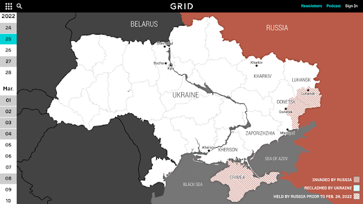
In 2024 the specter of military conflicts haunts the world. Israel is engaged in conflict in Gaza, Russia continues its illegal invasion of Ukraine and the Syrian civil war is now in its thirteenth year. It should be a matter of extreme shame that there are so many organizations who feel the need to publish interactive maps dedicated to tracking the progress of military action around the globe.
map of armed conflicts around the world

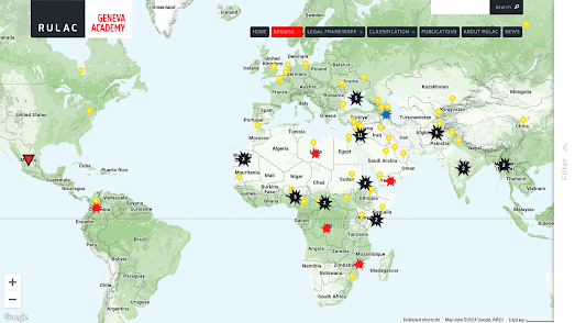
The Geneva Academy's The Rule of Law in Armed Conflict Map monitors and plots armed conflicts around the globe. The map currently shows the locations of  more than 110 armed conflicts, including the military occupation of Palestine by Israel and the occupation of parts of Ukraine by Russia.

The Rule of Law in Armed Conflicts (RULAC) online portal has been mapped armed conflicts around the world since 2007. The map currently shows that at least "55 states and more than 70 armed non-State actors" are presently involved in armed conflicts. 

If you click on the yellow country markers on the map you can discover which conflicts the selected country is currently involved in. For example if you click on the United States the map reveals that the US is presently involved in "airstrikes in Iraq and Syria" and is "also undertaking strikes against Islamist militants in Somalia, Pakistan, Libya and Yemen."

According to the International Institute for Strategic Studies (IISS) the intensity of conflicts around the world increased last year with the number of people dying in these conflicts increasing by 14% year-on-year.

The IISS is an international research institute (or think tank) focused on global security, political risk, and military conflict. The IISS Conflict Trends Map plots the fall and rise of conflicts around the world based on the result of the institute's annual Armed Conflict Survey. The interactive conflict trends map plots five main criteria: troop deployments, violent events, fatalities, the number of internally displaced persons and the number of refugees.

The map also includes a timeline control which allows you to track conflicts in countries around the world over time. Press the play button on this timeline and you can view an animated choropleth layer visualizing the progress of global conflicts for the years 2014-2023.
The Center for Preventative Action's Global Conflict Tracker is another interactive map which tracks conflicts around the world. The Center for Preventive Action (CPA) is a think tank based in Washington, D.C., affiliated with the Council on Foreign Relations. It has a specific focus on conflicts which affect 'U.S. interests'.

The Global Conflict Tracker allows you to filter the conflicts shown on the map by status (worsening, unchanging or improving). The map can also be filtered to show conflicts which have a 'critical', 'significant' or 'limited' impact on the United States. If you click on any of the conflicts shown on the map you are taken to the CPA's page on the conflict, which includes background information, a summary of concerns and news of any recent developments. 

The ACLED Conflict Severity Index (from the The Armed Conflict Location & Event Data Project) uses four different indicators to assess and rank the complexity and severity of conflicts in countries across the world. Based on violence measured in countries around the globe in 2022 the Index identified 46 countries and territories which were experiencing severe levels of conflict. 

You can explore Conflict Severity Index rankings for individual countries and the 46 countries identified with severe levels of conflict on ACLED's interactive map (based on 2022 conflicts). The map includes a choropleth layer which shows the number of incidents of political violence in each country. In 2022 political violence was seen in nearly every country and in many countries the incidents and number of incidents were considered severe by the ACLED. The ACLED has yet to publish it 2023 report.

Saturday, April 06, 2024

The D-Day Memorial Map

map of WWII war memorials in Normandy, France

KilRoyTrip is an interactive map of World War II memorials in Normandy. It provides a fantastic guide to anyone visiting the region who is interested in the D-Day landings and the liberation of France.

The Allied invasion of Normandy on D-Day Tuesday, 6 June 1944 was the largest seaborne invasion in history. On D-Day the Allied forces from the United States, Britain, Canada, and other countries began the liberation of France, and the rest of Western Europe, eventually leading to the end of the war.

Over 4,000 Allied soldiers died on D-Day alone. Total casualties, including wounded, are believed to be over 10,000. The KilroyTrip map provides an exhaustive guide to the memorials of these brave men who died in World War II in the Normandy region. These memorials include museums, cemeteries and war memorials. 

If you share your location with KilRoyTrip the map will show you the locations of your closest WWII memorials. Click on a marker and you will be taken to the selected memorial's dedicated place in the KilRoyTrip database. Each memorial entry in the database includes a description of the memorial, photographs of the memorial and links to other nearby memorials.

If you are interested in learning more about D-Day then you might also want to explore these vintage military maps from the D Day operation:

World War II Military Situation Maps - This Library of Congress collection of American military D-Day maps provides a day-by-day account of Allied and Axis troop positions from D-Day until the end of the war. The maps start on 6th June 1944, with the D-Day invasion, and then provide a daily picture of the military campaign in Western Europe.

US BIGOT maps - The University of Texas Libraries has two secret BIGOT Maps of Omaha Beach (East & West). BIGOT was a code-word for Operation Overlord and the BIGOT list included the names of all the personnel who had been cleared to know details of Operation Overlord.

Tuesday, February 06, 2024

Mapping the Spread of War in the Middle East

The Hamas attacks in Israel on 7 October 2023 have led to increasing violence across much of the Middle East. 

In response to the Hamas attacks Israel launched a devastating and destructive campaign against Gaza. In Yemen the Houthi responded to Israel's attacks on Gaza by targeting ships in the Red Sea. The US & UK replied by targeting Houthi locations in Yemen. Israel and the US have both bombed Syria. The US has bombed targets in Iran and Iraq, and Pakistan and Iran have begun launching tit-for-tat strikes against each other.

If you are struggling to keep track of who is attacking who and where then you can refer to The Guardian's interactive map How Gaza war led to violence spreading around the Middle East. The Guardian's story map starts with the 7 October Hamas attack on Israel, which led to the death of 1,200 Israelis. The map then chronologically maps the escalating crisis across much of the Middle East.

A very large proportion of the violence in the Middle East is of course funded by American tax payers. According to the US Campaign for Palestinian Rights every year the U.S. government gives Israel $3.8 billion. The Campaign's U.S. Military Funding to Israel Map, can show you what your tax dollars could buy you if the money sent to Israel was spent at home.

Enter the name of your state or city into the interactive map and it will tell you how many local tax dollars are being sent to Israel every year and how much public housing, child healthcare, school teachers, or respirator masks that money could buy.

The campaign's map obviously only takes into account the $3.8 billion given to Israel by the government. It doesn't include the money spent by America on its own military presence in the Middle East and the escalating costs of U.S. military strikes against targets in Yemen, Iraq and Syria.

Thursday, December 21, 2023

The Battle of Hong Kong

On the same morning that the Japanese attacked Pearl Harbor (Sunday, December 7, 19411) they also attacked the British Crown colony of Hong Kong. The Hong Kong garrison (consisting of British, Indian and Canadian units, the Auxiliary Defence Units and Hong Kong Volunteer Defence Corps) managed to hold out for over two weeks. However on Christmas Day 1941 the colony finally surrendered to the Japanese.

Project’44 has created a number of maps which document the Battle of Hong Kong, with an emphasis on the involvement of the Canadian troops defense of the British colony. The Fall of Hong Kong includes a story map which provides a detailed chronology of the fall of Hong Kong to the Japanese.

As you scroll through Project '44's story map you can follow the progress of the battle on an interactive map of Hong Kong. The map sidebar provides a narrated history of the battle, illustrated with photos and videos from the Battle of Hong Kong, while the interactive map automatically pans and zooms to highlight the locations mentioned in the narrated tour.


The Battle of Hong Kong 1941 is another interactive map which recounts the spatial and chronological history of the Japanese capture of Hong Kong in the Second World War. The map is the work of the History Department at the Hong Kong Baptist University. The map itself provides both a spatial and temporal account of the Battle of Hong Kong. The map's timeline contains 51 different time-steps. This timeline allows you to follow the progress of the battle during the eighteen days it took the Japanese to take Hong Kong, showing the changing positions of platoon/squad/individual artillery pieces over the whole course of the Japanese invasion.

The map also includes a 'Faces of War' layer. This map layer provides a number of short biographies on some of the key participants in the Battle of Hong Kong. As a result of the battle over a thousand Allied lives were lost and over a thousand were reported missing. It is believed that casualties on the Japanese side were at least as high. 

After the Battle the Japanese remained in Hong Kong for three and half years. During that occupation it is estimated that at least 10,000 Hong Kong civilians were executed. Resistance groups of Cantonese and Han Chinese continued fighting until the end of the Japanese occupation. On August 15th, 1945, Japan officially surrendered and on the 30th August the British army returned to Hong Kong. 

The Japanese occupation of Hong Kong lasted for three years and eight months.

1. The invasion of Hong Kong actually began on the 8th of December, however this is due to the effect of the International Dateline, it was in reality on the same actual solar day as the 7th December attack on Pearl Harbor.

Friday, November 17, 2023

Mapping Damage in Gaza

A researcher at UCL's CASA has released a new interactive mapping tool which can help researchers and news agencies "estimate the number of damaged buildings and the pre-war population in a given area within the Gaza Strip". The Gaza Damage Proxy Map is based on an earlier tool which was developed to estimate damage caused by Russia in Ukraine.

The Gaza Damage Proxy Map colors individual buildings in the Gaza Strip to indicate the probability that the building has suffered damage since October 10, 2023. If you use the map's drawing tool you can highlight an area of the Gaza Strip on the map. The Gaza Damage tool will then automatically estimate the number of damaged buildings in the highlighted area and the estimated affected population. The percentage of the buildings damaged in the area is also calculated for you. If you select individual buildings on the map you can view information on the date of the damage and view a link to the source media for the damage report.

The Gaza Damage Proxy map uses Synthetic Aperture Radar imagery captured by satellites to detect damaged buildings. By measuring the change in the intensity of these radar waves since before the Israeli attacks on Gaza it is possible to estimate the probability that individual buildings have been damaged. Damage points from the UN Satellite Office (UNOSAT) have also been used to validate the accuracy of the damage detection algorithm used by the map. The map itself also includes an optional layer which adds geo-located footage of strikes and destruction in Gaza as triangular map markers.

You can learn more about the methodology used to estimate building damage in Gaza in the Bellingcat article, A New Tool Allows Researchers to Track Damage in Gaza. The Ukraine Damage Assessment Map allows you to carry out similar analysis of the estimated building damage caused by Russia in Ukraine.

Also See

Mapping the Massacres - a comprehensive map of all the atrocities committed by Hamas on the 7th October.

Thursday, May 18, 2023

US Military Bases Around the World

The United States has over 800 military bases in more than 80 countries around the world. This makes the U.S. the largest operator of military bases in the world. These bases are used for a variety of purposes, including training, logistics, and intelligence gathering. They also play a role in projecting American power and influence around the globe.

World BEYOND War has created an interactive map that allows users to view the locations of 867 U.S. military bases in countries other than the United States. In the USA's Military Empire you can filter the military bases on the map by country, government type, opening date, number of personnel, or acres of land occupied. The yearly cost to the U.S. of its foreign military bases ranges from $100 – 250 billion. 

The largest number of U.S. military bases are located in Europe, with over 200 bases in Germany alone. Other major concentrations of U.S. bases are found in the Middle East, Asia, and Africa. Presently World Beyond War only maps U.S. foreign military outposts. However there are plans to add data on all foreign military bases maintained by all nations in future editions of the map.

Thursday, May 11, 2023

Mapping Russian Military Facilities in Crimea

Ukrainian journalists working for Radio Liberty have released an interactive map which shows the locations of more than 200 military facilities located in Crimea. The map shows over 200 Russian military locations in Crimea categorized into 10 different categories, documented using Planet Labs satellite imagery and terrestrial photography.

Ukraine is soon expected to launch a counteroffensive against Russian troops in Ukraine. Crimea itself is probably not a realistic objective in Ukraine's forthcoming counterstrike. However as Russia is using Crimea as a staging area for its operations in southern Ukraine all Russian military locations in Crimea are likely to be attractive targets for long-range Ukrainian missiles. 

The new Map of Military Facilities of Crimea reveals the locations of Russian military test sites, fuel depots, ammunition warehouses, radar and air defense systems, airfields, unit headquarters, and the bases of the Russian Black Sea Fleet. You can select to view any of these categories of Russian military sites on the interactive map. If you then click on a map marker you can read a short synopsis of the site and view any available satellite imagery and / or photographs of the location.

Friday, February 24, 2023

A Year of War in Ukraine

On February 24th last year Russia lauched a full-scale invasion of Ukraine. As a result of Putin's illegal war at least 200,000 people have been killed or injured. In Ukraine over 13 million people have been forced to abandon their homes, and many buildings, cultural artifacts and important infrastructure have been destroyed by the invading Russian army. 

Most media outlets today are marking the anniversery of Russia's invasion with some kind of summary of Ukraine's heroic year long resistance to Russian aggession. Among the best of these is the Grid's Ukraine, One Year at War: An Interactive Timeline of the Conflict

Using an interactive timelined map the Grid has mapped the progress of Russia's invasion so far. This interactive map features a calendar control which allows you to recount the war in Ukraine day-by-day in chronological order. As you scroll through the article the map updates to show the areas which were under Russian or Ukrainian control by date. Significant dates in the conflict are highlighted in grey on the calendar control. When you scroll to these important dates information windows on the map are used to provide background context to the unfolding invasion and to Ukraine's resistance. 

Over the past twelve months news organizations have published many interactive maps to document the progress of the war and to monitor the war crimes being committed by the Russian army. Links to some of these maps can be found by exploring the Ukraine tag on Maps Mania.

Thursday, November 17, 2022

Mapping Mariupol's Destruction

A Timeline of Mariupol's Destruction is an animated map which visualizes the damage caused to buildings by the Russian attacks on the Ukrainian city of Mariupol. The map shows damage caused by Russian bombing between March 5th and July 29th of this year.

The city of Mariupol was under siege from Russia from 25th February until 17th May 2022. In March the Red Cross declared the siege a humanitarian crisis. In May Ukarainian authorities reported that 90% of buildings in the city had been damaged or destroyed. Around 25,000 civilians are believed to have been killed in the Russian attacks on the city.

The map was created by analysing satellite imagery of the city by PlanetScope. This analysis "found that 2,664 structures sustained significant damage in the city".
360war wants to ensure that images of the damage caused by the occupying Russian army in Ukraine are seen by people around the world. 360war is documenting the destruction of Ukrainian towns and villages, showing the aftermath of Russian air strikes and artillery fire on the infrastructure and buildings of Ukraine. Using panoramic 'Street View' imagery 360war allows you to explore in close detail some of the devastating destruction left behind by the Russian army.

An interactive map shows the location of all the available 'Street View' images (Mariupol is still under Russian occupation so is not featured). On this map aerial panoramic images are indicated using a drone shaped marker, while ground based panoramic images are shown with black dots. Many of the interactive panoramas include a 'learn more' link which provide more information on the location depicted and the damage caused by the invading Russian army..