Showing posts with label New York. Show all posts

Wednesday, August 20, 2025

🙂 The Emoji Map of Train Delays ☹️

In the classic 1990s management console game Theme Park, visitors’ satisfaction levels were shown through the use of small expressive icons - 🙂☹️. A similar visual cue has been used in Bloomberg's new mapped visualization of train delays on the New Jersey Transit commuter rail service.

In NJ Transit Is NYC’s Least Reliable Commuter Rail — By a Long Shot Bloomberg has mapped a series of smiley-face emojis onto a New Jersey Transit map. Happy, sweating, and sad emojis are used to represent trains that are on time, 10-30 minutes late, and more than 30 minutes late, respectively. The use of expressive smiley emojis on an animated transit map vividly illustrates the levels of delays on different lines during a particularly bad evening commute.

Bloomberg tracked more than 190,000 trains using real-time transit feed data from May through July 2025 to determine that NJ Transit passengers experienced major service disruptions at six times the rate of other commuters on its New York and Connecticut counterparts. The data revealed that there are frequent delays of 15 minutes or more, cancellations, and particularly long delays of 30 minutes or more on NJ Transit trains.

By translating raw delay data into an immediately understandable visual language, Bloomberg’s mapped emoji visualization makes the scale and severity of NJ Transit’s service disruptions as clear as a smiley or sad face emoji.

Saturday, July 26, 2025

Searching Text in Street View

The Pudding has created an amazing data journalism project that allows you to search New York for any word or combination of words. Called All Text in NYC, it’s a remarkable tool that lets you dive into the city’s written landscape - mined entirely from Google Street View images. From shop signs in Queens to murals in the Bronx, it captures the way language is woven into the physical space of NYC.

Media artist Yufeng Zhao, who built the tool, fed more than 8 million Street View panoramas into a machine learning model that identifies and transcribes visible text. The result is a searchable archive of 138 million snippets of urban lettering - graffiti, storefronts, bumper stickers, menus, flyers, billboards, and more. It turns the city into a giant text document you can explore by keyword. 

You can discover more about the project and explore some of the remarkable textual patterns found in New York by The Pudding on NYC's Urban Textscape. This interactive article not only explains how All Text in NYC works but also explores some of the interesting linguistic clusters, recurring phrases, and neighborhood-specific quirks that emerge from the data - like the use of certain languages in different boroughs, or how slogans like “never forget” or “we deliver” dot the city’s commercial and cultural fabric.

What’s fascinating about this project is that it captures not just what’s written, but where and when it was captured. You can trace the spread of a meme, spot clusters of non-English signage that reveal cultural enclaves, or simply marvel at the quirks of hyperlocal advertising.

For example, I searched Urban Textscape for the words Google Maps and in a neat piece of meta discovery, I found a Street View image of the Google Maps Street View car itself. It’s a strange, self-reflective loop: using a tool built from Street View to find a photo of the very car that made All Text in NYC possible. Urban Textscape is full of these surprising moments that blend technology, city life, and storytelling.

This isn’t just a fun distraction - though it definitely is fun. It’s also a powerful reminder that cities speak. The signs we put up, the slogans we repeat, the language we choose - it all forms part of our urban landscape.

Whether you’re a linguist, a data nerd, a city lover, or just curious, it’s worth diving in and seeing what words you can find in New York’s ever-changing textual landscape.

Tuesday, February 18, 2025

Before New York

an animated 3D model of New Amsterdam showing two windmills, panning ans zooming to the wooded city walls

This is New Amsterdam in 1660, when Peter Stuyvesant was serving as the director-general of the colony of New Netherland. New Amsterdam, located on the southern tip of Manhattan Island, was the capital of New Netherland.

One of my favorite interactive maps of all time is the Beyond Manhatta. This project visualizes Manhattan Island and its native wildlife, as it would have looked in 1609. The Beyond Manhatta map allows you to explore New York's original natural landscape of hills, valleys, forests, wetlands, salt marshes, beaches, springs, ponds and streams. 

Thanks to the New Amsterdam History Center, we can now travel forward half a century to explore Manhattan after it had become a Dutch colony, administered and governed by the Dutch West India Company.

The New Amsterdam 1660 3D model (shown above) was created by the New Amsterdam History Center for its Mapping Early New York collection, which features maps and documents of New Amsterdam and New Netherland. This model allows you to explore the settlement’s houses, farms, taverns, and workshops, as well as its surrounding walls. It was developed based on the Castello Plan, a map of the settlement created in 1660 by Jacques Cortelyou.

You can view the original Castello Plan itself on the Mapping Early New York interactive map.

Wednesday, November 27, 2024

Mapping the Underground Art Scene

close-up view of part of Roy Lichtenstein's Times Square mural showing a stylized subway train

Earlier this month Maps Mania reviewed Subway Stories, a visualization of subway journeys on the NYC subway system. The map was developed for the 2024 MTA Open Data Challenge.  Now, the MTA has announced the winner of that challenge: Art Off the Rails, an interactive map showcasing the artworks of the MTA.

Art Off the Rails uses the MTA's extensive art catalog to map the locations of artworks in New York's subway, Metro-North, and Long Island Rail Road stations. This innovative tool turns your daily commute into a cultural journey by highlighting the incredible variety of public art across the Metropolitan Transportation Authority (MTA) system.

The New York subway system is home to hundreds of stunning works of art. From intricate mosaics to striking sculptures, these pieces enrich commuters’ daily journeys underground. With Art Off the Rails, commuters can delve into the history, artists, and stories behind each MTA art installation.

Stations with artworks are marked on the map as white circles, with the size of the circle indicating the number of artworks at that location. This feature makes it easy to explore the artistic highlights along your subway route. From the beloved Alice in Wonderland-themed mosaics at the 50th Street station to Roy Lichtenstein's Times Square mural and the abstract glass installations at Fulton Center, the MTA subway is filled with fascinating works of art. Now, with the Art Off the Rails interactive map, you can uncover and appreciate these artistic gems.

The London Underground's Art on the Underground map is a little more analog. While there isn’t yet an interactive map for the artworks on the Tube, the Art on the Underground website offers a free downloadable PDF Art Map. This printable guide (a snippet of which is shown above) uses the iconic Harry Beck-inspired schematic layout of the London Underground system.

On this map, numbers indicate the locations of artworks across the Tube network. A key provides details about each numbered artwork, including its title, artist, and precise station location. The London Underground map features works by notable artists such as Eduardo Paolozzi, Mark Wallinger, and Clare Woods.

Thursday, November 14, 2024

NYC's Subway Stories

New York City's subway network is a bustling artery that connects millions of New Yorkers to their daily lives. A new interactive map, Subway Stories, developed for the 2024 MTA Open Data Challenge, visualizes some of the stories and patterns that emerge from the rich flow of New York's subway ridership data. Drawing on comprehensive data from 2023, the visualization provides an unprecedented look at how the subway system functions as the lifeblood of the city, ferrying nearly four million passengers every day. 

The map is built on the MTA's Subway Origin-Destination Ridership dataset, a detailed collection of estimates that track the journeys of millions of riders. Although the MTA cannot directly record where each person exits, they use sophisticated algorithms to infer destinations based on where commuters start their next trip. This approach captures the complex network of journeys throughout the city, revealing the ways neighborhoods, work schedules, and events shape the daily rhythms of the subway system. By visualizing this information, Subway Stories paints a detailed portrait of New York's commuters, from the early morning rush of suburban workers pouring into Midtown to the late-night rides of performers and night-shift workers.

At the heart of the map are five stories: Fans at Flushing Meadows, A Tale of Five Chinatowns, Nightlife Along the L Train, The Weekend Shift, and How New York City Works. Each story looks at a subsection of the MTA data to reveal the unique rhythms and distinct communities that make New York's subway system so vibrant. From the surge of sports fans flocking to Flushing Meadows during the US Open, to the bustling activity of the city's diverse Chinatown neighborhoods, the narratives explore how different events, cultures, and industries shape the daily flow of commuters. Whether it’s the nightlife crowd hopping on the L train or essential workers heading to their weekend shifts, each story offers a glimpse into the heartbeat of the city, painting a detailed picture of how millions of people move through and interact with the subway system every day.

There are eight million stories in the naked city; these are only five of them. The map's creators are keen to learn if you also have a story to tell using the MTA's subway ridership data. If so - there is a short form that you can complete to share your story on the Subway Stories map.

If you are interested in creating your own scrollytelling data story then you might want to explore Mapbox's Interactive Storytelling: A low-code template to help you tell your map-based story. Alternatively you can start with Maplibre's Fly to a location based on scroll position demo map.

Friday, October 25, 2024

The History of New York

Mapping Historical New York: A Digital Atlas is an amazing resource that offers an unprecedented look at how Manhattan and Brooklyn were transformed at the end of nineteenth century and the beginning of the twentieth century. The interactive map visualizes New York census data from 1850, 1880, and 1910, to reveal how migration, residential, and occupational patterns evolved over the course of 60 years. Using the atlas takes users directly to the doorsteps of historical New Yorkers, locating each individual counted in the census at their home address - sometimes even before the city’s street grid was fully in place.

Using preserved historical maps, city directories, and census records, the Digital Atlas recreates the lived geographies of New Yorkers by race, gender, birthplace, and occupation. This interactive platform invites users to explore both big-picture trends and local stories, down to individual buildings and blocks. With plans to expand to all five boroughs and up to the 1940 census, the Atlas allows you to uncover countless narratives embedded within the city’s rich past. Whether you’re exploring case studies or creating your own visual stories, this is a unique tool for diving deep into the urban history of New York.

If you live in Manhattan or Broadway the map also provides you with a unique insight into the history of your own home. If your home existed in 1850 ( or 1880 or 1910) you can find your building on the map and discover who was actually living there over 150 years ago, including information on their race, gender, place of birth and their occupations. 

For a deeper look at the design and technical enhancements behind Mapping Historical New York, the Stamen team offers a comprehensive overview in their article, Telling the Story of Changing Populations With Mapping Historical New York: A Digital Atlas. This post details Stamen's collaboration with Columbia University’s Center for Spatial Research, outlining how they used advanced cartographic techniques and interactive features to make the historical census data accessible and visually engaging for the map's users.

Wednesday, August 28, 2024

Text Search for Street View

screenshot of New York Street View images containing the word donut

all text for nyc (brooklyn) is a very impressive search engine which allows you to search Google Maps Street View imagery for any word. In the words of its developer it is "a unique digital archive of Brooklyn's typography. Users can search and visualize every sign, notice, and street art captured in street images".

Enter any word (or combination of words) into 'all text for nyc' and it will return interactive Google Maps Street View images from Brooklyn which contain your entered text. The 'about' section of 'all text for nyc' does not go into any detail about how the search engine was built, beyond stating it was made 'Using optical character recognition on street level imagery'. I'm guessing a pipeline was established using the Street View Static API to download all of Brooklyn's Street View imagery and then use machine learning to scan and extract all instances of words in those images.

all text for nyc is such an innovative idea that all its possible uses have not been fully explored or realized yet. I am sure that its ability to read street signs and also store names would be a fantastic resource for human-centric landmark-oriented directions (eg turn right at 'Jerk Chicken', go past the 'liquor store' and turn left at 'Danny's Donuts'. I am sure that 'all text for nyc' also has lots of possible uses which I wouldn't even come close to thinking of.

Also See - Text on Maps

Last year the David Rumsey Map Collection unveiled its Text on Maps feature which allows users to search one of the world's largest collections of digitized maps by text. The David Rumsey Map Collection contains over 57,000 geo-referenced vintage maps. Using the Text on Maps feature you can search these 57,000 historic maps for any word or combination of words (eg gold mine).

Saturday, August 10, 2024

Memorial Day Weekend Helicopter Flights

map of helicopter flight paths in NYC

The Gothamist has mapped out helicopter flights over New York City during the Memorial Day Weekend. The map accompanies a story on the rise in residents' complaints about helicopter noise in the city and the news that the City Council is introducing two bills aimed at reducing helicopter traffic.

The interactive map in NYC Council bills aim to soar above helicopter noise complaints uses data from flightradar24 to visualize the flight paths of helicopters over the city and their destination airports. The map is a very effective visualization of the huge number of helicopters flying over NYC, "nearly 2,000 helicopter flights recorded from the Thursday-through-Tuesday holiday weekend."

The map also illustrates the most common flight paths taken by helicopters in the city. In the screenshot of the map above you can see that helicopters in NYC tend to follow the Hudson, the East River and both the north & south shorelines of Long Island. This is a pattern which can also be observed using the ADS-B Massive Visualizer.

map using colored lines to show helicopter flight paths over NYC

The ADS-B Massive Visualizer allows you to query and visualize the world's air traffic data. Using the visualizer you can query 50 billion flight data records. This allows you to map the flight paths of different types of aircraft anywhere in the world - for example the routes taken by helicopters in New York

On this map you can again see how helicopters in New York avoid the city's massive skyscrapers by following the Hudson and East River. These routes may also be popular as the rivers and shorelines can be used to help pilots navigate the city.

A similar pattern can be seen in the flight paths taken by helicopters in London. This query of helicopter flights over London shows that many helicopter pilots like to follow the river Thames, as far as the Isle of Dogs in the East End where they turn northwards and then follow the River Lea up through the Olympic Park (or vice versa if traveling in the opposite direction). Again these routes may be popular with pilots as they avoid tall buildings and are easy to navigate.

map of Paris showing helicopter flight paths

Helicopter flights over central Paris are heavily regulated. Because of this there is no flight traffic along the Seine in central Paris. Instead helicopters appear to follow the Peripherique in south and east Paris, the path of the Seine in the west and the Autoroute du Nord in the north of the city.

Friday, July 19, 2024

30 Days of Crashes in New York City

animated map of Manhattan showing the locations of crashes between June 15th and June 25th

Between June 16th and July 15th, 149 people were injured by cars in the planned New York congestion zone and 4 people were killed.

At the beginning of June New York Governor Kathy Hochul canceled New York City’s planned congestion zone. Under the planned congestion zone vehicles traveling into or within the central business district of Manhattan would have been charged a fee. 

In response to Huchul's cancellation of the congestion zone scheme Transpo Maps has begun mapping all the crashes in the planned congestion zone area. The map plots the locations of vehicle crashes over the last 30 days using data from NYC’s open data portal. Apparently the map is updated as new data is made available on the data portal.

The NYC Congestion Zone Live Crash Tracker shows the locations of crashes where people were injured using orange markers. Pink markers are used to show crashes where there was a fatality. If you click on a census tract on the map you can view data on the number of crashes in the block during 2023, and data on the number of cyclists, pedestrians and car drivers injured and killed in car crashes last year. You can also view data on the number of 'vulnerable residents' and car-free households in the selected census tract.

Wednesday, March 06, 2024

There are 2,773 stories in the Naked City

a choropleth map showing The City articles by New York neighborhood

The 1960's procedural police series the Naked City used to conclude every episode with the line: "There are eight million stories in the naked city. This has been one of them." If there are eight million stories in New York then The City has got quite a long way to go before it is finished reporting on them. So far it has managed to find only 2,773 stories in NYC.

The City asked ChatGPT to find and map all the locations mentioned in The City since its founding in 2019. The result is Where AI Mapped Our Stories, an interactive map of the 2,773 locations mentioned in 4,159 articles in The City. The map features two main views: a choropleth view - showing the number of stories in The City by neighborhood and a marker view plotting the exact 2,773 locations mentioned in The City since 2019. 

If you live in New York then this second 'Individual Stories' view is a great way to find the stories in The City which are closest to your home. In fact you can click on any of the individual markers on this map view to be taken directly to the story on The City website.

According to ChatGPT's analysis The City has covered "a broad cross-section of our city". However it does seem that some neighborhoods, such as eastern Queens and Staten Island, have not featured as often as many other New York neighborhoods.

If you are interested in running a similar geographical analysis of a large dataset then you can read more about the process undertaken by The City in using ChatGPT to map its stories in the article We Asked an AI to Map Our Stories Across NYC.

Saturday, December 16, 2023

How Well Do You Know New York's Subway?

Following the huge success of his London Tube Memory Game Benjamin Tran Dinh released a New York subway version of the game, called the New York City Subway Memory Game.

Benjamin's game requires you to name all 472 New York City subway stations. The game is therefore more of a marathon than a sprint and I suspect will take you at least a few hours to complete. If you don't have that much time to spare for guessing the name of NYC subway stations then you might prefer to play NYC Guessr instead.

NYC Guessr is a fun, and very short, game which requires you to identify the locations of New York City subway stations on a subway map. The game's Github page describes NYC Guessr as 'GeoGuessr for Subway Systems', which might give you some idea of the game-play involved. 

In truth NYC Guessr is very simple to play. All you have to do is point to the locations of five NYC City subway stations on the provided map. In each of the five rounds you are awarded points based on how close your answer is to the correct location of the named station. Your combined score for all five rounds is shown at the top of the game.

The NYC Guessr Github page mentions a Boston version of the game. There is no link to that game but a folder named 'Fix boston globe embed' led me to suspect that the Boston Globe might be featuring the game, and a quick web search returned the Globe's Play MBTAGuessr. Unfortunately the Globe's game is pay-walled but a little intuitive thinking led me to https://mbtaguessr.com/, which provides direct (non-pay-walled) access to the game.

Friday, August 25, 2023

Finding Shade from the City Heat

If you need to find a shaded oasis in the concrete jungle of New York City then you can use Cornell University's new Tree Folio NYC interactive map. Tree Folio NYC uses data from a 2021 New York LiDAR survey and the 2015 New York Street Tree Survey to map the shadows cast by buildings and individual tree canopies in New York at any time of day and on any day of the year.

If you zoom-in to any street in New York on the map you can select any building or tree to view them in 3D and to visualize the shade that they cast at any point during day-light. Using the two time-controls at the bottom of the map you can select any day of the year and/or any time of day to view the areas that will be in shade at any selected time.

You can also hover over any tree on the Tree Folio NYC map to learn what species of tree it is, its trunk diameter, and its current health. According to Cornell University factors such as tree health and canopy size contribute to the amount of shade a tree will cast. The University was able to use a 2021 LiDAR survey to create a 3D picture of the tree canopy of 666,000 New York trees, from which it was then able to calculate the amount of shade cast by each tree for any time of day and any day of the year.

Also See

JveuxDuSoleil - an interactive map which simulates shadows from buildings throughout the day
ShadeMap - mapping the location of shadows from the sun for any time and day of the year
Shadowmap - view solar shadows anywhere on Earth at any time of the day or year

Tuesday, June 13, 2023

Chronotube

NYC Subwaysheds visualizes how far you can get in "40 minutes from each subway station in New York City". Hover over a subway station on this map and an isochrone layer shows the accessible areas around that station in ten minute intervals (traveling by subway and by foot).

Mapbox's Chris Whong was inspired to make the map by the ever popular Chronotrains map. Chronotrains visualizes the travel times between different cities in Europe by train. It shows how far you can travel by train in 8 hours from every European train station. 

You might also like Chronotrains 1911, which uses train travel-times from 1911 to show you how far you could travel by train in five hours from any French station in the second decade of the 20th Century. The data for the 1911 map comes from Cambridge University's Communes project, which has digitised the French rail network from 1832 to 2015.

You can find even more public transit travel time maps using the isochrone label on Maps Mania.

Monday, February 27, 2023

The Real-Time NYC Subway Map

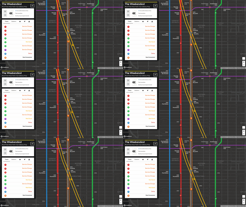
The Weekendest - Real-Time New York City Subway Map shows you the real-time location of trains on New York's vast subway network. 

If you select a station on the Weekendest subway map you can discover how long until the next trains are due to arrive in each direction. You can also see where those trains actually are in real-time on the map. Select a train on the map and you can not only view its current location but you can see how far behind schedule it is and view its estimated arrival time at each station along its route.

The Weekendest uses real-time GTFS-RT data provided by the MTA. If you click on a line on the map you can view all the current delays, service changes and service irregularities which are currently affecting that line. 

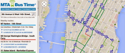
If you prefer traveling by bus then you should have a look at the MTA's real-time map of bus locations. MTA Bus Time is a Google Map that shows the live position of buses on New York's bus system. The bus locations are determined by on-board GPS. 

It is possible to search the MTA Bus Time map by intersection, bus route or individual bus stop. If you click on an individual bus you can also view its next three scheduled stops.

If you are a fan of live real-time maps of train networks then you might also like:

Travic - animated maps of over 700 transit systems around the world
OSM Tchoutchou - shows real-time trains in France, Ireland, Denmark and Finland
Train Map - a live map of the Belgium rail network
Réseau SNCF en Temps Réel - the live position of all SNCF's trains throughout France
Swiss Railways Network - the original real-time map of Swiss trains
Trafimage - the entire public transit network of Switzerland in real-time
Mini Tokyo 3D - a live real-time map of Tokyo's public transit system (in 3D)
Zugverfolgung - real-time train tracking in Germany, Austria, Switzerland, Belgium and the Netherlands.

Monday, December 05, 2022

How Well Do You Know Your Neighborhood?

The New York Times is running an interesting geographical survey asking New Yorkers to draw the border of their local neighborhood. In an attempt to "create a reader-sourced map" of New York neighborhoods the NYT ask their readers where they live in NYC and then to draw the outline of that neighborhood on an interactive map.

To participate in Help Us Map New York's City's Neighborhoods you just need to center the interactive map on your home (the map bounds is restricted to New York City). You are then asked to give the name of your neighborhood and enter how many years you have lived at that address. Then, by simply clicking on the map, you are asked to draw a line around your neighborhood.

The New York Times are not the first organisation to survey local knowledge about local boundaries using an interactive map. In fact a few years ago DNA Info ran a very similar survey asking their readers to draw the boundaries of New York neighborhoods. In September of this year Axios also asked its readers to draw the outline of their local neighborhood on an interactive map.
In Axios' Draw Your Neighborhood you are asked to draw an outline on a map to show where you think your neighborhood boundary lies. Once you have drawn the boundaries for a few of your city's neighborhoods you can compare how well your local knowledge compares to other Axios readers. 

There are twenty U.S. cities to play in Axios' Draw Your Neighborhood, including San Francisco, Philadelphia, Dallas and Chicago (but not NYC). After you select a city you are then asked to draw on an interactive map the boundaries of five city neighborhoods. When you have drawn all five you can view a map showing the average boundary for each neighborhood (as drawn by other players) and are given a percentage score for each neighorhood indicating how different your guess was from the average.

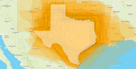
It is actually very easy to create your own map survey. Two years ago I created my own map survey Where is Texas, which asked people to draw the border of a whole state. You can clone my map to create your own map survey for any location on Earth (just click on the fish logo on the map and select 'Remix on Glitch' to create your own editable instance of the map).  

If you are interested in the results of my map survey then take a look at Here is Texas. This map shows all the entries submitted to my Where is Texas map survey. The real border of Texas is also shown as a white polygon on the map.

Thursday, June 23, 2022

The Drunken Spider Crawl

Today I finally got around to creating my own 'data spider' map, inspired by William Davis's viral Hub and Spoke interactive map.

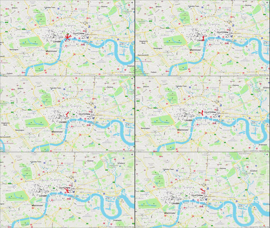
My Drunken Spider Map can help you find the ten nearest bars to any location in London or New York. If you pan around the map then the 'spider' will walk around the map, so that it is always pointing to the ten nearest bars to the center of the map.

Cloning William's map was very easy. Essentially all it involved was adding my own data and Mapbox account code. I also added a geolocate button. So, if you live in London or New York you can simply press this button to automatically find the ten nearest bars to your current location.

My Drunken Spider Map is hosted on Glitch, which means you can easily clone the map simply by pressing the 'Remix' button on its Glitch page. If you want to create a Drunken Spider Map for your town or city then you can use overpass turbo to quickly get the data for all the local bars.

If you want bar data for a different city then you can use this overpass turbo query. Simply center overpass turbo on a city, press the 'run' button' and then press 'export' and save the data as a geojson file. Then add the data to your Glitch clone of my Drunken Spider Map.

Of course you could always use overpass turbo to download other data. For example this query will give you the locations of all the cafes in the current map view on overpass turbo. Of course if you do use cafe data then you should change the name of your project from the Drunken Spider Map to the Caffinated Spider Map.

Thursday, June 09, 2022

Scratch & Sniff New York

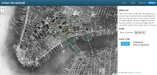
Under the grey, decrepit streets of New York there is a shiny, modern 21st Century city just waiting to emerge. At least there is on Chris Whong's Urban Scatchoff interactive map. 

Urban Scratchoff uses aerial imagery of early 20th Century New York, captured by a plane in a 1924 flyover of the city. Underneath this 20th Century aerial imagery is another layer which contains more recent aerial imagery of New York, captured by plane in 2018. You can reveal the modern imagery by simply clicking and dragging on the map to "scratch off" the historical imagery and reveal the present-day imagery beneath. You can also switch the layer order of the two sets of aerial imagery. Place the modern aerial map of New York on top and you can then scratch the map to reveal the historical imagery below.

Urban Scratchoff isn't Chris Whong's only interactive map exploring the history of New York. Last year Chris also mapped out a collection of vintage photos from the New York Historical Society to create a virtual Stroll Down Flatbush Avenue circa 1914

The society's Subway Construction Photograph Collection, 1900-1950 includes a continuous series of photographs taken on Flatbush Avenue, from Grand Army Plaza to the present-day Barclays Center. Chris has geolocated and mapped every photo in this series to create an historical Street View tour of 1914 Flatbush Avenue.

It is not often that you get a chance to travel back in time over 100 years. I had a lot of fun walking down Flatbush Avenue on Chris's map just noting the many sights that you can now no longer see in New York. These sights include barber poles, cigar store Indians, trolley stations, hat cleaners and horse-drawn delivery carriages. 

Being a bit of nerd I also took a virtual walk along the same section of Flatbush Avenue using Google Street View. The 21st Century walk is a lot more unpleasant than the early 20th Century walk. Nowadays there are four lanes of busy car traffic (with an additional two lanes of street parking), 90% of the stores seem to sell fast food and worst of all there are far fewer hats than there used to be and not one hat cleaner!

Saturday, June 04, 2022

Where Cars Kill

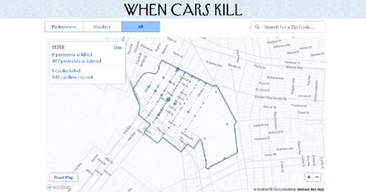
Every year tens of thousands of people are hit by cars in New York. The New Yorker has released an interactive map which allows you to see where cars have injured pedestrians or cyclists between 2013 and 2021.

Enter a New York zip-code into the When Cars Kill map and you can view the locations of all the car crashes in that neighborhood that resulted in injuries.The map uses data from the New York Police Department to show where the most dangerous accident hot-spots were between 2013 and 2021.Crashes that occurred between intersections are aggregated to the nearest one. Over half of New York City pedestrians killed were hit at an intersection.


curb extensions - one of the many possible road safety features which can reduce injuries from cars

The New Yorker's article When Cars Kill also includes a number of graphical illustrations of road design safety measures which could be introduced to reduce the number of pedestrians and cyclists injured and killed by cars. These include curb extensions (to give pedestrians more space), speed bumps, s-curve chicanes (to slow cars), protected bike lanes, and safety islands (dividing crossings into shorter intervals).

If you want to map traffic accidents in New York for yourself then you can use the NYPD Motor Vehicle Collisions data from NYC Open Data. In this data all collisions are geocoded with a longitude and latitude (to the nearest intersection). The data also includes the time of day of each incident (a factor not used in the New Yorker map).

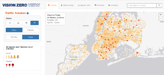
The time of day data is used in the Visions Zero View interactive map of New York City traffic crashes. This map also visualizes traffic injury and fatality crashes within New York. The map has two main views; a visualization of New York's traffic accidents and a visualization of the city's attempts to make the streets safer. 

The 'Crashes' view allows users to visualize the locations of pedestrian,cycling and car injuries and fatalities. This map view includes a graph showing the number of crashes by time of day. This graph is interactive, which means you can click on a time of day to view where accidents in the city occurred during the selected hours. 

The 'Street Design' view allows users to explore some of the Vision Zero initiatives which have been introduced on the city's streets, such as arterial slow zones, speed humps and other major safety projects designed to increase traffic safety in the city of New York.

Friday, May 13, 2022

The NYPD is Spying on You

There are thousands of surveillance cameras in New York which can track your movements around the city. The New York Police Department's facial recognition software can identify individuals as they move around New York and pass in front of any of the city's pervasive surveillance cameras. The system works using millions of profile pictures scraped from social media accounts without users' permissions. Black and minority communities are most at risk of being misidentified by facial recognition software and therefore most at risk of being wrongfully arrested.

Amnesty International, with the help of 7,000 volunteers, has analyzed Google Maps Street View imagery in New York to identify the locations of the city's security camera locations. Amnesty found and located over 15,000 surveillance cameras across the city.

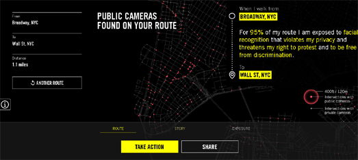
In Inside the NYPD's Surveillance Machine Amnesty International has created a route finder which allows you to discover how many surveillance cameras you will pass on any journey in New York City. For example if you walk from the Empire State Building to the Museum of Modern Art you will be filmed by surveillance cameras on 80% of the journey. 

Amnesty claims that the pervasive level of surveillance in NYC coupled with facial recognition software means that you are 'never anonymous' in the city and that your movements can be tracked at any time. You can explore the density of the city's surveillance cameras on Amnesty's Decode Surveillance NYC interactive map. The Decode Surveillance heat-map shows the density of surveillance cameras across the city. You can view the locations of individual cameras by exploring the Inside the NYPD's Surveillance Machine interactive map.

Wednesday, April 27, 2022

Step Inside a New York Tenement

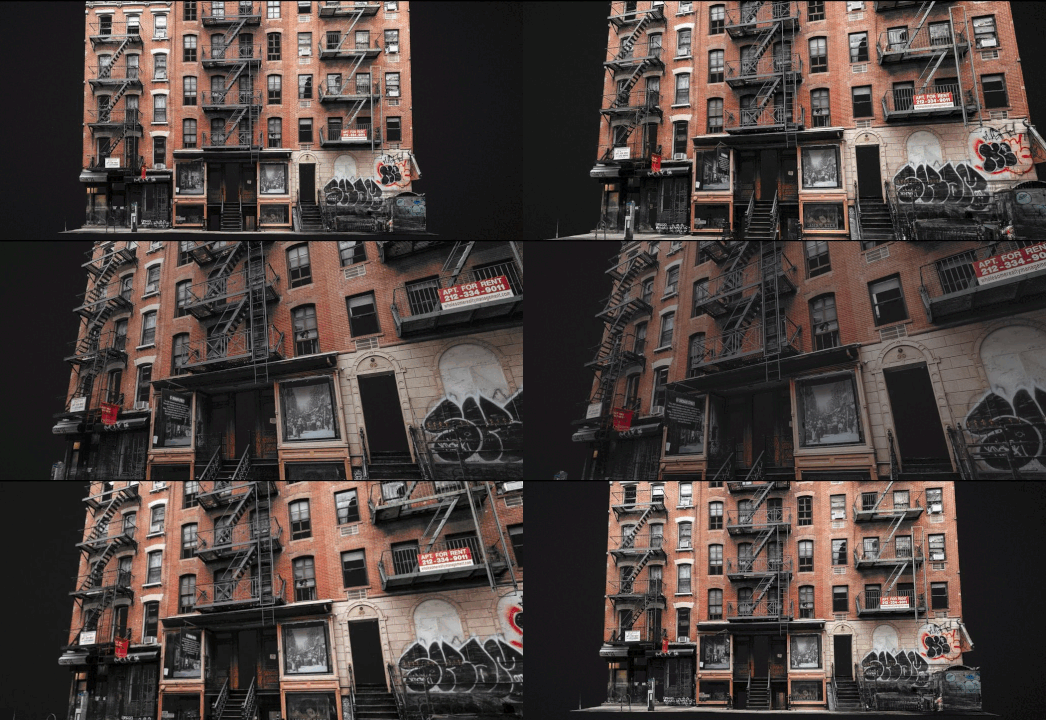
The Washington Post has created a virtual tour which allows you to step inside a New York tenement building and explore how people lived in the city at the beginning of the 20th Century. The tenement at 97 Orchard Street, Manhattan is one of two historical buildings owned by the Tenement Museum. Each building has been preserved to provide a sort of time capsule of life in the late 19th and early 20th century.

The Post's Tenement Museum Virtual Tour provides you with a unique first-person view of a preserved tenement building. As you scroll through the Post's interactive tour you are taken through the front door into the building's basement saloon. Keep scrolling and you progress through the property, visiting the saloon kitchen, the back courtyard and the upstairs apartments. Each room in the tenement building represents a particular period in history. Many rooms in the museum have been left as they were found, while others have been recreated to look as close as possible as to how they would have appeared during a specific period in time.

In order to create this amazing photogrammetry tour the Washington Post used a lidar scanner, drone-shot imagery and handheld cameras to scan and photograph the building and rooms from all angles.

The use of photogrammetry to create interactive 3D models is a growing trend in data journalism. Here are links to some other great examples of news organizations using 3D models to illustrate and explain major news events or to provide an interactive tour of an historical site: