Showing posts with label Italy. Show all posts

Tuesday, September 03, 2024

Mapping Moving Borders in Real-Time

3D map of Mt. Similaun, Italy

The international border between Italy and Switzerland & Austria in the Alps largely follows the path of the watershed line. Unfortunately due to global heating and shrinking glaciers the Alpine watershed line keeps on moving. The result is that the border between Italy and its Alpine neighbors is also constantly moving.

In 2016 the Italian Limes project attempted to track the movement of the Italy-Austrian border in real-time. In order to do this it installed 25 sensors on top of a glacier at Mt. Similaun. Every two hours these sensors recorded and transmitted their positions. This allowed the moving border between Italy and Austria to be updated and mapped in near real-time.

map of the 25 sensors on Mt. Similaun
3D map showing the position of the Italy-Austria border in 1920 and 2016 and the position of 25 border sensors

The Italian Limes project is beautifully illustrated using a 3D map of Mt. Similaun. On top of this map you can view the Italy-Austrian border in 1920 and the border's position in 2016. The map also shows the location of the 5x5 grid of GPS units which were used to track the glacier's movements in three dimensions in near real-time.

Via: The Visualising Data Newsletter

Saturday, June 08, 2024

The Vespa Map of Rome

animated GIF of a Vespa driving around the Dolce Activation map

This is yet another map I discovered via the ever fascinating Web Curios, which is a weekly roundup of interesting things found online (very often with an AI bent). This week Web Curios reviewed Dolce Activation, 'a very content-lite website' but one in which you get to drive 'A TINY VESPA AROUND ROME!!!'

In truth Dolce Activation is little more than a marketing campaign for Dolce and Gabbana perfumes. However the campaign does feature this beautifully rendered post-medieval map of Rome, complete with 3D buildings. In order to discover some of Dolce and Gabbana's hidden perfumes your objective is to drive around the map on a moped and find four of Rome's most famous landmarks.   

BTW, you don't have to drive the moped around. You can also use your mouse to explore Rome by dragging the map around.

I don't know Rome well enough to be certain but I think Dolce Activation is not a real map of Rome. It looks like Dolce and Gabbana may have just taken four well-known Roman landmarks and placed them on an imaginary map of the city (although I could be wrong). If you do want to explore a real post-medieval map of Rome then you can visit the Interactive Nolli Map Website.

the Colosseum as seen on the Nolli map of Rome

The Italian architect and surveyor Giambattista Nolli's ichnographic 'Great Plan of Rome' is an astounding 1748 map of Rome. At the time it was easily the most accurately surveyed and drawn map of the city to have ever been published. It was also one of the first ichnographic maps of Rome. 

The Interactive Nolli Map allows you to explore Giambattista Nolli's exceptional map for yourself in close detail. The original Nolli map includes around two thousand numbered locations around the city. These numbers refer to the map index which names each of the numbered sites. On the Interactive Nolli Map these numbers have been made interactive. When you click on one of these numbers on the map a small window opens providing you with information on the selected feature.

Monday, October 10, 2022

Italy's Election Map Street by Street

voter turnout in Turin 2018 & 2022

Voting Street by Street is an interactive map which allows you to analyze the 2022 Italian General Election results down to the street level in four of Italy's largest cities. The map allows you to explore which party voters supported at the hyper-local level and compare the results to previous elections. The map also allows you to compare voter turnout and support with a number of demographic and economic variables.

The 63.9% turnout for the 2022 election was a record low. It was a full 9% below the turnout for the 2018 election. Using Voting Street by Street it is possible to view a side-by-side comparison of the 2018 and 2022 election turnouts. You can also compare the voter turnout percentages to local demographic and economic factors. My superficial reading of the Voting Street by Street map is that voter turnout tended to be highest in the center of Italy's major cities and lowest in the suburbs. Comparing the turnout data to the socio-economic census data suggests that voter turnout also tended to be lowest among the economically disadvantaged.

Voting Street by Street also allows you to view the support for each of the main political parties at a hyper-local level. Using the map you can compare each party's support at the street level in the 2022 and 2018 elections. You can also compare support for each party with the socio-economic and demographic variables (for example to see if there is a correlation between unemployment and voting for the Brothers of Italy).

You can view a number of national maps of the 2022 Italian election on the Italian Election Maps post on Maps Mania.

Monday, September 26, 2022

Italian Election Maps

Italy appears to have voted in its first Fascist leader since Benito Mussolini. The main winner in yesterday's national elections has been Giorgia Meloni's Brothers of Italy, a party which traces its roots back to Mussilini's National Fascist Party.

Sunday's election saw an historic low turnout of just 63.91% of the electorate. The Right Alliance (consisting of Brothers of Italy, Forza Italia, League and Us Moderates) will now form the next Italian government, having won a majority of seats in both the Chamber of Deputies and the Senate of the Republic.

You can explore the Italian election results on The Guardian's Italian Election 2022: Live Official Results. The Guardian's results page includes an interactive map which shows the winning coalition in each electoral seat. You can hover over individual seats on this map to view a breakdown of the votes cast for the 'Right Alliance', 'Left Alliance', 'Five Star', 'Center Alliance' and 'Other'. 

Corriere Della Sera's Election Results 2022 also includes an interactive map which shows the winning coalition in each electoral district. Both The Guardian's and Corriere Della Sera's maps show that the Right Alliance has been the most popular coalition in seats across the whole country. If you click on individual seats on the Corriere Della Sera map you will be taken to a more detailed breakdown of the results in that seat.

Thursday, January 20, 2022

The Cycling Stress Map

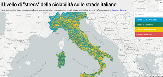
Earlier this month I reviewed the City of Boston's Bicycle Level of Traffic Stress interactive map. A map which rates every road in the American city based on the stress caused to cyclists from road traffic, the lack of bike lanes and other conflict factors. The Bici Stressat ed al Traffico interactive map is a little more ambitious, in that it has mapped the cycling stress levels on every single road in Italy.

The Bici Stressat ed al Traffico is an interactive map which rates and colors every Italian road based on the stress caused to cyclists from other road traffic and from the availability of cycling infrastructure. Every road on the map is given one of four ratings: 'Safe for Children', 'Low Stress', 'Moderate Stress' or 'High Stress'. Cyclists can use the interactive map legend to turn on or off the roads of different stress levels. So, for example, if you wanted to plan a pleasant bike ride you could just select to view all the roads rated Safe for Children or Low Stress.

The four different cycling stress ratings given to individual roads are based on both the levels of road traffic and the presence / absence of separated bike lanes. You can learn more about how each of the four ratings are defined on the BikeItaly GitHub page (in Italian). These ratings are apparently based on ratings defined by Bike Ottawa.

Saturday, July 17, 2021

The Sexist Streets of Italy

There are roughly 16,500 streets and squares in Rome. 7,892 of those streets and squares have been named for people. The vast majority of the streets and squares which have been named for people have been named after men. 7,364 of the 7,892 streets in Rome named for people are named after men and only 528 streets have been name for women. This inequality in street naming is repeated in every one of Italy's major cities. 

Mapping Diversity is a fascinating analysis and visualization of the street names of Italy. Using Mapping Diversity you can discover how many streets in Italy's major cities are named for women compared to how many streets have been named after men. The visualization analyzes more than 40,000 streets in the main city in each of Italy’s regions. 

In Mapping Diversity's analysis of Italy's major cities only 6.6% of streets named after people have been dedicated to women. 1,626 streets in total have been named for women in all of Italy's major cities. If you exclude the streets named after female saints then the number is only 959. Of Italy's major cities Bolzano has the highest percentage of streets named for women. However even in Bolzano only 13% of streets named after people are named for women.

Using Mapping Diversity you can view dedicated maps of each main city in each of Italy's regions. On these maps you can view all the streets named for people. You can see how many of these streets named for people in each city have been named for men and how many have been after women. 

You can learn more about the methodology behind Mapping Diversity's analysis and how the maps were created on Finding gendered street names. A step-by-step walkthrough with R


Geochicas has been at the forefront of efforts around the world to reveal the under-representation of women in place-names. Their Las Calles de las Mujeres is an interactive map which reveals all the streets named for men and women in a number of cities in Spain, Argentina, Mexico, Bolivia, Cuba, Paraguay, Peru and Uruguay. 

A number of other interactive mapping projects have explored the sexist culture of naming streets in cities around the world: 

Street Names in Vienna visualizes all the streets named for men and women in the Austrian capital.
From Pythagoras to Amalia analyzes 5,400 Amsterdam street names - including exploring how many are named for women compared to the number named after men.
Recognizing Women with Canadian Place Names shows 500 locations in Canada which have been named for women from lots of different backgrounds. 

In Europe EqualStreetNames has carried out an analysis of the diversity of street names in a number of European cities:  

Wednesday, June 16, 2021

The Tower of Pisa in 3D

The Spanish newspaper La Vanguardia has published a really interesting article which explains how the Leaning Tower of Pisa has been stabilized and protected from further subsidence and collapse. This interesting article has been made even more gripping by being illustrated with some fantastic 3D modeling of the Tower and its environs.

This is How the Tower of Pisa was Prevented from Falling explains how the Tower of Pisa was constructed in the 12th Century and how the tower began to lean during its early construction.Even during the construction of the first four floors the tower began to lean towards the north.During the construction of the higher floors measures were taken to try to keep the tower's central axis vertical. Then, ever since the tower was completed, numerous efforts have been made to prevent further inclination. 

Using a 3D model of the Leaning Tower of Pisa La Vanguardia illustrates the engineering behind some of the attempts that have been made to halt the Tower from leaning even further to the north. In particular the newspaper explains some of the measures undertaken during the closure of the Tower of Pisa, between 1990 and 2008. These stabilization efforts are said to have made the tower safe for at least another 200 years. 

Monday, April 26, 2021

Anti-Fascist Heroes

In Italy the 25th of April is Liberation Day. A national holiday is held on this day to celebrate the anniversary of Italy's liberation from Mussolini's fascist regime and of the occupation of Italy by Nazi Germany during World War II.

To commemorate Liberation Day mad-scientist has created an interactive map which highlights all the streets in Italy which have been named for Partisan heroes of the resistance. If you hover over any of the streets colored red on the Roads of the Resistance map the name of the street will be shown in the map sidebar. If you click on a street then an information window will open providing a preview of the individual's Wikipedia entry. 

The Roads of the Resistance map was partly inspired by Geochicas' Calles de las Mujeres analysis of the disparity in the number of streets named for men compared to those named for women.On the Calles de las Mujeres map individual roads are colored either blue or yellow to show whether they were named for either men or women. A doughnut chart also displays the percentage of the streets (with people's names) named for men compared to the percentage of streets named for women

Saturday, January 30, 2021

Mapping the Eternal City

In 1748 the Italian architect and surveyor Giambattista Nolli published an ichnographic plan of Rome. Nolli's 'Great Plan of Rome' was remarkable for a number of reasons. It was easily the most accurately surveyed and drawn map of the city to have ever been published. It was also one of the first ichnographic maps of Rome. Before Nolli all the maps of Rome produced since the Roman Empire has almost always been drawn from a bird's eye / oblique perspective.

The Interactive Nolli Map allows you to explore Giambattista Nolli's exceptional map for yourself in close detail. The original Nolli map includes around two thousand numbered locations around the city. These numbers refer to the map index which names each of the numbered sites. On the Interactive Nolli Map these numbers have been made interactive. When you click on one of these numbers on the map an information window opens providing information on the selected feature.

The Interactive Nolli Map also includes a story map introduction to Nolli's Great Plan of Rome. Under the 'Curated Essays' heading you can find a link to The Nolli Map as Artifact, which is a guided tour of the illustrations around the edge of the original map. A number of other essays are also linked under the 'Curated Essays' menu but these essays don't appear to have been completed yet.

Tuesday, November 03, 2020

Rome Church Orientations

Today's #30DayMapChallenge is to create a map with polygons. My Church Orientations map displays Roman churches as extruded polygons. The compass rose on the map also visualizes the orientation of all the churches in the map view.

Since the 8th Century churches have tended to be built facing towards the east. The main focus of a church, the alter, is placed at the east end of the church, often in an apse. The major entrance to the church is often placed at the west end. In fact the word 'orientation' actually comes from the practice of constructing buildings to face the east. Building a church the other way around, with the entrance at the east and the apse at the western end, is called 'occidentation'.

When early Christians prayed they would face towards the east. Hence the tradition of building churches with the alter towards the east. One theory for why Christians pray towards the east is that the beginnings of the organized church was in Europe and worshipers were praying in the direction of Jerusalem. Another theory for why churches face east is because they have been aligned to where the sun rises on each church's saint day.

My Church Orientations map uses the building footprints (the lines which define the outline of the churches) for the compass rose. In other words the compass rose shows the orientation of all the church walls (in the current map view).

I obtained the building outlines for Rome's churches using this Overpass Turbo query. The compass rose code I stole from Vladimir Agafonkin's amazing Street Orientations map.

Tuesday, October 27, 2020

The Map the Italians Stole

At the beginning of the 16th Century nautical knowledge was power. During the 15th and 16th Centuries the Portuguese were at the forefront of this knowledge, leading the way in overseas exploration and in establishing mercantile trade routes. 

Among the many notable Portuguese explorers of this time was Vasco da Gama, who in 1498 was the first European to reach India by sea. Just two years later, in 1500, Pedro Álvares Cabral became the first European to discover Brazil and then, just a few years later again, Ferdinand Magellan completed the first circumnavigation of the Earth. 

One of the most important tasks of all these overseas expeditions was to create accurate nautical charts. During this period Portuguese cartographers were completing enormous master charts mapping coastlines, prevailing winds and important trading knowledge. To protect this important knowledge these maps were deemed state secrets. State secrets which other countries were desperate to steal.

One map which was successfully stolen was the Cantino Planisphere. In fact the map is now known for the spy, Alberto Cantino, who successfully 'acquired' the map from the Portuguese for the Duke of Ferrara (Ferrara was a city-state in northern Italy). 

The Cantino Planisphere is now owned by the Biblioteca Estense in Modena, Italy and you can explore an interactive version of the map for yourself using the library's new Digital Collections website. The Cantino Planisphere is a remarkable map for many reasons. The map includes a depiction of the Brazilian coastline, which Cabral had only just discovered. The map also includes knowledge gained from Vasco de Gama's voyage to India and Columbus’s voyages to the West Indies.

The Cantino Planisphere also includes the recently decided Tordesillas Line. In 1494 (at the Treaty of Tordesillas) Portugal and Spain agreed to divide the newly discovered lands across the Atlantic between themselves. The line, about halfway between the Cape Verde islands and the West Indies, divided what would belong to Portugal (everything east of the line) and the lands which would belong to Spain (everything west of the line).

The new Digital Collections of the Biblioteca Estense includes lots of other vintage maps - including the Carta Catalana, a medieval mappamundi, dating from the 15th Century.

Friday, October 16, 2020

Roman Pompeii in Virtual Reality

The Réunion des Musées Nationaux – Grand Palais (Rmn-GP) in Paris has created a Virtual Reality video which allows you to explore a villa and garden in Pompeii, as it would have looked before the town was buried under volcanic ash and pumice during the eruption of Mount Vesuvius in AD 79.

The House in the Garden of Pompeii provides a 360 degree view of a real Roman house & garden in Pompeii. This VR experience shows you what the house looks like today and how it would have looked over 2,000 years ago, before the eruption of Vesuvius. The House in the Garden not only shows you an interior view of the house it also shows you how the house's garden appears today and how it would have appeared to its Roman owners before it was buried in ash.

Don't worry if you don't own a VR headset. You can still view the YouTube video and rotate the video to explore all 360 degrees of the Roman house and gardens even without a headset.

The Expo Pompeii exhibition at the Rmn-GP includes a restored statue of Livia. You can view this statue in your own living room using the exhibitions Livia AR application. Visit Livia AR on your mobile phone or tablet and you can discover what it looks like to have a full-size statue of a Roman woman standing in your home. 

Here are a few more virtual museum tours which you might enjoy:

The Uffizi Galleries Virtual Tour - one of the greatest collections of Renaissance art in the world
The Metropolitan Museum of Art - includes a number of virtual exhibitions
The National Gallery - London's National Gallery has a number of virtual tours
The Rijksmuseum Masterpieces Up Close - a virtual tour of the museum's Gallery of Honour
The Sistine Chapel Virtual Tour - explore the Sistine Chapel and Michelangelo's astonishing ceiling
The Smithsonian National Museum of Natural Museum - has created a number of virtual tours
The Stonehenge Virtual Tour - places you in the center of this mysterious pre-historic monument
Beijing Palace Museum - explore the museum's galleries and the amazing buildings of the Forbidden City
Buckingham Palace - take a virtual tour around the Queen's favorite pad 

Wednesday, July 08, 2020

Virtual Tours of the World's Museums

In my continuing quest to virtually visit every museum in the world during lock-down I am today touring the Uffizi Gallery in Florence and the Colonial Williamsburg living-history museum in Virginia.


Florence's Uffizi Gallery dates back to the 16th Century and has one of the greatest collections of Italian Renaissance art in the world. In 2019 the Uffizi reopened ten restored galleries housing its collection of Venetian paintings of the 1500's. You can explore these galleries yourself online on the Uffizi Galleries Virtual Tour.

On this virtual tour you can explore 360° degree panoramic imagery of the Uffizi's Hall of the Dynasties and the Galleries of Sixteenth-Century Venetian Painting. Using the interactive white circles you can move around just as you would using the arrows in Google Maps Street View. As you virtually explore the galleries you can discover more about each of the paintings by clicking on the small green circles to read the painting's wall notes.


The Colonial Williamsburg museum in Virginia includes several hundred restored or re-created buildings from the 18th Century. The museum provides a unique glimpse into life in 18th Century America.

The Colonial Williamsburg Foundation has created three virtual 360° degree panoramic tours. These tours allow you to explore the Governor's Palace, the Capitol Building, and the Art Museums. Each of the panoramic tours starts with an introductory video. The Governor's Palace video in particular is very impressive as it takes you into the palace while accompanied by a number of actors in 18th Century dress.

Each of the three virtual tours allow you to explore using a number of connected 360° degree images. These images include interactive hot-spots which allow you to learn more about the individual rooms and the artifacts found within them.


If you want to explore more of the world's best museums and galleries during lock-down then here are a few more virtual tours that you might enjoy:

The Metropolitan Museum of Art - includes a number of virtual exhibitions
The National Gallery - London's National Gallery has a number of virtual tours
The Rijksmuseum Masterpieces Up Close - a virtual tour of the museum's Gallery of Honour
The Sistine Chapel Virtual Tour - explore the Sistine Chapel and Michelangelo's astonishing ceiling
The Smithsonian National Museum of Natural Museum - has created a number of virtual tours
The Stonehenge Virtual Tour - places you in the center of this mysterious pre-historic monument
Beijing Palace Museum - the Palace Museum has created a number of virtual tours which allow you to explore some of the museum's galleries and also some of the amazing buildings of the Forbidden City
Buckingham Palace - take a virtual tour around the Queen's favorite pad

Monday, May 18, 2020

Mapping Stores Open in Italy


Last month a French interactive map was released to show which stores were open and which were closed during the lock-down in France. Ça reste ouvert is a crowdsourced interactive map which provides information on the operating status of stores across the whole of France. The map's creators also made the code for the map freely available on GiHub so that people in other countries could make their own store maps.

Inspired by Ça reste ouvert interactive maps for Germany, Switzerland and Austria soon followed:

Bleibt offen Germany
Bleibt offen Switzerland
Bleibt offen Austria

On all three of these maps the stores which are open are marked green and stores which remain closed because of the epidemic are colored red.

Italy now also has its own interactive map to show which stores are now open as the country begins to emerge from its lock-down. Restiamo Aperti can be used to see which stores are open and closed across the whole of Italy.

If the status of a business is unknown anyone can add or change the details by completing a short form. In addition to showing whether a location is open, it is also possible to optionally enter a store's opening hours and add details on whether the store delivers and / or has a take-away service.

Wednesday, May 13, 2020

Our Sidewalks Are Too Narrow


The Florence Sidewalks Map visualizes the widths of sidewalks in the Italian city of Florence. It allows users to see where in the city it is possible to observe social distancing and where it is impossible to maintain a gap of 2 meters between yourself and other pedestrians.

All sidewalks on this map are colored red if the sidewalk has a width of less than 2 meters. Blue colored sidewalks have a width of over 8 meters. It looks to me like Florence is a city crying out for pedestrianization. Much of the street layout and street widths in Florence date back to at least the Renaissance. Perversely because the roads were designed to accommodate people and horses Florence's streets aren't wide enough to accommodate cars and wide sidewalks.

On average the streets in London are significantly wider than in Florence. However all that extra space in London is of course devoted to cars. University College London analyzed the width of pavements in London and discovered that Most London pavements are not wide enough for social distancing.

From its analysis UCL discovered that at least 66% of London's pavements are not wide enough for people to observe the two metres apart social distancing suggested by the government. In fact UCL discovered that only 36% of London pavements were at least three metres wide, which they judge to be the minimum width for people to be able to leave a gap of 2 meters when passing other pedestrians.


If you live in New York then you can use the Sidewalks Width Map to see where it is safe to walk in the city while maintaining social distancing with other pedestrians. The Sidewalks Widths map colors New York City's sidewalks based on their widths. It uses New York City's Sidewalk dataset to show where it is possible to maintain social distancing while walking in the city and where social distancing is impossible.

Sidewalks on the map are colored to show whether social distancing is possible. Blue colored sidewalks are the widest and indicate a sidewalk where social distancing should be easy. Green sidewalks are less wide but still wide enough so that social distancing should be possible. Red sidewalks are narrower than 10 feet and show where a path is too narrow to practice social distancing. Just hover over a sidewalk on the map to view its width in feet.

Tuesday, April 07, 2020

The Sistine Chapel Virtual Tour


Saint Peter’s Square and the Sistine Chapel may now be closed. However the Vatican Museum's website is still open and so is its Sistine Chapel Virtual Tour.

The Sistine Chapel Virtual Tour allows you to take a virtual stroll around the chapel and examine Michelangelo's extraordinary painted ceiling. The Sistine Chapel is where the papal conclave meets to elect a new pope. The interior of the chapel is covered in colorful frescos, most famously the chapel's ceiling features nine scenes from the Book of Genesis, painted by Michelangelo.


The Sistine Chapel Virtual Tour consists of a series of connected 360 degree panoramic images. Arrows in the images allow you to stroll around the chapel. Like Google Maps Street View images you can rotate around within each image and zoom into details on the chapel's glorious frescos. For example, you can zoom in on Michelangelo's The Creation of Adam (pictured above), in which the hands of God and Adam nearly touch.

The central section of the ceiling contains nine scenes painted by Michelangelo in the early 16th Century. These nine scenes from the Book of Genesis depict God creating the Heavens and Earth, God creating the first man & Woman, Adam and Eve, and the story of the flood and Noah.

Monday, March 30, 2020

At Home in Italy


Italy has been under lock-down for three weeks now. Under the lock-down Italians are only allowed to leave their homes for work or health reasons. The lock-down has obviously had a huge impact on the distances that people are moving and traveling, compared to their normal pre-coronavirus activity.

La Repubblica has used mobile phone data to map the intensity of movement by people in Italy since the 23rd of February. The Covid-19 Mobility Impact animated map is a powerful visualization of how the whole country has practically come to a stop over the course of only a few weeks. As the timeline animation plays out the map starts turning from red (indicating high levels of movement) to blue, as Italians are forced to remain at home.

The map uses data from Teralytics to visualize how far people traveled in Italy between 23 February and 25 March. Where Italian's moved and traveled in that period is determined by the location data from 27 million mobile phones (all the data is anonymous). If you click on a region on the map you can view the percentage drop in movement in that area since Feb 13th.

La Repubblica's article is illustrated with a few photographs of famous tourist locations looking deserted, without the normal throng of people. The Guardian has also published a series of photos, Italy coronavirus lockdown leaves streets deserted, showing public spaces which are normally busy with life and traffic looking practically empty.


One result of this huge reduction in people's movements has been a drop in air pollution from the huge fall in motor vehicle traffic. Earlier this month the European Space Agency released an animated map showing nitrogen dioxide emissions over Europe from Jan 1st to March 11th. ESA's Nitrogen dioxide emissions drop over Italy uses data from the Copernicus Sentinel-5P satellite to show NO2 levels over Europe. Claus Zehner, ESA’s Copernicus Sentinel-5P mission manager reports that, "the reduction in emissions that we can see, coincides with the lockdown in Italy causing less traffic and industrial activities."

Sunday, March 15, 2020

Falling Air Pollution Around the World


Yesterday I posted news of the European Space Agency's animation of falling nitrogen dioxide emissions over Europe from Jan 1st to March 11th. Cristina Vrinceanu has used the same ESA data, captured by the Copernicus Sentinel-5P satellite, to map NO2 emissions across the whole world from before and after the outbreak of Covid-19.

Comparison of Mean Tropospheric NO2 Concentration is a Google Earth Engine map which allows you to directly compare NO2 emissions from before the outbreak of COVID-19 to the mean emissions since Feb 20th. The map allows you to compare before and after NO2 emissions around the world. A drop in air pollution is particularly evident on the map over northern Italy.

Nitrogen Dioxide air pollutants comes from motor vehicle exhaust, from the burning of coal oil & gas and from manufacturing processes. The fall in NO2 in China and Italy could be due to cloud cover and changing atmospheric conditions, however scientists at the European Space Agency are confident that the fall in Italy is due to the reduction in road traffic and industrial activity from the quarantines and lock-downs put in place by the Italian government.

If you want to create your own Earth Engine visualization then you might also like Cristina Vrinceanu's write-up of how she created her before & after NO2 visualization, Monitoring emissions during the Italian COVID-19 epidemic lock-down.

Saturday, March 14, 2020

Air Pollution Plummets in Italy


Two weeks ago NASA showed how the huge reduction in air & road traffic and economic activity in China has also led to a huge drop in air pollution. Levels of NO2 plummeted in China after the introduction of coronavirus quarantines and the shut-down of factories. NASA visualized this drop with two side-by-side maps comparing NO2 over China during January and at the end of February. Airborne Nitrogen Dioxide Plummets Over China shows a huge drop in NO2 levels since the outbreak of Covid-19.

Since NASA released their visualization the number of Covid-19 cases in Italy has dramatically risen. In response the Italian government has initiated travel bans, quarantine zones, bans on public gatherings and suspended religious and cultural events. The result in Italy's northern industrial zone has been a similar drop in nitrogen dioxide that has been seen in China.

The European Space Agency has released an animated map which shows nitrogen dioxide emissions over Europe from Jan 1st to March 11th. ESA's Nitrogen dioxide emissions drop over Italy uses data from the Copernicus Sentinel-5P satellite to show NO2 levels over Europe. Claus Zehner, ESA’s Copernicus Sentinel-5P mission manager reports that, "the reduction in emissions that we can see, coincides with the lockdown in Italy causing less traffic and industrial activities."

Monday, March 09, 2020

Italy Quarantine Zone Map

Italy has become the first country in Europe to impose quarantine zones. Italy has seen the highest number of Covid-19 cases behind China and South Korea. In response the Italian government yesterday imposed a quarantine on the region of Lombardy and fourteen neighboring provinces in Piedmont, Veneto, Emilia-Romagna, and Marche.


The control of movement in the quarantined zones will affect over sixteen million people. Movement in and out of the affected areas is restricted. All cultural events in the region are banned and people are required to keep at least one metre of distance from each other in public spaces - such as restaurants, churches and supermarkets.

The quarantine will have a large effect on the already fragile Italian economy. The lock-down affects Milan, the country's economic capital, and Venice one of Italy's most popular tourist destinations. Even before the new quarantine zones were imposed many of Italy's largest tourist attractions had already been experiencing large reductions in visitor numbers.


aerial imagery of Piazza del Duomo (left taken Jan 22nd, right taken March 4th)

The two images above show foot traffic in Milan's Piazza del Duomo before and after the huge outbreak of Covid-19 in Italy. The piazza gets more than 5 million visitors every year. However the aerial image on the right shows the normally busy piazza almost deserted on Wednesday of last week.