Showing posts with label Ireland. Show all posts

Friday, August 23, 2024

200 Years of Irish Maps

1846 Ordnance Survey map of the northern Irish coast

The first ever large-scale survey of an entire country was started nearly 200 years ago. From 1825 to 1846 the Irish Ordnance Survey undertook a highly detailed survey of the whole of Ireland in order to create maps primarily at the 6 inch scale.

To celebrate 200 years of Irish mapping the University of Limerick and Queen’s University Belfast has created OS200. The OS200 website is a digital archive of Ireland's Ordnance Survey which allows anyone to browse and explore the Ordnance Survey's First Edition Six-Inch Maps, the OS Memoirs, Letters and Name Books.

The maps themselves are exquisitely detailed and beautifully drawn. Thanks to the digitization work by the OS200 project you can now explore these original Ordnance Survey maps of Ireland in the closest detail as interactive maps. If you are Irish, or have ever visited Ireland, you can have hours of fun exploring places you know on the OS maps, as they looked 200 years ago. You can have just as much fun browsing the Ordnance survey Name Books.

As well as spending years scientifically surveying Ireland the Ordnance Survey sent out agents of the Topographical Department to collect and compile lists of the historical forms of place-names to determine the correct place-name labels to be used on the maps. These Name Books list place-names (with English translations and alternate spellings) but also provide details on the people who live at each place, the people's religions, who owns the land, and who leases the land. It also lists information on the types of crops grown and the condition of the soil. These non-etymological details hint at one of the original purposes of the map -to help the British government levy local taxes.

The broader governmental aims for creating a national map of Ireland are also apparent in the Memoirs. As well as the geographical surveys and place-name collections the Ordnance Survey staff were required to gather additional information "on social and economic conditions, ... the landscape, topography, nature, geology, historical monuments and antiquities, estates, mills, infrastructure, people and culture ..., communications and (provide) 'suggestions for improvement'". These memoirs provide a fascinating glimpse into local life in Ireland in the early 19th Century.

Saturday, May 06, 2023

The Rise & Fall of the Irish Railway

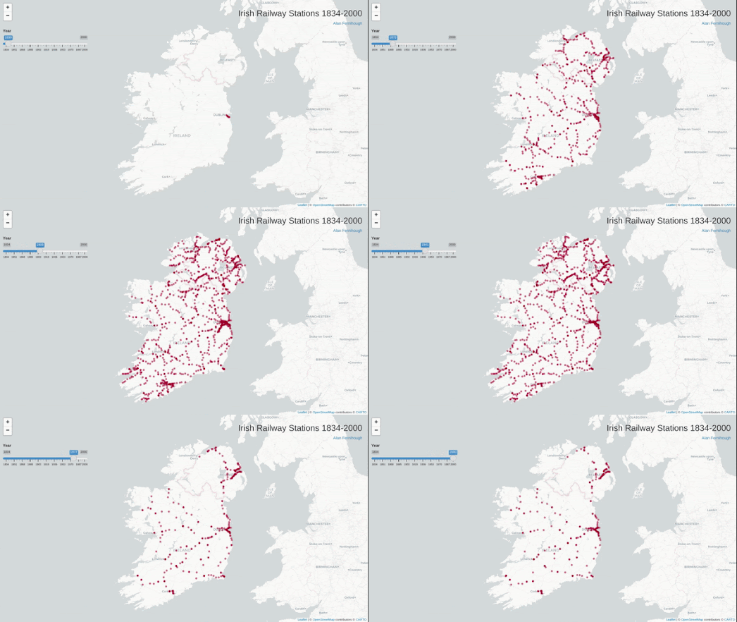
Irish Railway Stations 1834-2000 is a simple interactive map which plots all the Irish train stations which are / were open for every year from 1834 to 2000. By scrolling through all 166 years on the map you get a great overview of the rise and fall of the railway in Ireland.

The first railway line opened in Ireland was the Dublin and Kingstown Railway (D&KR), which ran between Westland Row in Dublin and Kingstown (Dún Laoghaire), a distance of 10 km (6 mi). It was opened on 17 December 1834. In 1839 a second railway line, the Ulster Railway, opened between Belfast Great Victoria Street and Lisburn. 

If you use the map's timeline to progress through the years from 1834 you can see how the railway spread across Ireland, largely emanating out from the initial lines built in Dublin and Belfast. For almost a century after 1834 the railway in Ireland continued to grow, reaching out to all parts of the island of Ireland. 

When you reach the late 1930's on the map you can begin to see railway stations disappearing off the map. The Great Depression and the rise of the motor car obviously had an effect of freight and passenger traffic resulting in the closure of a number of stations. In the 1950s and 1960s you can begin to see the closure of many branch lines on the map. This significant reduction in the rail network in Ireland means that even in the 21st Century the Irish rail network consists of only around 1,698 miles, or around half of the 3,480 miles of line that existed in the early 20th Century.

Also See

A Journey Through the History of Swiss Railways - mapping 175 years of Swiss rail
Zeitlinie Vienna - Vienna's tram network since 1865
Zeitlinie Graz - an animated map of Graz's tram network since 1878
Citylines - mapping transit systems around the world over time

Thursday, February 02, 2023

Why Your Street Has That Name

James Joyce's novel Ulysees starts and ends in Eccles Street, Dublin. The novel's main character, Leopold Bloom, lives on Eccles Street with his wife Molly. I have just discovered that the street was named after John Eccles who was the mayor of Dublin (1710-1711).

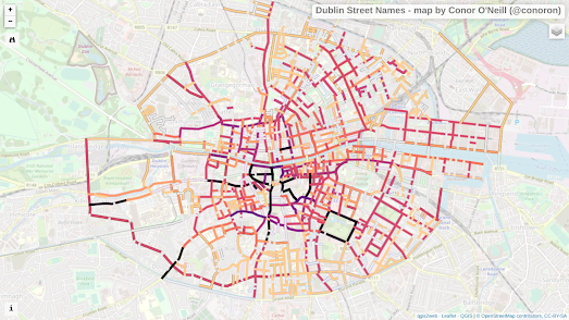
You can discover where other Dublin street names originated on the Dublin Street Names map by Conor O'Neill. Click on a street on Conor's map and you can discover the meaning behind its name. For example if you click on the famous Grafton Street you will learn that the street was named for Henry FitzRoy, 1st Duke of Grafton, an illegitimate child of Charles II.

The map includes a number of layer options which allow you to view the streets colored by year (the earliest appearance of a street name), by gender (revealing the streets named for men and the streets named for women), and by category (royals, politicians or nobility).

Also See

History of San Francisco Place Names - the meaning of San Francisco street names.
Strassenkrieg - the meaning behind Berlin's military themed streets
Open Etymology Map - MapComplete's global street name map based on WikiData.
Open Etymology Map - Daniele Santini' global street name map also using WikiData

Wednesday, July 14, 2021

A Tour of the Irish Border

We need to talk about the border is an interactive story map which takes you on a multi-media tour of the Irish border. Since the Good Friday Agreement in 1988 there has been only a soft border between Northern Ireland and the Republic of Ireland. 

The border between Northern Ireland and the Republic of Ireland is the only land border between the UK and the EU. Now that the United Kingdom has left the European Union the border between Northern Ireland and the Republic of Ireland has by default become an external EU border. In theory it could once more become a hard border to support the infrastructure necessary to maintain custom checks for goods and people entering and leaving the EU. 

Elisabeth Blanchet & Laurent Gontier have traveled around the Irish border taking photographs and interviewing the people they met on the journey. 'We need to talk about the border' is an interactive story map which takes you on a photo-tour of the border. Overall the interviews with local people living along the border leaves you with a sense that there is an overwhelming sense of anger with the UK government for endangering the peace stemming from the Good Friday Agreement. 


In 2019 The Guardian created an animated map to show how much traffic passes across the Irish border every day. The Guardian's animated map visualizes the traffic crossing the border at 10 different locations during one hour on Monday 2nd, September 2019. A Typical Hour in the Life of the Irish Border uses data from under-wheel sensors at ten different locations on the border. The animated map helps to visualize the amount of activity on the Irish border. Traffic and trade which is likely to be seriously disrupted and slowed if a hard border is reintroduced between the Republic of Ireland and Northern Ireland. 


The 1998 Belfast Agreement played an integral part in ending the Troubles in Northern Ireland. The worry is that a return to a hard border would destabilize the Belfast Agreement and could even reignite anger and violence. If anyone is in any doubt about the level of violence experienced along the old hard border between the Republic and Northern Ireland they should check out the Irish Times' Explore the Border interactive map.

Explore the Border maps a sample of just some of the border incidents experienced during the Troubles. Click on a marker on the map and you are taken to one of the old crossings along the border. The map sidebar reports on any major violent incidents which occurred at this crossing. The number of bombings, shootings and arson attacks are also listed.

Explore the Border also uses Google Street View images of each mapped crossing on the border. This allows you to explore the border for yourself and highlights how a hard border would not only be difficult to implement but would be an ugly scar on a very beautiful country. 


Keith O’Faoláin has created an animated movie of the Irish border, Oh Border Where Art Thou. The movie uses satellite imagery to explore the border between the Republic of Ireland and Northern Ireland.Watching the movie it is very apparent that the current border is very 'soft'. There are very few hard geographical barriers between the Republic and Northern Ireland. Mostly the border just follows roads and fields.

The European Union and the United Kingdom have signed up to the Northern Ireland Protocol. An agreement that there will be no new checks on goods crossing the Irish border. Unionist and pro-Brexit politicians in Northern Ireland have tried to overturn the Northern Ireland Protocol, including trying to persuade the High Court of Northern Ireland to declare the Protocol unlawful.

Thursday, May 20, 2021

Placing Poems in Ireland


During lock-down most of us had our personal geographies curtailed. However physical restrictions on our movements didn't stop us thinking about far away places and people. In April Irish poet Roan Ellis-O’Neill asked the people of Ireland to write a poem about an imagined journey "away from the stifling reality of the pandemic". The result is the Placing Poems interactive map.

Placing Poems features poems about locations across the whole of Ireland. Each of the poems was submitted by a member of the public. The deadline for submitting poems has now passed but you can read the poems which were submitted simply by clicking on any of the markers on the Placing Poems interactive map. 


In 2019 a similar public art project was carried out in England & Wales. Places of Poetry was devised to inspire the English and Welsh to write poetry about the places that inspire them. The project asked budding poets to pin their poems about English and Welsh locations directly to the Places of Poetry interactive map.

The background map used for the Places of Poetry project is inspired by William Hole's engraved maps created for Michael Drayton epic poem Poly-Olbion (1612). The new map is an original work but is heavily inspired by Hole's highly decorative and iconographic style. The Place of Poetry map includes new icons celebrating some of the UK's most well known heritage sites. These include Stonehenge, Ely Cathedral and even the Oval cricket ground. Other icons on the map (for example for forests and farming regions) are more direct copies of Hole's iconography. The marine icons of Neptune, sirens and ships are also direct copies from William Hole's engraved maps.

Wednesday, December 02, 2020

The Irish Famine Atlas


From 1845 to 1849 the potato blight sweeping across Europe caused a mass famine in Ireland. Ireland suffered much more than other European countries mainly due to the inadequate respone to the famine in Ireland by the British parliament in London. As a result of the famine around one million people died in Ireland and one million people emigrated. Overall the famine caused Ireland's population to decrease by a devastating 20%-25%.

The Atlas of the Great Irish Famine is an ongoing project by Irish broadcaster RTE to draw together historical records and research into the period known in Ireland as the Great Famine. The project includes an interactive map which allows you to visualize the effect of the famine on the Irish population.

Before and after the Great Irish Famine: an interactive map allows you to directly compare the Irish population from before and after the famine. A slide control on the map allows you to swipe between a choropleth map of the Irish population in 1841 and a map of the population in 1851, Swiping between the two maps reveals the stark effect of the famine on the population of Ireland. It shows that there were very few places in Ireland where the famine didn't have a devastating effect on the local population.

You can explore the effect of the Irish Famine on individual parishes in Ireland on the Irish Famine Project website. The Irish Famine Project's interactive map allows you to explore in more detail the effect of the Irish Famine on the population of every parish in the country. If you select a parish on the map you can view details on the parish's pre-famine and post-famine population and the overall percentage fall in the population.

The map uses data from a wide number of sources, including the 1841 and 1851 census. If you click on the 'more information' link in a parish's information window you can view a more detailed breakdown of the pre- and post-famine population. This includes details on the drop in the local male and female population.

Monday, August 24, 2020

How Much of Your Town is Parking Lot?


A few years ago the housing charity Shelter claimed that just as much land was covered by golf courses in the UK as was used by housing. The claim wasn't meant as an attack on golfing but was made to illustrate the point that there was easily enough land for more housing to be built in the UK.

But was Shelter correct? Do golf courses use as much land as housing in the UK?

The Golfulator might have the answer. Draw around an area of Great Britain or Ireland on the Golfulator interactive map and it will tell you how much land in that area is used for golf and how much is used for housing.

My relative limited use of the map suggests that golf in the UK does not use as much land as housing. Even in St Andrews, 'the home of golf', there is a fairly even split between golf and housing. With so many local golf course St Andrews has to have one of the highest golf to housing ratios in the UK. Therefore in most areas of the UK housing is going to take up a higher percentage of land than golf. However the ratio will obviously depend on where you draw the map.


The Golfulator map uses data from OpenStreetMap on the location and areas of UK housing and golf courses. The Golfulator is on GitHhub. If you want you could therefore adapt the map for your own purposes - for example to find out how much land in Los Angeles is devoted to parking lots.

Although you don't have to do that. Because it has already been done. If you want to know how much of LA is dedicated to parking then you can use the Parkulator. Draw around your town on the Parkulator interactive map and you can find out what percentage of your town is defined as dedicated to car parking on OpenStreetMap.

Central Los Angeles is around 4% parking. That is enough space for nearly 19,000 more homes.

Tuesday, March 24, 2020

Bad for Airbnb, Good for Renters,


Covid-19 is proving very bad news for Airbnb hosts. However Airbnb's loss may be good for renters. There are reports from around the world that Airbnb hosts are facing a huge hit to their incomes. Over recent years the number of Airbnb properties has been growing & growing in cities and tourist hot-spots around the world. Now, thanks to Covid-19 and the collapse in tourism, Airbnb hosts are facing a massive drop in custom.

Airbnb themselves have also upset many of their hosts around the world by over-riding their usual refund policy in response to the coronavirus epidemic, allowing travelers to cancel their Airbnb reservations and receive full refunds. In other words hosts are having to bear the majority of the financial burden of cancellations by having to reimburse their customers.

In response many Airbnb hosts appear to be putting their properties back onto the rental market. For example in Dublin, according to property website Daft.ie, there has been an increase of 64% of new rental properties across the city in March. An increase they believe which is caused mainly by the collapse of the short-term holiday letting market. This glut of new rental properties could be good news for renters, who now appear to be in a good position to find properties and negotiate competitive rents.

The situation seems to be similar in many cities around the world. Vice reports that there has been a jump in new properties to the rental market in Toronto. There appears to be plenty of anecdotal evidence that during the last two weeks lots of other cities around the world have seen a sudden increase in the number of rental properties being advertised.

In response to the collapse in tourism and the short-term rental market Airbnb has written to the US Congress to ask that any economic relief packages put in place by the government includes,
"measures to financially support American short-term rental operators and travel industry solo-entrepreneurs and small businesses during this time of crisis and recovery."

It seems that a lot of Airbnb hosts are not waiting for possible government economic relief and have already turned to the longer term rental market instead. This can be only good news for those who are looking to rent a property.

Monday, February 10, 2020

2020 Ireland Election Maps


On Saturday the people of Ireland voted in the 2020 Ireland General Election. With about half of the seats already declared the emerging story is of the dramatic end of two-party politics in Ireland, due to the incredible rise of Sinn Féin. At the time of writing Sinn Féin has the largest percentage of first preference votes of all the political parties. The party has increased its share of the vote by 10.7% since the last election in 2016, while the other two main political parties, Fine Gael & Fianna Fáil, have both witnessed a fall in their vote share.

Irish broadcaster RTÉ has published a live interactive map of the 2020 Irish election. The RTÉ Election 2020 map visualizes the percentage of first preference votes which each political party has won in every Irish constituency. If you view the first preference vote share of Sinn Féin you can see that their popularity is particularly strong in those constituencies bordering Northern Ireland.

Sinn Féin ran less candidates in the election than the other two main parties. This means that despite its success it may well struggle to form a coalition government. Before the election both Fine Gael & Fianna Fáil said that they would refuse to work with Sinn Féin in forming a coalition government. We will have to wait to see whether the success of Sinn Féin in this election will change their animosity towards Sinn Féin.

Hopefully there will be more maps of the 2020 Ireland election to come ...

Thursday, October 03, 2019

Extra-Tropical Storm Lorenzo


Storm Lorenzo is expected to hit the Republic of Ireland later today. Storm Lorenzo contains the remnants of Hurricane Lorenzo, the most powerful hurricane that has ever been recorded in the far east Atlantic.

Met Éireann has issued an orange warning of very strong winds in Galway, Mayo, Clare, Kerry and Limerick. Winds of up to 140 kilometers an hour are expected. Storm surges are also expected to produce coastal flooding and damage. The rest of the country currently has a yellow wind warning. The UK Met Office expects the affect of the storm on the UK will be minimal but has issued yellow wind warnings for Northern Ireland and parts of south west England and south Wales.

You can view some powerful visualizations of Storm Lorenzo on the Earth and Windy interactive maps. These two real-time animated maps visualize real-time wind and rain conditions across the world. Currently both maps show the strong winds produced by Storm Lorenzo closing in on the western coast of Ireland.


Storm Lorenzo is also a major danger to shipping. You can see on MarineTraffic that there is currently a Lorenzo shaped hole in shipping traffic off the coast of Ireland as most boats understandably try to avoid the storm.

Tuesday, September 03, 2019

One Hour on the Irish Border


One of the major considerations in the Brexit negotiations between the EU and the UK is the border between the Republic of Ireland and Northern Ireland. This is the only land border between the UK and the EU. When free movement and free trade between the EU and the UK ends there may need to be a return to a hard border between Northern Ireland and the Republic.

The Guardian newspaper has created an animated map which shows the traffic crossing the border at 10 different locations during one hour on Monday 2nd, September 2019. A Typical Hour in the Life of the Irish Border uses data from under-wheel sensors at ten different locations on the border. The animated map helps to visualize the amount of traffic between the two countries. Traffic and trade which is likely to be seriously disrupted and slowed if a hard border is reintroduced between the Republic of Ireland and Northern Ireland.


The 1998 Belfast Agreement ended the Troubles in Northern Ireland and removed the hard border. The worry is that a return to a hard border would destabilize the Belfast Agreement and could even reignite anger and violence. If anyone is in any doubt about the level of violence experienced along the old hard border between the Republic and Northern Ireland they should check out the Irish Times' Explore the Border interactive map.

Explore the Border maps a sample of just some of the border incidents experienced during the Troubles. Click on a marker on the map and you are taken to one of the old crossings along the border. The map sidebar reports on any major violent incidents which occurred at this crossing. The number of bombings, shootings and arson attacks are also listed.

Explore the Border also uses Google Street View images of each mapped crossing on the border. This allows you to explore the border for yourself and highlights how a hard border would not only be difficult to implement but would be an ugly scar on a very beautiful country


Keith O’Faoláin has created an animated movie of the Irish border, Oh Border Where Art Thou. The movie uses satellite imagery to explore the border between the Republic of Ireland and Northern Ireland.

Watching the movie it is very apparent that the current border is very 'soft'. There are very few hard geographical barriers between the Republic and Northern Ireland. Mostly the border just follows roads and fields. If a hard border does have to be created it will prove very expensive and we will probably have to ask Mexico to pay for it.

Friday, February 15, 2019

Do You Speak the Queen's English?


The most popular interactive page on the New York Times website in 2013 was How Y’all, Youse and You Guys Talk. This interactive feature asked readers to answer questions about the words they use and how they pronounce them. From the answers given to these language questions the NYT was able to create an interactive map showing where the reader was from in the United States.

Now the New York Times has released a similar interactive feature which can tell Irish and British readers where they are from. If you answer 25 questions about the words you use and how you say them then the NYT will create a heat map identifying where it thinks you were raised. The newspaper will also show you a heat map after every single question you answer showing you where your answer is most and least common.

The British-Irish Dialect Quiz just about managed to identify where I was raised (pictured in the map above). I grew-up just within the southern tip of the NYT's heat map generated from my answers. However I have spent most of my adult life in London which could be why it thinks I'm from a little further north. than my childhood home.

Tuesday, February 05, 2019

The Irish Border - the Movie


Yesterday I posted a short tutorial on creating animated movies using aerial imagery from Google Maps. Today someone was kind enough to direct me towards Keith O’Faoláin's animated movie of the Irish border, Oh Border Where Art Thou.

One result of the UK's exit from the European Union could be the reintroduction of a hard border between the Republic of Ireland and Northern Ireland. Oh Border Where Art Thou is a great visualization of how difficult this task would be. The animated movie scrolls along the current border using Google Maps aerial imagery.

Watching the movie it is very apparent that the current border is very 'soft'. There are very few hard geographical barriers between the Republic and Northern Ireland. Mostly the border just follows roads and fields. If a hard border does have to be created it will prove very expensive and we will probably have to ask Mexico to pay for it.

You can explore the border further on the Irish Times' Explore the Border. This interactive map highlights some of the violent border incidents which occurred during the Troubles. The map also shows Google Street View images of each mapped crossing on the border. This allows you to explore the border for yourself and highlights how a hard border would not only be difficult to implement but would be quite an ugly scar on what is a very beautiful country.

Wednesday, January 16, 2019

Brexit & the Irish Border


One of the major considerations in the Brexit negotiations between the EU and the UK is the border between the Republic of Ireland and Northern Ireland. This is the only land border between the UK and the EU. When free movement and free trade between the EU and the UK ends there may need to be a return to a hard border between Northern Ireland and the Republic.

The 1998 Belfast Agreement ended the Troubles in Northern Ireland and removed the hard border. The worry is that a return to a hard border would destabilize the Belfast Agreement and could even reignite anger and violence. If anyone is in any doubt about the level of violence experienced along the old hard border between the Republic and Northern Ireland they should check out the Irish Times' Explore the Border interactive map.

Explore the Border maps a sample of just some of the border incidents experienced during the Troubles. Click on a marker on the map and you are taken to one of the old crossings along the border. The map sidebar reports on any major violent incidents which occurred at this crossing. The number of bombings, shootings and arson attacks are also listed.

Explore the Border also shows Google Street View images of each mapped crossing on the border. This allows you to explore the border for yourself and highlights how a hard border would not only be difficult to implement but would be an ugly scar on a very beautiful country.

Tuesday, October 09, 2018

Cork in 3D


Cork Guide has released a mapped guide to Ireland's third largest city. This bird's eye view interactive map provides an interesting categorized guide to the city and its major points of interest, hotels & heritage bars.

At the heart of the Cork Guide is an oblique map of the city showing the city's buildings in 3D. The 3D map is a little bit of a cheat as an interactive 3D map as it is built on an image map rather than from vector map tiles. Using a static image of the city as the map means that more details on the buildings aren't revealed as you zoom in on the map. As the map image of the city doesn't have any map labels it also means that there aren't any road names displayed on the map, even at the highest zoom levels.

However the map is still interactive and you can click on areas of the city to discover more about Cork, its history and places to visit in the city. The map information windows also include links to OpenStreetMap, which means that if you decide to visit somewhere you discover on the map you can get the address details (and road names) you need from OSM.

The main advantage of the image map library developed for the city guide is that it can also be used for building plans. If you click on the Cork Public Museum link you can view the library has been used to create a floor map for the museum. Again an oblique bird's eye view is used, this time showing a roofless plan of the museum. Click on the individual rooms in the museum plan and you can find out more about what you will find in that exhibition space. This is a much better use of the Cork Guide static image mapping library.

If I was developing the Cork Guide going forward I would restrict the use of the static image map library for creating interactive building plans for major buildings in the city. I would then look to replace the main mapped guide to the city using an established 3D mapping platform such as OSM Buildings.

Tuesday, August 07, 2018

How far can you travel on a Dublin bus?


Dublin is currently planning a major overhaul of its bus network. This will involve a more efficient network which connects more locations and which will carry more passengers. Of course the new network also carries the danger of upsetting existing customers, who are familiar with the current routes and services.

What better way to show the benefits of the new Dublin bus network than with an isochone travel time map? This map shows how far you can travel in 30 minutes using the current bus routes and how far you will be able to travel using the new proposed BusConnects routes. Enter a location into the Dublin's Proposed New Bus Network interactive map and you can see two isochrone overlays. One showing how far you could travel using the old routes and the other visualizing how far you can travel in 30 minutes using the new routes.

The isochrone layers are calculated based on how far you could travel assuming bus, rail and tram frequencies between 9:00 AM and 3:00 PM on weekdays. The calculated travel times include the walking, waiting and time on public transport. The waiting time is given as half the time between scheduled buses. For example, if a bus comes every 20 minutes the waiting time is calculated as 10 minutes.

As well as knowing how much further you can travel in 30 minutes using the new BusConnects network customers will also need to know where the new routes go. Therefore the Dublin's Proposed New Bus Network interactive map also shows all the new proposed bus routes. If you hover a route on the map you can view the bus frequency (how often buses will run on that route).

Monday, June 18, 2018

4,000 Irish Shipwrecks


The Wreck Viewer is a new interactive map which shows the locations of 4,000 shipwrecks around the shores of Ireland, dating back as far as the 16th century. The map was created by Ireland's National Monuments Service (NMS) to help provide access to and visualize the NMS’s Wreck Inventory.

Each red dot on the map represents a wreck for which there is a known location. 78% of the wrecks in the Wreck Inventory have no known precise location. If you select a wreck on the map you can read the wreck description. This includes details on the ship name, type of vessel and the date the vessel sank. The details also contain (where available) the wreck summary description which provides details on the vessel's history, voyage, cargo, passengers and the story of its loss. At present only 20% of ships in the database have a summary description.

Sunday, May 27, 2018

Repeal the 8th Referendum Results Maps


Ireland has voted overwhelmingly to overturn its ban on abortions. With a two-thirds majority the yes vote won a referendum to abolish the 8th amendment of the Irish constitution, an amendment which has made abortions illegal in Ireland. The Irish government has now promised to overturn the ban and allow legal terminations by the end of the year.

The Irish Times has created a simple interactive choropleth map which effectively shows the landslide victory for the 'Yes' vote across nearly the whole of Ireland. The Irish Times Referendum Results map uses just two colors (blue for 'Yes' and red for 'No') to show the overall result in each constituency. Using only two colors for the map's choropleth color ramp is an effective way to visualize how every single constituency in the country, apart from Donegal, had a majority voting 'Yes'.

Of course there were various levels of support for the 'Yes' vote in the different constituencies. The Irish Times map shows this by allowing users to hover over each constituency to see the percentage of 'Yes' and 'No' votes. The map also has the option to look a little more closer at the 'Yes' and 'No' votes in each constituency. Click on the 'Yes %' or 'No %' buttons and more color stops are added to the color palette to give an overall view of the percentage of 'Yes' and 'No' voters in each constituency.


The Guardian's choropleth map of the referendum results uses more colors. Under 50%, or a no vote, is shown in red. So Donegal still stands out on the map as the only constituency where a majority voted 'No'. The Guardian's use of 6 colors to show the different percentages for voting 'Yes' reveals that constituencies in Dublin (the cut-out map) were most strongly in favor of repealing the 8th.

It is a little too simplistic to say that support for the 'Yes' vote almost radiates out from Dublin but the map does show a small trend for support for the 'Yes' vote to fall away a little the further a constituency is from the capital. However there are probably too many outliers to this general trend to give it too much significance.

Monday, March 12, 2018

Mapping The Irish Famine


On Friday Alan Fernihough Tweeted a truly shocking animated map which shows how the population of Ireland was devastated by the Irish Famine. The map shows population density in Ireland for every year from 1841 to 2012. It reveals the devastating effect of the famine on the population of Ireland -an effect so devastating that the population of Ireland was larger in the first half of the 19th Century than it even is today.

Alan's website The Irish Famine Project provides an interactive map which allows you to explore in more detail the effect of the Irish Famine on individual parishes. If you select a parish on the map you can view details on the parish's pre-famine and post-famine population and the overall percentage fall in the population.


The map uses data from a wide number of sources, including the 1841 and 1851 census. If you click on the 'more information' link in a Parish's information window you can view a more detailed breakdown of the pre- and post-famine population. This includes details on the drop in the male and female populations.

Monday, November 20, 2017

Mapping the Irish Rebellion


I've been experimenting a lot recently with the Leaflet-IIIF plug-in. The plug-in allows you to display IIIF manifests in Leaflet maps. This map of Van Gogh's Self-Portrait Dedicated to Gauguin shows how you can use the plug-in to pan & zoom around an IIIF manifest. While this Compendium of Victorian Map Games shows how you can load different manifest URLs into the same Leaflet map.

One of the main advantages of using Leaflet to display IIIF manifests is that you can switch between a map and an IIIF manifest with some ease. In other words Leaflet can be used to show the location of geo-tagged images and provide an interface in which you can pan & zoom around these very same images. You can get a better idea by looking at this demo map of Dublin 1916.

This map uses a number of postcards created after the 1916 Rising in Dublin. These postcards are held by the UCD Digital Library. The map shows the location depicted in each of the images. If you click on a marker then you can view the postcard selected and pan & zoom around the image.

Switching between a basemap map layer and an IIIF manifest is not as straightforward as you might think. The reason for this is that the map and the IIIF manifest use different map projections. Therefore you need to change the map projection every time you switch between a manifest and the map.