The Energy Industry Map

The European Commission's interactive map The Energy and Industry Geography Lab provides an overview of Europe's energy infrastructure and the potential for developing cleaner energy.
The inital map view of The Energy and Industry Geography Map shows the location of the various types of power plants and their individual capacity. This layer provides a wonderful overview of how individual countries generate electricity. For example, the number of red dots (indicating coal fired power stations) in Germany and much of Eastern Europe shows that the continent still has a long way to go in eradicating greenhouse gas emissions.
The number of large green dots in France shows its reliance on nuclear energy (in 2021 69% of France's electricity production was generated by nuclear power). Norway is dominated by hydro-electric power plants (hydropower plants generate around 90 % of Norway's electricity). A large number of hydro plants are also located in north Italy, in the Italian Alps.
The Energy and Industry Geography Map includes a number of other map layers. These include a layer displaying energy infrastructure networks - showing the location of the continent's gas pipelines. The map also includes layers which show the locations of planned future energy projects in Europe and assessments of the continent's renewable energy potential.
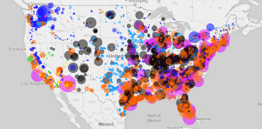
You can explore how America generates power on the U.S. Power Plants map. U.S. Power Plants is an interactive map showing the locations, size and type of America's electric power plants. The map shows where different types of power plant are located, how much each type of energy source contributes to the country's power supply and how much each source contributes to CO2 emissions.


Comments