Small Multiples of Global Heating

Germany is heating up. Mean hot days per year in the districts
In response to the recent extreme heat which has been experienced in much of the northern hemisphere a number of data visualization practitioners have turned to small multiple maps in order to show how climate change is leading to hotter temperatures over time.
A small multiple is a series of maps (or graphs or charts) using the same scale, which allows a series of data to be easily compared. Like climate stripe visualizations small multiple visualizations of average annual recorded temperatures can be very effective in showing the effect of global heating over time.

More and more extremely hot days
For example Spiegel (paywalled) recently published this small multiple visualization to show where weather stations across Germany have recorded temperatures over 35 degrees centigrade since 1971. The series of maps clearly shows that extreme temperatures are becoming much more common in Germany, particularly over the last decade.
The small multiple visualization at the top of this post was published by Zeit (paywalled) last week. This data visualization shows the number of hot days (over 30 degrees) recorded since 1951. Again this small multiple provides a very clear and very easy to understand visualization of how global warming is leading to ever more days with extreme temperatures in Germany.
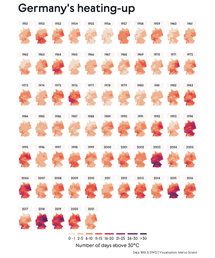
Germany's Heating Up. Number of Days above 30 Degrees
The same data has been used by Marco Sciani in his visualization Germany's Heating Up. His GitHub page Germany's Heating Up uses R to create a small multiple visualization of the effect of climate change on German temperatures.
Back in 2020 Zeit also released Too Warm Here, a tool which allows you to generate the climate stripes for any German town. Zeit's Too Warm Here included a small multiple maps visualization of how temperatures have changed in the whole of Germany over the last 137 years.

In this small multiple maps visualization Germany is colored for every year since 1881 to show the average annual temperature for that year. The map visualizes very clearly how in the last 22 years Germany has experienced temperatures which are far hotter than the previous average annual temperatures.


Comments