Racial Dot Density Maps
In the United States there are a number of interactive maps which use census data to visualize the population density and racial mix of local populations. For example CNN's Race & Ethnicity map uses colored dots to show the racial diversity within every census tract in the country.
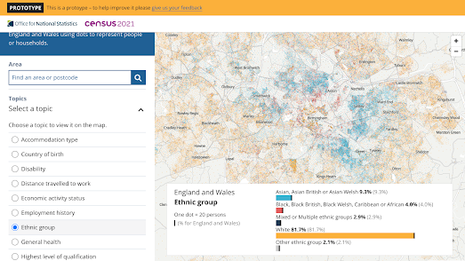
In the UK the Office for National Statistics has now released a Dot Density Prototype map for the 2021 UK census. This map allows you to visualize a whole range of household data in dot density format. The data available includes ethnic groups. Which means you can explore for yourself the racial density of different ethnic groups in any neighborhood in the country (the screenshot above looks at the density of ethnic groups in the city of Birmingham).
What is really impressive about the ONS map is the range of household data that you can explore. For example if I look at my census tract in East London I can see that 55% of the local houses are occupied by just 1 person, over 38% of the local population were born overseas, 42% don't own a car, and only 7.8% don't own a passprt.
Also See
The Racial Dot of Brazil - 190 million dots colored by race

Comments