Saturday, July 30, 2022

How Far Can You Travel in 5 Hours?

How Far Can You Go By Train in 5h? is an interactive map which shows you how far you can travel from any European rail station in less than five hours.

Hover over any location on this map (within the highlighted area in Europe) and you can view an isochrome layer which shows you how far you can travel by train in hourly increments. The nearest train station (from which travel times are calculated) is highlighted on the map in black. 

The travel time data used to power the isochrone layers comes from direkt.bahn.guru. The map assumes that any interchange between two different trains is a blanket 20 minutes and that travel between two interchange stations will be undertaken at a little over walking speed.

You can find more travel time maps listed under the label isochrone.

Friday, July 29, 2022

Who Was Born Near You?

This morning I have been using Topi Tjukanov's new Notable People map to find out which famous people were born in my home town. As a result later today I shall be visiting the homes of Joseph Lister ('the father of modern surgery') and Alfred Hitchcock. Both of whom were born just a short walking distance from my home.

The Notable People map uses Wikidata and Wikipedia listings to show the birthplaces of 'notable' people around the world. On the map placenames have been replaced with the names of famous people who were born at that location. On the map people with a higher 'notability rank' are prioritised over those with lower rankings and those with higher rankings also have larger labels than those with lower rankings. 

The Notable People map was inspired by The Pudding's A People Map of the USA. In 2019 the Pudding created an interactive map which showed the most famous person from each town in America based on the amount of traffic on individual Wikipedia pages. 

The Pudding's map proved so popular that they later released A People Map of the UK. This in turn inspired other map developers to create The World Map of Greeks and the Most Popular Natives of Czech Towns. I even got in on the act myself with my own Map of English Literature (showing the birthplaces of some of English Literature's most famous writers). 

Topi Tjuknov's new Notable People map supercedes these earlier maps through the simple feat of using a database listing the birhplaces of famous people across the whole world.

Thursday, July 28, 2022

GPS Jamming

I've been following John Wiseman's Twitter feed for a while, where he has been posting regular maps showing where pilots have experienced weak GPS signals. John has now released an interactive map, GPS Jam, which provides a daily map of where in the world GPS jamming is currently being experienced by aircraft 

To make his maps John processes every day's data from the ADS-B exchange. He can then accurately map where in the world aircraft have been reporting poor navigation accuracy. All aircraft broadcast ADS-B signals, which are used to calculate the plane's real-time location. These signals are also used to measure GPS accuracy. On ADS-B exchange all aircraft tracking reports include an 'accuracy' section, which provides self-reported data about the accuracy of the GPS signals being sent by the aircraft. 

GPS Jam uses these reports to show all the aircraft reporting poor navigation accuracy. The map is therefore able to identify areas around the world where GPS jamming is currently being used. On the map you might see evidence of GPS jamming around Syria, Cyprus and Israel, these are areas where there has been evidence of GPS jamming for a number of years. According to John Wiseman you might also see evidence of GPS jamming in the U.S., where there is often GPS jamming during military testing, especially in the West and Southwest. You may also see GPS jamming around Moscow, where it is often used by oligarchs to protect their expensive dachas from invasive drones.

John first started mapping GPS jamming before the Russian invasion of Ukraine. He hoped that the maps might provide an early indication of the start of the invasion and where Russia was concentrating its forces. Unfortunately, because airlines now avoid flying over Ukraine when possible, there isn't enough data to determine where the Russian military are using GPS jamming in and around Ukraine.

During the last decade there has been increasing evidence that Russia has been using GPS jamming around the world in order to disrupt its perceived enemies. This has been done with little regard to the dangers that blocking GPS signals poses to civilian aircraft and other vehicles which rely on GPS signals to navigate safely. 

Russia uses electronic warfare weapon systems, such as Borisoglebsk 2, to disrupt communications and GPS systems. GPS systems work by receiving radio signals from four or more satellites. It is relatively easy to block or jam those radio signals. GPS jamming works by sending out radio waves on the same frequencies which the satellites use in order to override or distort the radio signal. GPS spoofing works by sending radio signals which mimic the radio signals sent by the satellites. If a GPS unit can't receive the radio signals from four or more satellites or receives a spoofed signal then it can't accurately calculate its position on Earth.

Wednesday, July 27, 2022

Give Me Geodata

Hans Hack's Gimme Geodata just might make it onto my bookmark list of mapping tools I use on a near daily basis (a very short list which currently consists of Leaflet, geojson.io and overpass turbo). 

Gimme Geodata is a very easy to use tool for quickly downloading OpenStreetMap boundary data. To use the tool you just need to click on an interactive map to indicate your area of interest. Gimme Geodata will then list all the boundaries (and any other polygons such as administrative areas, parks, houses etc) within which your clicked location falls. For example if I click on Baltimore on the Gimme Geodata map it provides me with a hierarchical list of administrative areas, including Baltimore, Maryland and the United States.

You can then click on any of the provided boundaries to download or copy the data in GeoJSON form. Gimme Geodata is therefore a very easy to use tool for quickly finding and downloading geographical data from OpenStreetMap. For example if I wanted to create a map of all the parks in my local town I could grab the boundary data for each park by simply clicking on it on Gimme Geodata and then downloading the data to my computer.  

Gimme Geodata is very similar to MySociety's MapIt. If you provide MapIt with a latitude and longitude it will then list all the administrative areas that it falls within. You can then download the boundaries as Geometry (JSON), WKT, GeoJSON or KML data.

MapIt also features a number of query parameters which allow you to also find all the boundaries touching, intersecting or overlapping your requested location. The MapIt API includes a number of other features which allow you to define and refine the data you wish to download in lots of different ways. For example this query finds all the admin areas starting with 'Trump' -

  https://global.mapit.mysociety.org/areas/Trump.html

Tuesday, July 26, 2022

Redistricting America

Every ten years, after the national census, states have to redraw their congressional districts in response to changes in the population data. Following the 2020 census each of the 435 districts in the House of Representatives represents 761,179 people. While creating these new congressional districts with equal populations the temptation for both the Republicans and the Democrats is to gerrymander - to create new districts which are less competitive.

According to a new interactive map from CNN the new congressional map has far fewer competitive districts than before the 2020 census. In fact according to CNN there are 17 fewer competitive districts (districts which neither Biden or Trump won by 5 percentage points or less). Texas republicans are mostly to blame for this, because they have gerrymandered their state so much that instead of 11 competitive districts there is now just one in the whole of Texas.

CNN's map showing What Redistricting Looks Like Across the Country allows you to compare the new electoral map with the map used in the last Presidential election. CNN has used the results of the 2020 election to show how competitive each district is on the new congressional map and how far Democratic or Republican the seat would have been in the last Presidential election. If you click on a state on the interactive map you can take a closer look at how that state's political map has been redrawn since the last election.


Earlier this year the Washington Post devised an informative and fun way to teach its readers about gerrymandering. In order to show how the redrawing of congressional districts often involves clear attempts to make districts easier to win for one party or another the WaPo released Gerrymanering Mini Golf. 

In the Post's Gerrymandering Mini Golf game you get to play one hole of golf on each of nine different congressional district boundaries. Irregular shaped borders are one of the key indicators of a gerrymandered electoral district. Irregular borders also makes an electoral district harder to play in a round of Gerrymandering Mini Golf.

Take Ohio's 1st Congressional District. This electoral district has been so gerrymandered by the Republican Party that its boundary has been contorted into an extremely irregular shape. This means that it is a very difficult hole to play in the Post's Gerrymandering Mini Golf. The Post has given this hole a par 5, which is a strong indication of how gerrymandered the district now is. 

As well as giving each congressional district a par score the Post has given each district a compactness score. As you progress through your round of Gerrymandering Mini Golf the Post's notes on each district do a good job of explaining the pros and cons of using compactness as a measure for determining how gerrymandered an electoral district has been.

Monday, July 25, 2022

Digging to China

If you dig a hole anywhere in the United States then some wag is likely to ask you if you are digging to China. Of course if you could somehow dig a hole through the center of the Earth you wouldn't end up anywhere near China. You would emerge soaked to the skin in the south Indian Ocean, somewhere between Madagascar and Australia. That is because no point in the contiguous United States has an antipode which is located on land (except for a very few locations whaich have an antipode on one of the few mostly uninhabited small islands in the Indian Ocean).

An antipode is a point on the Earth's surface which is dimaterically opposite to another point. If you drew a straight line between these two points the line would pass directly through the center of the Earth. You can find out exactly where your home's antipode is on Topi Tjukanov's interactive map Antipodes.

if you could dig through the Earth from the USA you would end up in the Indian Ocean

Antipodes uses Mapbox's new 3D globe projection to show you what lies directly on the other side of the world from every single point on Earth. All the place labels on this 3D globe actually show antipodes. For example if you rotate the Antipodes globe to look at Argentina and Chile you won't see labels for Santiago or Buenos Aires but place labels for cities such as Beijing and Wuhan. It turns out that if you dig straight through the Earth from Argentina or Chile then you actually would end up in China.


There are many other maps which can help you find what is on the exact opposite side of Earth from your location. For example, if you enter any location into the Antipodes Map you can discover its antipode. Unfortunately for most people in the world both these antipodes maps will show you a result somewhere in an ocean or sea. Only around 15% of the world's land area has an antipode which is on land. The vast majority of us have antipodes which are in water. 

Saturday, July 23, 2022

The Brexit Temperature Map

In 2020 the UK left the European Union. For us Brits one of the fantastic benefits of leaving the EU has been the loss of our freedom of movement. Now when we enter a European Union country we are allowed to queue up at immigration control and get our passports stamped. 

One way to gauge the rip-roaring success of Brexit is to explore the Truck Border Crossing Times & Sea Crossing interactive map. For example, at the port of Dover this map shows that at this very moment there is a huge 6 km queue of cars, full of eager people excitedly waiting to have their passports stamped. When Britain was in the EU the port authorities would have just waved all those cars onto the waiting ferries. Now though they have to check & stamp every single passport. Resulting in the huge tail-backs of traffic now being experienced by the residents of southern England. 

Obviously having your passport stamped is well worth the 4 hour delays that ferry passengers are currently facing trying to travel to France. The authorities in Kent have even declared a major incident as a direct result of this Brexit success and all the traffic currently blocking the roads in southern England. They also report that there are currently over 3,000 trucks parked on the motorway, waiting for the chance to clear customs. 

Conversely if you check the border at Veurne-Ghylverde the map shows that there are currently no delays for those wanting to travel between France and Belgium. Those citizens of countries unfortunate enough to still belong to the EU will never get to experience the joy of waiting four hours in a traffic jam in the summer heat, and watching a ferry that you missed sailing off & disappearing over the far horizon.

Friday, July 22, 2022

Detecting Wildfires from Space

Le Parsien has been using imagery from the European Space Agency's Sentinel satellite array to show the spread of two wildfires currently raging in the Gironde region in southwest France. In Fires in Gironde: the fight is also being fought from space the newspaper shows how satellite imagery has been used to detect the locations of active fires, the wind direction, the extent of fire damage and the location of infrastructure which is in imminent danger from the spread of active fires.

Earlier this month two fires began in Gironde. The Sécurité Civile quickly requested that ESA's Copernicus program monitor the fires. Over more than a week the fire currently active in La Teste (shown above) has burned over 7,000 acres. Satellite imagery from ESA shows the extent of this burning. Analysis of the satellite imagery can also identify the location of residential buildings and of other important infrastructure which is in danger from the spread of the fire. It can even be used to identify the topology of vegetation in the affected areas, to help model how the fires might continue to spread.

Le Parisien uses a series of satellite imagery of the La Teste wildfire and the Landiras fire to illustrate how emergency services are using space technology to fight and help manage the two main wildfires currently raging in Gironde. In Feeling the Heat from Space the European Space Agency itself uses satellite imagery to show how the Copernicus Emergency Management Service is being used to respond to wildfires across Europe.

The ESA article includes the animated GIF above showing the active fires and burnscars from the wildfires near the commune of Guillos in Gironde. The ESA article also includes satellite imagery of the active fires in La Teste.

Thursday, July 21, 2022

The Paris Noise Pollution Map

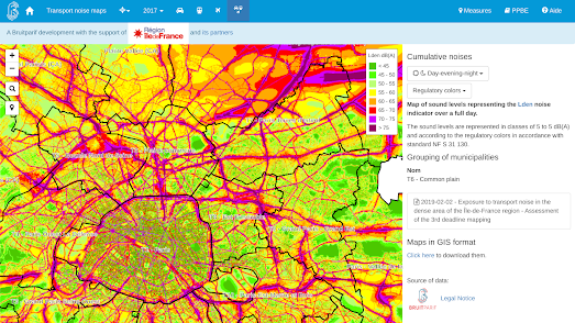
The Bruitparif Paris Transport Noise Map visualizes noise pollution within the ÃŽle-de-France region. The map shows the estimated level of noise pollution generated by cars, trains and planes across all of Paris.

Essentially the Paris Transport Noise Map provides a heat map view of the levels of transport noise in the capital. The map allows you to view noise pollution generated by cars, trains, planes, or a cumulative noise pollution visualization of all three combined. The noise pollution levels are determined by computer modeling and not from actual measurements. 

The main criticism of computer modeled maps of noise pollution is that they are little more than maps of transport infrastructure. However when done well, like the Paris Transport Noise Map, they take into account the effect of buildings, noise screens, traffic levels, average speeds and road surfaces on the amount of noise pollution generated.

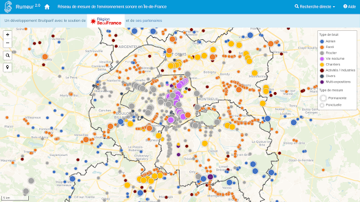
Bruitparif actually has deployed sound radars which capture noise pollution levels across the French capital in real-time. You can view the noise pollution levels recorded by these sound radars on its Rumeur interactive map. 

The Rumeur map allows you to view the sound levels recorded by any of the sound measuring stations in Paris. Click on a sound radar's marker on the map and you can view its current 'real-time' noise pollution reading and its measurement history. An interactive chart allows you to observe the selected station's entire history of decibel level measurements. 


If you don't live in Paris you can view noise pollution levels where you live on the OSM Global Noise Pollution Map. The OSM Global Noise Pollution Map uses OpenStreetMap data to estimate the levels of noise pollution across the world. 
At the heart of the OSM Global Noise Pollution Map is the simple idea of assigning noise pollution levels based on OpenStreetMap tags. Map features in OpenStreetMap are assigned a tag which describe what has been mapped. These tags can also be assigned a value. For example all roads that are tagged 'highway' are also assigned a value such as 'motorway', 'secondary' or 'residential'. 

The OSM Global Noise Pollution Map uses these tags and values to assign a noise pollution level based on general assumptions. For example highway, trunk, primary and secondary roads are deemed to be noisier than normal street or service roads. The OSM Global Noise Pollution Map also assumes that other mapped features, such as railways and retail & industrial zones, will also generate different levels of noise pollution. 

The OSM Global Noise Pollution Map isn't refined enough to take into account factors such as traffic levels & average speeds. 

Wednesday, July 20, 2022

The (Not So) Great Salt Lake

The Great Salt Lake in Utah is very, very big. Although it isn't as big as it used to be. In 1987 the lake was 3,300 square miles in size. Now, in July 2022, the lake is only around 950 square miles in size. While the size of the Great Salt Lake can fluctuate a lot naturally, due to seasonal changes in the weather, it is now undoubrably drying-up because of global warming.

You can see how drastically the Great Salt Lake is shrinking in size by viewing the lake from Space. Google Earth Timelapse allows you to view historical satellite imagery for any location on Earth. The application has 37 years worth of satellite imagery dating back to the 1980s. It is therefore possible to use Google Earth Timelapse to create your own animated timelapse image for any location showing changes over time.

The Great Salt Lake from space (1984-2020)

If you center on the Great Salt Lake in Utah on Google Earth Timelapse you can clearly see the extent that the lake has shrunk since the 1980s simply by pressing 'play' on the map's timeline.

Using Google Earth Timelapse to visualize the drying-up of the Great Salt Lake is very easy. What isn't so easy is documenting the toll of climate change on the lake by kayaking around its full circumference. Which is what EarthView did to create a 'Street View' type tour of the lake. Their Tour of the Great Salt Lake allows you to explore a first-person view of the lake in glorious 360 degree panoramic imagery. 

In June EarthView captured panoramic imagery by kayaking around the lake's eastern shore. They plan to capture imagery of the western shore in the fall. There are also plans to capture similar 'Street View' type imagery for Lake Powell, Lake Mead, Lake Tahoe and New Mexico’s Rio Grande.