A Brief History of Time & Space

the shifting borders of the Holy Roman Empire from 1000-1750
Point in History is an interactive map which allows you to explore country and regional borders over time. The map uses historical boundaries data from the Historical Boundaries Project in order to show how the boundaries of countries around the world have developed and changed through history.
If you click anywhere on the map a timeline will be added to the map sidebar. You can then select individual years from this timeline to view the selected country's borders at that point in history. For example the animated GIF above shows the changing borders of the Holy Roman Empire between 1000 and 1750.
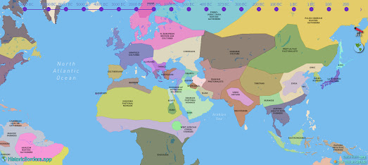
Historic Borders is another interactive map which uses the Historical Bounderies Project's data to show changing country borders over 4,000 years of history (2000 BC-1994). Using the Historic Borders' interactive timeline you can view a map of the world at any specific period within this 4,000 years of history.
The main difference between Point in History and Historic Borders is that the later map provides a global view of country borders for the chosen date, whereas Point in History concentrates on just visualizing the borders for your selected location.
A number of other maps also look at how the world map has changed as political boundaries have changed through time. Links to some of these historical border maps can be found in the Maps Mania post Mapping History.


Комментарии