Where Young People Are Moving
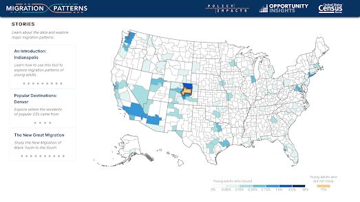
Migration Patterns is a new interactive map from the U.S. Census Bureau and Harvard University which reveals the towns and cities where young Americans are moving to. The map allows you to click on any U.S. county to see where young adults "move between childhood (as measured by their location at age 16) and young adulthood (as measured by their location at age 26)."
If you select any county (or 'commuting zone') on the map you can view a choropleth map view showing the most popular destinations for young Americans moving from the selected county. For example if you select Denver on the map you can see that 3.7% of young adults from Denver moved to Fort Collins between the ages of 16 and 26.
It is also possible to select “To” instead of “From” to see where young adults in a community moved from. For example in Denver 2.1% of young adults came from Fort Collins and 1.9% moved from Los Angeles.
It is interesting to see that Los Angleles seems to be a popular destination for young adults from nearly the whole United States. The draw of Hollywood appears to be as strong as ever. Seattle, Las Vegas and Denver also seem to be popular destinations for young adults to move to from towns and cities across the whole country.


Комментарии