The True Size of Climate Change
This week the World Resources Institute (WRI) and the University of Maryland announced that 4.1m hectares of primary rainforest was destroyed around the world in 2022. In reporting this news many media outlets compared the amount of rainforest lost last year as being equivalent to the size of Switzerland.
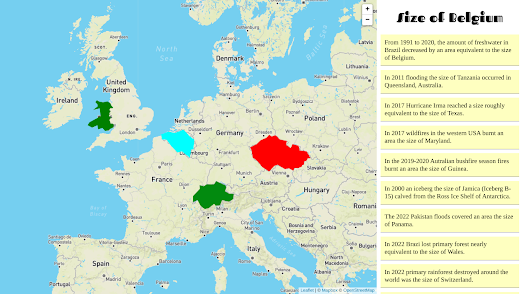
This got me thinking about how often the scale of natural disasters (such as hurricanes and wildfires) are explained by being compared to the size of countries or to other well known geographical regions. This in turn led me to the idea of creating an interactive map which uses drag-able country polygons to show the size of some well known climactic events and natural disasters.
Fans of The True Size Of ... will know all about dragging country shaped polygons around on an interactive map to compare country sizes. The True Size Of map allows users to drag and drop countries around on a map to compare the relative sizes of different countries. It can also be used to see how large an area of rainforest was destroyed last year - simply by dragging around the polygon of Switzerland on the map.
You can now also use my Size of Belgium interactive map to explore the size of a number of recent(ish) natural disasters and climactic events. For example last year's Pakistan floods were widely reported to have been 'about the size of Panama'. Using the Size of Belgium interactive map you can drag a Panama sized polygon around on the map to see how large an area this flooding event would have covered if it had happened in your home town.
The Size of Belgium also includes drag-able polygons showing the size of various recent hurricanes, icebergs and wildfires (including the recent wildfires in Canada).
I created the map with the help of webkid's amazing Leaflet Truesize plugin for Leaflet.js. If you don't want to go to the trouble of creating your own map then you can always just clone the Size of Belgium map on its Glitch page.


Комментарии