Google Maps in the News
The Guardian and The New York Times are both regular users of Google Maps. It is interesting how each of these two news organisation take a different approach to their use of the Google Maps API.

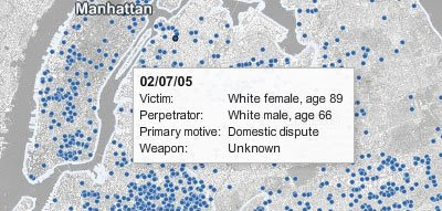
New York Times' New York City Homicides Map
Whilst The Times, under the guidance of graphics editor Matthew Bloch, usually produce stunningly designed data visualisations The Guardian tend to produce more simple maps with the emphasise on open data.
Many of The Guardian's Google Maps are released as part of the paper's Data Store. The Data Store is part of The Guardian's mission to "make data truly free". The Guardian's aim is to publish the raw statistics behind the news and make it easy to export the data.

The Guardian's Wikileaks Data Journalism Map
The Guardian therefore often produce Google Maps using Google Fusion Tables. These maps tend therefore to be a simple representation of the data with the emphasise that other developers are free to download the data and create their own visualisations.
________________

New York Times' New York City Homicides Map
Whilst The Times, under the guidance of graphics editor Matthew Bloch, usually produce stunningly designed data visualisations The Guardian tend to produce more simple maps with the emphasise on open data.
Many of The Guardian's Google Maps are released as part of the paper's Data Store. The Data Store is part of The Guardian's mission to "make data truly free". The Guardian's aim is to publish the raw statistics behind the news and make it easy to export the data.

The Guardian's Wikileaks Data Journalism Map
The Guardian therefore often produce Google Maps using Google Fusion Tables. These maps tend therefore to be a simple representation of the data with the emphasise that other developers are free to download the data and create their own visualisations.
________________


Комментарии