Animated Heat Map of New York - Updated
Thanks to a Tweet from Mike Pegg I've discovered that all these maps are the work of New York Times graphics editor Matthew Bloch. Matthew has a great website that serves as a portfolio of his online graphic design projects.
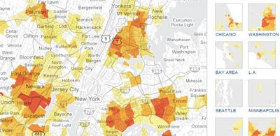
Tracking Taxi Flow

The New York Times had produced an excellent animated heat map that shows taxi pickups throughout the week in New York. The map has been produced from millions of taxi trips taken between January and March, 2009.
The biggest hot spot in New York in the mornings seems to be around Penn Station. Grand Central also seems to be a popular place to pickup taxis before work. Late at night the hotspots seem to be centred around Broadway presumably as night goers are heading home.
The New York Tines has been producing excellent Google Maps mashups for a number of years. In the last couple of years, however, their maps have been getting more and more innovative.
Here are few New York Times Google Maps from the archives:
New York City Homicides Map
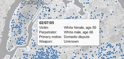
The New York Times has created a Google Maps mashup showing the location of all 3,402 homicides in the city since 2003. The data has been collected from New York Police Department announcements, in addition to news accounts, court records and additional reporting.
A Peek Into Netflix Queues
The New York Times have created a number of interactive Google Maps to examine Netflix rental patterns, neighborhood by neighborhood, in a dozen cities. For the maps Netflix provided data on the top 50 rentals in 2009 by zip code.
NY Times Best Places to Go in 2010
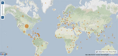
The New York Times are using Google Maps to display their readers' favourite destinations for 2010 and to show the New York Times' own picks.
Each country on the map is represented by a circle map marker. The size of the circle represents the number of reader recommendations. At the moment the USA is by far the most popular country as a travel destination.
NY Times Toxic Waters Map

The New York Times has compiled data on more than 200,000 facilities that have permits to discharge pollutants and have collected responses from states regarding compliance. The paper has made all of this data available via a very cool Google Maps mashup.
________________
Tracking Taxi Flow
The New York Times had produced an excellent animated heat map that shows taxi pickups throughout the week in New York. The map has been produced from millions of taxi trips taken between January and March, 2009.
The biggest hot spot in New York in the mornings seems to be around Penn Station. Grand Central also seems to be a popular place to pickup taxis before work. Late at night the hotspots seem to be centred around Broadway presumably as night goers are heading home.
The New York Tines has been producing excellent Google Maps mashups for a number of years. In the last couple of years, however, their maps have been getting more and more innovative.
Here are few New York Times Google Maps from the archives:
New York City Homicides Map
The New York Times has created a Google Maps mashup showing the location of all 3,402 homicides in the city since 2003. The data has been collected from New York Police Department announcements, in addition to news accounts, court records and additional reporting.
A Peek Into Netflix Queues
The New York Times have created a number of interactive Google Maps to examine Netflix rental patterns, neighborhood by neighborhood, in a dozen cities. For the maps Netflix provided data on the top 50 rentals in 2009 by zip code.
NY Times Best Places to Go in 2010
The New York Times are using Google Maps to display their readers' favourite destinations for 2010 and to show the New York Times' own picks.
Each country on the map is represented by a circle map marker. The size of the circle represents the number of reader recommendations. At the moment the USA is by far the most popular country as a travel destination.
NY Times Toxic Waters Map
The New York Times has compiled data on more than 200,000 facilities that have permits to discharge pollutants and have collected responses from states regarding compliance. The paper has made all of this data available via a very cool Google Maps mashup.
________________


Comments