Skip to main content
Search
Search This Blog
Maps Mania
Posts
Showing posts from November, 2023
Show all
November 30, 2023
The Most Popular Music in Your Town
November 30, 2023
London, Paris & Berlin Metro Memory Games
November 29, 2023
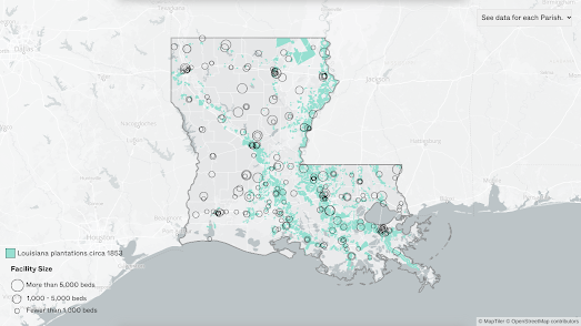
Locking Up Louisiana
November 27, 2023
The Live Amtrak Train Map
November 27, 2023
The World as 1000 People
November 25, 2023
The World's Largest Snow Dome
November 24, 2023
Global Sentiment Towards Israel & Palestine
November 23, 2023
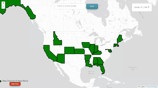
America is a Jigsaw
November 22, 2023
Where Your Food Comes From
November 21, 2023
America's Changing Plant Hardiness Zones
November 20, 2023
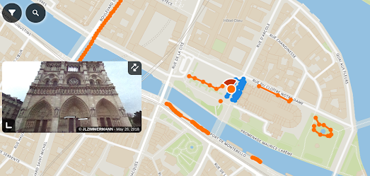
Alternatives to Google Maps Street View
November 18, 2023
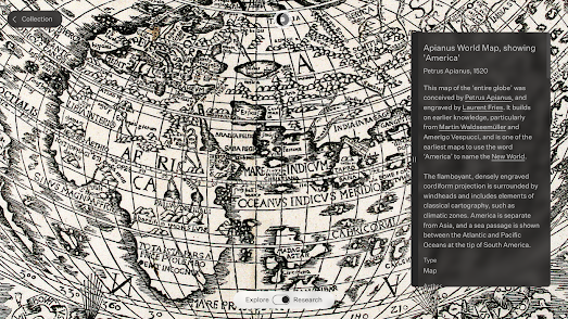
Introducing the Sunderland Collection
November 17, 2023
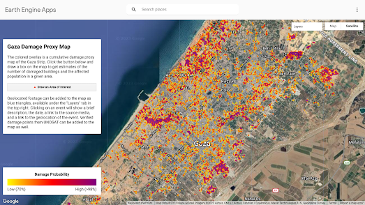
Mapping Damage in Gaza
November 16, 2023
The Rise & Fall of National Rail Networks
November 15, 2023
Wednesday Night is Game Night
November 14, 2023
Ten Years of Global Marine Traffic
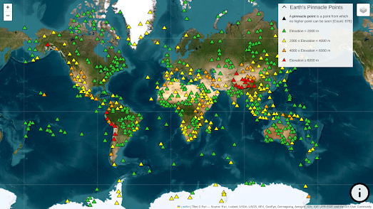
November 13, 2023
Standing on Top of the World
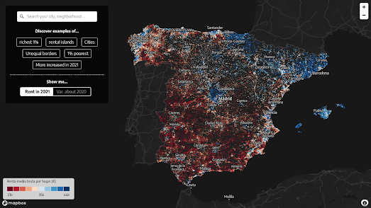
November 11, 2023
The Spanish Wealth Divide
November 10, 2023
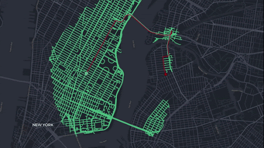
Peering into the Heart of Darkness
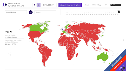
November 09, 2023
How Long Will You Live?
November 09, 2023
Documenting Russian Crimes in Ukraine
November 08, 2023
Dutchify Your Street
November 07, 2023
The Interactive Pathfinding Map
November 06, 2023
Redesigning the World's Transit Maps
November 04, 2023
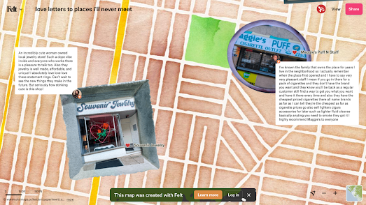
A Map of the World That Is Gone
November 03, 2023
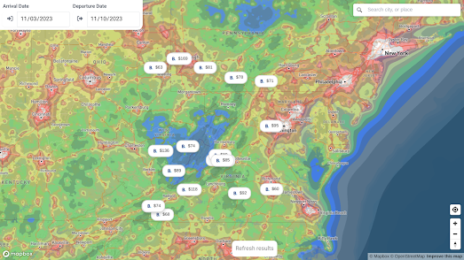
Star-Gazing Hotels
Newer Posts
Older Posts
Home