Skip to main content
Search
Search This Blog
Maps Mania
Posts
Showing posts from February, 2023
Show all
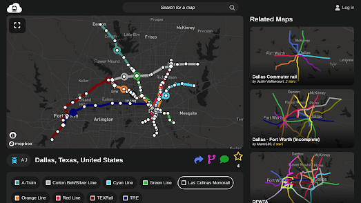
February 28, 2023
Build Your Own Subway Map
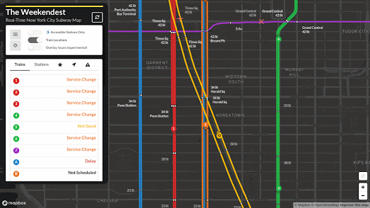
February 27, 2023
The Real-Time NYC Subway Map
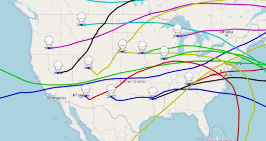
February 25, 2023
Lightship Earth
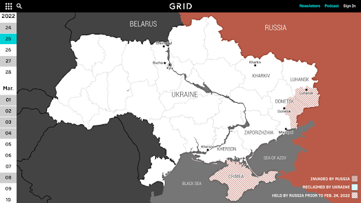
February 24, 2023
A Year of War in Ukraine
February 23, 2023
Mapping Fictional Spy Balloons
February 22, 2023
Depopulation Pyramids
February 21, 2023
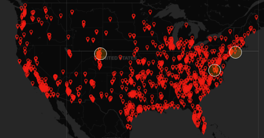
Police Carry out 5% of Homicides
February 20, 2023
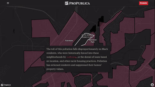
Southerners Have Poor Credit & Poor Health
February 18, 2023
Meres, Lochs & Llyns
February 17, 2023
Where People Will Die from Global Heating
February 15, 2023
Trash Can Earth
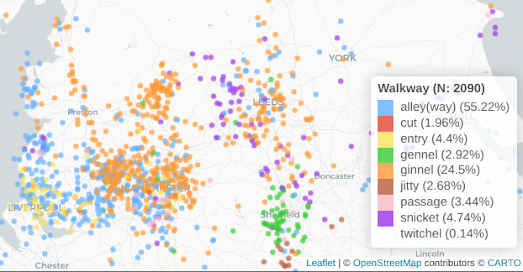
February 15, 2023
Twittens, Ginnels and Jitties
February 14, 2023
Prague in 3D
February 13, 2023
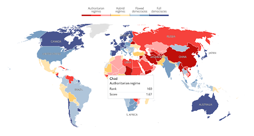
The World's Most Democratic Countries
February 11, 2023
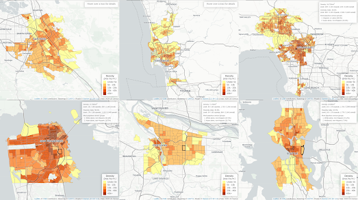
The Population Density of West Coast Cities
February 10, 2023
24 Hours of Ship Traffic in the Bay
February 09, 2023
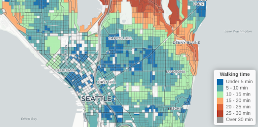
Is Seattle a 15-Minute City?
February 08, 2023
A Heat Map of U.S. Road Fatalities
February 07, 2023
Scrollytelling Video Mapping
February 05, 2023
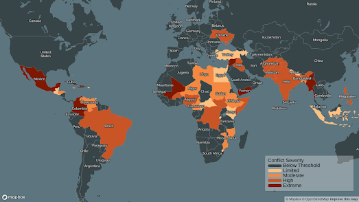
Ten Conflicts to Watch in 2023
February 04, 2023
Global Population Density
February 03, 2023
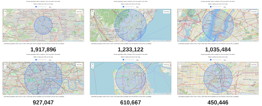
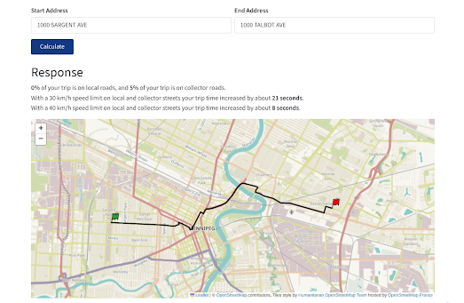
Speed Limited Travel Times
February 02, 2023
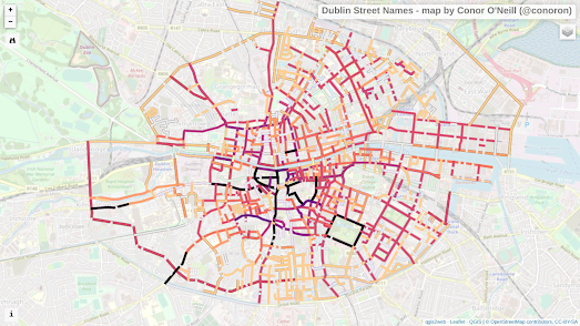
Why Your Street Has That Name
February 01, 2023
The Viking Invasion
Newer Posts
Older Posts
Home