Skip to main content
Search
Search This Blog
Maps Mania
Posts
Showing posts from October, 2020
Show all
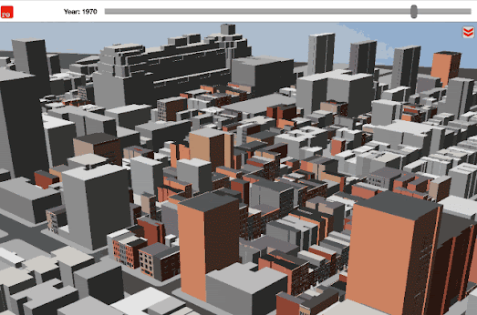
October 31, 2020
AI Time Travel
October 30, 2020
The UCLA Hate Crime Map
October 30, 2020
The Color of Covid
October 29, 2020
The First Map of the Election
October 29, 2020
How Many Countries Do You Know?
October 28, 2020
The Future U.S. Climate Explorer
October 28, 2020
Topographical Search Maps
October 27, 2020
Biden Wins the Presidential Donations Race
October 27, 2020
The Map the Italians Stole
October 26, 2020
How Much Tax Does Your Neighbor Pay?
October 26, 2020
Global Air Pollution Maps
October 24, 2020
McBroken
October 24, 2020
Citites Without Light Pollution
October 23, 2020
Half of All Americans Live Here
October 23, 2020
The Global Emissions Map
October 22, 2020
Climate Change & the California Wildfires
October 22, 2020
Earth's Climate from Space
October 21, 2020
The 2020 Bolivia Election Map
October 21, 2020
Mapping the View from Mount Washington
October 21, 2020
New York Has a New Subway Map
October 20, 2020
Life is Getting Better - Maps Are Not!
October 20, 2020
Berlin Airport in 3D
October 19, 2020
The World's Most Winding Roads
October 17, 2020
How to Win an Election
October 16, 2020
Roman Pompeii in Virtual Reality
October 16, 2020
Mapping Cholera in Amsterdam, Soho & Leeds
October 15, 2020
The Bay Area Property Tax Map
October 15, 2020
Do You Live in a 15 Minute City?
October 14, 2020
The Indigenous People's 'Cessions' Maps
October 14, 2020
The Second Wave is Coming
October 13, 2020
120 Years of Earthquakes
October 13, 2020
30 Years of German Reunification
October 12, 2020
Mapping Voter Suppression
Newer Posts
Older Posts
Home