Skip to main content
Search
Search This Blog
Maps Mania
Posts
Showing posts from October, 2021
Show all
October 30, 2021
MapBusters - the Game
October 29, 2021
The Diary of a Plantation Overseer
October 28, 2021
The Dot Map of 19th Century New York
October 27, 2021
Turning the Heat on Politicians
October 26, 2021
Your Town's Future Climate
October 25, 2021
View Your House Under Water
October 23, 2021
Gerrymandering in Texas
October 22, 2021
Spotting Methane Polluters from Space
October 21, 2021
The New Global Land Cover Map
October 20, 2021
Your Halloween Frightgeist
October 19, 2021
San Francisco Before Colonization
October 18, 2021
Why the Street Has That Name
October 16, 2021
Ships Waiting to Unload
October 15, 2021
The World's Carbon Center of Gravity
October 14, 2021
Real World Model Train Sets
October 13, 2021
The Historical Election Violence Map
October 12, 2021
Segregation in America
October 11, 2021
Czech Election Maps
October 09, 2021
Mapping the La Palma Volcano Eruption
October 08, 2021
Aerial Archaeology
October 07, 2021
Mapping the Last Tati Department Store
October 06, 2021
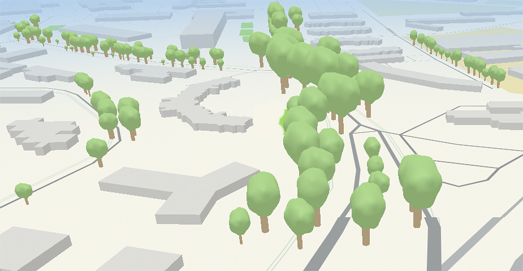
Mapping Trees in 3D
October 06, 2021
Strava Art
October 05, 2021
Gerrymandering in Texas
October 04, 2021
Who Owns the Most Cars?
Newer Posts
Older Posts
Home