Skip to main content
Search
Search This Blog
Maps Mania
Posts
Showing posts from August, 2021
Show all
August 31, 2021
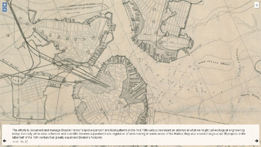
The Birth of Boston
August 31, 2021
Exploring the Underbelly of Pixlton
August 30, 2021
Hurricane Ida's Forecast Path
August 30, 2021
Russia's Building Age Maps
August 28, 2021
Make Your Own Map Posters
August 27, 2021
The 2021 Fall Foliage Map
August 27, 2021
The Supertunnel Simulator
August 26, 2021
The CCTV World Cup
August 25, 2021
Name that City
August 25, 2021
Make Your Own Coloring Maps
August 24, 2021
The Age of Humans
August 24, 2021
Where Does Your Name Come From?
August 23, 2021
50 Years of Landsat
August 23, 2021
How Covid-19 Conquered the World
August 22, 2021
Animated Street View Tours
August 21, 2021
Who Owns the North Sea?
August 20, 2021
Driving Directions for Birds
August 20, 2021
The Map of Female Composers
August 19, 2021
Great Balls of Fire
August 18, 2021
What Two Numbers
August 18, 2021
The Manga Map
August 17, 2021
Mapping the Unknown
August 17, 2021
The Globalization of the Premier League
August 16, 2021
Mapping the Advance of the Taliban
August 14, 2021
The New Racial Dot Map of America
August 13, 2021
America's Growing Racial Diversity
August 12, 2021
Mapping Wildfire Evacuation Risk
August 12, 2021
The Geography of Facebook Friends
August 11, 2021
The San Francisco Covid Burglary Map
August 11, 2021
Urban Sprawl in America
August 10, 2021
The IPCC Climate Apocalypse Maps
Newer Posts
Older Posts
Home