Skip to main content
Search
Search This Blog
Maps Mania
Posts
Showing posts from June, 2023
Show all
June 30, 2023
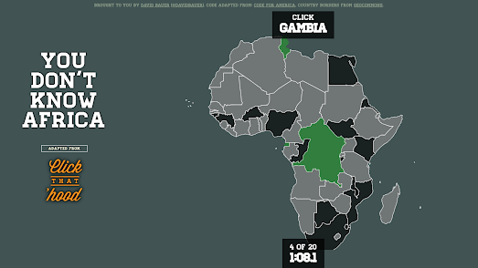
You Don't Know Africa
June 29, 2023
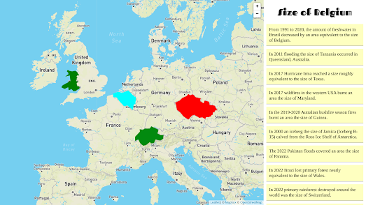
The True Size of Climate Change
June 28, 2023
The 2023 Best Cities for Cycling
June 27, 2023
The End of the Rainforest
June 27, 2023
Geoengineering Planet Earth
June 26, 2023
Where Do Refugees Go?
June 24, 2023
Discovering the Dissolution
June 23, 2023
The Solar Eclipse Simulator
June 22, 2023
A Year of Wildfires
June 21, 2023
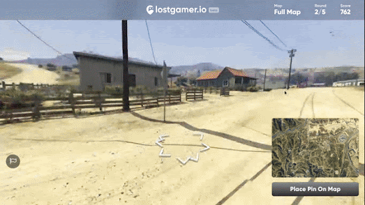
GeoGuessr for Video Games
June 20, 2023
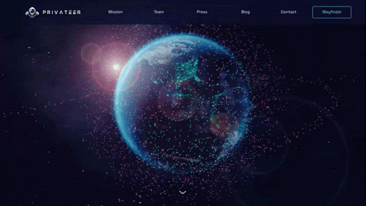
The Kessler Syndrome
June 19, 2023
Staring at the Moon
June 17, 2023
AI Street View Hallucinations
June 16, 2023
The History of Latin America
June 15, 2023
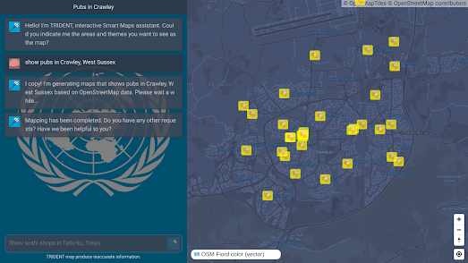
AI Map Search
June 14, 2023
The June Deportations
June 13, 2023
Chronotube
June 13, 2023
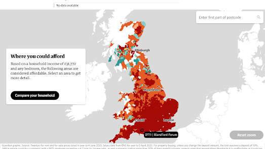
Where You Can't Afford to Live
June 12, 2023
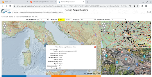
The Map of Roman Amphitheaters
June 10, 2023
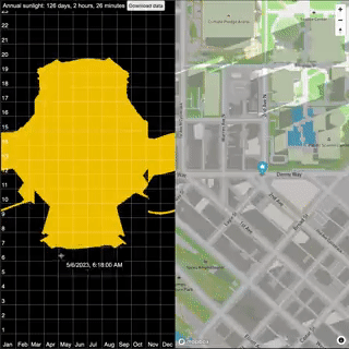
Global Sunlight Chart
June 09, 2023
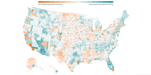
America's Pink Migration Banana
June 08, 2023
The Privatisation of East Germany
June 07, 2023
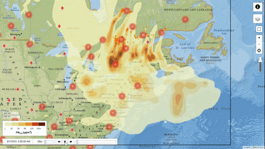
Wildfires & Smoke Pollution
June 06, 2023
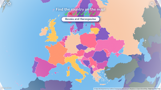
Quiz Around the World
June 05, 2023
Assassination Simulation
June 03, 2023
Where is the Cheapest McDonalds?
June 02, 2023
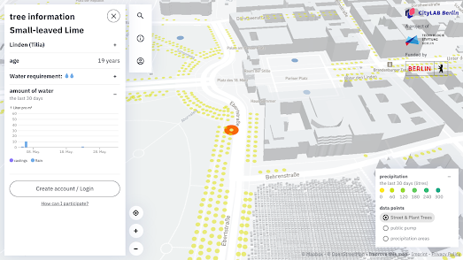
Tree Maps of the World
June 01, 2023
Mapping 1,001 American Novels
Newer Posts
Older Posts
Home