Historical Country Borders

The Historic Country Borders map allows you to explore the historic rise and fall of empires and countries around the world since 2000 BC. Using the map's interactive timeline you can select any date in history from 2000 BC to 1994 AD to view the borders of the world's countries at that time.
The map uses data from aourednik's historical basemaps to show country borders during the different stages of the world's history. This data comes with a few warnings. One warning draws attention to the fact that the borders of the past can be just as disputed as modern borders - if not more so. Another warning highlights that the historical borders of different civilizations in the past may not have been drawn with exact precision and the territories of different historical civilizations may very well have overlapped each other.
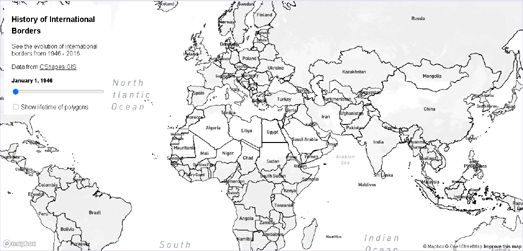
The History of International Borders is another fascinating map showing how country borders around the world have changed - in this case since the end of the Second World War. The History of International Borders map allows you to select dates between 1946 and 2016 to view the international borders during that time. Change the date and the map will automatically update to show the country borders as they existed during that period of time.
If you select the 'Show lifetime of polygons' option this will highlight those countries on the map whose borders have changed since World War II. The countries shown in green had stable borders during that period, while the countries colored pink have borders which have changed.
One problem with this map is that the country labels don't change with the changing borders. So (for example) what is now the Democratic Republic of Congo should be labelled Zaire on the map between 1971 & 1997, and Czechia and Slovakia should more accurately have the one label, Czechoslovakia, before 1993.

The animated map above shows the changing borders of Europe, the Middle East and North Africa during the Twentieth Century. It is a pretty good illustration of how geo-political developments demand frequently updated maps.
I created this animated map using Mundipedia. Munipedia is an interactive map which shows country borders for different dates in history. Enter a date into Munipedia and you can view how the world looked in that year. For example enter the year 1984 and you will see a divided Germany, split into East and West Germany. Skip forward a few years and in 1990 the map shows just the one Germany.
Not every single year is covered by the map. The legend above the map tells you the date currently being shown. The map also only covers modern history, starting as it does in the year 1899.
Running Reality is yet another interactive map which is trying to build a map of the world over time. Using Running Reality you can view a map of any location in
the world at any time during its history. In this way you can see how towns and cities have grown and fallen over time. You can also learn more about the people who lived there and the buildings in which they lived and worked.
To see how Running Reality works you can zoom-in on an individual city and then use the timeline to see how the city has changed over time. For example if you zoom in on New York and set the timeline to 1600 you will see no roads or buildings. Adjust the timeline to 1700 and a few roads and buildings can be seen in Manhattan. Advance another 100 years (to 1800) and the city has spread north as far as Greenwich Village and small developments have appeared in Brooklyn.

Chronas is one more interactive map which aims to provide a view of historical events across the globe and through time. This interactive map visualizes Wikipedia entries by date and by location and also shows country borders for different dates in history.
Chronas not only maps historical events but also provides a mapped overview of country boundaries for any given date. If you select a year from the time slider (running along the bottom of the map) the map will update to show how the world's borders existed at the chosen time. If you then click on a country or geographical area on the map a Wikipedia article on the selected historical region will open in the map sidebar. For example, if you select the year 573 AD from the time slider, you can select the Visigoths region on the map to learn more about these nomadic tribes during the first millennium.

The Ancient History Encyclopedia's Map of the Ancient World is an interactive map of the world from around 6,000 BCE to 270 BCE. The map plots historical civilizations and places by date. Change the date and the map changes to show the rough borders of the civilizations and peoples of your selected time
The map carries a disclaimer that it is "only complete in the Mediterranean until around 270 BCE". However the map isn't limited to this period and location. If you only use the back and forward arrows to navigate the map then you might not realize that the map actually does include data for the rest of the world. You can also move forward in time beyond 270 BCE (although the map doesn't yet continue past the Roman Empire).


Comments