Skip to main content
Search
Search This Blog
Maps Mania
Posts
Showing posts from 2023
Show all
December 30, 2023
Real-Time 3D Mapping
December 29, 2023
GeoTimeGuessr
December 28, 2023
Subway Specs - Part III
December 24, 2023
Santa Tracker Maps
December 23, 2023
Where Might I Live?
December 22, 2023
Destroying People's Homes in Gaza
December 21, 2023
The Battle of Hong Kong
December 20, 2023
Mapping the Alien Invasion
December 19, 2023
Coin Hoards from the Roman Empire
December 18, 2023
The Global Birdspotting Map
December 16, 2023
How Well Do You Know New York's Subway?
December 15, 2023
The Mapped History of the London Tube
December 14, 2023
The Historical Movie Map
December 13, 2023
Racial Profiling in Redlining Maps
December 12, 2023
Night Train to Europe
December 11, 2023
The Carbon Bomb Map
December 09, 2023
Discover Your Neighborhood Tree Score
December 08, 2023
Making Animated Map GIFs
December 07, 2023
Is Light Pollution Getting Better?
December 06, 2023
The Origin of Country Names
December 05, 2023
Historical Sanborn Maps of America
December 04, 2023
Global Heating
December 02, 2023
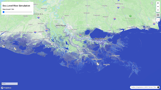
Sea Level Rise Maps
December 01, 2023
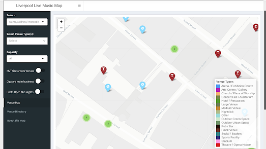
The Live Music Mapping Project
November 30, 2023
The Most Popular Music in Your Town
November 30, 2023
London, Paris & Berlin Metro Memory Games
November 29, 2023
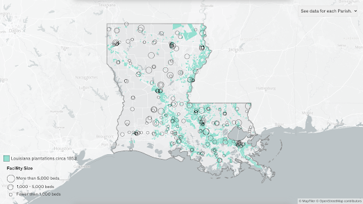
Locking Up Louisiana
November 27, 2023
The Live Amtrak Train Map
Newer Posts
Older Posts
Home


.gif)