Skip to main content
Search
Search This Blog
Maps Mania
Posts
Showing posts from August, 2018
Show all
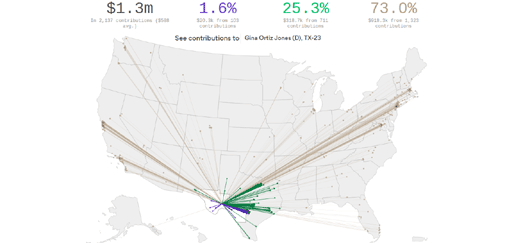
August 31, 2018
Where the Money Comes From
August 31, 2018
The NFL Maps of the United States
August 31, 2018
Building Age Posters
August 30, 2018
The USA's Longest Commutes
August 30, 2018
How Katrina Flooded New Orleans
August 30, 2018
Where House Prices are Rising & Falling
August 29, 2018
The United States of Global Trade
August 29, 2018
Yale Climate Opinion Maps
August 29, 2018
The Free Market in North Korea
August 28, 2018
The 2018 Fall Color Map
August 28, 2018
Internal Migration in the USA
August 28, 2018
Hong Kong Land Reclamation
August 27, 2018
The California Crop Map
August 27, 2018
The Mass Shooting Map of America
August 27, 2018
Monday's Mappa Mundi
August 25, 2018
The Sexist Streets of Brazil
August 24, 2018
The World's Biggest Exporters of Arms
August 23, 2018
Wildfire Smoke & Air Quality Maps
August 23, 2018
Global Heat Records Broken this Summer
August 22, 2018
Mapping the Native Communities of California
August 22, 2018
Roady McRoadface
August 22, 2018
Ich Bin Kein Berliner
August 21, 2018
Before & After Imagery of the Carr Fire
August 21, 2018
Exploring Ancient Rome
August 21, 2018
Harry Beck's Live London Tube Map
August 20, 2018
Taxis are the New Pizza
August 20, 2018
Mapping One Long Hot Summer
Newer Posts
Older Posts
Home