Skip to main content
Search
Search This Blog
Maps Mania
Posts
Showing posts from January, 2022
Show all
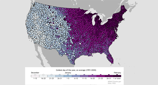
January 31, 2022
The Coldest Day of the Year
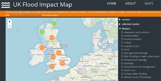
January 29, 2022
How Africa Pays for Climate Change
January 28, 2022
The Map of All Human Knowledge
January 27, 2022
All the Maps at Once
January 26, 2022
Lighting Up the World
January 25, 2022
Visualizing the Tonga Volcanic Eruption
January 24, 2022
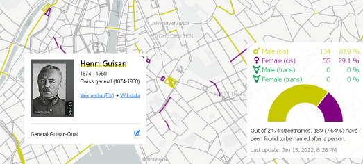
The Sexist Streets of the World
January 22, 2022
The Global Rewilding Map
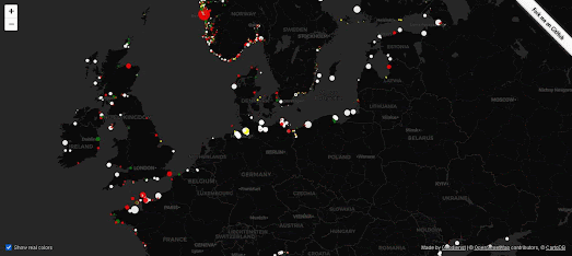
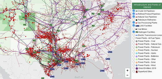
January 21, 2022
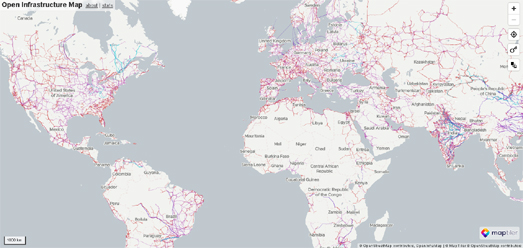
Mapping the World's Infrastructure
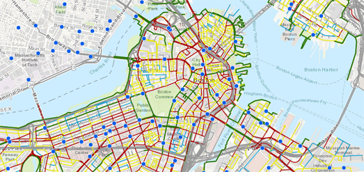
January 20, 2022
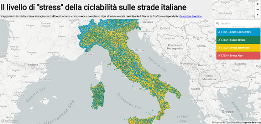
The Cycling Stress Map
January 19, 2022
A Brief Atlas of Time
January 18, 2022
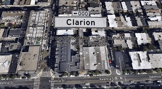
A 3D Tour of Clarion Alley
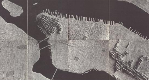
January 17, 2022
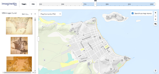
500 Years in Rio
January 16, 2022
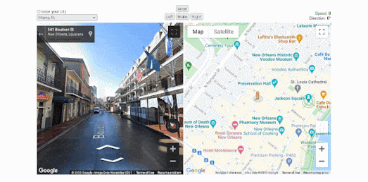
Taking a Sunday Street View Drive
January 15, 2022
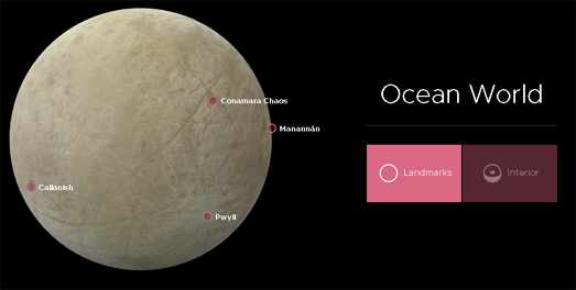
Looking for Life on Europa
January 14, 2022
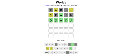
Wordle - Placenames Edition
January 14, 2022
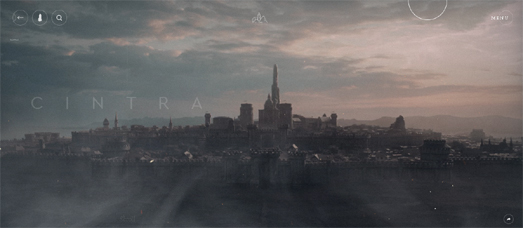
The Witcher Interactive Maps
January 13, 2022
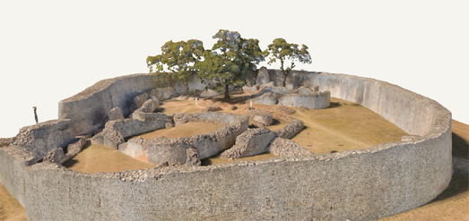
The Great Enclosure
January 12, 2022
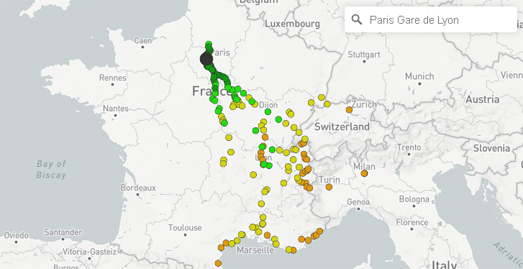
The Direct Train Map
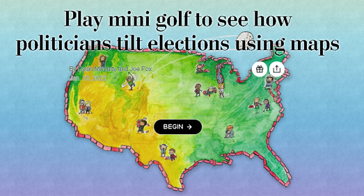
January 11, 2022
The Gerrymander Open
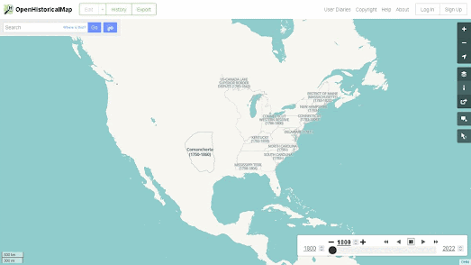
January 10, 2022
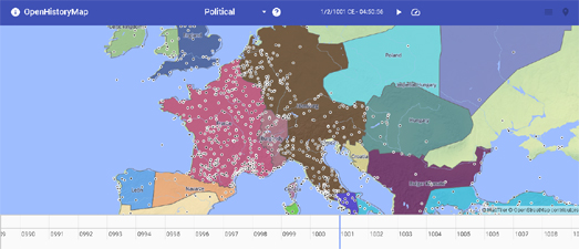
A Map of the World through Time
January 08, 2022
Natural Language Mapping
January 07, 2022
Mapping the American Power Grid
January 06, 2022
The Collapse of Chaplain South
January 05, 2022
The River Runner Global Edition
January 04, 2022
The Cycling Stress Map
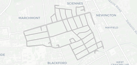
January 03, 2022
How to Run Every Street
Newer Posts
Older Posts
Home