Mapping the World's Infrastructure

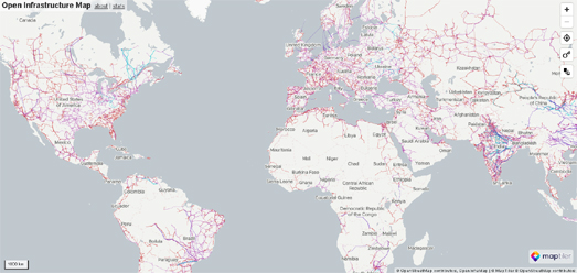
The Open Infrastructure Map is an interactive map of the world's power, telecoms, gas, and oil infrastructure. The map uses data from OpenStreetMap to plot electricity power plants & power lines, oil, gas & petroleum pipelines, water pipelines, and telecom cables.
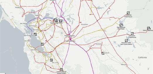
The Open Infrastructure Map includes five different layers. These layers allow you to turn on or off map data relating to 'Power', 'Solar Generation', 'Telecoms', 'Oil & Gas' and 'Water'. The electricity power lines shown are also color coded to show their levels of voltage.

As you zoom in on the Open Infrastructure Map more detail is added to the map to show the locations of individual power stations. Different map symbols are used to indicate the different types of power plant (nuclear, oil, coal, gas, wind, solar etc).
The Open Infrastructure Map also includes an interesting statistics facility. This allows you to view the amount of infrastructure mapped in different countries. For example Open Infrastructure Map has mapped 6,230 different power plants in the United States. Of these 763 are gas powered, 247 are coal powered and there are 62 nuclear power plants. The statistics given reflect only the infrastructure which has been mapped on OpenStreetMap. This data may be incomplete and the accuracy is only as good as the mapped data.

Gridfinder is an interactive map which visualizes the global electricity grid network based on night-light satellite imagery. The map predicts the existence of electricity network lines using evidence from night-time views of the Earth from space.
10% of the world's population does not have access to a reliable electricity supply. It is hoped that Gridfinder can be used to identify populations with poor access to electricity networks in order to help improve essential infrastructure and provide affordable and reliable energy.
The Gridfinder map shows the locations of known electricity lines using data from OpenStreetMap. The map also shows predicted electricity supply lines based on where lights can be seen at night from orbiting satellites. To predict the existence of these previously unmapped electricity supply lines the level of night-time light in satellite imagery is used to see where locations are most likely to be producing light from electricity. Where there is enough light to have been produced by an electricity network the map connects this to known electricity networks using an algorithm which follows roads and already known distribution lines.
You can read more about how night-time satellite imagery has been used to predict the world's electricity network on the research paper Predictive mapping of the global power system using open data.
Every year Telegeography releases a map of the huge global
network of undersea telecommunication cables which carry all our data
around the world. Subsea
cables carry telecommunication signals under the oceans, communicating
information between different countries and regions of the world. In the
19th Century the first submarine cables were laid to carry telegraphy
traffic. In the 21st Century submarine cables carry digital data, which
includes telephone and Internet data.


Comments