Wednesday, September 30, 2020

200 Years of Dutch Cartography


The Dutch Topographic Bureau was founded on February 18, 1815. Since that date, and for over 200 years, the Dutch government has been collecting and making available geographic information in the form of highly detailed national and local maps. You can learn more about the Dutch national mapping agency and view some of the extraordinary maps it has created over the last two hundred years on these two interactive maps:
The first of these, Time Travel - More than 200 Years of Topography, allows you to browse and view some of the incredible maps created by the Dutch mapping agency since 1815. This map includes a timeline control which allows you to browse the vintage Dutch maps by date. Select a year on this interactive timeline and you can view a Dutch Topographic Bureau map from that year.

In the modern era the Dutch national mapping agency has used aerial imagery as one of the tools in its mapping arsenal. The Time Travel map allows you to explore these aerial images for the whole country for any year from 2006.

The second map, 200 Years of Topography, is a story map which tells the history of the Dutch Topographic Bureau from its foundation in 1815 right up until the modern day. Using interactive maps, photos and text 200 Years of Cartography explores how maps have been made in the Netherlands over the past 200 years.

200 Years of Cartography is an historical chronology of the Dutch Mapping Agency. It starts by exploring the agency's foundation and proceeds in chronological order to explore how the agency has developed and changed over the following 200 years of its history. As you proceed through this chronological history of the Dutch Topographic Bureau you can view many examples of the maps that the bureau has created over the last 200 years.

Tuesday, September 29, 2020

3D Satellite Imagery


Landsat8.earth is a clever experimental map which allows you to view the latest satellite imagery captured by the Landsat 8 satellite in 3D. The map uses the latest cloudless satellite imagery and WebGL (powered by deck.gl) to show you a 3D map of the Earth.

By default Landsat8.earth is centered on the Grand Canyon but you can move the map to any location where Landsat 8 imagery is available. Landsat 8 is an Earth observation satellite designed to capture medium resolution (30-meter spatial resolution) imagery of Earth. Using Ladsat8.earth you can view the latest cloudless Landsat 8 imagery or you can view any of the seasonal cloudless satellite imagery captured by Landsat 8 dating back to Spring 2013.

You can also use Landsat.earth to view the multispectral image data captured by Landsat 8, including infrared, near infrared and shortwave infrared.


There are a number of other interactive map services which allow you to browse and search for satellite imagery of the Earth. Websites such as Planet ExplorerLandsat Lens and Google's Timelapse permit you to search for satellite imagery both by location and by date.

You can also use ESO's Land Viewer service. The Earth Observing System's Land Viewer application allows you to browse and download historical satellite imagery from the Sentinel-2 and Landsat 8 satellites.

The Land Viewer search facility includes options to search for satellite imagery of the Earth by location and by date. It also includes filters which permit you to search for day or night-time satellite images and the level of cloud cover and the degree of sun elevation in the returned satellite images. Land Viewer includes a number of band combinations which permit you to view satellite imagery using 18 different filters. These include natural & false color, infrared and panchromatic filters. There is also the option to apply your own custom filters to the satellite imagery.

Dividing Germany


30 years ago, after the fall of the Berlin Wall, East and West Germany was reunified and became one country again. The Berliner Morgenpost is celebrating the reunification of Germany by allowing you to divide Germany into two again.

30 years of German unity - East West? North South? Or completely different? is a clever interactive map which allows you to divide Germany in two. Using the interactive map you can draw a line anywhere that you want to divide Germany into two separate sections. Once you have divided the country into two sections you can view a number of choropleth maps showing how your two divided sections compare using a number of different social, economic and demographic metrics.

These metrics include the difference in life expectancy between your two divided sections, the average age, the gender pay gap and even the number of Olympic medals. The map includes three pre-cut views which allow you to view the differences between the old East Germany and West Germany, the difference between South and North Germany and the region of Bavaria with the rest of Germany.


The Berliner Morgenpost also created a clever interactive map feature five years ago, on the occasion of the 25th anniversary of German Reunification. The Unified Journey map tests how well you remember the location of the border between East and West Germany.

On the Unified Journey map you simply have to draw a line where you think the border between the two countries used to exist. Once you have submitted your border you can view where the real border was located and also all the other guesses made by readers of the Berliner Morgenpost. 

Monday, September 28, 2020

A New California Wildfire Map


Half of California's 33 million acres of forest are at risk of megafire and 350,000 Californians live in areas with high wildfire risk. The California Forest Observatory is a new monitoring system and interactive map designed to provide the latest information on wildfire hazard and forest health in California.

The new California Forest Observatory provides information not only on the current location of wildfires but also maps data that can help increase wildfire resilience in the state. The map uses data captured from satellite imagery and airborne LIDAR to provide information on forest structure, weather, topography & infrastructure. Information which is important for not only monitoring wildfire hazards but also for helping to prevent and/or manage future wildfires.

The map includes a number of different layers which can help to provide information on wildfire hazards. These layers include information on tree canopy density and height - information which can be used to predict the amount of fuel available to a wildfire. The Layers tab on the California Forest Observatory map also includes information on ladder fuel density and surface fuels - data useful in determining how surface fires can transition to canopy fires and how fires might spread.

Using the Trends tab you can view the latest wildfire information in California. This layer can show you the location of any wildfires currently active in the state. If you click on a location on the map you can access data on recent wildfire activity and a 3-day forecast of weather and wildfire exposure for the selected location.

The History of Human Population


3D Urban Expansion is an interactive virtual globe which shows the history of urban populations around the world over the last two thousand years. The globe uses data from the Yale study 'Spatializing 6,000 Years of Global Urbanization' to show the number of people living in urban environments across the world from 2000 BC until 1980 AD.

The interactive 3D globe includes a timeline control which you can use to select years between 2000 BC and 1980 AD. Select a year using this control and the globe updates to show how many people were living in different urban environments around the world. The numbers of people living in individual cities is shown using 3D towers. The taller a tower then the bigger the urban population.

Under the hood interactive 3D globe was created using the Three.js Globe Visualization library, which can be used to create Three.js powered WebGL globes.


You can also explore the history of world-wide population growth from 1 BC to 2050 on World Population : An Interactive Experience. In the year 1 BC the population of planet Earth was around 170 million. It is expected to reach 10 billion by the year 2100.

World Population : An Interactive Experience is a world map and timeline which visualizes global population trends over the last two thousand years. The map itself shows locations throughout history where more than 1 million people have lived. The map also includes a wealth of information about historical landmarks important to population trends. This information includes historical developments in science, food production, health, the environment and in human society.

Sunday, September 27, 2020

The Swiss Fall Foliage Map


Every year the Smoky Mountain website releases a Fall Foliage interactive map which shows when and where leaves change their colors across the United States during autumn. The map is so popular that I've always wondered why no-one has thought to create similar maps for other countries. Well - now they have.

The Swiss Tourism website has released a new Foliage Map, which shows where and when Swiss trees will be at their most colorful. This interactive map includes a slide control which allows you to adjust the date. When you change the date the map automatically updates to show the predicted foliage colors across the country for the chosen date.

The Fall colors displayed on the map are based on current climate data for drought, heat and precipitation conditions. The map also takes into account data on last year's fall foliage colors.

Saturday, September 26, 2020

Data Visualizations & Vintage Maps


Nombre Quotidien de Trains sur le Réseau de L'Ouest by Émile Cheysson

Anyone who has spent any time browsing through the David Rumsey Map Collection will have realized that not only is it a fantastic collection of the world's vintage and historical maps it also contains hundreds of examples of early and iconic data visualizations. Stanford Libraries has released a new online exhibition which uses some of these early examples of information graphics to explore the history of data visualization.

The Data Visualization and the Modern Imagination has been curated by RJ Andrews, a data storyteller based in San Francisco, and the Stanford Libraries. The exhibition includes many classic information graphics which have gone on to inspire data scientists right up until the digital age. These include such classics of data visualization as Alexander von Humboldt's geographical and geological charts, Charles Joseph Minard's flow maps and Florence Nightingale's rose diagrams.

The exhibition is organized into a number of different sections or chapters. These sections explore data visualizations which have been designed to explain different themes, such as geography, time, economics and nature. The exhibition is a great introduction to the history of data visualization. I'm sure it will also prove to be a great source of inspiration to many modern data scientists and digital cartographers.

Friday, September 25, 2020

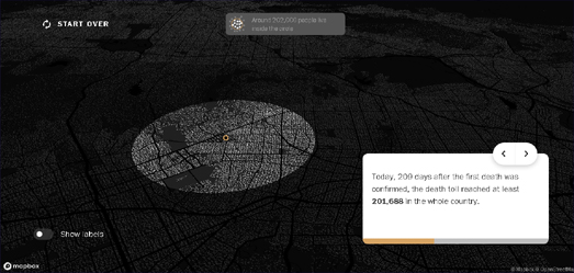
This Is What 200,000 Deaths Looks Like


The Washington Post has released a sobering visualization of the over 200,000 deaths from Covid-19 in the United States. In order to try to humanize the sheer scale of deaths from Covid-19 in the USA the Post has created an interactive map which shows you what 200,000 deaths would look like if they all occurred in your neighborhood.

In What if all covid‑19 deaths in the United States had happened in your neighborhood? the Post allows you to visualize the over 200,000 deaths which have happened in the last 209 days compared to your local population. Enter your address into the WaPo's interactive map and it will draw a circle around your home showing the extent where 201,688 people live. This is the number of people who have died in the U.S. since the beginning of the present health emergency.

It is a brilliant idea to visualize Covid-19 deaths in terms of the local population. The human brain finds it very difficult to understand large numbers, mostly because we don't have a ready context for numbers over a certain size. So when we say over 200,000 people have died from Covid-19 we have difficulty processing the scale of this disaster. The Washington Post map provides a fantastic way to contextualize this number by allowing you to see what this number of deaths would look like if they all happened among the population of  your immediate neighborhood.

The Post's map is a great idea. So it is important to credit Brazilian newspaper Folha de S.Paolo whose idea it was. The Washington Post map is an almost direct clone of the Brazilian newspaper's No Epicentro map. No Epicentro works in exactly the same way as the Post's map - only No Epicentro visualizes the number of Brazilian Covid-19 deaths on top of any address in Brazil.

The Indigenous Land Map


LandMark is an interactive map of indigenous and community land across the world. The map shows lands around the globe which are collectively held and used by Indigenous Peoples and local communities. The LandMark interactive map helps to provide Indigenous Peoples and communities with data to protect their land rights and to ensure the security of tenure over their lands.

The indigenous and community lands shown on the LandMark map are lands which are held or used by indigenous peoples and communities. This includes lands that are formally acknowledged by government and also those that are held under customary tenure arrangements. If you click on a land boundary on the interactive map you can learn more about the land, including details on the land's status and its size.

The LandMark map includes a number of other layers. The 'Percent of country held by indigenous peoples and communities' layer allows you to see how much land in each country of the world is currently held by indigenous people. This layer includes two separate views - one which shows indigenous land which is acknowledged by the local government and indigenous held land which is not acknowledged by government.

Other layers allow you to view the legal status of indigenous held land, the rights of indigenous people to the land's natural resources and information on tree cover loss (or gain) on indigenous held land.

If you are interested in the traditional territories of indigenous peoples then you might also like Native-land.ca, an interactive map of indigenous territories, languages and treaties around the world.

Thursday, September 24, 2020

Mapping Chinese Detention Centers


The Xinjiang Data Project is an interactive map showing 380 suspected detention facilities in the Xinjiang region of China. In the last few years China has detained and arrested over a million Uighurs and other Turkic and Muslim minorities in the Xinjiang Uighur Autonomous Region (XUAR).

Many of the reasons for the arrest of people in XUAR have been farcical. Muslims have been arrested and imprisoned for having 'abnormal' beards, for wearing veils or for avoiding alcohol. In fact people have been arrested for any sign of religious belief or cultural affiliation.

The Xinjiang Data Project map shows the location of 380 detention facilities in Xinjiang where arrested Uighurs are being held. If you select a facility on the map an information window will open with more information, including details on what it is believed the detention center is used for. The Xinjiang Data Project Map also includes an interactive timeline which features significant events in China's persecution of people in the Xinjiang Uighur Autonomous Region.

More evidence of China's re-education detention camps can be viewed on an Amnesty International interactive map. Amnesty International has mapped reports given to them by relatives of imprisoned Muslims in China. The map tells the stories of many Uighur citizens. Most of these Uighurs live abroad but have relatives that have been arrested and detained by the Chinese. You can view and explore the interactive map in Amnesty's Up To One Million Detained in China's Mass Re-education Drive.

Mapping Noise Pollution with Noise


Noisy City is an audible data visualization of noise pollution in the Belgium city of Brussels.

Like most noise pollution maps Noisy City uses a heat map model to visualize the intensity of the noise pollution in different locations. However what I really like about Noisy City is that it also uses real noise to indicate the levels of noise pollution in different parts of the city. Hover over a location on the map and turn on your speakers and you can listen to a representation of the noise levels at that spot in Brussels.

Using real noise to help convey the levels of noise pollution found around the Belgium capital is a clever idea. I also like the animated noise meter which reveals the number of decibels of noise pollution which can be found at each selected location.


One in every four people in Europe live near a road which is responsible for noise levels in excess of 55 decibels. The NOISE Observation & Information Service for Europe map allows you to explore the levels of noise pollution across the continent. The interactive map provides an overview of the levels of noise pollution created by road traffic, railways, airports and industry.

The NOISE map allows you to explore noise pollution levels from four separate sources. Using the map sidebar you can navigate to explore noise levels across Europe from roads, rail, airports or industry. Each of these four separate noise pollution maps provide you with an overview of average noise levels for locations across Europe during the day or at night.

If you click on a location on the NOISE map you can discover the number of people exposed to average noise levels of 55 dB or higher for the selected source of noise pollution. The map will also tell you how many people in the selected country are exposed to noise levels of 55db or above.


The OSM Global Noise Pollution Map uses OpenStreetMap data to estimate the levels of noise pollution across the world. At the heart of the OSM Global Noise Pollution Map is the very clever but simple idea of assigning noise pollution levels based on OpenStreetMap tags.

Map features in OpenStreetMap are assigned a tag which describe what has been mapped. These tags can also be assigned a value. For example all roads are tagged 'highway' but are also assigned a value such as 'motorway', 'secondary' or 'residential'.

The OSM Global Noise Pollution Map use these tags and values to assign a noise pollution level based on general assumptions. For example highway, trunk, primary and secondary roads are deemed to be noisier than normal street or service roads. The OSM Global Noise Pollution Map also assumes that other mapped features, such as railways and retail & industrial zones, will also generate different levels of noise pollution.

Wednesday, September 23, 2020

How Map Projections Lie


Mathigon has created an interesting visualization of the distortions created by different map projections. In an online lesson on spheres, cones and cylinders Mathigon looks at the problem of trying to represent a 3D globe on a two dimensional flat surface.

Mathigon explains that it is impossible to open and flatten the surface of a sphere without 'squashing' or 'squishing' certain areas. It illustrates this very effectively with a synchronized map and globe. In the Surface Area of a Sphere you can drag a square around a two dimensional map to observe how this mapped area has been distorted by the chosen map projection. The Mathigon illustration includes examples using four different types of map projection.


If you are interested in how different map projections distort the world then you will probably also like Projection Face. Projection Face is a great illustration of the distortions created by different map projections. The interactive shows how 64 different map projections effect our view of the world by showing each projection's effect when applied to something very familiar - the human face.

The distortions of each of the different projections can be illustrated further by clicking and dragging any of the mapped faces. This illustrates how the different map projections can be distorted themselves simply by changing the center of the map.

Projections Face is an interactive version of a 1924 illustration from Elements of Map Projection with Applications to Map and Chart Construction.


Comparing Map Projections is another clever visualization of different map projections. It allows you to directly compare different types of map projections and see the levels of distortions which each map projection introduces by visualizing a globe in two dimensions.

This interactive visualization provides a useful overview of the advantages and the disadvantages of specific map projections. For example if you select the much maligned Mercator map projection you can see that it scores very low for angular distortion. This means that all the lines of longitude are straight (compare the vertical lines of longitude on the Mercator projection to those on the Sinusoidal projection). The result is that a Mercator projection is really very useful for navigation.

However the Comparing Map Projections visualization also shows that the Mercator projection has very large overall scale distortion. A consequence of having a very low angular distortion is that the Mercator projection distorts scale (especially the further you move from the equator). The result is that the continent of Africa, for example, appears to be similar in size on a Mercator map to the territory of Greenland. You just need to compare Africa and Greenland on a globe to see that Africa is in fact far, far bigger than Greenland.

Make Russia Great Again


As part of Vladimir Putin's expansionist foreign policy Russia has been increasingly relying on private military companies (PMCs) to achieve its overseas economic, geopolitical, and military aims. Under Donald Trump the United States has been kindly withdrawing its military forces and political influence in parts of Africa, the Middle East, and South Asia - allowing China and Russia to pursue their grip on global power with very little hindrance.

The Center for Strategic International Studies has been taking a close look at Moscow's Mercenary Wars: The Expansion of Russian Private Military Companies. In this detailed examination of Russia's foreign operations the CSIS reveals how Russia has been using PMCs with local forces to enforce Russian influence and its military and economic interests. An interactive map is used to illustrate the countries where Russia's PMCs have been operating around the world. Satellite imagery is also used to explore where and how Russia trains these PMCs before they are deployed abroad.

One of the first uses of PMCs by Russia was in Ukraine, during Russia's annexation of Crimea in 2014. Since then Russia's PMCs have been operating in Ukraine's Donbas region. The PMCs are used to destabilize Ukrainian rule while Moscow sits back and denies any direct responsibility. PMCs have also been widely used by Russia in Syria. In Syria PMCs have been used to capture oil fields, refineries, gas plants, and other energy infrastructure from rebels. Ostensibly these PMCs are used as pro-regime supporters, helping to stabilize Assad's power, but are clearly also being used to pursue Russian economic priorities by securing key energy infrastructure. PMCs have also been extensively used by Russia in the Central African Republic and in Sudan.

The CSIS report on Russia's Private Military Companies uses Mapbox's Scrollytelling Template. Mapbox's Scrollytelling Template is a structured method for building scroll driven narratives using interactive maps. This CSIS report shows how the template can be used with and without the interactive map element - as Moscow's Mercenary Wars removes the map from the story when it isn't needed and adds it back in when it is required to illustrate a point.

Tuesday, September 22, 2020

Is it Safe to Trick & Treat?


The question on a lot of parents' minds this Halloween will be whether it is safe for their children to go out trick & treating. Halloween 2020 can help. Halloween 2020 provides the latest information about the current Covid risk levels in your county and the kind of Halloween activities that are possible for your county's level of risk.

Halloween 2020 is an initiative from the Hershey chocolate company. Hershey obviously have quite an incentive to encourage children to go out this Halloween. However the health information on Halloween 2020 is from trusted sources. The interactive map on Halloween 2020 comes from the Harvard Global Health Institute. Counties on this map are colored to show the current Covid risk levels based on the latest data on the infection rate in each county.

Once you have determined the risk level in your county you can refer to Hershey's recommended Halloween activities for that level of risk. These activities all adhere to the social distancing recommendations of the CDC. For example if you live in a red zone the recommended activities are designed to avoid contact with other people. These activities include Zoom parties, scavenger hunts around the home and family costume challenges. Activities for children who live in green zones are obviously a little more relaxed and do include activities that involve limited social contact - for example trick or treating at homes which have an official Safehouse certificate (homes that have prepared safe social distancing measures).

The Racial Disparity in Police Arrests


Between 1999 and 2015 the racial disparity in police arrests has increased substantially across the United States. During this period the extent to which Black Americans are arrested at a higher rate than White Americans has grown significantly. During the same period the disparity in police arrests of Asian Americans and American Indians has also grown compared to White Americans.

The Racial Disparities in Police Arrests Map uses FBI data on nationwide arrests (reported by 13,917 police agencies across the United States) to show the disparity in police arrests. The arrest risk ratio used on the map takes into account local population demographics. For example, if 10% of the local population is African-American and 40% of all arrests are of African-Americans then that is a large racial disparity.

In 1999 the average police agency in the United States arrested 5.48 African-Americans for every White person arrested. In 2015 this had risen to an average of 9.25 African-Americans being arrested for every White person arrested. So in sixteen years the racial disparity in people being arrested in the United States almost doubled.

The Racial Disparities in Police Arrests Map was created to illustrate a working paper for the Institute for Policy Research by Beth Redbird and Kat Albrecht. You can view the paper itself on the IPR website, Racial Disparity in Arrests Increased as Crime Rates Declined.

Monday, September 21, 2020

A Blueprint to Save Earth


A global team of scientists has spent over two years identifying the areas around the world that need to be protected in order to save the remaining biodiversity and biological wealth of our planet. If these identified areas are not conserved then we will not safeguard our biosphere. The Global Safety Net is therefore nothing less than a blueprint which has been designed to help save planet Earth.

The Global Safety Net Viewer is an interactive map which allows you to explore the areas around the world which have been identified as in most need of protection. These areas represent 50.4% of the terrestrial surface of the Earth. Using the map you can view five main layers; species rarity sites, high biodiversity areas, large mammal landscapes, intact wilderness, and additional climate stabilization areas. Together (with some additional wildlife corridors) these areas, if protected & conserved, will be able to sustain the world's current biodiversity.

If you select a country on the map you can view a chart showing the percentage of the land which needs protecting and a 'Protection Level' score showing how much of this land is already under environmental protection. The map can therefore be used to view the land that needs to be protected in each country and how much of that land is currently protected.

The 'Protection Level' score given to each country is in the range 0 to 10 - with a higher score indicating the most protection. The scores are based on the percentage of land which is protected. A score of 0 indicates that less than 5% of the land is protected. A score of 10 indicates more than 95% of land is protected. While a score of 5 indicates that roughly half the land is protected. The United States currently has a score of 3. This means the USA is protecting about 30% of the land that it needs to in order to protect the Earth's biodiversity.

Your Penguin Tour Guide


Hopper is a northern rockhopper penguin. He is also a qualified tour guide. Hopper usually lives on the Tristan da Cunha islands in the south Atlantic Ocean. Today however Hopper is ready to travel the world and he wants you to accompany him on his journey.

Hopper the Explorer is a fun Street View tour of some of the world's most famous tourist attractions. Select any one of a number of tourist locations from around the globe on the Hopper the Explorer interactive map and you can explore the site using Google Street View.

However this is Street View with a fully animated walking penguin. Click on the Street View image and Hopper the penguin will wander around the Street View scene. When Hopper is in the perfect spot you can even take a photo to perfectly capture the moment and save it for posterity.


Hopper the Penguin is not the first animal to make an appearance on Street View. Street View actually has quite a long association with a number of different animals. For example in the Faroe Islands you can explore Street View while in the company of woolly sheep.

Google Sheep View is a 360 degree panoramic tour of the Faroe Islands which was photographed by the islands' sheep. To capture this imagery the sheep carried a special 360 degree camera on their backs. They then wandered around the island, exploring the most beautiful spots and chewing lots of grass.


Of course the sheep of the Faroe Islands are just copying the cats of Japan. Panoramic Street View technology was in fact first invented by cats and first released in Onomichi, Japan.

Cat Street View is an impressive virtual tour of Onomichi, providing an unrivaled cat's eye view of the city. The tour takes in many of the cat-about-town's favorite shops and restaurants in the city. It also shows the locations of some of Onomichi's most loved cats.

The format of the tour will be familiar to any non-cat type entity who has ever used Google's Street View. It consists of a series of connected panoramic photos of the city. The big difference however is that the panoramic photos in Cat Street View are all taken from a cat's lowly perspective. And it's all the better for it.

Saturday, September 19, 2020

The Future Climate of America


The extreme wildfires currently blazing in much of the Western United States could be the new normal. At least according to a new map from the New York Times. And it isn't just the Wesstern United States which can look forward to a future of extreme climatic events. Every single county in the USA faces some sort of emerging climate threat.

Earlier this week ProPublica mapped out data from the Rhodium Group to show how climate change will drive agriculture and the habitable zone northward in the United States. In New Climate Maps Show a Transformed United States ProPublica show how different parts of the U.S. are likely to be affected by global heating. Their map shows where extreme heat will become commonplace, where growing food will become very difficult and where dangerous 'wet bulb' conditions will become the norm.

The New York Times has now also released an interactive map which attempts to explain how global heating will effect the climate where you live. If you enter your county into Every Place Has Its Own Climate Risk. What Is It Where You Live? you can find out which climate risks will become most extreme in your area.

The NYT's interactive map colors areas of the United States to show the climate risks which will be most extreme in different part of the USA. For example most of the East Coast will face increased risks from severe hurricanes, much of the Midwest will experience extreme heat, the Western states will face extreme droughts and the most Western states will see higher risk from wildfire. If you hover over your county on the map you can see the risks that your county will face in six different categories; hurricane risk, extreme rainfall risk, water stress risk, sea level rise risk, heat stress risk and wildfire risk.


Of course as a result of global heating most counties will experience higher average temperatures. Earlier this year the National Geographic released a new interactive feature which shows you how hot your area will become by comparing it to a city which currently experiences average temperatures that your home town can expect in the year 2070.

If carbon emissions continue to rise at the current rate then by 2070 the world will experience devastating climate change. For example Boston, Massachusetts will experiences temperatures 5 degrees centigrade hotter than today and 49 mm more rain will fall. This is similar to the climate that Bardwell, Kentucky has today.

In Your Climate, Changed the National Geographic uses an interactive map to show the future climate analogs of 2,500 cities around the world. These analogs are based on worst-case climate change scenario assumptions. The map automatically detects your location to show you your nearest future global heating twin. The map also explains what kind of climate zone your city currently experiences and compares that to the likely climate it will have in 2070.

Friday, September 18, 2020

14 Billion Miles from Earth


Yesterday Voyager 1 passed a distance of 14 billion miles from Earth.

Voyager 1 was launched into space on September 5, 1977. Its mission is to study the outer Solar System. It has taken Voyager 1 forty years to travel 14 billion miles. 14 billion miles is the furthest distance that any man made object has traveled from Earth. However in over 40 years Voyager 1 has yet to travel one lightday from Earth.

In 2012 Voyager 1 crossed the heliopause and entered interstellar space. Voyager 1 is still transmitting data to Earth. Hopefully it will continue to do so at least until 2025 when its radioisotope thermoelectric generators will probably no longer supply enough electric power to operate its scientific instruments


NASA's Voyager Mission Status website provides real-time information about the status of both Voyager spacecraft. On this page you can view how many miles each Voyager has traveled and the operating status of the scientific equipment of each craft.

The Voyager Missions Status page also includes an interactive map which shows the position of Voyager 1 & 2 in relation to the Sun and the planets. This 3D space map allows you to get some sense of the huge distances traveled by the Voyager spacecraft. However despite the huge distance already traveled Voyager 1 will take another 300 years to reach the Oort Cloud. The outer limit of the Oort cloud defines the cosmographic boundary of our Solar System.

The Moscow Building Age Map


How Old is This House is an interactive map which shows the age of all Moscow's buildings. The map uses a sequential color scheme - ranging from red for the oldest buildings to blue for the most recent. This is very effective in providing an historical overview of the age of Moscow's buildings

One feature that I like building age maps to include is an interactive map legend or a date control. An interactive legend or date control allows users to filter the buildings shown on the map by age. So, for example, you should be able to view on the map only the buildings built before 1900. Unfortunately How Old is This House doesn't have an interactive map legend so it is impossible to filter the buildings shown on the map by the age of their construction.

However How Old is This House does include extensive information about many of Moscow's buildings. If you click on an individual building footprint on the map you can view its year of construction and, where available, pictures of the building & links to its Wikipedia page.


The Moscow building age map is the second city covered by How Old is This House. How Old is this House - St Petersburg is a similar interactive map which colors every building in St Petersburg by its age of construction. St Petersburg has a long and colorful history. The city was founded by Tsar Peter the Great in 1703. For much of its history it was the capital of the imperial Russian Empire (after the Russian Revolution Lenin moved the capital to Moscow).

Unlike the Moscow map the St Petersburg building age map does includes a filter control which allows you to select a range of dates. Using this filter you can select to view only the city's oldest buildings. These include the Peter and Paul Fortress (the original citadel of St. Petersburg, which was founded by Peter the Great in 1703) and the Menshikov Palace (St Petersburg's first stone building, which was founded in 1710).


You can explore the age of Moscow's buildings on The History of Moscow Housing interactive map. The History of Moscow Housing is an exploration of how housing has developed in the Russian capital over the last few centuries. On this map individual buildings are colored to show their year of construction.

The History of Moscow Housing does include a date control at the bottom of the map which allows you to view houses built during different time periods. It is also possible to select individual buildings on the map to view the year that they were built.

Thursday, September 17, 2020

This is the Earth Now


Now is a very worrying time to be looking down on the Earth from above. In the Western United States huge clouds of smoke can be seen billowing across Oregon, Idaho and California While in the Gulf of Mexico a huge hurricane can be observed approaching Georgia and South Carolina.

Thanks to NASA you don't actually need to be aboard the International Space Station to view the Earth from space. Instead you can use Earth Now to view recent climate data on top of of an interactive 3D map of the Earth. This 3D globe includes the latest satellite imagery of significant climate events happening right now. So (at the time of writing) Earth Now includes imagery of wildfires in the western United States and Hurricane Paulette and Hurricane Sally.

As well as showing recent satellite imagery of climatic events Earth Now also allows you to view global climate data which has been gathered by NASA satellites. This data includes the latest surface air temperatures, carbon dioxide levels and carbon monoxide levels. The Earth Now globe also includes the real-time position of the satellites which have been used to gather all this climate data.

This is the West End


Earlier this week I asked readers of Maps Mania to draw the outline of London's West End on a map. The West End of London is one of those interesting geographical areas which has no universally accepted boundaries. According to Wikipedia the term 'West End' "is used colloquially by Londoners and is not an official geographical or municipal definition (and) its exact constituent parts are up for debate."

Because the West End has no agreed borders or boundaries I thought it would be interesting to see where people thought the West End was and to see which areas were generally accepted as being in the West End by the majority of people.

Here's the West End is an interactive map on which you can view all the shapes people drew in response to the question 'where is London's West End'. If you ask Google 'Where is the West End in London' it shows you a map of what Google thinks is the West End. As a point of reference I have included Google's defined West End area on my map. You can turn off Google's area on the map by pressing the 'Google's West End Border' button.

One very noticeable result of this survey is that most people define the West End as an area much larger than Google's definition of the West End. Most people seem to agree that the West End is north of the River Thames and most people seem to have used at least part of the river as the southern boundary of their West End. The eastern border of the West End is not so universally accepted. In my mind the West End stops at the border with the City of London. I think that most people seem to have a similar concept of where the eastern border of the West End is situated - although at least one person has a concept of the West End which stretches as far east as Bethnal Green and Hackney.

While the southern and eastern borders of the West End appear to be very close in a lot of people's minds there appears to be less agreement on the West End's northern and western boundaries. At least one person thinks that the West End stretches as far west as Heathrow. For some the West End includes Shepherd's Bush. However for many people the West End seems to end at Hyde Park (or at the end of Oxford Street).

Google's definition of the West End also has Oxford Street as its northern boundary. From the responses to my survey many people think that the West End stretches further north and the Marylebone Road seems to be a more popular boundary for the northern edge of the West End.


Here is my completely unscientific crowd-sourced definition of the West End - based purely on my own interpretation of the map survey results. This new crowd-sourced definition of the West End borders the City of London at its eastern extent, has a southern border along the Thames, has Marylebone Road as its northern border and stops at Hyde Park in the west.

This West End encompasses a far larger area than Google's West End. I am prepared to accept the southern, eastern and western borders of this definition of the West End. I am less happy with the northern border. I think I would agree with Google on this - and I would be far happier to use Oxford Street (rather than Marylebone Road) as the northern border.

Because there is no definite answer I am of course free to continue to think of the northern border of the West End as Oxford Street. And you are of course free to think of the West End in any way that you want. Perhaps we can all at least agree with Wikipedia that the West End is "the main commercial and entertainment centre of the city".


You can reuse my Where is the West End map survey if you wish.  If you want to create your own map survey tool just click on the fish icon on my Where is the West End map and select the 'Remix on Glitch' option. You can then clone my map and easily change it to survey any geographical area of your own choice.

Wednesday, September 16, 2020

The United States of Climate Change


One effect of climate change will be that the habitable zone, the areas where humans can comfortably live, will also change. In the United States the habitable zone, the region where temperature and precipitation is most favorable for human life, will shift significantly northwards.

ProPublica has mapped out new data from the Rhodium Group to show how climate change will drive agriculture and the habitable zone northward in the United States. In New Climate Maps Show a Transformed United States a scrollytelling story map is used to visualize how global warming will dramatically alter the way that people live in the US.

In the South and Southwest extreme heat will become commonplace. Growing food will also become very difficult in many parts of the country. The ProPublica article includes a number of maps which show the areas of the US which will have 'wet bulb' conditions (where extreme heat and excessive humidity combine to create lethal weather conditions), where extreme wildfires will become more common, where sea level rise will flood coastal areas and where agriculture will become near impossible.


Using maps to show how climate change will impact our lives can be very revealing. Earlier this year the National Geographic released a new interactive feature which also explains what you can expect from global heating. It does this by showing you a city which currently experiences average temperatures that your home town can expect to see in the year 2070.

If carbon emissions continue to rise at the current rate then by 2070 the world will experience devastating climate change. For example Boston, Massachusetts will experiences temperatures 5 degrees centigrade hotter than today and 49 mm more rain will fall. This is similar to the climate that Bardwell, Kentucky has today.

In Your Climate, Changed the National Geographic uses an interactive map to show the future climate analogs of 2,500 cities around the world. These analogs are based on worst-case climate change scenario assumptions. The map automatically detects your location to show you your nearest future global heating twin. The map also explains what kind of climate zone your city currently experiences and compares that to the likely climate it will have in 2070.

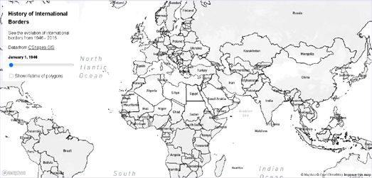
The World's Shifting Borders


The History of International Borders is a fascinating map showing how country borders around the world have changed since the end of the Second World War. The map allows you to select dates between 1946 and 2016 to view the international borders during that time. Change the date and the map will automatically update to show the country borders as they existed during that period of time.

If you select the 'Show lifetime of polygons' option this will highlight those countries on the map whose borders have changed since World War II. The countries shown in green had stable borders during that period, while the countries colored pink have borders which have changed.

If you are interested in geo-politics then you might want to pay attention to the borders in Eastern Europe after 1990 - during and after the final years of the Union of Soviet Socialist Republics. You might also be interested in the many changing borders in Africa post-1960, as many African countries began to achieve independence from European colonial powers.

One major problem with the map is that the country labels don't change with the changing borders. So for example what is now the Democratic Republic of Congo should be labelled Zaire on the map between 1971 & 1997, and Czechia and Slovakia should more accurately have the one label, Czechoslovakia, before 1993.

Tuesday, September 15, 2020

The Building Height Histogram Map


I've seen lots of interactive maps which visualize building height data by color. These interactive maps color individual building footprints to represent the height of every displayed building. The result is usually a very colorful map which helps to show where the tallest (or shortest) buildings are concentrated within a city.

What these maps don't do is provide you with any data on the number of buildings of different heights within an area. Which is where the Rendering OSM Objects in Mapbox GL interactive map comes in. This map includes a dynamic histogram which tells you how many buildings of each height there are within the current map view.


Drag the map around and the histogram will automatically update to show you the number of buildings of different heights in the map view. A small inset map also provides a 3D view of all the buildings which provides a neat overview of where the buildings of different heights are actually situated.

There are many reasons why you might want to show the number of buildings by height in a defined area. For example, many residents in my neighborhood are currently fighting a planning application for the development of a tall block of apartments. This map could be used to show the current number of local buildings of different building heights. It could help to highlight how a taller building would look very out of place in this neighborhood. 

How Big Are the U.S. Wildfires?


This year the wildfires burning across the western United States have consumed more than 7,000 square miles. This is an area equivalent to the size of New Jersey. In order to help people understand the huge scale of some of the current active wildfires burning in California and Oregon NBC news has created an interactive map comparison tool.

See how the wildfires across the Western U.S. compare to where you live allows you to overlay the perimeters of a number of active wildfires on your own town or city. The map therefore allows you to compare the size of the selected fire with a geographical area that you are more familiar with. Not only does the map show the perimeter of the selected fire on top of your selected town it also informs you how many times bigger the fire is than the size of your town.


As a European a tweet by Blaine Cook helped provide me with some context for the huge size of the near surface smoke caused by these wildfires. Blaine has used the outlines of a number of European countries to roughly show the area of the wildfire smoke covering the western United States yesterday.

I'm not certain which map comparison tool Blaine used to create his image. It looks to me like it might be The True Size Of ... - which allows you to drag polygon shapes of different countries and overlay them on top of a map to make direct comparisons of size between different countries.

Where is the West End?


Most Londoners have a very clear concept of where North and South London are. The River Thames neatly divides the city in two and most people seem to accept that everything north of the river is North London and everywhere south of the river is South London.

However I don't believe that Londoners have such a clear understanding of where the West End and the East End begin & end. I want to find out which areas of London are most commonly thought of as the West End. I have therefore created an interactive map, called Where is the West End, in order to record people's ideas of the West End.

Please use Where is the West End to draw the area that you think of as London's West End on the map of London. Your area will then be saved to a database. Later this week I will create another map which will visualize all the different West End areas submitted to the map. The result will hopefully provide us with some understanding of which areas of London are most commonly considered the West End.

My map survey tool can be used to query people's concepts of any geographical area. If you want to create your own map survey tool just click on the fish icon on my map and select the 'Remix on Glitch' option. You can then clone my map and change it to survey any geographical area of your choice.

Monday, September 14, 2020

Paris in the Nineteenth Century


Vergue is a fantastic interactive map which features hundreds of amazing early vintage photographs taken around Paris. The map showcases in particular the work of the famous Nineteenth Century photographers Charles Marville and Gustave Le Gray.

You can explore the vintage photography of Nineteenth Century Paris on top of the 1840 Plan de Paris vintage map. On this map the location of all the historic photographs in the Vergue collection are shown as red map markers. Click on these map markers and you can view the selected vintage photograph in the map sidebar.

Each photograph on the map comes with detailed information, which includes the date of the photograph and the name of the photographer. Each photo is also accompanied by a detailed account (in French) of the location depicted in the selected picture. This means that the Vergue map not only allows you a glimpse into the Paris of the Nineteenth Century it also provides you with a neat history of how locations around the city have changed in the last 150 odd years.

If you are a fan of vintage photographs and the unrivaled view that they provide of our cities' histories then you might also like Picturing the Past - a round-up of 18 other vintage photo maps.

The Interactive Whodunnit Map


Crime City is a fun board game which is played on a hand-drawn city map. The demo of the game can also be played online as an interactive map.

At the heart of Crime City is a large hand-drawn city map. This map contains a number of crimes and the clues that you need to solve them. The online demo of the board game uses the Leaflet.js interactive mapping library to allow you to play the game on your computer, tablet or phone.

Your first task in Crime City is to find the crime scene (pictured above). Clicking on the crime scene reveals a clue. You then need to solve that clue by searching for another secret location on the city map. Solving that clue with the help of the map will reveal the next clue - and so on - until you hopefully eventually solve the crime.

Turning large images into map tiles so that the image can be viewed using an interactive mapping library isn't new. If you are interested in creating your own interactive image map, like the one in Crime City, then you need to create map tiles from your image. Probably the easiest way to do this is by using Zoomify.

Bjørn Sandvik has written a neat Leaflet plugin (code available on GitHub) which can help you create a Leaflet map from a photo using Zoomify. Showing Zoomify Images with Leaflet is a blog post that explains how to use the plug-in to create your Leaflet.js interactive map from a Zoomified image.

Using Bjørn's Leaflet plugin all you need to do to create an interactive image map is Zoomify your photograph and provide the url to the Zoomify image folder. The result is a Leaflet map of your photograph which you can pan and zoom like any other map. Of course once you have created your image map you can then add other interactivity as well. For example you can add map markers or bounding boxes to the mapped image.

You can view a number of other examples of Leaflet maps made from large static images on the Maps Mania post Microscopic Mapping.

Sunday, September 13, 2020

Ranking the Countries of the World


The average American has a life expectancy roughly equivalent to someone living in Albania. This is surprising because the GDP per capita in the USA is $54,541 compared to a per capita GDP of $5,075 in Albania. The average American is clearly a lot richer than the average Albanian but all this wealth doesn't buy a longer life. The conclusion must be that there is something very wrong with the American health system.

You can view life expectancy and average per capita GDP around the globe on Rank Country, a new interactive map which allows you to compare countries across the world based on a huge range of different demographic, economic, health and social metrics. Rank Country provides country rankings for thousands of different data indicators. Using Rank Country you can compare countries around the world based on lots of different factors.

The thousands of different metrics that you can explore with Rank Country are organized into different categories. You can also use the search facility to find areas of interest. For example if you are interested in gender differences you could enter 'female' to explore all the economic, social and political metrics related to women and girls.

Saturday, September 12, 2020

The Black Lives Matter Map


The killing of George Floyd by the police in Minneapolis on May 25th sent in motion a huge protest movement which has spread across the United States and to other countries around the world. The Black Lives Matter movement has led to people taking to the streets in huge numbers to protest against police brutality and racially motivated violence against black people.

Mapping The Black Lives Matter Movement is attempting to map and document the thousands of daily protests and demonstrations which have taken place around the world in support of the Black Lives Matter movement. The map shows the location of protests, contested statues and Black Lives Matter artworks. If you click on a marker on the map you can click through to read a report on the demonstration from a trusted news source.


The Southern Poverty Law Center has mapped over 1,500 public symbols of the Confederacy across the United States. These public symbols include not just statues and other memorials but schools, parks and roads which have been named for Confederate leaders or battles.

In Whose Heritage? Public Symbols of the Confederacy the SPLC has created an interactive map showing the location of Confederate symbols and memorials. The map uses color coded markers to show which are monuments, which are schools and which are roads. If you select a marker on the map you can also see the year that this selected memorial to the Confederacy was dedicated.

One of the arguments against removing these public memorials to the Confederacy is that they are historical monuments. However the vast majority of these memorials aren't even 100 years old. The SPLC has compiled a timeline of when these memorials to the Confederacy were dedicated. This timeline shows that there have been two main periods which have seen spikes in the number of Confederacy memorials being dedicated. The first was in the first two decades of the Twentieth Century. The second was in the 1950's and 1960's.

Friday, September 11, 2020

The World Social Progress Rankings


Since 2011 the Social Progress Index has been assessing the quality of life experienced by people in countries around the world. Of the 163 countries which are ranked each year only in the United States, Brazil and Hungary are people now worse off than they were in 2011.

The Social Progress Index uses a number of different economic and social indicators to rank the quality of life in different countries around the world. Each country is scored and ranked for how well it meets the basic human needs of its citizens, ensures their well-being and provides social and economic opportunities.

The 2020 Social Progress Index has now been released. The new rankings for each country can be explored on the Index's interactive map. Click on a country on this map and you can view its overall Index ranking and the country's individual rankings in each of 12 individual metrics.

The United States performs particularly poorly in the area of Health & Wellness (which is probably not a surprise to anyone who has been watching the news over the last few months).Within the four areas which make up this metric the USA is ranked 97th of the 163 countries for 'Access to quality healthcare'. In other words people in the United States have access to roughly the same quality of healthcare as people living in Afghanistan.