Skip to main content
Search
Search This Blog
Maps Mania
Posts
Showing posts from May, 2023
Show all
May 31, 2023
The World's Population in 3D
May 30, 2023
The World's Most Impressive Mountain
May 29, 2023
Stack Overflown
May 27, 2023
Bat Virus Jump Zones
May 26, 2023
MapLibre Adds WebGL2 Support
May 25, 2023
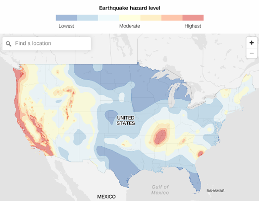
Discover Your Earthquake Risk
May 24, 2023
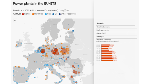
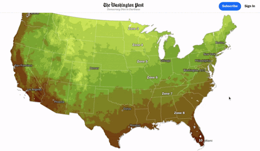
Germany - the Dirty Man of Europe
May 23, 2023
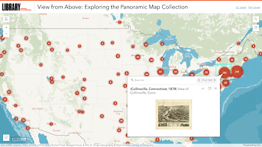
A Bird's Eye View of America
May 22, 2023
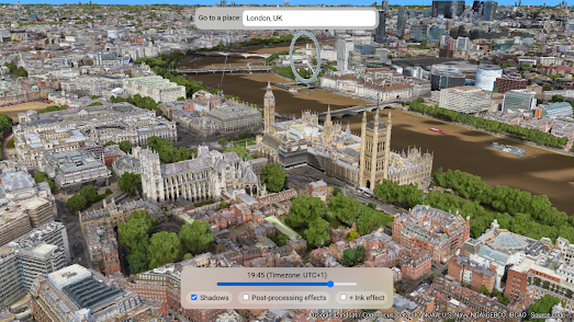
Explore the World with Shadows
May 21, 2023
Explore the World in 3D
May 19, 2023
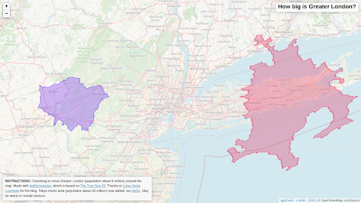
How big are London, New York & Tokyo?
May 18, 2023
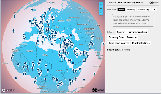
US Military Bases Around the World
May 17, 2023
Streets GL
May 16, 2023
AI Street View
May 15, 2023
The Map of GitHub
May 13, 2023
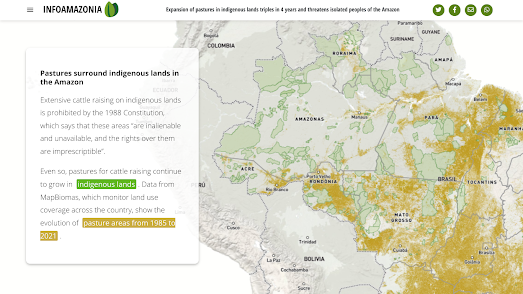
The Great Amazonian Indigenous Land Grab
May 12, 2023
The Folk Music of the World
May 11, 2023
Mapping Russian Military Facilities in Crimea
May 10, 2023
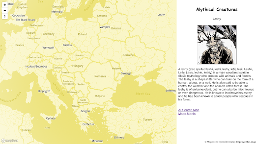
Mythical Creatures of the World
May 09, 2023
AI Map Search Finds Atlantis
May 07, 2023
Cinematic 3D Space Simulations
May 06, 2023
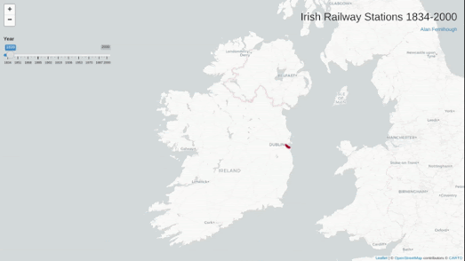
The Rise & Fall of the Irish Railway
May 05, 2023
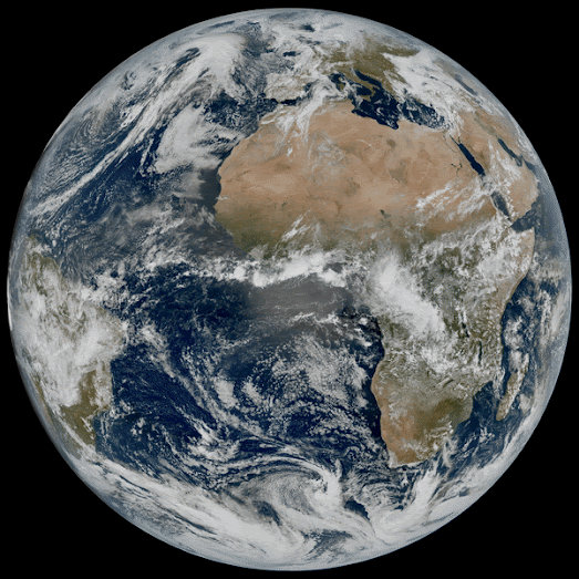
The First Images from EUMETSAT MTG-I1
May 04, 2023
Trees are Moving North
May 03, 2023
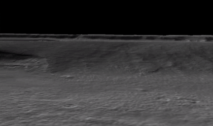
Exploring Mars in 3D
May 02, 2023
The Map of 52,000 Books
May 01, 2023
Where Students Travel to Study Abroad
Newer Posts
Older Posts
Home