Skip to main content
Search
Search This Blog
Maps Mania
Posts
Showing posts from October, 2022
Show all
October 31, 2022
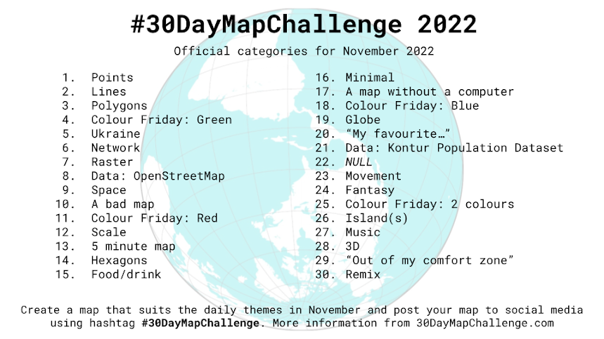
The 30DayMapChallenge is Back
October 31, 2022
Brazil Final Election Maps 2022
October 29, 2022
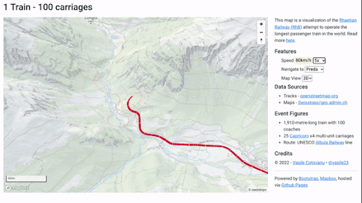
The Longest Train in the World
October 27, 2022
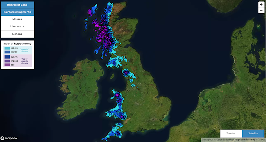
The Lost Rainforests of Britain
October 26, 2022
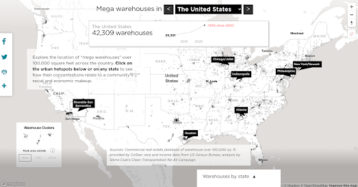
The Mega Mega Warehouse Map
October 25, 2022
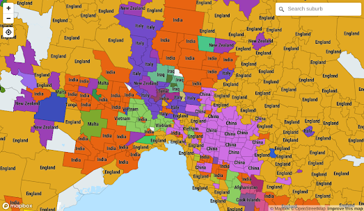
Mapping the Australian Census
October 24, 2022
The New Global Air Pollution Report
October 22, 2022
Mapping in Time & Space
October 21, 2022
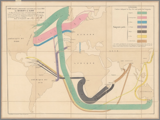
Minard's Map of Worldwide Migration
October 20, 2022
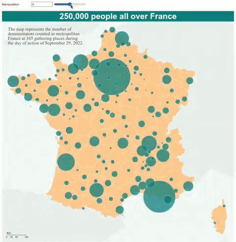
Climate Change & Global Conflict
October 19, 2022
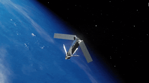
Space Junk 2.0
October 17, 2022
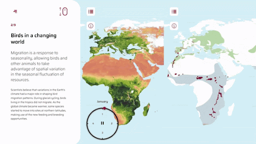
How Climate Change Affects Bird Migration
October 13, 2022
Mapping the Growth of a City in 3D
October 12, 2022
How to Lie With Maps
October 11, 2022
Declassified US Nuclear Targets
October 11, 2022
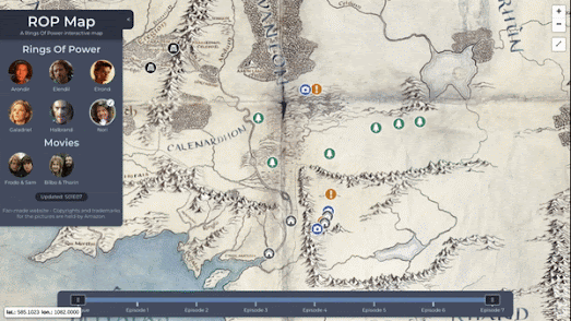
New Maps of Westeros & Middle-earth
October 10, 2022
The 2022 Austrian Election Maps
October 10, 2022
Italy's Election Map Street by Street
October 08, 2022
Watercolor World
October 07, 2022
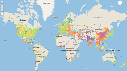
Maps Sans Frontieres
October 06, 2022
Parkulator
October 05, 2022
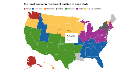
Why Trump Voters Eat at Wendy's
October 04, 2022
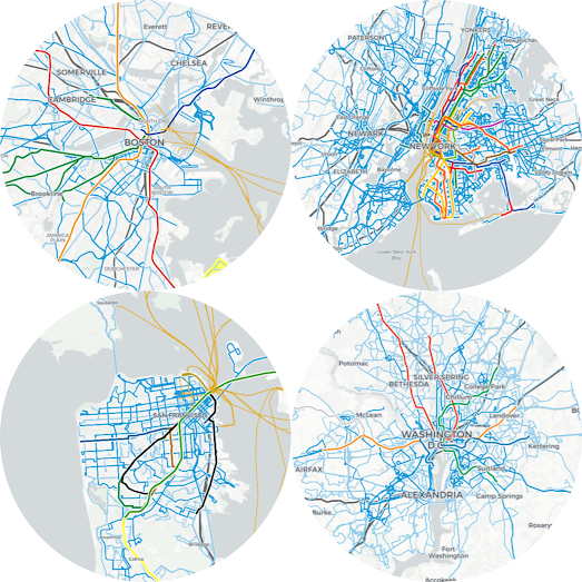
Mapping the World's Public Transport
October 03, 2022
Using CSS Filters for Custom Map Designs
Newer Posts
Older Posts
Home