Skip to main content
Search
Search This Blog
Maps Mania
Posts
Showing posts from August, 2019
Show all
August 31, 2019
California's Rental Calculator
August 30, 2019
The World's MegaCities
August 30, 2019
French Population Towers
August 28, 2019
Mapping the Paranormal, the Weird & the Wonderful
August 28, 2019
Mapping the Risk of Flooding
August 27, 2019
One Season in One Year
August 27, 2019
The Annual Fall Foliage Map
August 27, 2019
How Healthy are the Dutch?
August 26, 2019
The First San Francisco Building Age Map
August 26, 2019
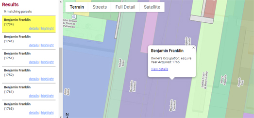
Mapping Early Philadelphia
August 26, 2019
Biographical Mapping
August 24, 2019
Mapping the Burning Rainforest
August 24, 2019
Between a Wall & the Syrian Army
August 23, 2019
Building America's Transcontinental Railway
August 23, 2019
Who is Still Smoking?
August 23, 2019
Iran and the Strait of Hormuz
August 22, 2019
How Far is a Mile?
August 21, 2019
Mapping America's Area Deprivation Index
August 21, 2019
Europe Stinks
August 21, 2019
Mapping the English Premier League
August 20, 2019
The Dot Map of American Education
August 20, 2019
Burning the Amazonian Rainforest
August 20, 2019
Greta Thunberg's Real-Time Map
August 19, 2019
1% of the World Lives Here
August 19, 2019
The Proper Pronunciation of Placenames
August 19, 2019
A Game of Hungarian Thrones
August 17, 2019
The 3D Building Age Map
August 16, 2019
Coral Bleaching of the Great Barrier Reef
August 16, 2019
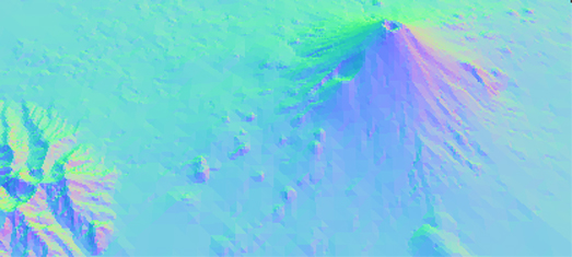
3D Terrain Mapping
August 15, 2019
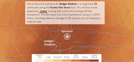
Mapping Earthquake Scenarios
August 15, 2019
Berlin: The Divided City
August 14, 2019
Right Whale Spotting
August 14, 2019
John Snow's Cholera Map in 3D
Newer Posts
Older Posts
Home