Sunday, March 31, 2019

Snakes on a Map


Classic games have become Google's welcome resource for April Fools pranks on Google Maps. In previous years, on the 1st of April, we have had the joy of playing Pacman, Ms Pacman and Where's Waldo on Google Maps. This year you can play the classic arcade game Snake on Google Maps!

If you open the Google Maps application on your phone or tablet on April 1st and click on the map menu you should see a link that allows you to play a game of snake at different locations around the world. In the game you have to steer a bus (not a snake) around a city and collect passengers. You get one point for every passenger you pick up. The length of your bus also grows with each passenger that you collect. The object of the game is to collect as many passengers as you can and not to crash into yourself or drive off the edge of the screen.

You can choose to play Snake on top of the pixelated map of a number of different global cities. Each city comes with its own bus or, in the case of San Francisco, its very own streetcar.

Saturday, March 30, 2019

Urbano Monte's Planisphere As a Globe


In November 2017 the David Rumsey Map Collection at Stanford University obtained one of only two manuscript copies of Urbano Monte's Planisphere. This huge map is one of the earliest large complete maps of the world.

The original manuscript map is in the form of a 60 sheet atlas. Urbano Monte intended for the sheets to be joined together to create one very large 10 foot map. The David Rumsey Map Collection has achieved that goal by digitizing all 60 sheets and creating a digital interactive map of Urbano Monte's Planisphere.

Jeremy Ashkenas has used the David Rumsey Map Collection's version of Urbano Monte's 1587 map to create an interactive 3D WebGL globe of the Planisphere. Urbano Monti’s Planisphere (1587) allows you to view the map as an interactive globe.

Urbano Monte's original Planisphere uses a north polar azimuthal projection. This projection places the North Pole at the center of the map. Urbano Monte himself suggested that a central pivot be added to the center of the map so that users could rotate the map while exploring the atlas. Viewing the map as a 3D digital globe also seems to work.

Visionscarto has also used the map tiles from the David Rumsey interactive map to create a tool for viewing Urbano Monte's Planisphere using different map projections. Urbano Monte World Map Reprojections. includes 21 different map projections. It even includes everyone's favorite Mercator projection, which means you can make direct comparisons between Urbano Monte's Planisphere and Google Maps if you so wish.

Friday, March 29, 2019

Let's Make a Choropleth Map


After completing Glitch's Make a Web Map with Leaflet challenge the other day I decided I wanted a harder challenge. I therefore decided to see if I could make a choropleth map visualizing the incidence rate of measles in European countries.

The European Measles Choropleth Map is a very basic choropleth map which uses data from the Word Health Organization to show the 2018 incidence of measles per 1 million total population in European countries (there is no data for Germany).

If you want to see how the map was created and try to recreate the map yourself then you can try the Let's Make a Choropleth Map in Leaflet challenge on Glitch. In this challenge you have to load a GeoJSON file onto a Leaflet interactive map and color individual countries based on the country's rate of measles. The Interactive Choropleth Map tutorial on the Leaflet website is very useful if you need a little more help in making your choropleth map. 

Thursday, March 28, 2019

Washington's Earthquake Prone Buildings


More than 7,500 buildings in Washington are particularly vulnerable to collapse during an earthquake. You can view the location of all Washington's earthquake prone buildings using a new interactive map.

The Washington URM Dashboard shows the location of Washington state's earthquake vulnerable buildings. These are buildings which are constructed with unreinforced masonry. URM buildings are possibly prone to collapse during earthquakes because they aren't constructed with steel, which adds strength to brick and mortar walls. Buildings constructed with unreinforced masonry are particularly vulnerable to the side-to-side movement caused by earthquakes.

If you select a building's marker on the map you can view building details by then clicking on the 'Building Attributes' tab. This will reveal information about when the building was constructed, the construction materials used and other building elements.


In Portland the Oregonian has taken a different approach to mapping the city's earthquake vulnerable buildings. In 1974 Oregon enacted its first statewide building code. Nineteen years later, in 1993,  western Oregon adopted its first seismic standards. Franz Rad, a professor of civil & environmental engineering at Portland State University, argues that these dates provide a "broad-brush look at the vulnerability of buildings".

Earthquakes: How Vulnerable are Portland’s Buildings? uses Portland building age data to assess which buildings are most earthquake prone. Building footprints are colored on the map to show buildings constructed before 1974, those buildings constructed from 1974 - 1993 and buildings erected after 1993. You can therefore use the map to assess the ('broad-brush') vulnerability of any Portland building to earthquake damage.

Europe's Measles Outbreak


This Measles Incident Rate Globe shows the incident rates of measles in countries around the world. The globe uses scaled circular markers to visualize the number of measles cases in each country normalized by each country's population.

The data for the map comes from the World Health Organisation. The data records the 12 months rolling incidence of measles per 1 million total population and the data was released in 2019. You can download the data yourself on the WHO Measles and Rubella Surveillance Data page. The spreadsheet containing the data is entitled 'Reported measles and rubella cases and incidence rates by Member States'.

In the twelve month period of the WHO data Madagascar has by far the biggest problem with measles with a incident rate of 2386.35 per million residents. Ukraine had the second highest incident rate of 1439.02 and Georgia had the third highest rate of 809.09.

In 2018 Ukraine had a huge outbreak of measles. According to UNICEF the worst-hit area of the country was the western Lviv region, "where negative attitudes toward immunization, and previous shortages in vaccine supply, have resulted in low vaccination rates." As you can see on the amCharts globe the huge outbreak in Ukraine has a knock-on effect throughout Europe. You can see that neighboring countries also have a high incident rate of measles. In fact in Europe as a whole measles cases more than tripled, mostly as a consequence of the Ukraine outbreak.

The measles map is a demo of amCharts Rotating Globe with Circles data visualization library. amCharts is a JavaScript library which supports a large range of charts and geographical map types. You can find many more map demos in the amCharts demos section. The Rotating Globe with Circles demo includes links which allow you to open the measles globe in CodePen or jsFiddle.

Redesigning the London Underground Map


Over recent years the London Underground map has begun to look a little cluttered as new Transport for London (TfL) services such as the London Overground and the DLR have been added to the map. A consensus seems to be emerging that the official TfL London Underground Map is now too busy and complicated. Which is probably why in just the last month two different cartographers have released their own London Underground maps.

One of these cartographers is Kenneth Field, who has been inspired to design his own version of the London Underground Map. You can view an interactive version of Kenneth's map at London Underground Overground Map and view a static, printable version of the map at Make a Transit Map in ArcGIS Pro. The Make a Transit Map in ArcGIS article includes instructions on how the map was made and explores some of the reasons for the design choices made in creating the map.

One significant change in Kenneth's tube map is the depiction of the River Thames. In the official TfL map the Thames is represented schematically and it follows the same design principles used in mapping the individual transit lines, which are depicted using either straight horizontal & vertical lines or lines at 45° angles. On the London Underground Overground Map the Thames is depicted geographically rather than schematically.


The other recent redesign of the London Underground Map has opted to completely ignore the straight line rule imposed on many transit maps around the world by fans of Harry Beck's original London tube map. Luke Carvill's London Underground map contains lots of sweeping curves. In particluar a large oval overground line is used to draw the eye into the central London area of the map. Zones 1 and 2, which Luke says are the zones "mostly relied on by tourists", is therefore clearly framed on the map by the oval overground line.

Wednesday, March 27, 2019

The Map of Baseball Fandom


The Atlanta Braves are supported in more areas of the country than any other Major League Baseball team. According to SeatGeek they are the favorite MLB team in 515 different counties and dominate the map across nearly the whole of the Southeastern United States.

SeatGeek has created an interactive map which shows the most popular Major League Baseball team in every U.S. county. To create their map SeatGeek looked at which seats were being bought for which teams in every county in the country. The resulting Where Do MLB Fans Live map shows the most supported baseball teams across the whole of the United States.


The New York Times has also mapped where the fans of America's baseball teams live. The NYT however used data from Facebook to determine which baseball teams are the most supported in each country. Using the location data of Facebook users, who have declared support for a baseball team in their profiles, the New York Times created this Map of the Baseball Nation.

Zoom in on the map and you can select counties on the map to view the top three teams (and the percentage of fans for each) supported in the clicked county. You can also search the map by zip-code or address to find out who are the most supported baseball teams in your county.


This isn't the first map of sports fandom that SeatGeek has created. Back in August of last year the NFL Shoppers on SeatGeek interactive map revealed the most popular NFL team in every U.S. county. Popularity for an NFL team is determined on this map by the number of customers for game tickets on the SeatGeek ticketing website for every NFL football team.

How to Make a Map with Leaflet


Make a Web Map with Leaflet is a Glitch challenge which shows you how to make a Leaflet.js powered interactive map. Glitch is a platform for creating, editing and hosting web applications. More importantly for new map makers it provides a neat way to clone and play with the code behind a basic interactive Leaflet map.

If you are an absolute beginner to creating JavaScript powered interactive maps then you might want to take a quick look at the Quick Start Guide on the Leaflet website. This guide introduces you to the concept of linking to the external Leaflet style sheet and Leaflet JavaScript files which you need to create an interactive map with Leaflet.js. The guide also shows you how to create the division element which you need to place the map within your html and then how to add map tiles to your map.

Once you are comfortable with the basics of Leaflet then you can move on to Make a Web Map with Leaflet. One of the main concepts of Glitch is that you start creating something by remixing a project that already works. The Make a Web Map with Leaflet challenge provides you with the code of a working Leaflet interactive map showing neighborhood boundaries in Portland, Oregon. You can edit this code and see the changes you make on the interactive map in real-time.

The challenges associated with Make a Web Map with Leaflet ask you to style the map pop-ups, change the GeoJSON file to a different location and add a legend to the map. You could also try changing the base map tiles used in this map (this Leaflet Provider Demo might help with that task).

Tuesday, March 26, 2019

The SB-50 Impact Map


In an attempt to address California's housing supply crisis Senator Scott Wiener has introduced a bill which is designed to encourage the building of apartment buildings in areas with good transit, at the expense of single family homes. If passed the bill will prevent cities and towns from stopping the construction of apartment buildings in certain areas.

Of course not all single family home owners are happy at the prospect of new tall apartment buildings being constructed in their neighborhoods. If you want to know if your California neighborhood could be affected by SB-50 then you can refer to a new interactive map which attempts to map out the areas of California where new apartment buildings will be welcomed.

The creators of the Will SB 50 Wipe Out Your Neighborhood? are definitely opposed to State Senator Scott Wiener's SB-50 bill. The site claims that "SB 50 is an unprecedented law that will destroy thousands of homes & apartments to build luxury housing up to 8 stories high". That opposition to the bill shouldn't make much difference to the map as long as it is accurate. However at the moment the final definition of the areas affected by SB-50 has yet to be decided. Will SB 50 Wipe Out Your Neighborhood? claims that in this "map, we roughly approximate the San Francisco Planning Department's approach".

On the interactive map three colors are used to show areas where 'Buildings up to 85' feet could be allowed, where 'Buildings up to 75' feet could be built and where 'Buildings up to 75 feet (in jobs rich/good school areas)' will be permitted. The creators of the map say themselves that the zones are 'purely projections' at this time and "will be updated once the California legislature decides on a definition". If you are worried about SB-50 it might be worth bookmarking this map and returning to it once this definition has actually been decided.

Hillshade Mapping in Real Time


Armand Emamdjomeh, Andy Woodruff and Sahil Chinoy have been inspiring each other to create hillshade maps in Observable. Each of the following Observable Notebooks contain maps which allow you to change the hillshade effect on a map in real-time by changing the azimuth and elevation of the hillshade light source.

Sahil's Hillshader allows you to adjust the azimuth and elevation of the lighting effect on a map of the Hawaiian island of Moloka’i. When you adjust these parameters the map hillshade updates live on the map. Hillshade includes a series of multiple small maps which show the effect that different azimuth and elevation settings have on the map of the island.

Armand Emamdjomeh's Mapbox Hillshade and Satellite Map Blending allows you to apply different hillshade styles to a satellite map in Mapbox. Armand's Notebook also allows you to adjust the azimuth and elevation of the light source but this time applies the hillshade in real-time to an interactive map rather than a static image.

Andy Woodruff's DIY Hillshade also applies a hillshade effect to an interactive map, only this time to a terrain map layer in a Leaflet powered map. As with the above examples you can adjust the azimuth and elevation of the sun to see the hillshade effect applied to the terrain map layer in real-time.

Animating Commuter Journeys


flowmap.blue is a great tool for creating interactive flow-maps. To create a flow-map with flowmap.blue you just need to save your date in a Google Spreadsheet. flowmap.blue will then automatically create a flow-map from your data.

Commuter Flows Between Swiss Municipalities 2014 is a great example of flowmap.blue in action. This interactive flow-map visualizes where commuters travel from home to work in Swiss towns and cities.The map uses different sized flow lines to show the number of people who commute into different municipalities from outlying areas.

You can hover over any location on the map to see the number of people who commute into the location every day and the number of outgoing commuters from the selected location. If you select the 'Animate flows' option on the map you can see these commuting flows animated on the map, with the animated flow lines showing the direction of commuting traffic in and out of the different municipalities.

Another example of commuting flows that was created with flowmap.blue is Commuters in the Netherlands. This map uses data from 2016 to show the commuting patterns of Dutch towns and cities. Commuters in the Netherlands includes the same option to see these commuting flows actually animated on the map.


Mark Evans has created animated maps of commuting flows in the USA and in the UK. Mark's hypnotic animated maps show workers traveling to and from towns and cities in both countries.

The Commute Map is an animated map showing where people commute from home to work in the United States. The maps don't show the actual journeys that commuters make but give a great sense of how town and city centers suck in commuters from surrounding suburbs. As the animations play out on the map you can see the movement of workers into the cities in the morning and the movement home again in the early evening.

Mark's Commute Map of England & Wales shows where people commute from home to work in the UK. With both the US and UK map you just need to use the two drop-down menus to first select a region and then an individual city or town.

Monday, March 25, 2019

The Story of The U.S. in 141 Maps


Manifest Destiny - The Story of the US Told in 141 Maps tells the story of the United States in 141 maps from the Declaration of Independence right up to the present day. Manifest Destiny uses small multiple maps to show how the territory of the United States has grown throughout its history

Click on any one of the small maps and you can view it as a larger map. On each map different colors are used to show the extent of U.S. territory at the time and the disputed & unclaimed territory. Each map reveals the changes which occurred due to a significant event in U.S. history. The first map in Manifest Destiny comes from March 4 1789. This is the date when the Constitution of the United States came into effect forming a new nation. The last map in the series is from August 21 1959. This is the date when Hawaii became the 50th state.


The belief in the Manifest Destiny of the United States was widely held in early America. It was a belief that the country's settlers were destined to expand across the whole of North America. You can see how this Manifest Destiny played out on another mapped visualization. The US Census Bureau has created an animated map which shows where the mean center of the population has been for each U.S. census from 1790 to 2010. The Mean Center of Population for the United States 1790 to 2010 shows how the mean center of population in the US has shifted westward in the last 220 years from Kent County, Maryland to Texas County, Missouri. 

How Boeing 737 Flights Came to an End


After the crash of Ethiopian Airlines Flight 302 and the death of 189 people, countries around the world began grounding Boeing 737's. In the days after the crash I saw a lot of links to real-time flight tracking websites, such as FlightRadar24, to show areas around the world where the Boeing 737 had been grounded and where flights of the plane were coming to a stop.

When the USA grounded the plane on March 13th the plane was effectively grounded worldwide. The New York Times has used data from FlightRadar24 to create an animated map which shows how the grounding of the Boeing 737 spread around the world after the crash of Flight 302 on March 10th right up until the FAA's suspension of flights on March 13th.

From 8,600 Flights to Zero: Grounding the Boeing 737 Max 8 shows flight paths used by Boeing 737's around the world. On the map the active flight paths are shown in blue and the flight paths where flights have been grounded are shown in orange. As the map animates through time from March 10th to March 13th you can see the grounded flights (shown in orange) spread across the world until flights come to an almost complete halt


Despite the suspension of commercial flights there have been some flights of Boeing 737 planes around the USA since March 13th. Airlines have flown Boeing 737s from one location to another location where they want the planes to be stored during the suspension. Boeing itself has continued to run test flights from its facility in Renton, Washington.

You can view an animated map of Boeing 737 flights over the United States on Bloomberg's animated map Where Boeing’s 737 Max Planes Go When They’re Grounded. This map shows Being 737 planes flying across America from March 12th through March 17th. On March 12th you can view an almost normal day of flights of Boeing 737 planes. On the 13th the flights almost grind to a halt after the FAA grounded the plane. On the following days you can view the few flights of Boeing 737 planes that took place as airlines moved planes around and Boeing continued running test flights.

Where is Your Surname From?


When people research their family trees they often don't consider searching for the geography of  surnames. Researching the current and historical distribution of your last name may provide some very useful clues as to the countries, regions and even individual towns where you should concentrate your search for genealogical records.

If you are from Italy or have an Italian surname you can search for the geographical spread of your last name using the Heatmap of Italian Surnames. Just enter your name and you can view a heatmap showing the distribution of that name in Italy based on data from Pagine Bianche.

In Germany you can use GeoGen to view a map showing the geographical distribution of German surnames. If you have Irish forebears then you can use the Geo Genealogy Map of Irish Surnames.

The Geo Genealogy Map of Irish Surnames uses data from the 1890 census to show which families were living where in Ireland at the end of the nineteenth century. The surname labels on the map represent the relative birth counts of names. The larger a surname label on the map then the more people with that name were living in the county in 1890. If you zoom in on a county then more surnames will appear on the map.

You can also search for the geographical distribution of a name by using the search box. Search for a name and the map will reveal the number of people with that name in each county at the end of the nineteenth century.


If your family is from the UK then you can use named to research the origins of your family. Enter a surname into named and you can view a heat-map showing where your surname is unusually common in the UK. The application is very easy to use. All you do is enter a surname and named shows you a heatmap showing you where there is an unusually high number of people with that name. For example, 'Clarke' is a fairly common surname across the whole of the UK but named shows that it is actually unusually common in the Midlands area of the UK.

Named also allows you to enter two surnames to generate a heatmap showing mutual locations with the most people with either of the two surnames. This is very useful if you know both surnames of two married ancestors. The generated heatmap shows the locations in the UK where those two surnames are most common.

You can use Forebears to undertake a global search for your family surname. If you enter a surname into Forebears it will tell you the meaning of your name and show you a map of the global distribution of your name. Beneath this generated map you can view a list showing the number of incidences of your surname recorded in each country around the world. It also shows the ratio of people with your surname in each country and the rank of your name in comparison to the incidence of all over surnames in each country.

Sunday, March 24, 2019

Map Breakout!


The classic Breakout arcade game, first released in 1976, is probably one of the most addictive computer games ever created. In fact all that was missing from the original Breakout game was a map. Which has now been rectified with the release of Map Breakout.

The purpose of the original Breakout game was to destroy rows of colored bricks by deflecting a ball with a player controlled paddle. In Map Breakout the rows of colored bricks have been replaced with a map of the world. Your objective in the game is to keep the ball in play using your paddle and knock out as many countries as you can.

Use the 'a' and 'd' keys on your keyboard to move the paddle left and right. I can't find a 'start' button so I've just been refreshing the page to start a new game.

Saturday, March 23, 2019

Global Flight Patterns


Flight paths over New York City

The real-time flight tracking application Plane Finder allows you to follow the real-time location of planes around the world on an interactive map. This month Plane Finder is celebrating its ten year anniversary and to mark the occasion Plane Finder has released a Global Coverage Map.

Plane Finder uses data from a network of ADS-B receivers around the world to map the flights of plane in real-time. The Global Coverage Map uses a week of this data (15th-21st March 2019) to reveal the flight paths taken by planes around the world. One week's worth of data has been merged together and compiled to make this single interactive map.

If you zoom-in on individual cities on the map you can clearly make out traffic into and out of major airports. For example, in the screenshot above of New York you can see John F. Kennedy International Airport, Newark Liberty International Airport and LaGuardia Airport. You can even make out the location of the Statue of Liberty as a small circle on the map. This circle is made from the circular flight paths made by helicopters as they take a sightseeing loop around the statue.


Flight paths over London

In London you can clearly see the two main flight paths taken by planes as they approach Heathrow's two different runways. West of Heathrow planes quickly fan out after take-off depending on their destinations. In the east you can see the single flight path taken by planes as they approach and leave London City Airport and its single runway.

If you don't like flying then you might prefer the World Map of Shipping Traffic. This interactive map reveals the world's major shipping lanes based on AIS shipping data.

Friday, March 22, 2019

The Latitude & Longitude of Population


About 88% of the world's population lives north of the equator. One reason for this is that there is more landmass north of the equator and more water south of the equator. However the north of the planet has only around 68% of the world's landmass. This means that nearly 90% of the world's population is squeezed into the 68% of the world's landmass north of the equator.

You can see where the world's population lives in terms of latitude and longitude on Engaging Data's World Population Distribution by Latitude and Longitude. This map shows the distribution of the world's population as a population grid. The map also includes two buttons which allow you to reorganize the population data. One button redistributes the world's population into a graph showing the population distribution by longitude. The other button organizes the population data into a graph showing the world's population distributed by latitude.


You can also see the distribution of the world's population by longitude and latitude on Andre Andersen's World Population Map. This population density map includes two graphs views which show the distribution of the world's population by latitude and longitude.

Both these maps reveal that a huge percentage of the world's population not only lives north of the equator but also lives in a narrow vertical band east of Delhi and west of China's east coast. That is between longitude 72 E and longitude 123 E. Or in other words a huge percentage of the world's population lives in India and China.

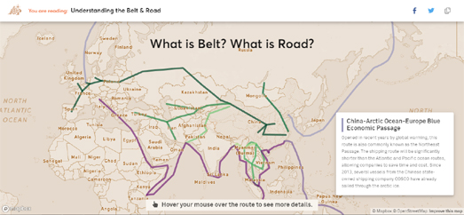
Understanding China's Belt & Road Project


China has spent more than 25 billion dollars on its Belt and Road Initiative (BRI). The initiative is designed to create the infrastructure to secure China’s trade routes and energy supplies. It is also being used to increase China's influence in the rest of the world. Kontinentalist has published a great introduction to China's Belt and Road Initiative in the form of an interactive story map.

Understanding the Belt and Road both visualizes the physical infrastructure being built by China and explores the reasons why China is investing so much money in creating these transport links with the rest of the world. The interactive map first displays the six economic corridors that China are developing to connect the super power with Europe, Central Asia, Russia, and the Middle East. Each of these corridors can be selected on the map to learn more about each of the six individual routes. As you progress through the story the interactive map updates to explore the economic reasons behind the Belt and Road Project. To help visualize the economic reasoning behind the project the map is updated to show the population of China's major cities and regional GDP from 2012-2016.

Understanding the Belt and Road includes a number of other data visualizations which look more closely at how China is funding the initiative. In particular Understanding the Belt and Road examines the Asian Infrastructure Investment Bank, which China is developing to counteract the power of the Bretton Woods institutions of the World Bank, the International Monetary Fund, and the Asian Development Bank.

Understanding the Belt and Road also explores the diplomatic partnerships that China is developing with other countries. The interactive map is used to highlight on the map the '16+1 Initiative', China's partnership with 16 Central and Eastern European countries. It also shows how in Asia the 'Lancang-Mekong Cooperation', is building a partnership with all the Mekong countries. The map also explores the partnerships China is developing in the Middle-East and in Africa.

Finally Understanding the Belt and Road looks at some of the issues that China is facing in building such a huge initiative. These problems include territorial disputes where other countries might not be entirely supportive of China building economic corridors on disputed territory. It also explains some of the debt-trap diplomacy that China has used to impose its Belt and Road Initiative on countries which are heavily in debt to China.


You can learn more about the BRI on the Mercator Institute for China Studies' Belt and Road Tracker, an interactive map which shows some of the many BRI projects spanning Asia, the Middle East, Europe and Africa. These projects include huge transport and oil & gas pipeline networks. The map sidebar allows you to show or hide different types of infrastructure project on the map. These include the railroads, ports and gas & oil pipelines which China has already constructed as part of its BRI. It also allows you to view railroads, ports and gas & oil pipelines which China plans to construct in the near future.

In One Belt, One Road the Financial Times also explores some of the construction projects being created by China to transport people and goods around the world. In The five main projects of the Belt and Road Initiative the South China Morning Post explores five huge Chinese infrastructure projects. These include a rail route from China to London, Gwadar Port, a rail route to Iran, the Asian gas pipeline and the Khorgas Gateway.

Britain's Most Expensive Wrong Turn


The UK is obsessed at the moment with the concept of expensive wrong turns. Which is why insurance company Quotezone has released a thinly veiled attack on Brexit in the form of an interactive map.

The Worst Places in the UK to Take a Wrong Turn purports to be an interactive map visualizing the worst 18 places in Britain to take a wrong turn or miss a junction on a motorway. The map shows the locations of each of these 18 most expensive wrong turns on the motorway network. For each of the 18 turns it also shows the total number of detour miles motorists will end up driving, the time needed to rectify the mistake and how much money the driver will have to pay for the extra fuel use caused by their mistake.

The worst place to take a wrong turn in the UK is on London's orbital motorway, the M25. If a driver misses the southbound exit on the M26 and accidentally ends up on the M25 then they will have to travel for another 18 miles to correct their course, adding 31 minutes onto their journey at a cost of £3.44.

Of course we all know that The Worst Places in the UK to Take a Wrong Turn is a clever metaphorical attack on the Brexit referendum. That wrong turn will cost a little more than £3.44.

Thursday, March 21, 2019

Can We Save the World's Forests?


The Bonn Challenge is asking governments and people around the world to help restore 150 million hectares of forest by 2020 and 350 million hectares by 2030. To help with this effort the World Resources Institute has released an interactive map designed to show where in the world degraded forest lands actually have the potential to be successfully restored.

The Atlas of Forest Landscape Restoration includes a number of different map layers which allow you to see the current levels of forest coverage around the world, the condition of those forests, the human pressure on forest landscapes and where in the world forests have the potential to be restored. The map also includes a layer which allows you to see Bonn Challenge pledges made across the globe. This layer adds a number of markers to the interactive map showing where governments and organisations have pledged to restore degraded forests. You can click on these markers to learn more about the individual projects in different countries around the world.


The World Resources Institute is also one of over 40 global partners who maintain the Global Forest Watch interactive map. Global Forest Watch is an organization dedicated to monitoring and detecting deforestation around the world. Since the year 2000 the world has lost more than 500 million acres of forest. The Global Forest Watch map visualizes current global forest coverage and where forests are being lost.

Global Forest Watch is attempting to establish a global forest monitoring network. The Global Forest Watch interactive map is part of an initiative to provide the tools for anyone to explore forest loss and forest gain across the globe. The map includes a number of layers, including forest cover and loss since 2000, worldwide tree height data, tropical forest carbon stocks and data about global forest use. The map also includes links to forest-related stories. The links to these  stories are embedded on the map at specific locations and the stories include photos, video, and explanatory text.

Revoke Article 50


Since last night over 1 million people in the UK have signed an online petition to "Revoke Article 50 and remain in the EU". Article 50 of the Lisbon Treaty sets out how a European Union country might voluntarily leave the union. The number of people who have now signed the Revoke Article 50 petition forces the UK government to consider a parliamentary debate on revoking Article 50 and staying in the EU.

The UK government and parliament website includes an option to view where in the UK people have signed the petition. This interactive Petition Map allows you to view parliamentary constituencies colored by the number of signatories of the petition and by the percentage of constituents who have signed the petition.

You can also view a hex map of the results on ODI Leeds' Hex Map of UK Parliament Petitions website. This map shows each UK constituency as a hexagon. The map colors each constituency's hexagon based on the number of signatories. You can also view each constituency colored by the percentage of the constituents who have signed the petition. While both maps allow you to view the percentage of voters who have signed the petition so far, the hex map obviously has the advantage of not exaggerating the visual influence of the larger rural constituencies.

The Geography of European Drug Taking


Amsterdam is the European capital of ecstasy users. According to an analysis of European wastewater treatment plants more MDMA is consumed in Amsterdam than in any other European city.

The European Monitoring Centre for Drugs and Drug Addiction (EMCDDA) has estimated the levels of consumption of different recreational drugs in major European cities. The Centre uses a process of back-calculation to estimate the consumption of drugs based on the trace amounts entering wastewater treatment plants. You can browse the results of the EMCDDA's analysis on an interactive map of European City Drug Use.

The map shows the estimated levels of drug use for over 70 European cities. The map allows you to view the estimated consumption of cocaine, amphetamine, methamphetamine and MDMA. The scaled markers on the map represent the estimated consumption levels of the drug selected. The map includes a number of filtering tools which allow you to view the estimated levels of consumption for different years and for different days of the week.

Cocaine use is highest in western and southern cities in Europe. Cocaine is not used so much in eastern Europe. Amphetamine use is very low in southern Europe. Amphetamines are used much more in cities in northern and eastern Europe. Methamphetamine use has historically been low in Europe, except for Czechia and Slovakia. It now seems to be becoming more popular in parts of east Germany.

Wednesday, March 20, 2019

Mapping the World's 7,111 Living Languages


There are 7,111 languages still being spoken around the world. However at least a third of those languages are in danger of dying out. Ethnologue's Living Languages interactive map shows where all 7,111 living languages, as of 2018, are spoken around the world.

The language markers on the map are colored by region (with locations assigned to primary countries). Nearly two thirds of the world's languages are from Asia and Africa. These two continents have the densest concentration of different languages. However the vast majority of the world speak a European or Asian language. 18.5% of the world's languages are Pacific languages. However on average only about 1,000 people speak each of those languages, therefore only a very small percentage of the world's population speak one of those Pacific languages.

Papua New Guinea is the country with the most different languages. There are 840 different living languages in Papua New Guinea. Indonesia comes next with 710 languages. Nigeria is third with 524 languages.


You can learn more about many of the languages on the Living Languages map using the Langscape Map, a map which provides information on around 6,000 languages spoken around the world. You can click anywhere on the Langscape Map to view which languages are spoken at that location.

As well as helping you discover which languages are spoken where, the map includes information about demographics, language families and audio recordings & text materials. After clicking on a location on the map you can select any of the listed languages to view information about it beneath the map.

Moving From Coal to Gas & Renewable Energy


The United States is undergoing a major shift in how it generates electricity. Over recent years there has been a large shift away from coal and towards gas, wind, and solar. Electricity Transition has released a great story map which illustrates this movement from coal powered electricity to other forms of energy.

Electricity Transition uses a series of animated heat-maps to show the rise of solar and wind energy over recent years. These animated heat-maps are very effective in showing the increasing use of solar and wind energy and also the areas where both methods of electricity generation are being most used.

After viewing the animated tours of electricity generation you can explore the map and data for yourself. A drop-down menu allows you to select to view different sources of energy, including coal, gas, solar, wind, nuclear and hydro. Once you select an energy source you can use the map timeline to view the levels of electricity production from that source over time. If you zoom in on the map you can view the locations of individual power plants. The dot markers that appear when you zoom in are scaled to show the levels of electricity generated. The size of these markers will change as you change the year to reflect the different levels of power generation at plants over the passage of time.

You can also explore America's power supply on the U.S. Power Plants map. U.S. Power Plants is an interactive map showing the locations, size and type of America's electric power plants. The map is a great way to see where different types of power plant are located, how much each type of energy source contributes to the country's power supply and how much each source contributes to America's CO2 emissions.

Mapping the Midwest Floods


The American Midwest is currently suffering from record levels of flooding. Heavy rains and snow melt following last week's bomb cyclone has led to unprecedented flooding in areas of Nebraska, South Dakota, Wisconsin, Iowa and Minnesota.

The New York Times has used river gauge data from the United States Geological Survey to visualize river heights along the Missouri and Mississippi Rivers over the last six days. The map animates through Wednesday 13th through to Monday 18th showing the record river height levels over these six days. The NYT's Rising Waters map is an effective visualization of how quickly the height of rivers in the Midwest rose over the last week. However it doesn't actually reveal the extent of flooding in the area.


Vox has used satellite imagery to illustrate the scale of the flooding in the Midwest. In What the historic Midwest floods look like from space Vox compares two satellite images of Nebraska side-by-side. One of the images was taken in March 2018. The other was captured on March 16th this year. This side-by-side comparison clearly shows the extent of flooding along the Missouri, Platte and Elkhorn rivers around the city of Omaha.


The Washington Post has released both a map of stream gauges and before & after satellite images to illustrate the effect of the cyclone bomb on the Midwest. The Post's Satellite Images Show the Devastating Floods in the Midwest uses a static map to show all the stream gauges with levels above flood stage on March 19th. The Post has also published an animated GIF which compares two satellite images of the Missouri River. The images are from May of last year and from March 15th this year. Comparing the two images in this way reveals the extent of the swollen tributaries of the Mississippi River. The Post's article is illustrated with a number of other before and after satellite images of flooded locations in the Midwest.

USA Today has also published a series of satellite images revealing the extent of flooding in the Midwest.

Tuesday, March 19, 2019

Mapping the Ganges & Its Pollution


Reuters reports that the Indian government has pledged to spend nearly $3 billion on cleaning up the Ganges. The Ganges is of huge religious and cultural importance to millions of Indians. Millions of Indians also depend on the river everyday to supply their water needs. Unfortunately the river is also hugely polluted by industrial waste and plastics (some of this comes from religious offerings wrapped in non-biodegradable plastic).

In The Race to Save the River Ganges Reuters claims that the Indian government has not spent most of the money that it has promised to cleaning the Ganges. In fact untreated sewage is still being dumped in the river in huge quantities. The Reuters report includes an animated map which traces the course of the river Ganges from the pristine waters at its source in the foothills of the Himalayas to its entry into Bangladesh. This map also shows the extent of the Ganges' tributaries across Tibet, Nepal and Bangladesh. A population density overlay on the map shows how the river basin is a vital source of water for over 400 million people. A polluted Ganges is a very big problem to millions of people.

Under the story map in the Reuter's report is a fabulous flow map of the river Ganges. As you scroll through this flow map of the river you can see where sewage-drains, factories and other rivers pour pollution into the river as it moves downstream. There is an element of Minard's famous visualization of Napoleon's March on Moscow to this flow map. As you move down river on the strip map the size of the river grows to show the accumulated levels of wastewater discharged into the Ganges as the river flows across India. The daily amount of wastewater entering the river every day is 6.07 billion litres.

Who Will Win the Global City Race?


Animated bar chart races have suddenly become a very popular method for visualizing data over time. Their recent popularity owes much to John Murdoch's 18 Years of Interbrand’s Top Global Brands.

This animated bar chart race shows the brand value of the top global brands from the years 2000-2018. As the animation plays out each brand's bar on the chart grows or shrinks to reflect the brand's value. The bars also re-sort themselves automatically to show the most valuable brand at the top and the least valuable brand at the bottom. If a brand falls out of the top twelve most valuable brands then it falls off the bar graph. This method of visualization is very effective in showing the sudden rise or sudden fall in the value of a brand in comparison to the world's other large brands and the performance of these brands over time.

John Murdoch has now released another impressive animated bar race. This one shows The Most Populous Cities in the World from 1500 to 2018. This bar chart race is an incredibly interesting visualization of the world's most populated cities. There is something hypnotically fascinating watching different cities move up and down the chart over time as their populations rise and fall in comparison to other cities around the world. The bar chart is accompanied by a map which shows the location of the currently displayed most populated cities. Each city's bar on the chart is also colored by global region. The colors on the chart and the map help to reveal any regional patterns in the relative rise and fall of city populations.

As fantastic as John's visualization is I hope that there is more to come. I'd love a date control so that I could manually navigate to view the most populated cities in specific years. I'd also love some historical commentary with the visualization to provide some context or explanation as to why different cities rise or fall in the visualization. For example, when the visualization starts in 1500 Vijayanagar is the second most populous city in the world. It then suddenly drops off the chart in 1565. According to Wikipedia "In 1565 ... the city fell to a coalition of Muslim Sultanates. The conquered capital city of Vijayanagara was looted and destroyed, after which it remained in ruins.". An annotated version of The Most Populous Cities in the World would keep me happy for days.

As it is The Most Populous Cities in the World is totally awesome. What is even better is that it has been built and released as an Observable Notebook. That means anyone can fork, use and adapt the code. If you click on the 'dataset' line in the code you can see how the data for the visualization is formatted and click through to view the csv file where the data is held. This means that it would be a relatively trivial matter to adapt the visualization to work with your own data. Therefore you could create your own bar chart race, for example to show the most populated countries in the world over time or to show the most populated cities in your country over time. You could use economic data to show the GDP per capita of cities or countries over time. You could show the average life of death in cities or countries over time. In fact the bar chart race method is a great way to visualize lots of different types of data that has a time element.

Monday, March 18, 2019

The Deathscapes of China


The huge level of development in twenty-first century China has been bad news for the dead. The high premium on land in the country has resulted in a kind of graveyard gentrification, where those who had thought they had reached their final resting place have had their graves forcibly relocated to other locations. In fact around ten million graves have been exhumed and moved in just the last ten years.

Chinese Deathscape: Grave Reform in Modern China by Thomas S. Mullaney, Professor of Chinese History at Stanford University, explores the reasons behind this modern policy of grave relocation and burial reform in China. The essay examines the incentives and punishments imposed by the central government to encourage regions to meet their grave relocation quotas. It also looks at how these grave relocations have been reported by the media and have been perceived by the Chinese people.

Accompanying the essay is an interactive map of the locations around China where graves have been exhumed. The size of the markers on the map reflects the number of graves relocated at each location. The annotated locations in the text are particularly impressive. If you click on an underlined passage in the essay then the map will center on the mentioned location. In addition a line is drawn from the text to its actual location on the interactive map. If you select locations on the map you can view details on the date of the relocation and the numbers of graves exhumed.

Who Owns NYC?


Lots of buildings in New York City are owned by shell companies, which are used by landlords to maintain anonymity in order to hide themselves from tenants and avoid repercussions. That is why JustFix.nyc has launched Who Owns What in NYC?, a service which reveals the buildings owned by individual landlords and by management companies.

If you enter a New York address into Who Own What in NYC? you can view an interactive map which shows all the other buildings in the city which your landlord might own. Select any of the highlighted buildings on the map and you can view the name of the registered owner and their business address. You can also view details about the building, including the name of the site manager, the year the building was constructed and the number of violations and evictions associated with the building.

The map also includes a button to connect with JustFix.nyc if you are having issues with an individual building. Pressing this button will allow JustFix.nyc to send a certified letter of complaint to the landlord about your issues with the property.


If you are having problems with a New York landlord you might also be interested in some of the data visualizations released by the Acting Public Advocate of the New York City Council concerning New York's residential evictions. One of these, Evictions: NYC residents are affected by evictions every day, allows you to explore New York's eviction rates by year, zip code, or district.

There were over 19,000 people evicted in New York City in 2018. If you select individual markers on the interactive eviction map you can view the eviction property's address and the date that the eviction notice was executed. The Bronx has the highest rate of evictions in New York City. Brooklyn has the second highest rate, closely followed by Queens in third place.

A second Building History interactive map allows you to explore 2018 evictions by building type, year of construction and by rent stabilized properties. The map menu on this interactive map also allows you to view the buildings with the most evictions in 2018. 16 Richman Plaza was the individual property with the most evictions last year. This property, owned by River Park Residences, had 60 evictions.

If you enter the address "16 Richman Plaza" into Who Owns What in NYC? you can view a map of all 84 buildings owned by this landlord in New York. Eugene Schneur appears to be the landlord associate with all 84 of these buildings. Interestingly Eugene Schneur isn't even in the top 100 worst landlords in New York, based on the 2018 NYC Landlord Watchlist from the Public Advocate for the City of New York.

The Rising Temperatures of Europe


Since 1960 every European city has become hotter. Lisa Charlotte Rost has used historical temperature data from Berkeley Earth to visualize how much the average temperature has risen or fallen in every European city since 1960. The interactive map in Which European cities have gotten warmer? (Spoiler: All of them) uses colored markers to show the average temperature difference in European cities. If you hover over a city's marker you can view the name of the city and the number of degrees centigrade that the average temperature has risen in the city since 1960.

There appears to be some geographical differences in the extent to which average temperatures have risen in Europe. North-eastern Europe has seen the highest rises in average temperatures. The three European cities which have seen the highest rises (Orsha, Minsk & Gomel) are all in Belarus. Chernihiv in neighboring Ukraine has witnessed the next highest rise in average temperatures. The lowest average temperature rises are all in south-east Europe. Six cities, all in Greece, have the lowest average rises on the map. Cities in neighboring countries such as Cyprus, Bulgaria and Macedonia also appear to have warmed by a smaller degree than Europe as a whole.

The average temperature rise in Patrai, Greece since 1960 is 1.59 degrees centigrade. This is the smallest rise recorded on the map. The highest average temperature rise was in Orsha, Belarus. The rise recorded there was 3.33 degree centigrade.

Sunday, March 17, 2019

John Ogilby's Cartography


Earlier this week Layers of London, a website dedicated to visualizing London's history, added a new vintage map layer to their interactive maps. The new layer allows you to explore Layers of London's historical events on top of John Ogilby and William Morgan's 1676 map of London.

Ogilby and Morgan's map was created after the Great Fire of London in 1666. The map was originally intended to assist in the planning out of land in the City after the fire. It is believed to be the first map to show every building in London in plan (rather than through an oblique bird's eye pictorial view).

The screenshot above shows the plan of the new St. Paul's Cathedral. The old cathedral had been destroyed in the Great Fire of London. Work on the new cathedral had begun in the 1670's (when this map was surveyed) but was not completed until 1711. Ogilby & Morgan's map therefore presumably uses Sir Christopher Wren's own plans to show where the completed cathedral would soon stand.

You can view another online interactive application of Ogilby and Morgan's map on the British History Online website.


Ogilby & Morgan's map of London was published one month after Ogilby's death in 1676. As a cartographer Ogilby is probably better known for his Britannia Atlas. This atlas of roads in England & Wales is presented in a series of scrolls. Each scroll includes just one journey, shown as a strip map, from one British town to another. The Britannia Atlas includes 85 routes and provides a guide to navigating over 7,500 miles of road. The Britannia was therefore Britain's first proper road atlas. In the 1670's the finished atlas cost £5 to buy, or the equivalent of around £700 in today's money.

Late in his life Ogilby was appointed 'Cosmographer and Geographic Printer' to Charles II. However cartography was only a small part of Ogilby's life. During his relatively long life he had also been a dance teacher, a tailor a translator of Virgil, a publisher, and the founder of the first theatre in Dublin. He made a lot of money from his translations of Virgil but, if John Dryden is to be believed, Ogilby was probably a better cartographer than he was a translator. Dryden claimed that Ogilby's work was only good enough to be used for toilet paper or wrapping pies ('martyrs of pies, and relics of the bum'). I assume Dryden was unimpressed with Ogilby's translations of Latin. I can't believe Dryden would wipe his arse with Ogilby and Morgan's superb map of London.

Saturday, March 16, 2019

Europe's Busiest Shipping Routes Revealed


Ships around the world are fitted with AIS transponders which automatically report the position, course, and speed, of individual vessels. The Automatic Identification System can be used by websites like MarineTraffic to show the live real-time position of ships across the globe. The accumulated data from AIS transponders can also be used to reveal interesting patterns in ship traffic, such as the location and density of popular shipping lanes.

European Marine Traffic has used the accumulated data of ship traffic in 2017 to visualize the density of European marine traffic. The map reveals the areas of Europe's seas which see the most ship traffic and the shipping lanes which are most used by ships when transporting cargo in Europe. For example the English Channel stands out on the map as an area with extremely dense marine traffic. The English Channel is in fact the world's busiest seaway, with over 500 ships passing through the channel every day.

Other areas that stand out on the map for their heavy marine traffic are the Strait of Gibraltar and the Skagerrak strait. The Strait of Gibraltar is heavily used by marine traffic entering and exiting the Mediterranean Sea while the Skagerrek is the gateway from the North Sea to the Baltic Sea. The Skagerrek strait is uses by around 7,500 vessels every year.


The AIS data for marine traffic also includes information on vessel type. It is therefore possible to create shipping density maps for different types of vessel. Alasdair Rae has done this for the marine traffic around the UK. In Watching the Ships go By Alasdair has created maps which show the most popular shipping routes used by cargo ships, passenger ships, shipping boats and other types of vessels around the UK.

If you want to view the density of Shipping traffic in the rest of the world it is possible to do this using MarineTraffic. The live ship tracking map MarineTraffic includes an option to view a density map of the world's shipping traffic. If you select the 'Density Maps' overlay on MarineTraffic you can view an overlay which shows the accumulated recorded data of all vessels on MarineTraffic over recent years.