Skip to main content
Search
Search This Blog
Maps Mania
Posts
Showing posts from August, 2023
Show all
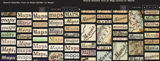
August 31, 2023
Text Recognition Map Search
August 30, 2023
Mapping Hurricane Idalia
August 29, 2023
NIMBY Mapping
August 28, 2023
Terraforming the Metaverse
August 26, 2023
How the Blitz Changed London
August 25, 2023
Finding Shade from the City Heat
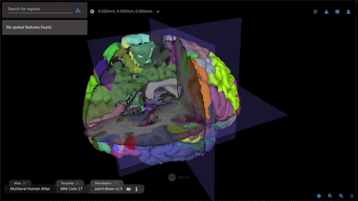
August 24, 2023
A New Google Map of the Brain
August 23, 2023
Using AI to Geolocate Photos
August 22, 2023
Unlocking America’s Visual Time Machine
August 21, 2023
Mapping Water Scarcity
August 19, 2023
The AI Diplomacy Map
August 18, 2023
GeoClash
August 17, 2023
Cinematic Mapping
August 16, 2023
US Air Force WWII Photos
August 15, 2023
The Meteor Shower Map
August 14, 2023
Neighborhood Colors
August 12, 2023
Competing in the Tour de France
August 11, 2023
Mapping the Amazon Underworld
August 10, 2023
City Guesser
August 09, 2023
Mapping 3D Game Worlds
August 08, 2023
Global Burning
August 07, 2023
30 Second Data Viz with OSM GPT
August 07, 2023
OSM GPT
August 06, 2023
Swimming in Sewage
Newer Posts
Older Posts
Home