Skip to main content
Search
Search This Blog
Maps Mania
Posts
Showing posts from March, 2023
Show all
March 31, 2023
Going Postal
March 30, 2023
Can AI Models Make Maps?
March 29, 2023
The Mass Shooting Database
March 28, 2023
The Real-Time Wind Power Map
March 27, 2023
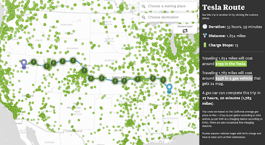
The Electric Vehicle Driving Test
March 25, 2023
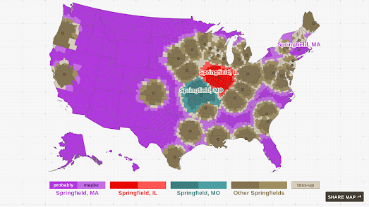
Toponym Homonyms
March 24, 2023
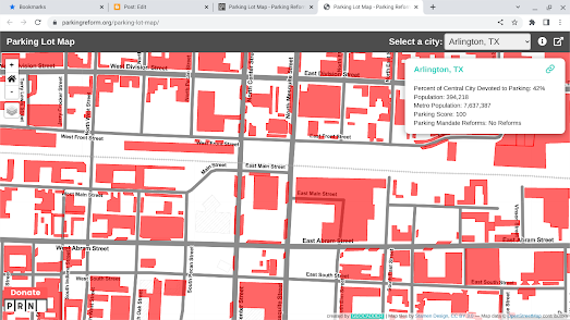
Is Your Town a Parking Lot?
March 23, 2023
Locals vs Tourists 2023
March 22, 2023
Spying on a Chinese Spy Balloon
March 21, 2023
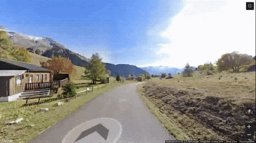
Animated Street View Routes
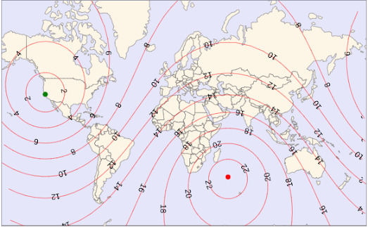
March 20, 2023
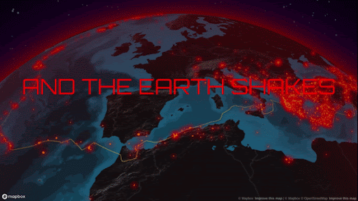
The Earth Shakes
March 18, 2023
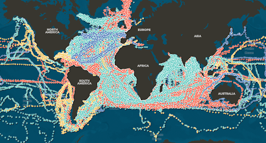
The Climatological Map of the World's Oceans
March 17, 2023
What do you call an American with a Brain?
March 16, 2023
The Civic Freedom Index
March 15, 2023
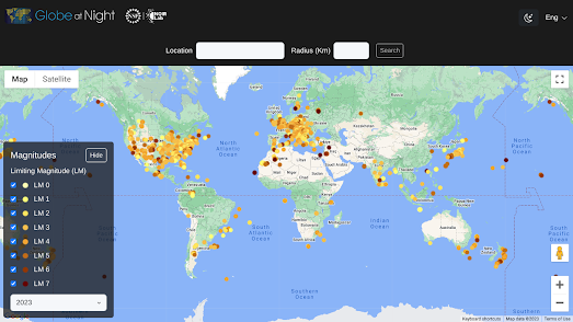
The Sky at Night
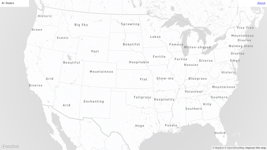
March 14, 2023
AI States
March 14, 2023
The Global Flight Time Map
March 13, 2023
The 2023 Submarine Cable Globe
March 11, 2023
The City of Women Subway Map
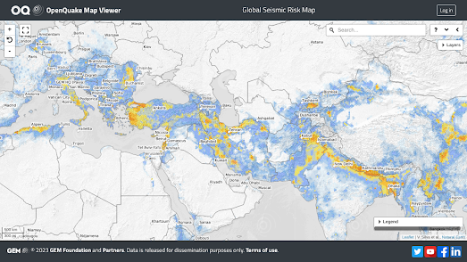
March 10, 2023
Earthquakes - Global Risk & Hazard Maps
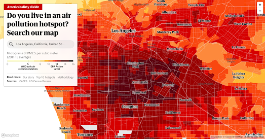
March 09, 2023
The Worst Air Pollution in America
March 08, 2023
Stockholm is Twice as Sexist as Havana
March 07, 2023
The Map of Home Heating
March 06, 2023
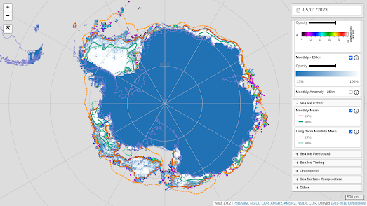
Sea Ice in Antarctica
March 04, 2023
Racial Dot Density Maps
March 03, 2023
Rising Sea Stripes
March 02, 2023
The Witch Trials of Europe
March 01, 2023
The Undeniable Truth on Street View
Newer Posts
Older Posts
Home