Wednesday, August 31, 2022

The Animated Map of the Berlin Subway

Ubähnchen is a fantastic new transit map which simulates the movement of trains on the Berlin subway network based on the scheduled timetable.

There have been a number of very impressive 3D animated transit maps released in the last few years. These include Moving Hamburg, an impressive 3D animated public transport map of Hamburg and Mini Tokyo 3D, the live real-time map of Tokyo's public transit system.

The Hamburg and Tokyo 3D maps are fantastic toys for anybody who's ever dreamed of owning a virtual train set. However my inner Fat Controller loves the transit map style used by Ubähnchen. Ubähnchen also comes with an option to switch to a more geographically accurate map. This map also allows you to view S-Bahn trains in real-time.

Trainspotters may also be interested in the Ubähnchen Statistics section, which includes lots of data from the Berlin subway network, including the avarage daily train activity per line and the number of daily stops at each station on the network.

Tuesday, August 30, 2022

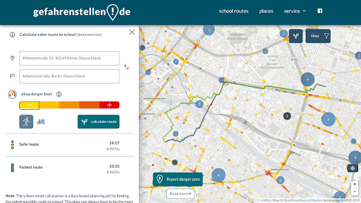
Mapping the Safest Route to School

With the school year about to start many parents are beginning to worry about the dangers their children face traveling to and from school. For many the biggest potential danger is the one posed by cars and other road traffic.

If you live in Germany you can now use a new routing service to help discover the safest route to school. Gefahrenstellen.de is an interactive map which can help you find the route to school with the least traffic and risk. Enter your home address and the address of your school into Gefahrenstellen.de and it will calculate and suggest the fastest and safest route for the journey.

In calculating the safest routes the map takes into consideration a number of different factors. These include traffic volumes and police accident data. Calculated safe routes also take into account the locations of user submitted reports on dangerous hot-spots. By clicking on the 'Gefahrenstelle melden' button users of the map can report a possible dangerous location, which may be related to bad road conditions or misconduct by car drivers or other road users.

Via: Heidelberg Institute for Geoinformation Technology

Monday, August 29, 2022

Where Should You Live?

MoveMap is an interactive map which can help you decide the best place to live based on your own preferences and tastes. Tell Movemap what kind of weather you prefer, what kind of environment you would prefer to live in and the amount you wish to spend on a property and Movemap will show you the best places to live in the United States which match your preferences. 

MoveMap uses property price data from Zillow, average weather data from NOAA, and data from the American Community Survey to determine which counties you should move to. The easiest way to discover the best place to live is to take the MoveMap Quiz. The quiz asks you to select options from a number of statements about your preferred climate and environment and then shows you where you should live based on your replies. You can get a more nuanced response by also using the filter controls in the map sidebar to refine your preferences.

After you have told MoveMap your requirements it highlights the best counties which match your preferences on an interactive map. The counties are color-coded based on the average home price. If you select any of the suggested counties you can click-through to learn more about the cost of property in the county and the biggest cities and towns. You can also learn more about the climate, the state tax burden, the median age, and the risks from earthquakes, hurricanes and tornadoes.


Before deciding to move to a county suggested by MoveMap you might want to consider how much it costs to live there. HowMuch's True cost of living in the United States interactive map can tell you how much it costs to live in American neighborhoods based on your own personal needs. Using the map you can discover where you can (and cannot) afford to live in America's major towns and cities.

Enter a city into HowMuch's cost of living interactive and you can view a map visualizing how much it costs to live in each of the city's neighborhoods. Your personal cost of living will obviously depend on factors such as the size of your family, your income, occupation, and even your food preferences. The cost of living map therefore includes a number of filters which allows you to customize the neighborhood cost-of-living ratings to match your own circumstances.

After you have entered your income (and other cost-of-living factors) the map will color neighborhoods based on whether you can afford to live there or not. The areas colored red on the map are neighborhoods where you would have to increase your income in order to be able to afford to live. You can hover over individual neighborhoods on the map to view exactly how much more you would have to earn to be able to afford to live there or (if you are lucky) how much money you will have left living in the neighborhood after your costs of living have been deducted.

Saturday, August 27, 2022

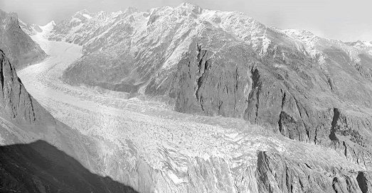
Swiss Glaciers Have Shrunk by 50%

View of the Fieschergletscher in 1928 and 2021 (Photo: swisstopo and VAW / ETH Zurich)

New research by the Swiss Federal Institute for Forest, Snow and Landscape Research (WSL) and the ETH Zurich University has discovered that the volume of glaciers in Switzerland shrunk by 50% between 1931 and 2016.

The Swiss research, presented in A historical perspective on glacial retreat, used photogrammetry to analyse over 21,000 photographs of glaciers taken between 1916 and 1947. They used these historical photographs to measure the surface volume of Swiss glaciers at different points in time. From this analysis they have calculated that there has been a drastic reduction in glacier volume in Switzerland over the last 90 years.
The Gorner Glacier in 1930 and 2022. (Photo: swisstopo und VAW / ETH Zurich)

The study also discovered that not all glaciers are shrinking at the same rate. The level to which glaciers have retreated depends on three main factors, the altitude of the glacier, the slope of the glacier snout, and the amount of debris on the glacier.

You can explore more visualizations showing the extent of glacial retreat around the world in the post Melting Glaciers

Friday, August 26, 2022

Persepolis in 3D

500 years before the birth of Christ the city of Persepolis served as the capital of the largest empire in the world. Today what is left of the city is mostly architectural ruins. It is therefore now hard to imagine the magnificence and splendor of what was once one of the most awe-inspiring cities on Earth.

Luckily you now don't have to imagine what Persoplis used to look like because the Getty Museum can show you exactly how the ancient city looked at the height of its power (c500 BC). Persepolis Reimagined is an amazing 3D reconstruction of the ancient Persian city. Enter into Persepolis Reimagined and you are taken on an impressive guided tour of a digital 3D reconstruction of the Gate of All Nations, the Apadana audience hall, the Palace of Xerxes, the Southeastern Palace, the Royal Treasury, and the Hall of 100 Colums.

As you scroll through this amazing guided 3D tour of Persepolis, interactive markers and hotspots allow you to learn more about the functions and purpose of individual buildings and even see how some of these important landmarks look today. 

Hot-Tip: Click on the 'settings' icon and turn on 'dragging interactions'. This allows you to directly interact with the 3D model of Persepolis, giving you the full 360 degree experience. 

Thursday, August 25, 2022

How Far Can You Commute in One Hour?

If you have ever wondered how far you can commute using public transport then you will love the commutometer interactive map. Just click on your home on the commutometer interactive map and it will show you how far you can travel in 5 minute intervals by subway, train, bus, tram or ferry.

Drag the green marker to your home address on commutometer and you can view an isochrone map visualizing how far you can travel on public transport in incremental journey times. Obviously how far you can travel by public transport in one hour can depend on the time when you wish to travel. Commutometer accounts for changes in the public transport timetable by allowing you to enter the day and time of when you want to travel.

As well as providing an overall isochrone layer commutometer also allows you to query the journey times for individual destinations. After the isochrone layer has loaded you can click on any address within the isochrone layer to view the exact journey time from your defined origin. 

Commutometer doesn't work everywhere in the world. If you zoom out the areas where the map doesn't work are shown using an opaque mask. These areas are also labeled 'no data' to show that the map can't access public transportation data at these locations.   

You can explore more journey travel time maps using the Maps Mania isochrone label. This includes the very popular How Far Can You Go By Train in 5h?, an interactive map which shows you how far you can travel from any European rail station in less than five hours.

Wednesday, August 24, 2022

Mapping the Extreme Heat Belt

Last Monday the First Street Foundation released data from its analysis of how current and future extreme heat events will impact American neighborhoods. Enter your zip-code into the First Street Foundation website and you can view the risk that your home faces over the next thirty years from extreme heat (and also the risk to your home from wildfire and flooding). The First Street Foundation hyperlocal extreme heat data has also been used by the Washinton Post and Axios to map the growing dangers of extreme heat across the United States.

Axios has used the extreme heat data to map an Extreme Heat Belt that they say will soon emerge in the USA. The Axios map shows the counties in America where the heat index could reach 125°F at least one day a year by 2053. According to Axios an 'extreme heat belt' will exist in 30 years time, stretching from Texas to Illinois, where people can expect at least once a year to experience deadly temperatures.

Currently only 8 million Americans are exposed to extreme heat days each year. Thanks to global heating by 2053 that number is expected to rise to 107 million. If you hover over a county on the Axios map you can find out if that county currently experiences extreme heat days and whether it will in 30 years time.

The Washington Post has also used the First Foundation data to map out the number of dangerous heat days that you can expect where you live by 2053. If you think that this summer was too hot then I've got some bad news for you. Thanks to global heating it is going to get much hotter. According to the Washington Post map by 2053 "two-thirds of Americans will experience perilous heat waves, with some regions in the South expected to endure more than 70 consecutive days over 100 degrees."

In More dangerous heat waves are on the way: See the impact by Zip code you can find out how many days of dangerous heat you can expect each year where you live in thirty years time. Just enter your zip-code into the Post's map to discover how many days of dangerous heat you currently experience on average every year and how many days you can expect in 2053. The Washington Post defines 'dangerous heat' as temperatures over 100 degrees.

Tuesday, August 23, 2022

The Terrifying Sound of Sea Monsters

Olaus Magnus's Carta Marina is the first derailed map of the Nordic countries to include place-name labels. The map also includes a number of fantastical sea creatures. Olaus Magnus described most of the sea monsters depicted on his map at length in his book 'A Description of the Northern Peoples'. Unfortunately Magnus never made any audio recordings of these monsters. We can therefore only imagine what terrifying sounds were made by these monstrous creatures.

This is exactly what I have done with my Sounds of Sea Monsters interactive map. Click on any of the sea monsters depicted on this interactive version of the Carta Marina and you can listen to an (imagined) recording of the monster's terrifying screams, growls and roars. You can also read the 'real' description of the monster that Olaus Magnus provided in his encyclopedic volume 'A Description of the Northern Peoples'. My map also includes some other interesting information provided by Magnus on the customs and lives of these Northern Peoples. 

Sounds of Sea Monsters was created using the Leaflet mapping platform. The map also wouldn't be possible without two wonderful Leaflet plug-in libraries - leaflet-IIIF and leaflet-hash

Museums and art galleries around the world are increasingly using the iiif format to display vintage maps as zoomable images. The leaflet-iiif plugin allows you to use these iiif manifests with the Leaflet mapping platform. This means that you can create a Leaflet map from any image which has a iiif manifest.

In order to add interactive elements to a iiif image displayed in a Leaflet map it is necessary to apply a coordinate system to the map. Leaflet-hash adds a latitude and longitude to the URL of a Leaflet map. It can therefore be used to grab the coordinates of any location on the map. I used the leaflet-hash plug-in order to create the clickable polygon shapes on my Sounds of Sea Monsters map. 

Monday, August 22, 2022

How to Make Your Own Pretty Map Posters

I made the map poster above using a new map poster creation tool called prettymaps. prettymapp is a web app which you can use to create pretty map images for any location on Earth.

Prettymapp is an online interactive version of @marceloprates' pretty maps project. The original 'pretty maps' project is a Python library to draw customized maps from OpenStreetMap data. The new prettymapp app uses this library to create an actual online tool for making your very own pretty map images.

Prettymapp is very simple to use. Simply enter an address and press the 'submit' button and prettymapp will automatically create a map poster centered on your location (you can type in a latitude,longitue instead of an address to give a precise location). The tool includes a number of options for changing the design of your final map. These allow you to choose your own colors for individual map features, such as the color of water, grassland and roads. There are also options for customizing the size and placement of the title of your map. 


Hans Hacks' Figureground Posters is another fun tool for creating map posters from OpenStreetMap data. To create your poster simply click on the Figureground Posters interactive map to select the location that you wish to work with. You can then select a size for the area that you want to map. 

Figureground Posters creates circular maps so just choose the radius size that you wish to map (up to 2000 meters). When you are happy with your chosen location and radius size click 'Make Poster'. Figureground Posters will then create a simple map of your selected area using the building footprint data from OpenStreetMap.

Street Patterns is another great tool for making map posters. The tool also uses data from OpenStreetMap to create small circular images consisting of just the street data of your chosen location. Street Patterns doesn't only help you create your own map posters it also explains the whole process it uses in creating these Street Pattern maps. Therefore while using Street Patterns to create your own map poster you can also learn a little about how to use Overpass Turbo and Turf.js to download and use OSM map data.

Saturday, August 20, 2022

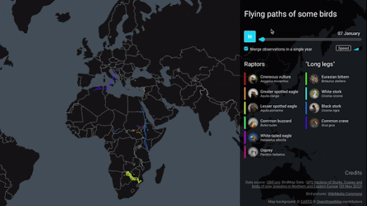
The Migatory Map of the White-Tailed Eagle

Benjamin Becquet has used data from the Global Biodiversity Information Facility to create a mesmerizing animated map visualizing the annual migration patterns of ten different bird species. His Bird Tracking Map uses time-stamped GPS data to reveal the annual migratory journeys of ten different species traveling between Africa and Europe. 

Press the play button on Benjamin's map and you can watch how these different bird species journey back and forth between northern Europe and southern Europe/Africa over the course of a single year. As the map animates through the year the Spring and Autumn migratory patterns of each species of bird becomes apparent on the map.  

The map can be filtered to show only the migratory journey of any single species of bird or any combination from the ten different species. The map also includes a speed button which controls the speed that the time-stamped GPS data is animated on the map. 

If you are interested in the migratory journeys of birds then you might also enjoy eBird's maps of individual bird species migrations. The eBird Status and Trends webpage allows you to view animated maps which show the migratory journeys undertaken every year by thousands of individual species of bird.

Friday, August 19, 2022

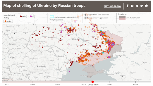
Ukraine Under Attack

The Map of the Russian Shelling of Ukraine is a new interactive map which shows where and when Russia has bombed the people of Ukraine. 

The map uses different colored markers to indicate the different types of shelling attacks (rocket, air or artillery). If you click on any of the markers you can view the date of the Russian attack and click-through to read any media reports about the selected shelling. The map includes a timeline feature which allows you to select to view attacks by date-range. You can adjust the end-date on this timeline to view the cumulative amount of shelling from the beginning of the Russian invasion until the selected date.

The Map of the Russian Shelling of Ukraine also features selected satellite images from Planet.com. If you zoom in on any of these satellite images you can see for yourself some of the damage caused by Russian missiles fired on Ukraine. At the moment the map is only available in Ukrainian. An option to view the map in English should be available from early next week. 

You can also explore evidence of Russia's war crimes in Ukraine on Bellingcat's Civilian Harm in Ukraine, an interactive map which locates and records evidence of Russia's attacks on civilians during its invasion of Ukraine. The Ukrainian Civilian Objects Attacks and Casualties Interactive Map is another attempt to track and map Russian attacks on civilian targets in Ukraine.The map consists predominantly of geo-tagged photographs of civilian buildings which have been damaged by Russian bombs. This map also includes a running total of the number of civilians who have been killed and injured by the Russians in Ukraine.

Wednesday, August 17, 2022

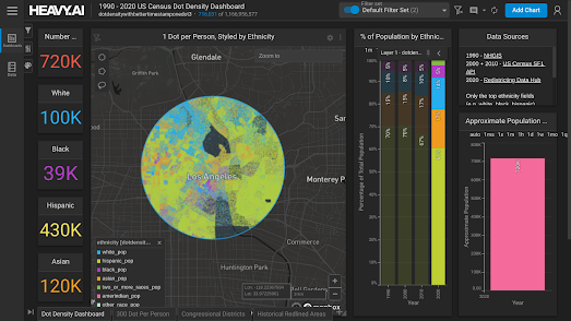
Explore Your Local Census Data

The 1990 - 2020 US Census Dot Density Dashboard is an impressive visualization of U.S. census data. Using HEAVY Immerse's interactive census dashboard you can not only explore a dot density map of the United States you can also actually drill down into the demographics of any defined area in the United States.

There are already a number of racial dot density maps which allow you to explore the racial and ethnic diversity of the American population. These maps include CNN's interactive map Race and Ethnicity Across the Nation, Esri's Race and Ethnicity in the US by Dot Density and Ben Schmidt's All of US

Where the new US Census Dot Density Dashboard improves on these earlier maps is in its searchability. Using the polygon, polyline or lasso drawing tools provided you can define your own area on the map to view a breakdown of the local racial and ethnic demographics. Draw an area on the map and you can view a racial dot density map for your selected area and a breakdown of the numbers of the White, Black, Hispanic and Asian populations living in that area. An interactive chart also provides you with the percentages of the different ethnic groups at the time of each of the last four censuses. 

Monday, August 15, 2022

Comparing Route Planning Providers

3 different routes returned by 3 different routing services between the same two addresses

SG Transportation Routing is a new route planning service which can provide you with driving directions in Singapore. This map can be used to get driving, cycling or walking directions between any two locations in the country. Unlike nearly every other route planning map, SG Transportation also allows you to choose between three different routing APIs. Therefore if you don't like the route and directions first provided by SG Transportation Routing you can simply switch to view a route from a different routing / directions provider.

SG Transportation Routing works like nearly every other driving directions application. If you enter a starting point and a destination the application will work out a route and provide you with turn-by-turn directions. The application even allows you to switch between three different transportation modes (driving, cycling & walking). 

Unlike most other route planning applications, however, SG Transportation Routing allows you to choose between three different routing services. These are the Gragphopper Directions API, OneMap and the HERE Routing API. If you look at the screenshot at the top of this post you can see that these three different routing services can provide very different routes between the same two addresses. 

Charmaine Chui, the developer of SG Transportation Routing, has written up a short introduction to his new interactive map on Towards Data Science, Data Visualisation of Travel Routes by Multiple Service Providers on Web App— Built with LeafletJS + NodeJS.

Saturday, August 13, 2022

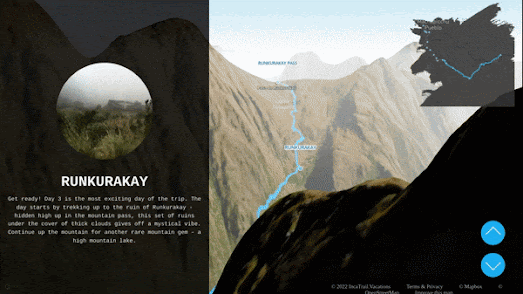
Hiking the Inca Trail to Machu Picchu

The 3D Inca Trail Tour is a guided tour of the four day trek from Piskacucho to Machu Picchu. This interactive tour of the incredible journey to the historic Incan citadel in the Andes makes impressive use of MapboxGL's 3d terrain data to provide a virtual taste of some of the world's most beautiful views.

As you scroll through the tour you will follow the actual ancient path taken by the Royal Incan leaders to get to Machu Picchu. The tour features a number of waypoints along the trail which include historic Incan ruins and the natural wonders of the Andes mountains. The tour also shows you the locations of the three camps along the route where visitors are able to grab a night's rest before continuing their trek.

You can discover more about how the 3D Inca Trail Tour was made at Learn How 3D Inca Tour Was Made with MapBox, GPS, and xyz... . This includes explanations of how turf.js was used to help create the small inset map and native JavaScript to control the scrolling elements of the tour.

If you want to create your own 3D tours with MapboxGL then you might also like Building Cinematic Route Animatios with MapboxGL. During this year's Tour de France and Le Tour Femmes the Mapbox Twitter account posted animated route maps every day of the current stage. 

The Mapbox blog's post on these cinematic route animations explains how they animated each stage's route, how they controlled the camera position for the fly-over animations and how the interactive map animation of each stage was finally exported to video.  

Friday, August 12, 2022

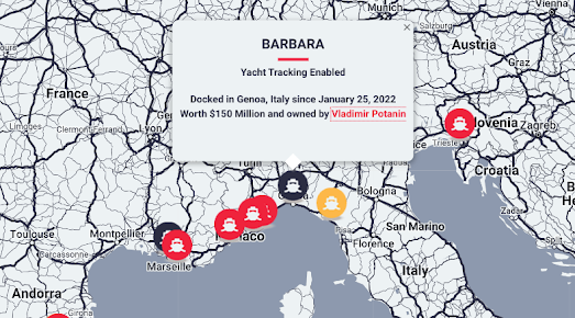
The Oligarch Yacht Map

In March I attempted to track the assets of Russian oligarchs with a little help for real-time aviation & marine tracking maps. Oligarch.info is now maintaining an interactive map which shows the latest known location of a number of super yachts owned by Russian oligarchs.

The Oligarch.info Yacht Map shows where oligarch yachts have been seized around the world. On the map all impounded yachts are shown in red. The last locations of yachts which have disabled GPS tracking are shown using yellow markers. The yachts shown in black have yet to be seized. The yachts shown on the map can be filtered by the name of an oligarch, by worth and by status. 

The Twitter account Russian Oligarch Jets is very useful if you want to track the location of oligarch owned planes. This automatic Twitter account regularly posts updates on the locations of jets owned by Russian oligarchs. It also Tweets out handy screenshots of all the registration numbers of the planes that the account is currently tracking.

Thursday, August 11, 2022

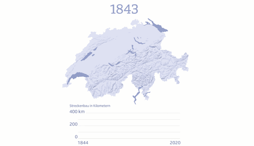
The History of the Swiss Railway

In August 1847 a railway line was opened connecting the Swiss cities of Baden and Zurich. 175 years later Switzerland's rail network is over 5,000 kilometers long. Swiss broadcaster SRF is celebrating 175 years of the country's railway network by taking you on a Journey Through the History of Swiss Railways.  

SRF's history of the Swiss railway includes a map which shows the opening of new railway lines by year of construction. This map is accompanied by a graph which shows the length (in km) of railway lines opened in each year. From the animation of this map above you can see that the golden era of the Swiss railway was in its first one hundred years. Since the 1920s further extensions to the railway in Switzerland have been fairly sporadic. 


You can view animated maps of other rail networks being constructed around the world on the amazing Citylines. Citylines is a collaborative platform which is busy mapping the public transit systems of the world. Using Citylines you can explore interactive maps visualizing the local transit systems of hundreds of cities around the globe. You can also use Citylines to explore how each city's public transport network has grown over time. 

My favorite feature of Citylines is the ability to view a city's transit network developing through time. Each city's transit system map includes a date control, which allows you to view the extent of the local transit network for any year in history. Press the play button on the map and you can view an animated map showing how the city's transit system has developed through history. 

All the data used on Citylines is open sourced under the Open Database License (ODbL). This means that if you want to create your own city public transit map then you can download the data for your map from Citylines (in json or CSV formats).


You can view a mapped visualization of the first 40 years of the London Underground network on my own History of the London Underground. My animated map shows the development of the tube network from 1863-1900. 

The London Underground began when the Metropolitan Line opened in 1863. This original line had seven stations and stretched between Paddington and Farringdon. By 1890 the network had grown to include a District Line and the beginnings of the Northern Line. 

You can watch the London Underground grow during its first 40 years on my History of the London Underground map. If you press the 'Start' button on the map the London Underground lines will start to appear on the map in the order in which they were constructed. The animated tube lines were created using the Leaflet.Polyline.SnakeAnim plugin for Leaflet.js. 

If you want to reuse the code from my map then you are welcome to do so. You can clone my project on Glitch.

Wednesday, August 10, 2022

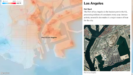
The Coolest Spots in the Hottest Cities

Last week Bloomberg explored the coolest spots inside the world's sweltering cities. Using thermal radiometer equipment aboard orbiting satellites NASA and ESA are able to explore ground temperatures at a street-by-street level. The detailed maps of these temperature recordings can then be used to discover which areas in towns and cities are urban heat islands and which areas provide cool relief during the hottest weather. 

Bloomberg has used satellite imagery from ESA to examine in detail the hottest and coolest neighborhoods in a number of global cities (London, Delhi, Fez, Los Angeles, Melbourne and Seville). 

Their analysis of these maps is at times unsurprising. Most people are probably already aware that parks and trees can provide relief from extreme temperatures. However the maps also reveal that we can learn from the past. For example in Fez, Morocco satellite imagery reveals that modern suburbs built along wide roads are much hotter neighborhoods than older neighborhoods in the city which were built with clay bricks and much narrower streets. 

In Seville architects are experimenting with an ancient Iranian technology - qanats. These are underwater aqueducts which are used to cool the buildings built above them. Los Angeles is experimenting with using reflective paint on rooftops to reflect sunlight back into space. While Melbourne has started to install permeable asphalt to help rainwater reach tree roots, which helps promote the healthy growth of trees and the shade provided by healthy tree canopies. 

One of the best ways to prevent urban heat islands is to provide more tree canopy cover - to create natural shade. Planting more trees in urban environments not only helps to reduce street-level temperatures, they can also contribute to a better quality of life and can make neighborhoods more attractive places to live.

Google's Tree Canopy Insights interactive map visualizes the level of tree canopy cover in a number of major U.S. cities. The map is designed to show the current tree canopy coverage in each city and to help identify where new tree planting efforts are most needed. The map allows you to see the level of tree canopy coverage in different neighborhoods in each city alongside demographic data, such as population density. Using the map it is therefore possible to quickly identify where the most people are likely to be living in urban heat islands and where new tree canopy cover is most needed.

Tuesday, August 09, 2022

A Summer of Drought

One consequence of the extreme temperatures being experienced in Europe this summer is that most of the continent is now under a drought warning and many areas are under a severe drought alert. The European Drought Observatory's Drought Indicator map shows that nearly all countries in Europe are currently experiencing drought conditions.

The extreme heat across Europe has already led to wildfires in countries such as Portugal, Spain, France, Greece and Morocco. Fires which have resulted in hundreds of deaths and the evacuation of thousands of people. Now the prolonged heat wave is leading to drought conditions which are likely to seriously impact crop yields across the continent.

The EDO's July 2022 Drought in Europe Report (PDF) claims that "water stress and heat stress ... are driving crop yields down from a previous already negative outlook for cereals and other crops. This reduced expectation affects in particular: France, Romania, Spain, Portugal, Italy and to some extent Germany, Poland, Hungary, Slovenia and Croatia."

The EDO Drought Indicator interactive map shows which parts of Europe are currently under a drought 'watch', 'warning' or 'alert'. The map also includes layers which allow you to view the continent's soil  moisture levels, monthly precipitation and daily temperatures.

While Europe suffers under extreme temperatures and a prolonged dry period South Korea has been experiencing the heaviest rain in decades. According to the BBC at least eight people have died in Seoul as a result of severe flooding. 

Monday, August 08, 2022

What does 'Home' Mean for You?

Which place in the world most feels like home mean to you? This is the question that people around the world are answering on the HomeStories interactive map. 

The concept of HomeStories is very simple. It simply asks people to describe where their home is and show it on a map. However as you browse the HomeStories interactive map it soon becomes apparent that the idea of 'home' is often a very emotional and personal concept tied inextricably to our own unique life experiences.  

HomeStories is inspired by Paul Salopek's Out of Eden expedition. Journalist Paul Salopek is currently on a 21,000-mile walk around the world. His Out of Eden walk is roughly tracing the footsteps of the very first human beings who migrated out of Africa in the stone-age to eventually populate the whole world. 

During his multiyear walk Paul is documenting his journey and reporting on the stories of the people he meets. You can learn more about Paul's huge trek, view a map of his route and read his account of the journey on National Geographic's Out of Eden. Out of Eden includes video, audio and text about the people and places Paul has encountered on the walk. It also features an interactive Journey map, which allows you to access all the stories and media from each stage of the Out of Eden expedition. 

The National Geographic has also published another interactive map of the Out of Eden journey. The Out of Eden: Milestone map provides a fascinating insight into the people that Paul encounters on his journey. Every hundred miles Paul stops the first person he meets and asks them three questions: 

 Who are you? 

Where do you come from? 

Where are you going?

You can now use the new HomeStories map to answer the question of where 'home' is to you. Initially the map was designed only for the citizens of Chicago but news of the map has spread around the world and people are now submitting their stories from all corners of the world. Adding your own HomeStory to the map is very easy. Just click on the “Add Your HomeStory” button. You can then upload a photo of the place that feels like home to you and explain why this is the place that most feels like home.

Saturday, August 06, 2022

Mapping the World's Languages

The Map of World Languages is an interactive map of 6,000 languages spoken around the world. The map includes 4,000 different living languages, around 2,000 historic languages and 6 constructed languages. 

On the map colored circles of different sizes are used to show the number of each language's speakers. The circle's colors indicate the different language families. For example all Arabic languages are shown using a yellow circle, with the larger circles indicating the Arabic languages with the most speakers.

If you click on any of the languages shown on the map you can access Language Player's resources for learning that language. These resources include conversation practices and videos in which you can actually listen to the language being spoken.

The Langscape Map is another interactive map which allows you to explore the thousands of languages spoken around the world. If you click anywhere on this map of the world you can discover more about some of the languages which are spoken at that location. 

The Langscape Map includes 6,400 of the world’s languages. After clicking on a location on the map you can select one of the listed languages to view more information about it beneath the map. As well as helping you discover which languages are spoken where, the map includes information about the demographics of each language's speakers and information about the different language families. The map also includes audio recordings & text materials related to many of the world's languages. 


There are around 7,151 languages still being spoken around the world. However at least a third of those languages are in danger of dying out. Ethnologue's Living Languages interactive map shows where all 7,151 living languages (as of 2022) are spoken around the world. 

The language markers on this map are colored by continent (with locations assigned to primary countries). Nearly two thirds of the world's languages are from Asia and Africa. These two continents have the densest concentration of different languages. However the vast majority of the world speak a European or Asian language. 18.5% of the world's languages are Pacific languages. However on average only about 1,000 people speak each of these Pacific languages, therefore only a very small percentage of the world's population speak any one of the individual Pacific languages.

Friday, August 05, 2022

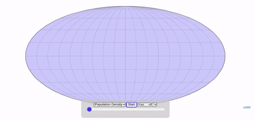
Assembling the World by Population Density

Engaging Data has released an interesting visualization which allows you to watch a map of the world being assembled, country by country, based on a number of different data variables.

The animated GIF at the top of this post shows countries being added to the map based on population density. The first country to appear on this map is Greenland, with a population density of 0.03 ppl/km2. The last country to appear on the map is Bangladesh, with a population density of 1,251.84 ppl/km2.

Assembling the World Country-by-Country includes a number of different data sets which you can view being turned into a map of the world. These include total population size, GDP and life expectancy. According to the data being used Sierra Leone has the lowest life expectancy (50.1 yrs), while Japan has the highest (83.7 yrs).

If you are interested in population density then you might also like Population Density Around the World, which links to a number of other interactive data visualizations showing exactly where it is that most people live on planet Earth.

Thursday, August 04, 2022

Real Time World Temperature Records

The pace of global heating in 2022 means that it is now possible to create a real-time map showing locations around the world where all-time temperature records are being broken. In just the last 24 hours two locations in the U.S. have experienced their highest ever recorded temperatures (Cotulla, TX & Escanaba, MI). 

It isn't only in America where heat records are now being broken on a daily basis. According to the Real Time World Temperature Records Map towns in Japan, Peru and Nicaragua have also seen their highest ever temperatures in the last 24 hours. The Real Time World Temperature Records Map is an interactive map which shows in real-time locations around the world which have just experienced their highest ever recorded temperature.

The map retrieves the latest temperature records from this Esri WeatherRecordsBreakers REST API. I don't know whether this is an official Esri data feed or an API which has been set up just for this map. I also cannot tell from the map or the API where the temperature data itself is being sourced from.


If you want to know how climate change is affecting your weather then you can refer to the Climate Shift Index map. Every day the Climate Shift Index reveals where in the United States temperatures have been affected by climate change. The map reveals just how much global warming could be affecting the weather on any given day. 

The colors on the Climate Shift Index map show where that day's temperatures are more or less likely due to climate change. The darkest areas on the map indicate those areas where climate change has had the greatest effect on the day's weather. For example, an area shaded dark red, with a CSI score of 5, is experiencing weather which climate change and global warming has made five times more likely. In other words the local temperatures being experienced in those locations would be nearly impossible without carbon pollution creating global heating. 

The Climate Shift Index is updated daily in order to show the local influence of climate change, every single day. The map provides a 3-day CSI forecast for US weather, which means you can view the CSI forecast for the current day and for the next two days. 

Wednesday, August 03, 2022

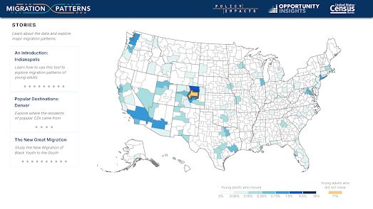
Where Young People Are Moving

Migration Patterns is a new interactive map from the U.S. Census Bureau and Harvard University which reveals the towns and cities where young Americans are moving to. The map allows you to click on any U.S. county to see where young adults "move between childhood (as measured by their location at age 16) and young adulthood (as measured by their location at age 26)."

If you select any county (or 'commuting zone') on the map you can view a choropleth map view showing the most popular destinations for young Americans moving from the selected county. For example if you select Denver on the map you can see that 3.7% of young adults from Denver moved to Fort Collins between the ages of 16 and 26. 

It is also possible to select “To” instead of “From” to see where young adults in a community moved from. For example in Denver 2.1% of young adults came from Fort Collins and 1.9% moved from Los Angeles.

It is interesting to see that Los Angleles seems to be a popular destination for young adults from nearly the whole United States. The draw of Hollywood appears to be as strong as ever. Seattle, Las Vegas and Denver also seem to be popular destinations for young adults to move to from towns and cities across the whole country. 

Tuesday, August 02, 2022

Mapping the Social Inequality Gap
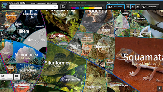
The Social Capital Gap is an interactive map which shows where in the United States people with low and high incomes are friends with each other and where in the country people with different incomes don't mix. The map is based on an analysis of 21 billion friendship relationships of American Facebook users.

To create the map the socioeconomic status of individual Facebook users was determined using factors such as educational achievement, language and location. The economic status of each individual was then compared to the economic status of their Facebook friends. 

As with many maps which visualize economic factors in the United States the black belt is particularly prominent on the Social Capital Gap map. In this case as an area where there are very few connections between people of low and high incomes. At the other end of the scale there appears to be far more social interaction between different income levels in the Midwest. 

One reason why social connections between different income levels is so important is that there is a lot of evidence that poor people are more likely to move up the economic ladder in areas where there are more friendships between high and low incomes than in areas where there is little social interaction between people of different income levels. Beneath the Social Capital Gap interactive map you can view a graph which shows this connection between economic connectedness and upward income mobility.

If you enter your zipcode or county into the map then you can view both the average level of social connectedness in your county and the local levels of upward income mobility. 

Monday, August 01, 2022

The Map of Life

LifeGate2022 is a Google Map of life on Earth. It presents a taxonomic map of the 2.6 million known species of life. On the map different species of animals, plants and micro-organisms are organized based on their degree of evolutionary kinship.

LifeGate2022 is the creation of Dr. Martin Freiberg, who is curator of the Botanical Garden at the University of Leipzig. On his map different degrees of taxa are represented as territories separated by colored lines. 

What makes Dr. Freiberg's map different from previous taxonomic maps of life on Earth is that it actually uses photographs to illustrate the diversity of life on Earth. The map currently includes over 400,000 photos of different species of life. More photos are being added to the map all the time. Already over 6,000 photos have been added of different organisms by users of the map.  


Lifemap is another interactive map which allows you to explore the tree of life. Using this map you can explore the taxonomic classification of over 800,000 different species. 

Like LifeGate2022 this map works like other interactive maps - allowing you to explore different taxa by panning and zooming. With Lifemap this means that as you zoom in on a taxa the groups within that classification are revealed. In this way you can carry on zooming into the map and the tree of life until individual species are revealed. 

Each node in Lifemap is clickable, so as you zoom into the different taxonomic groups on the map you can click on a node to read its definition and to learn more about the taxa from its Wikipedia entry.


You can also use OneZoom to explore the complete tree of life on Earth. This application uses an interactive map interface to visualize the evolutionary relationships between all the species living on our planet. 

Each leaf on the OneZoom tree of life represents an individual species. The branches represent the lineage of these individual species. The points where the different branches diverge on the tree of life show where different groups have split from one another. At each divergence point you can see the geologic time of when it is believed this divergence took place. 

Red leaves on the OneZoom tree of life are those that are currently under the threat of extinction. When you zoom down to the individual leaf of a species you can click on that leaf to learn more about the selected animal from its Wikipedia entry.