Assembling the World by Population Density
Engaging Data has released an interesting visualization which allows you to watch a map of the world being assembled, country by country, based on a number of different data variables.
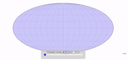
The animated GIF at the top of this post shows countries being added to the map based on population density. The first country to appear on this map is Greenland, with a population density of 0.03 ppl/km2. The last country to appear on the map is Bangladesh, with a population density of 1,251.84 ppl/km2.
Assembling the World Country-by-Country includes a number of different data sets which you can view being turned into a map of the world. These include total population size, GDP and life expectancy. According to the data being used Sierra Leone has the lowest life expectancy (50.1 yrs), while Japan has the highest (83.7 yrs).
If you are interested in population density then you might also like Population Density Around the World, which links to a number of other interactive data visualizations showing exactly where it is that most people live on planet Earth.


Comments