Skip to main content
Search
Search This Blog
Maps Mania
Posts
Showing posts from February, 2022
Show all
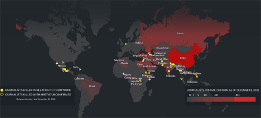
February 28, 2022
Mapping Attacks on the Free Press
February 25, 2022
The Russian Invasion in Real-Time
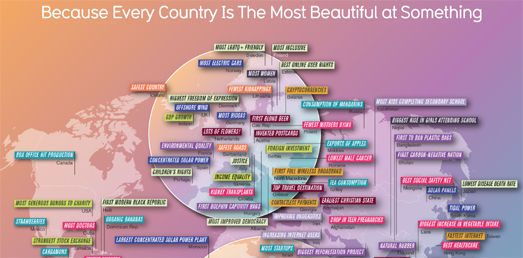
February 24, 2022
The Best in the World
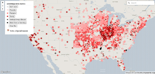
February 23, 2022
The Interactive Map of Sundown Towns
February 21, 2022
Colonizing America
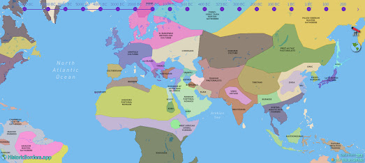
February 17, 2022
Mapping History
February 17, 2022
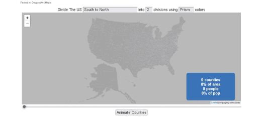
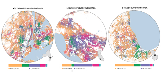
Dividing America by Population
February 16, 2022
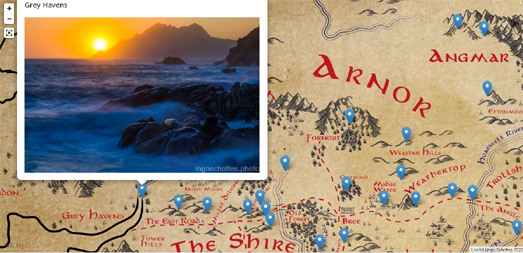
Street View of Middle Earth
February 15, 2022
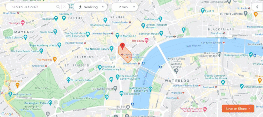
How Far Can I Walk in 10 Minutes?
February 14, 2022
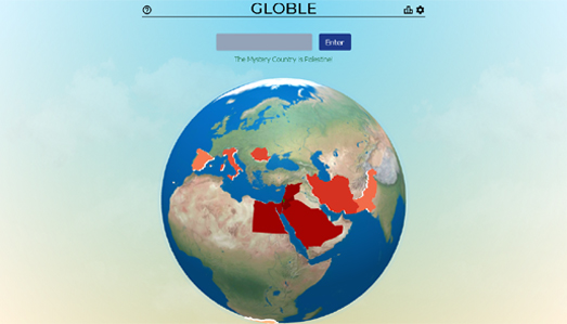
Globle
February 12, 2022
The Black Elevation Map
February 11, 2022
Redlined for Ever
February 10, 2022
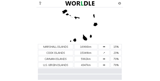
Worldle
February 09, 2022
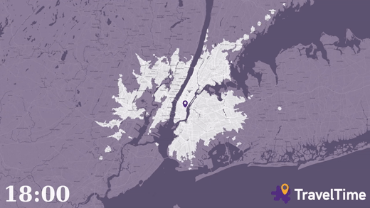
Isochrone Maps by Time of Travel
February 08, 2022
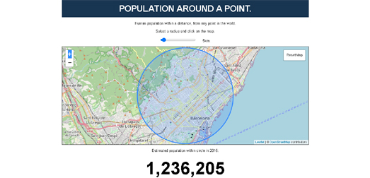
Population Density Around the World
February 07, 2022
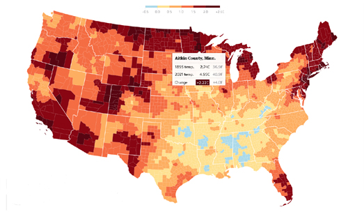
Here Be Climate Change
February 05, 2022
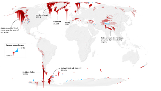
The Age of Disappearing Glaciers
February 04, 2022
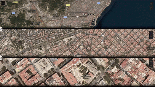
Enhanced Zoom & Multiple Map Views
February 03, 2022
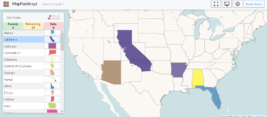
The Interactive Map Jigsaw Puzzle
February 02, 2022
The Sexist Streets of Budapest
February 01, 2022
Distances to Abortion Providers
Newer Posts
Older Posts
Home