Skip to main content
Search
Search This Blog
Maps Mania
Posts
Showing posts from December, 2022
Show all
December 30, 2022
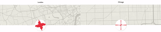
A Little Map Fun x 3
December 29, 2022
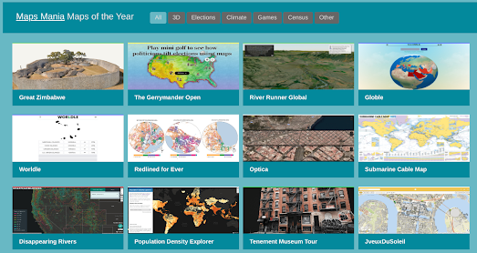
The 50 Best Maps of 2022
December 23, 2022
Mapping Street Orientations
December 22, 2022
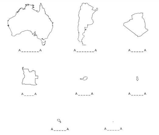
The A-A Christmas Quiz
December 22, 2022
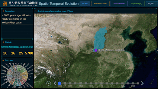
Mapping the Ancient Silk Route
December 21, 2022
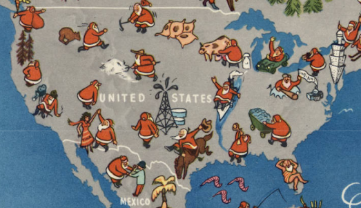
Santa's Map of the World
December 20, 2022
Mapping Segregation in the United States
December 19, 2022
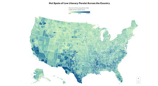
The American Illiteracy Map
December 17, 2022
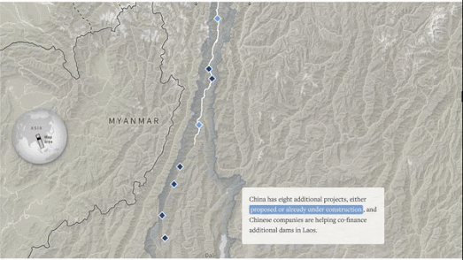
Scrolling the Mekong River
December 16, 2022
The Average Color of the United States
December 15, 2022
Why India is Warming More Slowly
December 14, 2022
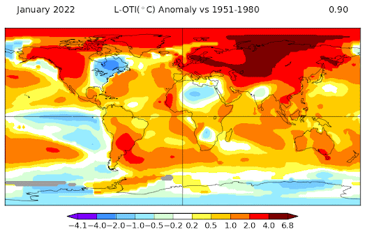
2022 - A Year of Global Heating
December 13, 2022
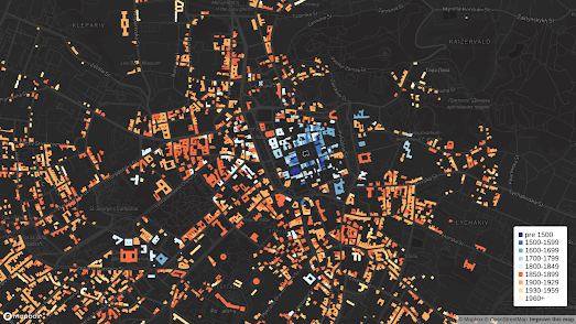
How to Make a Building Age Map
December 12, 2022
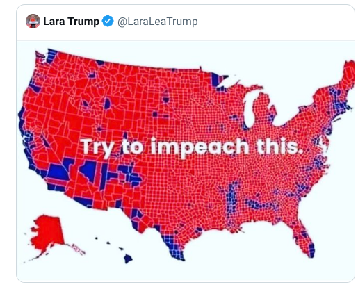
Land Doesn't Vote
December 10, 2022
3D Conservation Mapping
December 09, 2022
The Map of Stories
December 07, 2022
Who is Dreaming of a White Xmas?
December 07, 2022
The National Fast Food Index
December 06, 2022
Mapping Armageddon
December 05, 2022
How Well Do You Know Your Neighborhood?
December 02, 2022
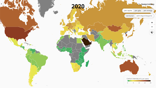
The World's Largest Polluters
December 01, 2022
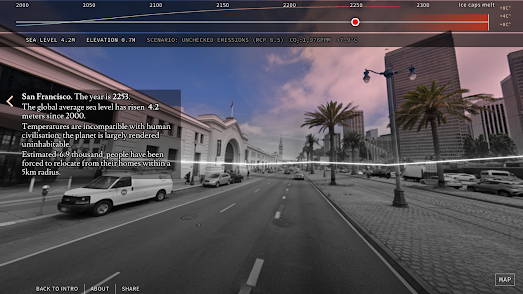
How Rising Seas May Impact Your Home
Newer Posts
Older Posts
Home