Wednesday, November 30, 2022

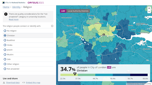
England is No Longer a Christian Country

New data from the 2021 UK census shows that for the first time less than half of the people of England & Wales identify as Christians. In last year's census 5.5 million fewer people described themselves as Christian than in 2011.

The Church of England plays an integral role in UK life. 27 bishops are automatically given seats in the House of Lords (the upper house of the UK parliament) and schools in the country are required to teach and worship the Christian religion. The new census data has led to renewed calls for the disestablishment of the Church of England, to end its status as the official church of the UK.

You can explore support for the Christian religion and the support for other religions on the Office for National Statistics Census Mapper. This interactive choropleth map allows you to view the percentage of people who identify with the Christian, Muslim, Jewish, Buddhist, Hindu, or Sikh religions, or who identify as non-religious. 

One interesting pattern revealed by the map is that inner-city census tracts seem to have fewer Christians than suburban and rural areas. This doesn't mean that these areas necessarily have more people identifying as non-religious. The drop in the percentage of people identifying as 'Christian' in inner-city areas appears to be because these areas are more ethnically diverse. In other words more people in these areas identify with non-Christian religions.

Across England & Wales 37.2% of the population said they had no religion. 46.2% of people said that they were Christian. On current trends by the time of the next census in a decade's time there will be more non-religious people than Christians in England & Wales. 

If you select 'No religion' on the ONS map you can view the areas of England & Wales where the majority of the population already identifies as non-religious. South Wales in particular has a cluster of census tracts where the majority of the people have no religion. Norwich and Brighton and Hove also stand out as cities where over half the population identify as non-religious. Interestingly both Norwich and Brighton & Hove have a relatively high percentage of White residents, compared to other cities in England & Wales. This may suggest that there is a higher percentage of people identifying as non-religious in the White population than there is in other ethnic groups.

Tuesday, November 29, 2022

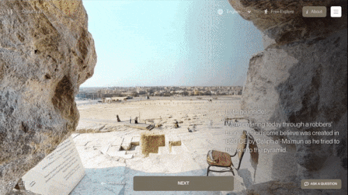
Explore Inside the Pyramid of Giza

Go Inside the Great Pyramid of Giza is an amazing virtual 'Street View' tour of the normally closed inner chambers of the Khufu Pyramid in Egypt. This guided tour allows you to explore the interior three chambers of the pyramid, including the King's Chamber, the Queen's Chamber and the subterranean chamber, which is cut into and decends into the bedrock below the pyramid itself.

The Khufu Pyramid or Great Pyramid of Giza is the largest of the Egyptian pyramids and is the tomb of the pharaoh Khufu, who died in 2566 BC.The Great Pyramid was the world's tallest building for more than 3,800 years. Very few people are allowed inside the Great Pyramid of Giza. Today you are one of them.

The tour enters the pyramid via a robber's tunnel believed to date back to 820 BC. At the entrance of this tunnel you have two choices. You can either take the Guided Tour or use the Free Explore option. The guided tour uses custom made 360 degree panoramic 'Street View' imagery to lead you inside the pyramid and into the three chambers. This guided tour includes contextual annotations which explain what you are seeing during the tour. The 'Free Explore' option allows you to enter and explore the pyramid alone. In this mode you are left to your own devices to use the navigation circles added to the panoramic imagery to virtually explore inside the Great Pyramid. 

Monday, November 28, 2022

Do You Live in A Disadvantaged Neighborhood?

A new interactive map identifies neighborhoods in the USA which are "considered disadvantaged communities". The Climate and Economic Justice Tool was developed by the Council on Environmental Quality in order to help the government meet the Justice40 initiative, under which federal funds should be targeted at communities which are "overburdened by pollution and historic underinvestment."

If you enter your address or zip-code into the map you can discover if your census tract is designated disadvantaged or not. You can also view a host of data which reveal how your census tract ranks in comparison to other areas using a number of socio-economic and environmental metrics. 

The map identifies 27,251 census tracts in the U.S. as disadvantaged or partially disadvantaged. A tract can be identified as disadvantaged if it is seen to have a 'burden' related to climate change, poor transportation, legacy pollution AND where average household income is less than or equal to twice the federal poverty level.

Thursday, November 24, 2022

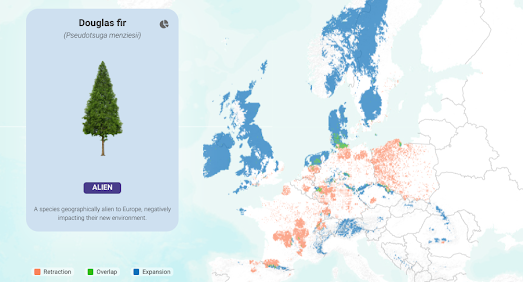
The Future of Forests

Climate change is already leading to temperature changes in biomes, and effecting the development of the species which depend on them. As a result of global heating and increased temperatures the natural habitats of forest tree species are beginning to change. According to Appsilon (creators of R Shiny dashboards) predicted "climatic changes will significantly affect living conditions for trees. Increased temperatures and decreased precipitation during the growing season will affect particular tree species differently."

In order to show how climate change will affect individual tree species Appsilon has released Future Forests, an interactive map which visualizes the current range of a number of tree species and predicts their future ranges under three different climate change models. If you choose a species of tree from the map's drop-down menu and a climate change scenario (optimistic, moderate or pessimistic) you can see the tree species' current range and its predicted range in 70 years time. 

For example, the map above shows in red where the Douglas fir will stop growing in Europe under a pessimistic climate change scenario. Under this scenario the Douglas fir's habitat will move dramatically. The map shows in blue the areas where the Douglas fir is predicted to start growing outside its current habitat under this pessimistic climate change model.

The map allows you to view the predicted habitats of 12 different tree species which currently grow in European forests. 

Wednesday, November 23, 2022

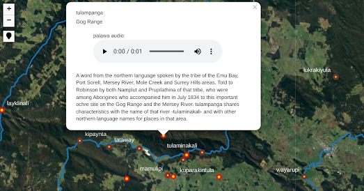
The lutruwita place names map

pulingina to lutruwita (Tasmania) Place Names Map is an interactive map which shows the original palawa kani names for lots of locations in lutruwita (Tasmania). palawa kani is the language of Tasmanian Aborigines. The map was created by the Tasmanian Aboriginal Centre using research undertaken by the palawa kani Language Program.

According to the Tasmanian Aboriginal Centre only "a handful of places in lutruwita still bear their original names". These handful of palawa kani place names are also given using English spellings, which do not convey the original sounds. The pulingina to lutruwita Place Names Map includes audio recordings of each place name spoken by a palawa kani speaker. Click on a place name's marker on the map and you can also learn a little about the history of the name.

You can learn more about the map and the palawa kani Language Program on the Tasmanian Aboriginal Centre website.

You may also be interested in:

  • New Zealand - the Te Reo Māori Web Map shows the Te Reo place-names of New Zealand towns, cities, lakes, rivers, mountains and other notable locations.
  • Australia - The Land is a Map shows locations in Australia with names of Indigenous Australian origin. Click a place name marker on the map to learn more about a place name's etymology from its Wikipedia entry.

The New FCC National Broadband Map

Last week the Federal Communications Commission (FCC) released its most accurate map of national broadband provision. Enter your address into the FCC National Broadband Map and you can discover which Internet Service Providers are available where you live and the types of service and speeds which you can expect.

The ISP availability and service speed data are provided by the providers to the FCC. If you think the data for your address is wrong then you can submit a 'Location Challenge' directly on the map. You can also report if your address is missing from the map.

The new FCC National Broadband Map will be used by the government to help to determine where to distribute money from the $42.45 billion in the Broadband Equity, Access, and Deployment (BEAD) program. Every state will receive $100 million from the BEAD program. Extra funding will then be distributed, using the FCC map, to areas which are currently unserved or underserved by Internet Service Providers.

Tuesday, November 22, 2022

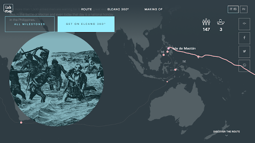
Explore the First Route Around the World

On September 20 1519 five ships set out with 239 men from Sanlúcar de Barrameda in Spain. Their goal was to find a new route to the Moluccan Islands, in Indonesia. On September 6 1522 just one of those ships, the Victoria, landed back in Spain. It was the first ship to have circumnavigated the globe. 

Only 18 men returned to Spain on the Victoria. Many of the others died on the journey, including the original captain, one Ferdinand Magellan, who was killed in the Philippines in April 1521.

In order to commemorate the 500th anniversary of the first ship to sail around the world the Spanish broadcaster RTVE has released an interactive map of the route taken by Magellan's expedition to  cicumnavigate the globe. In The First Around the World you can follow this whole voyage from Spain, to South America, through the Strait of Magellan, across the South Pacific, to the Phillipines, around the Cape of Good Hope and (nearly three years later) back to Spain.

As you follow the route taken by Magellan's expedition you pass a number of milestones. These milestones including the kidnapping and chaining up of two indigenous South American of the Tehuelches people, the burning of a village in Guam, and an attack on the island of Mactan (during which Magellan died). 

Monday, November 21, 2022

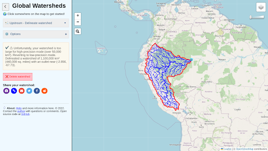
The Global Watershed Map

Click anywhere on the Global Watersheds map and you can view a visualization of the upstream watersheds calculated from your selected location. The map allows you to quickly see where water is coming from and where it is going at any location on Earth.

The screenshot above shows the huge 1 million km² watershed flowing from the Andes into the Solimões River in Brazil. If you want to view the world's largest watersheds on the Global Wathershed map then click downstream in the Amazon Basin (the world's largest watershed) or downstream in the Mississippi River Watershed in the United States.

If you wish to see where a watercourse flows to then you can select the 'downstream' option on the map. This will then display the flow path of the selected river from the selected location to the ocean. Other options allow you to download the data of a watershed in geoJSON, shapefile or KML formats.

You can view an animated journey of the downstream flow path of a river on the River Runner interactive map. River Runner Global allows you to virtually drop a raindrop anywhere in the world to visualize its journey to the sea. You can select any location in the world on the map and then watch the animated journey that a raindrop would take from that location downstream to the sea. 

In order to work worldwide River Runner Global uses the MERIT-Basins global vector hydrography dataset. The map also uses Natural Earth data for the river name labels. You can read more about River Runner Global here.This 'about' page includes information on how to download the river name data and how to clone and deploy the River Runner API.

Global Watersheds also has an API. You can read more about the Global Watersheds API on the map's about page. The API allows you to grab the geoJSON data for any location in the world by entering a lat/lng as a query string to a formated URL.

The River Runner Global team has also compiled a list of some of their favorite raindrop paths. River Runner Global Paths includes links to over 20 animated journeys, showing how a drop of water would travel from locations around the world - downstream to the sea.

Sunday, November 20, 2022

Mapping the New Manure Action Plan

Belgium newspaper De Tijd has carried out an awesome geographical analysis of the Flemish government's Seventh Manure Action Plan (MAP7). Under European Union directives Belgium must reduce the amount of nitrates and phosphates which are being washed into Belgium waterways from agricultural fertilizers. 

By 2027 all bodies of water must achieve a 'good' status. The new Manure Action Plan proposes introducing a set of measures to reduce over-fertilization and its polluting impact on Belgium's inland water. One of these proposed measures is extending the width of the buffer zone which must exist between watercourses and agricultural crop-land. 

In Where are the thousands of hectares of endangered agricultural land? De Tijd has mapped out the impact of extending the current 1 meter buffer zone to 3 meters or to 6 meters. By mapping out Belgium's crop-land and its watercourses De Tijd is able to show how much crop-land is lost under different sized buffer zones. 

Buffer zones between crop-land and watercourses are essential to reduce the washoff of fertilizer into rivers and streams, therefore reducing the amount of nitrates and phosphates that end up in Belgium's inland waterways. However increasing the size of these buffer zones obviously decreases the amount of land which can then be used for growing crops. 

De Tijd's analysis shows that the current 1 meter buffer means that just over 4,700 hectares are removed from agricultural land in Flanders. Increase the buffer zone to 3 meters and almost 14,000 hectares are removed from possible crop-land. Increase the buffer zone to 6 meters and almost 30,000 hectares are removed from possible agricultural land. That is around 4.4% of all Flemish agricultural land.

Using De Tijd's interactive map you can explore where in Flanders the increases to buffer zones will have the biggest impact on available crop-land. De Tijd also goes on to show which specific crops would be most affected by the MAP7 proposals. 

Friday, November 18, 2022

The Map of the Fediverse

Following Elon Musk's takeover of Twitter the open-sourced social networking service Mastodon has seen a huge growth in users. One way in which Mastodon differs from Twitter is that it operates as a federated network, on a large number of independently run instances. These separate instances are connected by the Fediverse (a collection of connected servers that are used for social-networking and micro-blogging) which allow the independetly run instances to communicate with each other.

Many instances of Mastodon have been created for specific subjects or fields. For example Maps Mania can be found on Mastodon on Mapstodon.space, which is an instance of Mastodon created for 'GIS, mapping, geospatial and cartography professionals and enthusiasts'. Some Mastodon instances have also been created for specific locations, to serve local or even national communities. 

If you want to find a Mastodon instance that serves your city, region or country then you can explore the Mastodon Near Me interactive map. This map shows Mastodon servers which serve a specific geographical area and which are open to new members who wish to join Mastodon.

You can also find a fediverse server by location on the Fediverse Observer. This interactive map shows where the servers of Mastodon instances are physically located. The instances shown on this map are not necessarily designed to serve people from a particular geographic region, it just happens to be where they are located. For example although I live in the UK I belong to an instance, Mapstodon.space, whose server is physically located in France.

You can also explore the fediverse on fediverse.space. Fediverse.space is less of a map and more of a network chart of Mastodon instances. It looks at the connections between instances to create a network chart which visualizes the interconnected relationships between the different Mastodon communities. 

For example if I search for Mapstodon.space on the fediverse.space map I find that its nearest neighbors are en.osm.town (an instance for OpenStreetMap editors and users), vis.social (a Mastodon instance for members of the data viz community) and sciences.social (the Mastodon social network for social scientists). 

Etienne Côme, a researcher at Université Gustave Eiffel, has also created an interactive network chart of the fediverse. Etienne says that one of the first things he noted about Mastodon was "how much more 'geographical' the fediverse is than other social networks". He therefore decided to map around 2,000 instances in his Mapstodon visualization of the Mastodon fediverse.

In this network mapping of the fediverse individual instances are organized based on the connections between instances as expressed in public toots made in each instance. There is a little more detail of how the visualization was made in this toot thread.

You can follow Maps Mania on Mastodon at mapstodon.space/web/@mapsmania

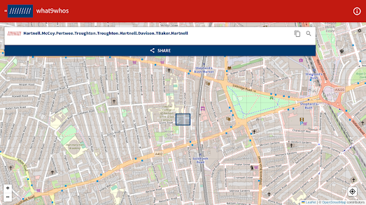
Share Your Location with What9Whos

What9Whos is a proprietary geocode system designed to identify any location on Earth using the names of nine actors that have played the role of Dr Who. 

What9Whos is designed to make sharing your location easier than having to give a full postal address. For example instead of having to tell someone to meet you at the "Capitol Building" you can just simply tell them to meet at:

"/////////McCoy.Martin.Troughton.McGann.Hartnell.CBaker.Hartnell.Eccleston.Smith"

Not everyone is happy with using a propietary geocoding system for location sharing and over the years What9Whos has been parodied many times. Some of these parodies include: 


There are of course many other alternatives to What9Whos. You can use Google's much ignored Plus Codes or even the centuries old latitude and longitude system. You could even devise your own geocoding system using pataaddress.

The open sourced pataddress global addressing system allows you to pinpoint any location on Earth using four words. pataddress comes with its own default word database (the words used to describe a location) but also allows you to build your own database with a built-in word frequency analyser.

Thursday, November 17, 2022

Mapping Mariupol's Destruction

A Timeline of Mariupol's Destruction is an animated map which visualizes the damage caused to buildings by the Russian attacks on the Ukrainian city of Mariupol. The map shows damage caused by Russian bombing between March 5th and July 29th of this year.

The city of Mariupol was under siege from Russia from 25th February until 17th May 2022. In March the Red Cross declared the siege a humanitarian crisis. In May Ukarainian authorities reported that 90% of buildings in the city had been damaged or destroyed. Around 25,000 civilians are believed to have been killed in the Russian attacks on the city.

The map was created by analysing satellite imagery of the city by PlanetScope. This analysis "found that 2,664 structures sustained significant damage in the city".
360war wants to ensure that images of the damage caused by the occupying Russian army in Ukraine are seen by people around the world. 360war is documenting the destruction of Ukrainian towns and villages, showing the aftermath of Russian air strikes and artillery fire on the infrastructure and buildings of Ukraine. Using panoramic 'Street View' imagery 360war allows you to explore in close detail some of the devastating destruction left behind by the Russian army.

An interactive map shows the location of all the available 'Street View' images (Mariupol is still under Russian occupation so is not featured). On this map aerial panoramic images are indicated using a drone shaped marker, while ground based panoramic images are shown with black dots. Many of the interactive panoramas include a 'learn more' link which provide more information on the location depicted and the damage caused by the invading Russian army.. 

Wednesday, November 16, 2022

The 3D Graffiti Map

StreetArtifacts is an interactive map which documents and virtually displays street art in a number of global cities. The map uses textured 3D scans to allow users to view examples of street art as either 3D photogrammetry models or displayed in Augmented Reality mode. 

Currently StreetArtifacts has mapped examples of street art in New York, Portland and Karachi. Choose one of these three featured cities and you can view an interactive map on which small yellow map markers display the locations of captured street art. To view the 3D model of an archived work of street art you simply need to click on its map marker.  If you select the AI option you can also view the model in augmented reality on your smartphone.

You can take a virtual tour of street art in Argentina on Google's Street Art project. The Street Art website provides guided tours of amazing graffiti in cities around the world, including a wonderful audio guide to the graffiti of Buenos Aires in Argentina. The Talking Walls of Buenos Aires tour uses Google Maps Street View imagery to introduce you to some of the city's best street artists and their works of art.

The Talking Walls of Buenos Aires takes you on a guided tour around graffiti in three of the capital's neighborhoods; Villa Crespo, Colegiales and Barracas. You can explore the artwork in each of the tours up close using Google Maps Street View. Each of the artworks also includes an audio guide, which provides information on the location, the featured street artist and the individual work of art.

Monday, November 14, 2022

Global Flight Paths & Shipping Lanes

24 Hours of Global Air Traffic is an interactive 3D globe which visualizes the actual flight paths of 24 hours of air traffic around the world. The map uses ADS-BExchange data captured on 1st Spetemebr 2022.

More than 200 million data points are shown on this global map of air traffic. Although the visualization uses a Mapbox GL 3D globe the flightpath altitudes are not shown in 3D. However on the map aircraft that were recorded at low altitudes are colored in red and the color purple is used to show aircraft flying at higher altitudes (above 18000 feet). The brightness of the flightpaths increases with the amount of aircraft traffic.

ADS-B Exchange uses crowd-sourced data. This means that the map lacks data in some areas. If there is no one with a receiver near a location then data from an aircraft transponder flying by will not be captured.This is particularly true for smaller aircraft flying at low altitudes. Cruising jet liners flying at higher altitudes are more likely to be tracked.

This map of global shipping density reveals the world's major shipping lanes and also the areas of the world that the major shipping companies avoid. The reasons why some areas of the world's seas and oceans don't see as much traffic as others can vary from geo-political reasons to the dangers of piracy and local sailing conditions.

The live ship tracking map MarineTraffic includes an option to view a density map of the world's shipping traffic. If you select the 'Density Maps' overlay on MarineTraffic you can view an overlay which shows the accumulated recorded data of all vessels on MarineTraffic over recent years.

The Gulf of Sirte off the coast of Libya is one area with a low density of ship traffic. According to Wikipedia the dangers to boats in the gulf have been known for centuries, "Ancient writers frequently mention the sandbanks (in the gulf) and their vicinity as dangerous for shipping". Elsewhere marine traffic might avoid coastlines because of Emission Control Areas. The EU, the US and Canada all have controls which force ships to use cleaner and more expensive fuel near coastlines.

The different types of routes and journeys taken by different types of marine vessel around the UK can be seen in a series of maps by Alasdair Rae. In Watching the Ships Go By Alasdair has created a number of static maps showing the vessel tracks of different types of vessel in the coastal waters around the UK. These include maps showing the different routes taken by cargo ships, passenger ships, fishing boats, high speed craft, military vessels, tankers and recreational craft.

You can also explore the different shipping routes of different types of vessel using Shipmap.org. Shipmap.org is an outstanding animated interactive map visualizing the movements of the global merchant shipping fleet over the course of one year. The map uses AIS shipping data from Spire to visualize the movements of different types of cargo ships over the course of 2012.

Shipmap.org allows you to filter the ships shown on the map by type of cargo vessel. The narrated tour provided with this map also explains some of the interesting patterns that emerge from mapping the worldwide merchant shipping trade.

Saturday, November 12, 2022

Mapping Your Local Soundscapes

Hush City is an interactive map of quiet areas around the world which have been collected by people using the Hush City moble phone app. Using the map you can find the quiet spots near you where you can go to escape the busy chaos of everyday life. 

Areas in your neighborhood which have been observed as quiet places are shown on the map with colored markers. If you click on a marker you actually listen to an audio recording of the soundscape recorded at that location by a Hush City user. You can also read the user's feedback and any photographs of the location posted to Hush City. The color of a marker indicates the noise levels measured at a location by the app, shown in A-weighted decibels (an expression of the relative loudness of sounds as perceived by the human ear). 

The Hush City map also includes controls which allow you to filter the quiet areas shown on the map by noise level, by the user descriptions used to tag the location, and by the location's perceived quietness. 

From the insect chorus of the Borneo to the crooning baritone song of an Atlantic humpback whale, earth.fm wants to serenade you with the sounds of nature. Earth.fm is a map featuring the sounds of nature captured by professional nature recordists across the world. 

The earth.fm interactive map provides access to geo-located immersive soundscapes which have been recorded around the globe. Click on any of the markers on the map and you can listen to an actual sound recording which was captured at the chosen location. The map includes a number of controls which allow you to filter the sound recordings shown on the map by the predominant sounds in the recording and by the type of habitat.

Cities and Memory is a wonderful sound map which not only allows you to listen to recorded soundscapes but also allows you to listen to imagined soundscapes inspired by the same locations. 

Stuart Fowkes' Cities and Memory sound art project aims to present both the real sounds of the world and also their re-imagined counterparts, creating two parallel sound worlds; one of the real and one of the imagination.

Every location and every faithful field-recording on the Cities and Memory sound map is accompanied by a reworking, a processing or an interpretation that imagines that place and time as somewhere else, somewhere new. The listener can choose to explore locations through their actual sounds, or explore interpretations of what those places could be. They can can even flip between the two different sound worlds at their leisure.

For example, if you click on the Greenwich foot tunnel in London you can listen to the real sounds of people walking through the tunnel. Alternatively you can listen to an imagined soundscape of some poor souls entombed beneath the Thames.

Chatty Maps provides a number of maps which reveal the dominant soundscapes of city streets in a number of global cities. The map is based on an analysis of the tags used in photos posted to Flickr. This analysis is then used to determine the likely sound profile of individual city streets. 

Chatty Maps includes interactive Leaflet based maps of New York, San Francisco, Chicago, Boston, Washington, Miami, Seattle, London, Barcelona, Madrid, Milan and Rome. On each map the city's roads are colored to show the dominant sounds on the street, based on tags used in social media.

If you select a street on the map you can also view a data visualization which explores the relationship between the street's soundscape and emotions. For example streets with music sounds are often associated with strong emotions of joy or sadness, while those with human sounds are more usually associated with joy or surprise.

Friday, November 11, 2022

Top 5 Moving Maps

Day 23 of the #30DayMapChallenge calls for participants to create a map around the theme of movement. This year the vast majority of the maps I've seen posted on social media in response to the #30DayMapChallenge have been static maps. I'm hoping that the theme of 'movement' might inspire a few more participants to venture into creating interactive maps on the 23rd. 

Static maps can certainly visualize movement, for example through the use of arrows in flow maps, or the use of lines in ischrone maps. However interactive maps can physically and visually represent movement through the use of actual moving parts, by animating lines, markers and polygons on top of map tiles. So, if you want to participate in day 23 of the #30DayMapChallenge you can get some inspiration from the:

Top 5 Moving Maps


1. Earth NullSchool

Earth Nullschool is a fantastic interactive map that animates the current (and past) weather conditions being experienced around the world in real-time. The map uses weather data from the Global Forecast System to create real-time animated maps of global wind conditions. Zoom in on any location in the world and animated colored isobars visualize in real-time the strength and direction of the local wind conditions.

You can also view global weather conditions being animated in real-time on the Windy map. You can even add animated wind isobars to your own interactive maps using the Web-GL Wind plug-in for Mapbox.    

2. RiverRunner

Sam Learner's incredible River Runner allows you to click anywhere on a map of the United States to view the path that a drop of rain would take downstream from that location to the sea. The US River Runner map uses Mapbox's elevation data and the USGS's national hydrology data to calculate and animate this incredible journey of a single drop of water from any location in the USA to the ocean.

River Runner doesn't actually use any animated features on the map but creates a sense of movement by simply automatically panning an interactive map to show the entire journey you could take by river from a chosen location to the sea. 

If you live outside the United States you can join in the fun by using Sam's River Runner Global map.

3. Mini Tokyo 3D

Mini Tokyo 3D is a live real-time map of Tokyo's public transit system. The map shows the live position of Tokyo's trains in 3D as they move around Japan's biggest transit network.

Obviously there are lots of examples of interactive transit maps which show the positions of moving trains on a map by using animated markers. What makes Mini Tokyo 3D stand out is the use of 3D blocks for the trains and the use of 3D buildings. These three dimensional elements really help to create a vivid real-time simulation of the whole Tokyo transit network. A simulation where the trains can actually be seen (virtually) moving around the city in real-time. 

4. FlightRadar24

FlightRadar24 is an incredible interactive map which shows the locations of planes around the world in real-time. Zoom in on any location on FlightRadar24 and you can watch thousands of plane markers moving around the map, showing the position of planes in real-time. 

The map uses ADS-B data in order to be able to show the live positions of the world's planes. Automatic Dependent Surveillance–Broadcast (ADS-B) uses satellites to track the locations of aeroplanes as they travel around the globe

If you like watching thousands of planes moving around the world in real-time then you might also like watching ships moving in real-time on a global map. MarineTraffic is to the world's shipping traffic what FlightRadar24 is to aeroplanes. This interactive map uses AIS data (which is used on ships to automatically track their locations) to provide real-time information on the locations of ships as they ferry goods and people around the globe. 

5. Data Spiders


In the summer William B. Davis released his Hub and Spoke map. William's map shows the eight closest airports when you click on any location on Earth on the map. Obviously this map will be invaluable to anybody who is desperate to know where their nearest airports are located. However, to be honest, what is more interesting about this map is how the data being visualized is able to crawl as you pan around the map. 

This is because as you move the Hub and Spoke map the eight-legged airport finder crawls across the map to your new location. As it moves it continues to update to show the eight nearest locations to each changed location. The result is (as you can see in the animated screenshot above) like being in control of a massive data spider!

The Data Spider technique developed by William B.Davis inspired lots of cartographers to release their own hub & spoke based maps. These include Massachusetts Libraries Spoke Map, Runways, Trails of WindSpoke Spider and the Closest Hill Map.

Thursday, November 10, 2022

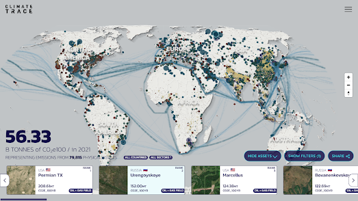
Mapping Real-Time Carbon Emissions

Every day humans release 162 million tons of greenhouse gas emissions into the troposphere. This level of pollution is completely unsustainable and is directly leading to global heating. Now for the first time ever you can discover the individual facilities around the world which are the biggest contibutors to the destruction of planet Earth.

A new interactive map from Climate TRACE identifies, tracks, and monitors sources of greenhouse emissions around the globe. The map allows anyone to discover and monitor the 79,000 highest emitting greenhouse gas sources in the world.

The Climate TRACE Emissions Map uses scaled map markers to show the locations of facilities around the world emitting greenhouse gases and to show the level of gases emitted. The map also allows you to explore the levels of greenhouse gases emitted by individual countries and industrial sectors. The data from the map comes from an analysis of satellite imagery and from self-reported emissions data.

According to Climate TRACE the new map shows that self-reported data by countries and industries does not reflect the true levels of greenhouse gas emissions around the world. For example last year " the actual emissions from global oil and gas production collectively were around double what was self-reported to the UN in 2020."

The interactive map includes a number of controls which allow you to filter the information shown on the map. You can filter the map to show individual countries, individual sectors of industry and different types of greenhouse gas emissions. For example you can filter the map to show only the highest emitters of carbon dioxide in the United States. Doing this reveals that the Permian oil & gas field in Texas is the highest polluter of CO2 in the U.S. In 2021 it emitted nearly 71 mt of CO2, which was almost double the amount of CO2 emitted by the third highest polluter of CO2 in the USA. 

The third highest source of CO2 in the USA was the motor vehicles of Los Angeles (36.47 mt CO2). In comparison motor vehicles in London, a city with over double the population of LA, emitted 4.43 mt of CO2.

Wednesday, November 09, 2022

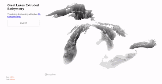
3D Bathymetry Mapping

Mapbox's William B Davis has created an awesome demo map showing the bathymetry of the Great Lakes in 3D. His Great Lakes Extruded map actually allows you to virtually dive in and out of Lake Superior, the largest freshwater lake in the world.

The Great Lakes Extruded bathymetry map uses Mapbox GL's fill-extrusion styling option to help visualize bathymetry data taken from the National Oceanic and Atmospheric Administration. Usually fill-extrusion is used to show height, for example when used to extrude building footprints to visualize the height of buildings in 3D. With the Great Lakes Extruded map William has cleverly used fill-extrusion to visualize the depth of the Great Lakes. 

You can see Mapbox's fill-extrusion styling property used more conventionally (for height rather than depth) in a Ubilabs tutorial on how to use Mapbox GL's fill-extrusion property to create a 3d mapped visualization of European unemployment data. Using the fill-extrusion property you can extrude the height of shapefiles on a Mapbox GL map depending on the height of a value in your data. In this case Ubilabs have used this property to create a 3d map of Unemployment in Europe.

The Ubilabs tutorial shows you how you can use 'fill-extrusion-height' to apply a height to a polygon area based on data values. In the demo map European country shapefiles are extruded based on the unemployment rate in each country in 2015. Each of the country shapefiles on the map are also colored based on the country's unemployment rate.

Another good example of a map using the fill-extrusion property is this San Francisco Lidar Map, which applies the extrude property to San Francisco tree and building Lidar data. This Lidar data has been added to the map in Mapbox Studio from a GeoJSON file (presumably downloaded from the City of San Francisco). The result of using this Lidar data is that as well as visualizing buildings in 3D the map also extrudes other features, such as ships and individual trees.

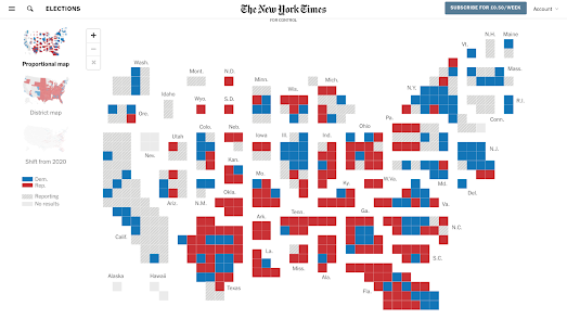
Live 2022 Midterm Election Maps

If you want to follow the 2022 Midterm Election in real-time then you are spoilt for choice. Early indications suggest the Republicans are set to take the House. This year you can keep up-to-date with the results as they are announced on any one of a number of live midterm election maps.

The New York TImes' U.S. House Election Results 2022 (paywall) includes an interactive map of the latest results. This map has three main views. The 'proportional' and 'district' map color electoral disticts based on the party which is currently leading. A third 'Shift in Margin' map uses directional colored arrows to visualize the swing (to Democrats or Republicans) in each district compared to the 2022 primary election.

If you have access to YouTube then you can follow the election on NBC News' Live: Election Power Map. This live YouTube feed is scrolling through a live map of the results, a map of states with races and a projection of the final results.

The Washington Post's Midterm Elections 2022 includes an interactive map showing the leading candidate in each senate race. If you hover over a state on this map you can also view an estimation of the percentage of votes counted so far in the state. A table view also shows the latest results in all the House midterm election races. 

You can also follow the latest results on live tracking maps at:

The Guardian's US midterm election results 2022
Reuters' U.S. election 2022
The Financial Times' Live Results Map: US Midterm Elections
Politico's House Election Results 2022: Live Map

Monday, November 07, 2022

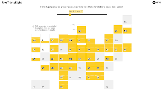
When to Expect the Midterm Election Results

FiveThirtyEight has released an interactive map which provides information on when you can expect each state to count and announce the results of today's election. When Will We Know 2022 Midterm Election Results? includes a cartogram map which allows you to select a U.S. state in order to find out when the polls close in that state, the races to watch in the state and when you can expect the results to be declared.

Each state has different rules on when and how votes are counted. Therefore some states are much quicker at releasing election results than others. According to FiveThirtyEight some states "like Arizona, Nevada and Pennsylvania ... could take multiple days to count all their votes."

The FiveThirtyEight map includes a slide control which allows you to adjust the date and time. This allows you to see which states are expected to have reported results for a selected date and time over the coming days. For example the screenshot above shows (in yellow) all the states who FiveThirtyEight expect to have announced election results by 12 am tomorrow (Nov 9th).

The FiveThirtyEight predictions for state election returns are based on each state's 2020 primary election counting, data received from state election officials and analysis from Edison Research.

Currently the Democratic Party has a very slim majority in the House of Representatives and the Republicans only need to make a net gain of five seats on November 8th.

According to AllSides "Republicans have a 77% chance of taking the U.S. House ... (and the) Democrats have a 52% chance of keeping the U.S. Senate".  In Who Will Control the House and Senate? AllSides has created two interactive maps to show the probable party winner in each electoral district in both the Senate and House elections.

On each AllSides map electoral districts are colored to reflect the party most likely to win in the midterm elections. You can hover over individual electoral districts on either map to see the latest odds based on the AllSides Election Forecast Model. This model "takes into account polls on individual races, national sentiment towards each party, history of past midterm elections ... to estimate the vote share of candidates in a race and the probability that they will win".

FiveThirtyEight suggests that the Republicans have a 7 in 10 chance of regaining the lower chamber. In The Seats Republicans Could Flip To Win The House FiveThirtyEight maps out the districts which are most likely to switch hands in November. Using a hexagonal cartogram, with districts organised by state, they have highligted in red and blue those districts most likely to flip (with the reddest seats most likely to flip to Republicans and the bluest seats most likely to flip to Democrats).

One thing that makes the 2022 midterm elections unique is the unprecedented number of anti-democratic far-right candidates standing for office. According to Political Research Associates there are 274 candidates in the 2022 midterm election cycle who "represent a definable Electoral Far Right". They identify far-right candidates by support for such issues as racial/ethnic nationalism and election denial.

In Mapping The Electoral Far Right in the 2022 Elections Political Reasearch Associates has published both a choropleth and dot map showing where these 274 far-right candidates are standing for office. According to these maps Arizona, Texas and Florida are the states where the most far-right candidates are standing for office.

See A Satellite Tonight

James Darpinian's See a Satellite Tonight can tell you at what time tonight satellites will fly over your house. It can also show you exactly where to look in the night sky if you want to see a satellite passing overhead. 

Share your location with See a Satellite Tonight and you can view an interactive 3D Cesium Earth map, showing your current location highlighted on the globe. The globe also features an animation of any satellites passing over your home tonight. The map menu (running down the left-hand side) tells you at what time a satellite will be flying overhead. It also includes, in chronological order, options to view any other satellite passes over your house tonight and on subsequent nights.

The real magic of See a Satellite Tonight is that you can also view an animation of the satellite flying over your house on Google Maps Street View. This shows you exactly where to look in the night sky if you want to see the passing satellite and at what time. 

When I first wrote about See A Satellite Tonight back in 2019 James Darpinian's interactive map only showed the location of the International Space Station. Since then the map has introduced a few new features. Now as well as telling you where to find the International Space Station See A Satellite Tonight can tell you how to spot the Starlink constellation of satellites and the Russian launched SL-16 RB.

The Street View animated map showing you exactly where to look now also shows you where you can find the constellations and major planets in the night sky. For example, tonight in the UK, if I look eastwards, I should be able to view Jupiter and Saturn fairly low in the night sky.

Saturday, November 05, 2022

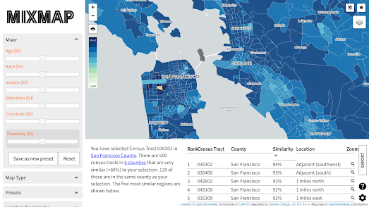
Find Your Neighborhood Twins

If you live in California you can find out which other neighborhoods in California are most similar to your neighborhood using the new MixMap tool. MixMap is a 'place-based semantic similarity platform'. Or, in more simple terms, it is an interactive map that can help you find census tracts which have very similar census data results. 

To use the map simply click on any census tract in California. The map will then color all other census tracts based on their socio-economic and demographic similarities to your selected tract. A table beneath the map will list the top 5 census tracts in California most similar to the tract you have chosen (you can click on any of these listed tracts to see their locations highlighted on the map). 

The socio-economic & demographic census data being used to calculate the tract similarity are age, race, income, education, commute and proximity. In the map sidebar you can adjust the weighting given to each of these individual metrics when calculating the similarities. For example if you just want to find the census tracts with the most similar age range distributions you can adjust the age mixer to 100 and set all the other metric mixers to zero.

You can also adjust the 'map type' in the map sidebar. The default view is a choropleth map which colors each tract based on similarity. You can adjust this to the 'Most/Least' view which changes the map to show just the most and least similar tracts - colored blue and red on the map.

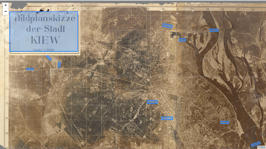
The Luftwaffe Map of Kiev

Before the Battle of Kiev (when the Germans captured the city of Kiev in WWII in 1941) the Luftwaffe created a large photographic map of Kiev. To create the map the Luftwaffe made a number of reconnaissance flights to take aerial photographs of the city. These photos were then edited and photographically printed at the local Wehrmacht headquarters, near Kiev, by the German Army ‘Motorized Surveying & Map Detachment’.

The Photographic Map of Kiev also includes a number of placename labels which the Germans added to the map to identify the locations of important infrastructure which were targets for the invading army. These included the harbour, railways stations, bridges and the citadel. Major roads and railway lines were also labeled on the map to indicate the neighboring towns that they led to. 

On my Photographic Map of Kiev I have added English translations for the German labels. My map was created using my Leaflet-IIIF-GeoJSON utility tool to add the manifest of the map, to highlight areas on the map and to save the created GeoJSON data. If you are interested in annotating historical vintage maps yourself then you might find these instructions for using Leaflet-IIIF-GeoJSON and Leaflet-IIIF-Annotation helpful.

The Photographic Map of Kiev is owned by the David Rumsey Collection. You can learn more about how the map was made and what it shows on the David Rumsey Map Collection website.

Friday, November 04, 2022

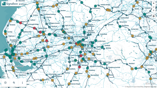
The Real-Time Train Map

The Signalbox Live Train Map shows the location of trains in the UK in real-time on an interactive map. Zoom-in on the Live Train Map and you can watch the trains actually moving on the map to show the trains' real-time, real world locations. 

Trains on the map are indicated by colored arrows. The arrows show the direction of travel of the train and the color indicates whether the train is delayed or running on time (green = on time, yellow = 1-10 min delay, & red = over 10 min delay). Click on an individual train marker and you can lock onto that train to track it as it moves on the map. If you select the 'view stops' option you can also see a train's entire schedule and when it is timetabled to arrive at each station on its route.

The Signalbox Live Train Map also includes a number of filtering tools. These allow you to filter the map to show only trains from a specific train company or to only show trains traveling to or from a named station. 

If you are a fan of live real-time maps of train networks then you might also like:

Travic - animated maps of over 700 transit systems around the world
OSM Tchoutchou - shows real-time trains in France, Ireland, Denmark and Finland
Train Map - a live map of the Belgium rail network
Réseau SNCF en Temps Réel - the live position of all SNCF's trains throughout France
Swiss Railways Network - the original real-time map of Swiss trains
Trafimage - the entire public transit network of Switzerland in real-time
Mini Tokyo 3D - a live real-time map of Tokyo's public transit system (in 3D)
Zugverfolgung - real-time train tracking in Germany, Austria, Switzerland, Belgium and the Netherlands.

Thursday, November 03, 2022

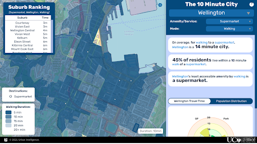
Do You Live in a 10 Minute City?

The concept of the 15 Minute City was first developed by Professor Carlos Moreno of the Sorbonne. The idea of the 15 Minute City is to make urban living more liveable and sustainable by ensuring that all the essential needs of individuals can be accessed without having to get in a car or use public transport. 

A 15 Minute City is an urban environment which promotes a sustainable future by ensuring that all the essential needs of individuals can be accessed within a short distance of travel. These essential needs include such things as grocery stores, health care facilities, cultural attractions, transit stops, educational facilities and leisure activities. Individuals living in a 15 Minute City should be able to access all these essential health, educational, retail and leisure needs within a short fifteen minute walk or bike ride.

If you live in New Zealand you can now find out if you actually live in a 10 Minute City. Urban Intelligence's new X Minute City interactive map allows you to discover how far you have to travel in New Zealand's major cities in order to access education, healthcare, greenspace/recreation, food, and other essential services.

Select a city on the map and then choose one of the Amenities / Services from the drop-down menu and you can view a choropleth map of the city showing how long it takes to walk to that service from each city block. The map sidebar tells you on average how long it takes to walk to the chosen amenity / service in the whole city and a bar graph reveals the percentage of the population living within 5, 10, 15, 20 & 20+ minutes from the chosen amenity.

If you live elsewhere in the world then you can find out if you live in a 15 minute city using the CityAccessMap. This new interactive map from Delft University of Technology visualizes how accessible essential services are to the local population in cities around the world (the map should work for any city with a population over 100,000). The map uses OpenStreetMap data to assess the distribution of city infrastructure and population data from the European Commission's Global Human Settlement Layer to work out where people actually live.

If you zoom in on a city on the CityAccessMap a heatmap layer shows you where accessibility to services is high or low in the city. If you hover over a location on the map you can also view a graph showing the local levels of accessibility to a number of essential services and how this compares to the city average. 

If you zoom out on the map a distribution graph will also appear on the map ordering the world's cities from least accessible to most accessible. According to CityAccessMap Orlando, Florida is one of the least accessible cities in the United States (and the world). In Orlando only 7% of residents have access to services within a 15 minute walk of their home. In comparison - in New York 76% of residents can access essential infrastructure within a 15 minute walk (in Paris it is 95%).