Friday, July 31, 2015

History of the World - Part One


Two weeks ago Associated Press added thousands of vintage newsreel videos to YouTube from British Pathe. The videos contain original newsreel footage of some the Twentieth Century's most historical events.

Luckily for me the videos were published just as I was looking for some time-based location data for a Leaflet.js slider control that I was working on. This Layer Group slider control for Leaflet.js is designed to load a subset of markers (defined using Layer Group) onto a map by selecting from a sequential series of options. For example, choosing a year from a range of dates.

You can view a demo of the new slider control on News Videos. News Videos is a collection of vintage newsreel reports from British Pathe and elsewhere. You can select to load videos onto the map by date by selecting a decade using the slide control at the bottom of the map.

The Dresden Codex in Leaflet


The Scripts of the World map unfortunately omitted Mayan Hieroglyphs. So in order to remedy the situation you should examine this Leaflet.js presentation of the Dresden Codex.

The Dresden Codex is the oldest known book written in the Americas. It is a pre-Columbian Maya book from the eleventh or twelfth century of the Yucatecan Maya in Chichén Itzá. It consists of 39 sheets in total, inscribed on both sides.

Maya Codex in 2,2 Gigapixeln allows you to zoom-in and pan around the Dresden Codex using the Leaflet map controls. The Dresden Codex image used in the map is 2.2 gigapixels in size, so you really can zoom-in on close details in the image.

Most of the hieroglyphs in the Codex are descriptions of the accompanying figures. It also contains astronomical tables, particluar concerning the passages of the Moon and Venus.

Scripts of the World


Writing Systems and Scripts Around the World is a nice way to visualize the scripts of different countries around the world.

The map tiles of every country in the world on this map is made up of each country's writing script. So for example the USA is made up of Latin script, Russia is Cyrillic and Egypt is Arabic. The countries on the map are also colored by the type of writing system used, alphabetical (yellow), logographic & syllabic (red), abjad (blue) and abugida (green).

If you select a country on the map you can find out the predominant script used in that country and also the percentage of the world's population which uses the script.

Thursday, July 30, 2015

Shootings in New York


Shootings in New York: 2010-2013 is a map of the John Jay College of Criminal Justice Research and Evaluation Center's Shooting Index for New York census tracts.

The Center's Shooting Index represents the per capita number of shootings within a tract in which a civilian was injured from 2010-2013. That is clear enough. However the index is 'calculated to weigh recent shootings more heavily than shootings for earlier years'. Which without any information on the weighting applied by the Center is a lot less clear.

The map includes the option to click on the census tracts to discover information about the racial make-up of the population, the percentage of people in employment and the percentage living in poverty. It is a shame that this data doesn't also include the total number of shootings which would help to overcome the opaqueness of the Center's own Index values.

Mapping Pluto


The Three Billion Mile Journey to Pluto is a really interesting map of New Horizons' long journey to reach Pluto. The map plots New Horizons nine year journey from Earth to Pluto and also shows the positions of the major planets as they orbit the sun.

The map is a simple two dimensional view of New Horizons and the planets. However I think it is an inspired idea to use simple animated markers on polylines to map the Solar System. It seems such a simple idea but one that opens up so many possibilities for anyone interested in maps and astronomy.


Our friends over at the Google Earth Blog have created a kml file which allows you to view Pluto in Google Earth. The Latest Pluto Map in Google Earth uses the latest high resolution imagery of Pluto. The map only includes about half of the surface area of Pluto but it is still an amazing way to explore the latest imagery from New Horizons.


NASA has released an updated global map of Pluto, which you can view on the John Hopkins Applied Physics Laboratory website.

Wednesday, July 29, 2015

The Street View Stadium Booking System


A couple of years ago a restaurant called GOSP introduced a Street View booking system. The system uses Google Business Photos (otherwise known as indoor Street View) to showcase the restaurant to potential customers.

Not only does GOSP use indoor Street View to provide a preview of the restaurant it also allows you to book a table. If you like the look of a particular table you can click on the overlaid marker in the Street View image and book that table for lunch or dinner. The Google Business Photos Booking System was developed by Big-e, an e-business online development team.


Back in 2013 I remarked that the system would be great for booking seats in sports stadiums. It's taken a while but the Dallas Mavericks now have a Street View seat booking system for the American Airlines Center.

Visit the Mavs website and you can tour the American Airlines Center on Google Maps Street View. Use the onscreen arena map to pick a seat in the stadium and you can preview the view with Google' panoramic imagery.

What's more if you like the view from the seat you can simply click-through to book your Mavs' season ticket.

Introducing Elastic Maps


A screenshot of the Elastic Terrain Map really doesn't do this map justice. The map is billed as a new way to visualize terrain data that uses animation and really needs to be experienced first-hand.

The magic of the Elastic Terrain Map happens when you pan the map. Wiggle the map and watch it wobble. As you pan and move around the map different parts of the map move at different speeds based on the elevation data.

The effect is a little disorientating at first and can make you feel a little queasy. However as you get used to the effect it provides an interesting way to view elevation - as the valleys and peaks become much more apparent on Elastic Terrain Map than on a map with static map tiles.

Use the back and forward arrows to view Elastic Terrain map work with different map layers. You can learn more about how the map works on the project's GitHub page.

The UK Pub Map


You can create a recognizable map of the Unites States by mapping only the country's rivers. If you want a recognizable map of Japan you could plot all the country's roads. If you want a recognizable atlas of the world then you can restrict yourself to mapping just the world's railways. However, if you want a recognizable map of Great Britain and Ireland, then you need pubs.

That's right - it's possible to create a recognizable map of the UK just by plotting all of the country's pubs. Drawing a Map from Pub Locations with the Matplotlib Basemap Toolkit is a nice tutorial on how to plot OpenStreetMap derived data with Matplotlib - but forget Mapplotlib we're here for the beer.

There are roughly 29,000 pubs in Great Britain and Ireland on OpenStreetMap. The result of plotting only these pubs and no other map data is an easily identifiable map of Great Britain and Ireland. It also seems to closely resemble a population density map of Great Britain and Ireland.

Tuesday, July 28, 2015

The Harvard Historical Sea Chart Collection


The Harvard Map Collection has released a new interactive map showcasing some of the fabulous historical sea charts in its collection of vintage maps. Sea Atlases allows you to explore these historical sea charts overlaid on a modern interactive map.

Ten atlas volumes were digitized by the Harvard Map Collection, and then georeferenced in order to be able to view them on top of modern day maps. Being able to explore these fantastic vintage sea charts is of course the main attraction of Sea Atlases, but this is only made possible by the beautifully intuitive and well designed interface.


The home page of Sea Atlases consists of a time-line which allows you to explore the collection by the age of the vintage sea charts. Once you open the map interface you can search for the sea charts by location. Pan and zoom the map and the locations of the available sea charts are indicated on the map by map markers. Click on a marker and you can select the 'view chart' option to view the vintage sea chart overlaid on top of the modern map.

Mapping Spanish Debt - Part Two


Last week Spanish newspaper El Pais released an interactive map showing which Spanish municipalities have increased or lowered their level of debt since 2011. The Variation of Municipal Debt in the Last Legislature map colors each Spanish municipality by whether they have reduced or increased their level of debt.

El Pais has now published another interactive map of the debt levels held by Spanish municipalities. Municipal Debt per Capita in 2014 uses scaled map markers to visualize how much money is owed be person in each Spanish municipality. The larger the marker the larger the per capita debt.

You can click on each municipality on the map to view its per capita debt level and its total level of debt. In total there are 561 municipalities in Spain which owe more than 1,000 euros per inhabitant.

Ukraine's Soviet Streets


Twenty Four years after gaining independence from Russia the cities of Ukraine still bear the scars of Russia's cultural and political imperialistic rule. The cultural hegemony of Russia over Ukraine can be seen in the country's maps, particularly in the preponderance of Soviet street names.

How to Find Lenin Square is a detailed analysis of the frequency and preponderance of Soviet street names in Ukraine. The article includes a number of maps of Ukrainian cities, in which the streets with Soviet era names are colored red. Some of the most popular Russian street names include 'Lenin', 'Felix Dzerzhinsky' (founder of the Russian secret police) and references to the Soviet space program.

The article also contains an analysis of the preponderance of Soviet influenced street names in Ukraine by longitude. This includes a bar chart showing the frequency on Russian street names by each 0.5 degree of longitude (moving from west to east). This bar chart shows that only in the very west of Ukraine is the Soviet era not still commemorated in the street names of Ukraine.

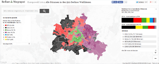
Maps from the Berliner Morgenpost


Over the last few years the Berliner Morgenpost has created an impressive number of mapped data visualizations. I'd say that at the moment only the New York Times matches the consistency and quality of the interactive maps being published by the Berliner Morgenpost.

You can view and learn more about some of the best of the Morgenpost's maps on Maps at the Berliner Morgenpost, an interactive slideshow highlighting some of the paper's amazing maps. The slideshow actually contains working embedded examples of each of the maps. The slideshow also contains a brief overview of the libraries used in some of the maps, links to GitHub, a mapping tutorial and links to view the maps in full on the Berliner Morgenpost website.

Monday, July 27, 2015

Everybody's Gone Dot Map Crazy


Where the Renters Are is a dot map visualizing where renters and owner occupiers live in the United States.

Zoom-in on a city on the map and you can get a great overview of which areas are dominated by owner occupiers and which areas are dominated by renters. In most cites the general pattern appears to be that city centers are dominated by renters and the suburbs by owner occupiers.

Where the Renters Are also wins the prize for being the first map I've seen to use Mapbox GL's new perspective view. Click on the 'tilt' button and you can view the map from an oblique view.


If you like dot maps then you should also have a look at Where are the Jobs. Where Are the Jobs uses data from the 2010 census to map every job in the USA. Each dot on the map represents one job.

The dots are colored on the map by four different industries and sectors. The colors reveal some interesting patterns in the spatial distribution of jobs and types of jobs. Zoom in on a city on the map and you can not only see where jobs are concentrated but where the different sectors are located in the city.


The Where Are the Jobs map was inspired by Cooper Center's Racial Dot Map. The Racial Dot Map uses a similar methodology to map every person in the United States.

The map uses data from the 2010 US census, with each of the 308,745,538 dots on the map representing the location of one American. The Cooper Center's dot map however goes beyond being just a visualization of geographic distribution as it also visualizes the distribution of race and ethnicity in the United States.

Mapping the Health of Canada's Rivers


The World Wildlife Fund has been assessing the health and threats to Canadian rivers. A new interactive map has been released, WWF Watershed Reports, which allows you to view the health and threat level to Canada's watersheds.

The zoomed out map view on WWF Watersheds Reports provides a choropleth view of the health and threat level to twelve Canadian watersheds. You can select any of the twelve watersheds to view a more detailed overview of the selected watershed, its current health and the threats it faces. When you select an individual watershed the map also zooms in and provides a more detailed choropleth view of the health and threat level in the whole watershed area.

Currently the WWF has assessed the health of twelve watersheds. More watersheds will be added to the map when their assessments are completed.

The World's Drunkest Countries


A few weeks ago the travel section of The Telegraph newspaper discovered CartoDB. Ever since they have gone made mapping the world's data.

Their latest map shows the World's Most Soused States. The map uses data from the World Health Organisation (2014) to show the amount of alcohol consumption in each of the world's countries. Countries in the former Eastern Bloc are among the world's top drinkers. Belarus, Moldova, Lithuania, Russia, Romania, Ukraine, Hungary, the Czech Republic and Slovakia make up nine of the top ten countries.

Andorra is the only non ex-Eastern Bloc country to make the top ten, sneaking in at number 7 on the list.

The Telegraph's other recent maps rank countries based on population density, the threat from terror and the risk of natural disaster.

Mapping the Math Universe


OpenMathMap is a Leaflet powered map of Mathematical Subject Classifications. Each country on the world map of math is a separate Mathematical Subject Classification.

Each country on the map is scaled by the number of publications on that subject classification. The closeness of the different Mathematical Subject Classifications on the map is determined by the ratio of papers that are published in both MSCs simultaneously, so that neighboring countries are those with a high number of papers published under both of them.

The map includes a search option to search the map by author, class and formula. The search option appears to be a work in progress as at the moment it doesn't seem to return any results.

Sunday, July 26, 2015

The Maps of the Week


This week I was really impressed with how Chicago's Million Dollar Blocks used a choropleth map of Chicago to tell the story behind the huge cost of incarcerating citizens. Illinois will spend 1.4 billion dollars on the Department of Corrections. A large proportion of that money will be spent on locking up Chicagoans from the low-income neighborhoods on the west and south sides of the city.

Chicago's Million Dollar Blocks maps how much money is being spent on incarcerating individuals from each Chicago block. A large number of these blocks in the west and south sides of the city are costing the city over a million dollars. The data is based on sentence lengths and on an estimation that the Department of Corrections spends approximately $22,000 per year for each inmate.

The map includes two main layers: All Offences & Drug-Related. If you mouse-over a block on the map you can view the cost to the state of both drug-related incarcerations and for all offences. If you zoom out on the map you can also view a choropleth layer showing the cost of incarceration at the neighborhood level.


This week the Oregonian also used a choropleth map to visualize the buildings in the city most likely to suffer earthquake damage, based on building age. 

In 1974 Oregon enacted its first statewide building code. In 1993 western Oregon adopted its first seismic standards. Franz Rad, a professor of civil & environmental engineering at Portland State University, argues that these dates provide a "broad-brush look at the vulnerability of buildings".

Portland buildings that predate 1974 are likely to be the most vulnerable to seismic activity. Buildings erected after 1974 are better built, and those built after 1993 are even better.

Earthquakes: How Vulnerable are Portland’s Buildings? takes the Portland building age data and colors the city building footprints to show buildings constructed before 1974, those constructed between 1974 & 1993 and buildings erected after 1993. You can therefore use the map to assess the likely vulnerability of any Portland building during an earthquake.


El Pais has also created an informative interactive map, to tell the story of Spanish municipality debt.

The Variation of Municipal Debt in the Last Legislature map shows which Spanish municipalities have increased or lowered their level of debt since 2011. Municipalities colored red on the map have increased their levels of debt and the municipalities in green have reduced their level of debt. You can find out the exact level of an individual municipality's debt by clicking on it on the map.

It is hard to get a complete overview of the numbers of municipalities that have managed to reduce their debt and those that have increased their overall debt just from the map view. It looks to me that about half of the municipalities are performing better economically and about half are performing worse. The good news is that many of the larger cities, such as Madrid, Barcelona and Valencia all seem to have managed to reduce their debt since 2011. 

Close Encounters of the Mapped Kind


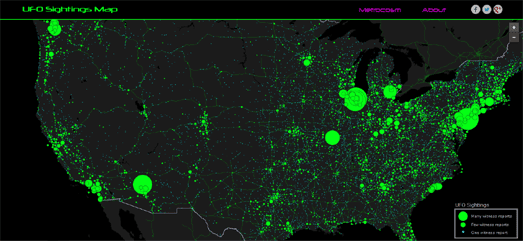
The UFO Sightings Map plots over 90,000 reports of UFO sightings since 1905. The map uses data from the National UFO Reporting Center.

UFO sightings are shown on the map using scaled map markers. The size of each marker relates to the number of eye witnesses. If you select a marker on the map you can actually read the witness reports. Many of the reports are accompanied by videos or pictures recorded by the eye witnesses.


QuantBait has created an animated map of all United States UFO sightings from 1933-2010. The UFO Sightings and Visualizations map also uses data submitted to the National UFO Reporting Center.

The map uses CartoDB's Torque library to animate through the decades of UFO sightings. The map reveals a clear trend of increasing numbers of close encounters through time. I'm not sure if this is the result of more and more alien invasions or increasing air traffic in the United States.


For a number of years UFO Stalker has been using the Google Maps API to show the locations of the latest UFO reports to MUFON (the Mutual UFO Network).

The map includes a number of filters, which allow you to filter the aliens on the map by date and the type of close encounter. If you click on a map marker you can read the event details of the reported sighting. It is also possible to search the map by location and date and view the latest reports in list format.

Saturday, July 25, 2015

The Battle of Britain Map


75 years ago in July 1940 the Luftwaffe began the Battle of Britain. This concerted air campaign, waged by the German Air Force against the United Kingdom, was an attempt by the German Air Force to assert authority over the Royal Air Force.

Batalla de Inglaterra is a comprehensive map of RAF and Luftwaffe bases in the summer of 1940. The map also includes the locations of radar stations and the maximum flight range of the German Messerschmitt 109 and the ranges of the RAF's radar coverage,

The RAF recently published the Battle of Britain Campaign Diaries, so the resources are there for anyone who wants to undertake the mammoth task of mapping the whole Battle of Britain campaign.

The UK's Top Tech Cities


This is a very interesting look at the location of GitHub users in the UK. It also has some very pretty scaled Octocat markers.

Where is GitHub most popular in the UK is a map of the number of GitHub users (who give a location) in UK cities. Perhaps the most surprising result on the map is London. Despite East London Tech City (aka Silicon Roundabout) being widely viewed as the center of the UK's tech scene London itself has a very small percentage of GitHub users.

The top city for GitHub users is Cambridge, with 3 times as many users as Brighton (the city with the second highest number of users). London itself comes quite a way down the list of the cities with the highest percentage of GitHub users. This could be because London has a more diversified range of industries than other cities. The results also might be different if we looked at a smaller geographic area in London. The percentage of the population with GitHub accounts in the area around Silicon Roundabout could well be a lot higher than London as a whole.

Around 1% of the population of Cambridge has a GitHub account. This is a third of the percentage of San Francisco, where over 3% of the population have a GitHub account. You can view a list of the top U.S. cities with GitHub accounts on The Top Tech American Cities.

You can also read more about how the 'Where is GitHub most popular in the UK' map was made in this blog post.

Friday, July 24, 2015

Kickstart the MapWheel


I've been lusting after a MapWheel for a while. MapWheel lets you design and order your very own beautifully crafted toposcope.

A toposcope is a marker or signpost which indicates the direction, and usually the distance, to notable locations. MapWheel lets you design your own personal circular toposcope pointing to locations (or people) important to you.

The MapWheel website uses the Google Maps API to enable you to customize your own MapWheel. You can enter as many locations as you want and MapWheel will automatically add the direction and distance of each location to your own MapWheel. When you have finished designing your personal MapWheel you can then choose from a number of different woods or stainless steel for the finished product.

MapWheel is now on Kickstarter. The two person company behind Mapwheel, Waypoint Ventures, is hoping to raise $30,000 by Aug 23rd. The rewards for the different values of pledges look very tempting to me.

Timelapse of New York City Crime


Timelapse of Crime in NY is an animated choropleth map of 15 years of crime in each of New York City's precincts. Press the play button and the map updates to show the number of reported crimes in each precinct for each year since 2000.

The use of an animated timeline choropleth map is pretty effective in visualizing the overall drop of reported crime throughout the city in the last 15 years. I also like the transition fading between the two separate colors when a precinct polygon updates.

If you select a precinct on the map you can view a bar chart of reported crime in the precinct for the last 15 years.

Mapping the Fortune Global 500


Every year Fortune ranks the top 500 companies in the world based on their yearly revenue. This year they have also published a map of the Global 500 based on the location of each corporation's company headquarters.

The size of the red circles on the Mapping the Global 500 map represent the size of each company's revenue. You can adjust the corporations displayed on the map by their annual profit & by revenue using the interactive bar charts above the map.

The bar charts were created with Crossfilter.js. The Google Maps Developers Team has a useful video demonstration of how to connect Crossfilter to the Google Maps API. All the code used in the video is available on GitHub and you can also play with this example map to get an idea of how powerful the combination of Crossfilter and Google Maps can be.

If you want to use Crossfilter with the Leaflet mapping platform you can use Crosslet, a JavaScript library combining Crossfilter, Leaflet and D3.

Thursday, July 23, 2015

The STD Map of America


RentApplication.com has created an interactive map showing the STD rates in cities across the United States.

How Bad are STD Rates in Your City uses data from the CDC for 2013. Each city's STD rate is normalized against the city's population. The city of Montgomery, AL has the highest rate of STD's in the United States with a rate of 1899.20 per 100,000 people.

If you select a city on the map you can view the number of cases of Chlamydia, Gonorrhea and Syphilis reported in the city. According to ReantApplication.com the military helped a number of cities rank highly, with Norfolk Naval Base, Ft. Hood, and Ft. Bragg all helping their cities to break into the top 10.

Refugee Roulette


If you want to claim asylum in Europe as a refugee then your best bet is to try to get to Sweden. The worst place to try to claim asylum is Hungary.

Irin News has published a map of asylum acceptance rates for countries in the European Union. Despite all these countries being in the Common European Asylum System there is still a wild variation in the number of refugees whose applications for asylum are accepted between the different countries.

In 2014 the approval rate for asylum applications in Sweden was 45 percent. In Hungary it was just 9 percent.


The current crisis in Syria is probably the biggest cause of the current refugee crisis in Europe. To get to Sweden however refugees face the difficult task of crossing Europe and passing through a number of countries where any request for asylum is more likely to be denied.

Swedish radio station Sveige Radio has mapped the journeys of a number of Syrian refugees. Reporters from the station have been following the progress of over 70 Syrians over the past year, as they try to escape the crisis in Syria and enter 'Fortress Europe'.

At the heart of Sverige Radio's report on Fortress Europe is a CartoDB powered map. You can access the journeys and stories of the individual refugees (and their families) from the map menu. If you select a name from the menu you can view their path to Europe on the map and read details about the journey beneath the map.

The report on each individual or family includes details on their decision to leave Syria and the difficulties they faced in entering Europe. Many of the reports include an audio interview with the refugee.


The Guardian also recently reported on one man's journey from Syria to Sweden. The Guardian story is a moving account of Hashem Alsouki's perilous journey from Syria.

The main danger for Syrians refugees fleeing to Europe is crossing the Mediterranean. The people smugglers have been known to deliberately sink ships carrying refugees. They also know that any ship they lose will more than likely be lost to them on arrival in Europe. They therefore tend to use the cheapest and least sea-worthy boats for these journeys.

Hashem Alsouki was lucky and successfully managed to cross from Egypt to Italy. Once in Italy Hashem then faced a number of difficult decisions about which route to take to Sweden. You can find out the route he chose and whether he succeeded in reaching Sweden by reading A Migrant's Journey.

The Tour de France in 3D


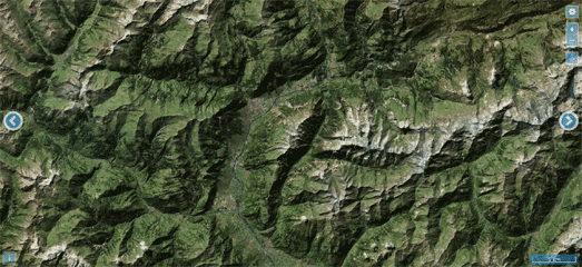
Recently the Wall Street Journal created a WebGL 3D interactive visualization of the Col d'Allos mountain stage in the Tour de France. The Guardian has now followed suit with a WebGL visualization of the Alpe d'Huez stage of this year's race.

Stage 17 of this year's Tour de France included the popular Col d'Allos mountain stage. The Col'Allos is one of the most popular mountain passes in the Tour de France and this year was the 34th time the route was included in the race.

The Wall Street Journal created a detailed map of the stage's big descents. The Madness of the Descent looks in particular at the Col d'Allos. During Stage 17, after a steep climb, with an average gradient of 5.5%, the riders faced a 10 mile descent, where they lost 3,400 feet in vertical elevation.

The Wall Street Journal's article includes an impressive 3d map of the Cal d'Allos pass. The 3d Col D’Allos visualization was created with WebGL and three.js. If you select one of the three yellow map markers the graphic pans and rotates to highlight different views of the Col D'Allos descent.

Stage 17 was won by the German Giant-Alpecin rider, Simon Geschke.


Stage 20 of this year's Tour de France will for the 29th time feature the famous Alpe d'Huez ascent. Stage 20 will take place this Saturday.

The Guardian's The Climb of Alpe d'Huez is a 3d tour of the 14km ascent. The visualization includes forward and back buttons which allow you to progress through the route of this mountain stage. As you progress through the route the 3d map of the Alpe d'Hues rotates and zooms to highlight some of the most important points in the climb.

Mapping Slow TV


Back in 2011 Norwegian Public Service broadcaster NRK broadcast non-stop for 134 hours the voyage of the cruise liner Hurtigruten around the Norway coastline. As well as amazing live footage of the cruise you could also keep track of the position of the cruise liner on a live real-time Google Map.

Slow television is the term used for these types of live 'marathon' television shows covering an ordinary event in its complete length. The Hurtigruten cruise wasn't the first 'slow television' broadcast by NRK (it had previously broadcast a number of films of complete train journeys). However the Hurtigruten broadcast received a big international following on the NRK website.

This had led many other broadcasters in other countries to broadcast their own 'slow television' events. For example, this year in the UK the BBC broadcast three special slow TV events, including 'The Canal Trip', broadcasting the journey of a barge along the Kennet and Avon canal. Unfortunately the BBC missed a trick by not using a map to track the position of the barge on its journey.

Czech online broadcasters Playtvak.cz has a number of slow TV broadcasts. One of these is Planespotting, a live broadcast from Václav Havel Airport in Prague. Planespotting allows you to watch a live broadcast of planes landing and taking off from the airport, from a camera positioned on the roof of the multi-story car park next to the runway.

The live footage is accompanied by the live audio feed from the control tower, so you can also listen to the pilots talking to the air traffic controllers. Beneath the live broadcast stream is a live Flightradar24 Google Map. The map shows the live position of the planes in the airport. This means that you can actually find out all kinds of details about the planes you are watching in the live stream, including the aircraft type, flight number and flight details.

Wednesday, July 22, 2015

Portland's Danger Buildings


Labrat Revenge's Portland, Oregon: The Age of a City was one of the first interactive building age maps. The map colors Portland buildings footprints by age. 544,033 buildings are displayed in total, resulting in a beautiful looking map that reveals some interesting facts about Portland's development over the years.

The Oregonian has now taken essentially the same data to create a map visualizing the buildings in the city most in danger from earthquake damage.


In 1974 Oregon enacted its first statewide building code. In 1993 western Oregon adopted its first seismic standards. Franz Rad, a professor of civil & environmental engineering at Portland State University, argues that these dates provide a "broad-brush look at the vulnerability of buildings".

Portland buildings that predate 1974 are likely to be the most vulnerable to seismic activity. Buildings erected after 1974 are better built, and those built after 1993 are even better.

Earthquakes: How Vulnerable are Portland’s Buildings? takes the Portland building age data and colors the city building footprints to show buildings constructed before 1974, those constructed between 1974 & 1993 and buildings erected after 1993. You can therefore use the map to assess the likely vulnerability of any Portland building during an earthquake.

Mapping Spanish Debt


Considering the state of the European economy it is surprising that there have been very few interactive maps visualizing the debt of the continent's poorer performing countries. However El Pais has created an informative interactive map of the debt held by each Spanish municipality.

The Variation of Municipal Debt in the Last Legislature map shows which Spanish municipalities have increased or lowered their level of debt since 2011. Municipalities colored red on the map have increased their levels of debt and the municipalities in green have reduced their level of debt. You can find out the exact level of an individual municipality's debt by clicking on it on the map.

It is hard to get a complete overview of the numbers of municipalities that have managed to reduce their debt and those that have increased their overall debt just from the map view. It looks to me that about half of the municipalities are performing better economically and about half are performing worse.

The good news is that many of the larger cities, such as Madrid, Barcelona and Valencia all seem to have managed to reduce their debt since 2011.

The Google Maps Flâneur


To enter Random Google Maps is to undertake a journey through the labyrinthine streets and hidden spaces of the map. It is an immersion in the secret language of the map; it is to see the map, to be at the center of the map, and yet to always remain hidden from the map1.

Sorry - I got lost for a second there. Actually Random Google Maps is an animated journey through random locations on Google Maps, with each new location decorated in a random Google Maps style. Just fire up Random Google Maps and sit back as the application takes you through an ever changing landscape of random locations presented in ever changing random colors.

If you take a little peak at the JavaScript behind Random Google Maps you will discover that the locations aren't really that random at all. The map picks from 26 locations around the world at random and then applies random colors to a number of the map features.

It's still a fun little map though.

1 with apologies to Walter Benjamin

Visualoop's New Data Visualization Gallery


Visualoop is one of the the best websites currently dedicated to showcasing infographics and data visualizations. I'm particularly fond of its weekly Digital Cartography roundup of the best interactive maps.

Visualoop has now launched a new data visualization gallery, which already features around 1,500 examples of the best data visualizations. You can search the data visualizations in the new gallery by category, publisher/media and by language. The category search doesn't include a 'map' option but if you search within the 'interactive' category you can find some great examples of mapped visualizations.

Visualoop's new data visualization gallery also includes a Designers & Collectives section, which provides profiles of some of the best designers and companies currently working in data visualization. For example, this section includes a profile of the CartoDB web mapping company and a portfolio of some of their best interactive maps.

If you are interested in interactive maps and /or infographics & data visualizations in general you should definitely add Visualoop's new data visualization gallery to your browser's favorites folder.

Tuesday, July 21, 2015

Literature's Great American Road Trips


You could argue that all great literature involves a journey of some kind. The idea of a hero undertaking a personal odyssey is probably older than the written word itself. However the mythological power of the road-trip in American literature seems particularly strong. It is America's ur-story, springing from the pioneering journeys of the early Western settlers. It is in many ways the story of America itself.

The Obsessively Detailed Map of American Literature's Most Epic Road Trips sets out to map the great American journeys undertaken by some of America's greatest writers (and a few not so great). The map features every place-name referenced in twelve American non-fiction books. The celebrated writers featured on the map include Mark Twain, Jack Kerouac and Tom Wolfe.

You can select to view each journey's route on the map from the map side-panel. Click on individual markers and you can read excerpts describing the chosen location. The map therefore provides a handy accompaniment to any of the mapped texts. However to truly appreciate the map you need to read the book.

The Meerkat Map


Links to live video streams on Periscope occasionally pop-up on my Twitter wall. However by the time I get around to clicking on the links the streams are always over. I have therefore actually never seen a live Periscope video broadcast.

I understand that Periscope actually has a map of currently live streams on its iOS app. That would be great if I actually owned an iOS device. I can't help thinking that there must be many people like me who would be tempted to download a Periscope app if Periscope actually had more of a web presence.

This seems to be a lesson learnt by one of Periscope's main competitors, Meerkat. The Meerkat web homepage provides a list of currently live streams. There is also the MeerkatMap, created with the Meerkat API.

The MeerkatMap is a great way to find live video streams by location. Markers on the map show the current live streams and you can click-through to watch any broadcast live on the Meerkat website. The map sidebar also includes a list & links to live video streams with no location data.

Revealing the location of live Meerkat streams obviously has some privacy issues. I don't know if the MeerkatMap has taken any steps to offset the exact location of the streams being shown. However if you are a Meerkat user then you might want to adjust your location settings in the app itself.

Solving the Problem of Cartograms


I don't usually like cartograms. I find that the geographical distortions in cartograms quickly lead to geographical illegibility.

The cartogram above, which compares property values between counties across the United States, has shown up a lot recently on my Twitter feed. Now if I hadn't told you that this was a cartogram of the continental United States I bet you would have struggled to identify the country.

After ignoring the Tweets about this cartogram for about a week I finally decided to click on the accompanying link. It turns out I was being very unfair to Metrocosm (the creators of this cartogram). The Metrocosm post on housing values across the United States includes this animated GIF:


Now the cartogram makes much more sense.

I've been converted. I'm now a fan of cartograms. Or to be more specific I like animated cartograms. By simply providing a transition from a regular map projection to a geographically distorted cartogram developers can easily mitigate against the dangers of geographic intelligibility inherent in static cartograms.


Macrocosm have provided another example of a cartogram which uses animated transitions between a traditional map projection and a map distorted by thematic variables. How We Share the World visualizes how the world is divided according to six different socioeconomic variables.

This interactive map allows you to view cartograms of the world with the countries resized based on GDP, Debt, Population, Births, Wealth and the number of Billionaires. The map includes a non-distorted map view1 which again helps to overcome the dangers to geographical legibility in the distorted views.

 1 stop being clever - you know what I mean.