Skip to main content
Search
Search This Blog
Maps Mania
Posts
Showing posts from September, 2022
Show all
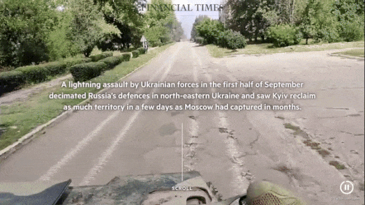
September 30, 2022
Liberating Ukraine
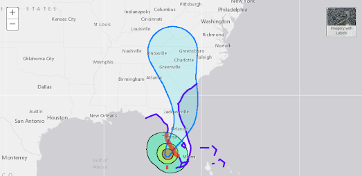
September 28, 2022
Hurricane Ian Tracking Maps
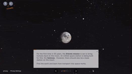
September 28, 2022
Journey to the Moon in 3D
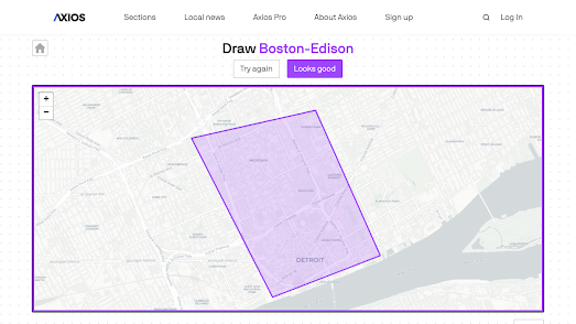
September 27, 2022
How Well Do You Know Your Boundaries?
September 27, 2022
Annotating Vintage Maps
September 26, 2022
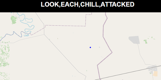
What Four Words
September 26, 2022
Italian Election Maps
September 24, 2022
A 15th Century Map of the World
September 23, 2022
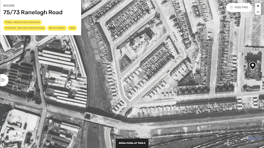
The RAF Map of Post-War London
September 22, 2022
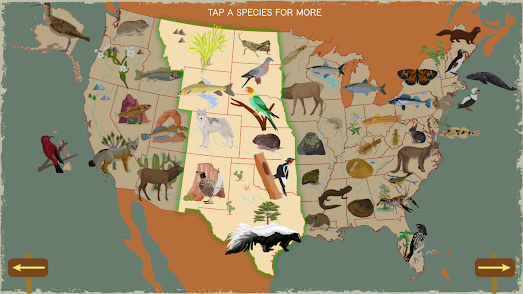
The United States of Extinction
September 21, 2022
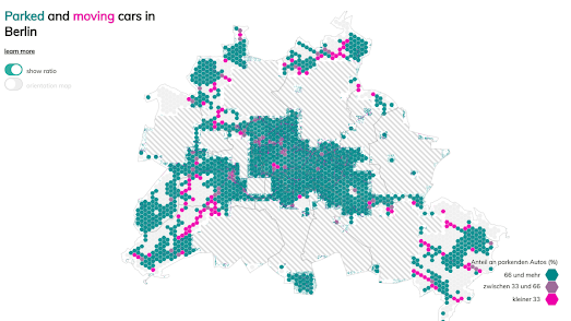
The Number of Cars in Berlin
September 20, 2022
CSI Suspect Mapping
September 19, 2022
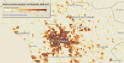
If the Romans did Data Visualization
September 16, 2022
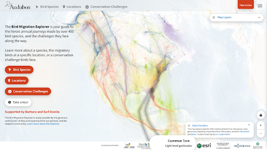
The Bird Migration Explorer
September 14, 2022
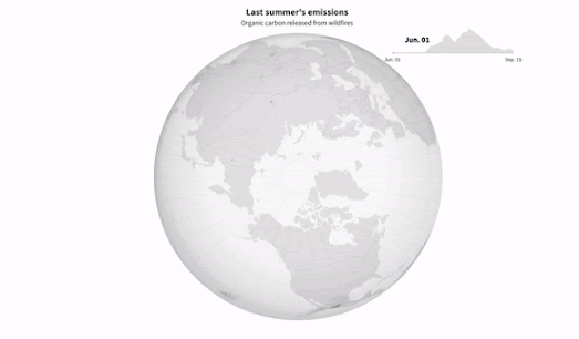
The First Summer of the Rest of Your Life
September 13, 2022
The Disastrous Growth of Arctic Wildfires
September 12, 2022
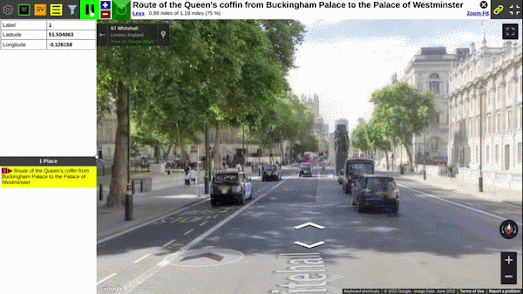
The Queen's Procession Route in London
September 12, 2022
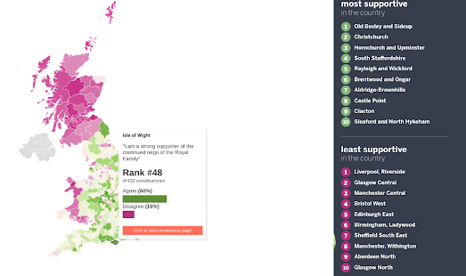
Does the UK Really Want a King?
September 10, 2022
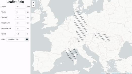
Animating the Weather
September 09, 2022
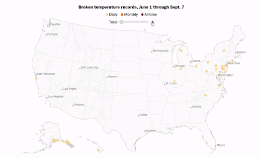
America's New Climate Change Map
September 08, 2022
Is Havana the World's Least Sexist City ?
September 07, 2022
Your Town, Middle-earth
September 06, 2022
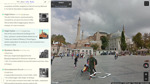
Mapping Constantinople
September 05, 2022
Leaflet-IIIF-GeoJSON
September 02, 2022
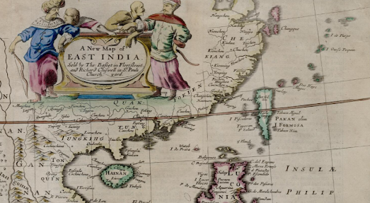
The Southeast Asia Map Collection
Newer Posts
Older Posts
Home