Skip to main content
Search
Search This Blog
Maps Mania
Posts
Showing posts from January, 2023
Show all
January 31, 2023
Iceland's Shrinking Glaciers
January 29, 2023
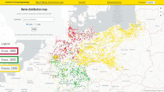
The Distribution of Surnames
January 29, 2023
The 2023 Czech Presidential Election Maps
January 28, 2023
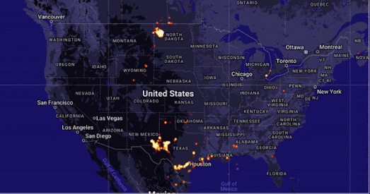
Natural Gas Flaring Map
January 27, 2023
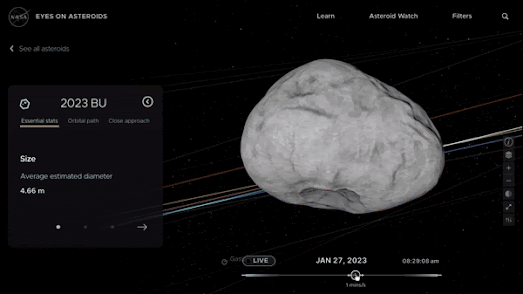
Asteroid Watch
January 25, 2023
The Global Contrail Map
January 24, 2023
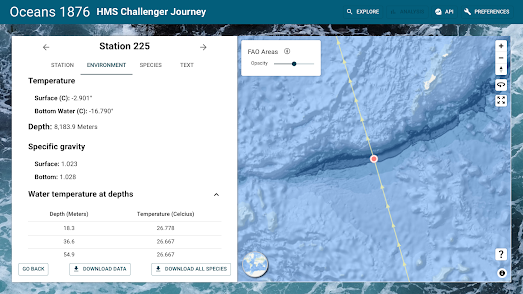
Mapping the Ocean Deep
January 23, 2023
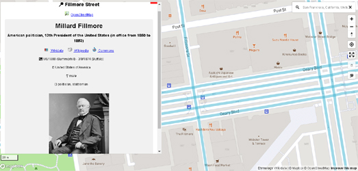
The Open Etymology Map(s)
January 21, 2023
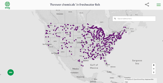
Forever Chemicals in Freshwater Fish
January 20, 2023
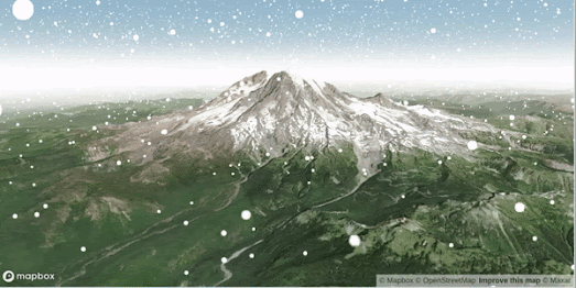
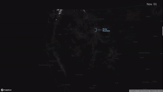
Mapping the Snow, Wind & Rain
January 19, 2023
Explore Your Neighborhood Profile
January 18, 2023
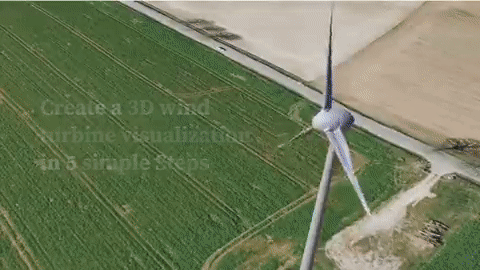
Build a Wind Turbine in Your Garden
January 17, 2023
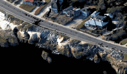
Californian Coastal Erosion
January 16, 2023
A Dialect Map of England
January 14, 2023
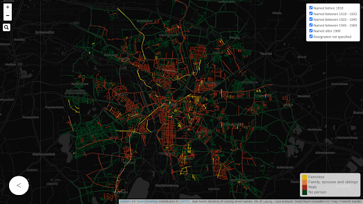
The Gendered Streets of Leipzig
January 13, 2023
Earthquakes with Depth
January 12, 2023
Beyond Snowfall
January 11, 2023
The Campaign for More Winter Sun
January 10, 2023
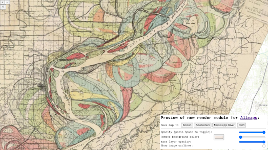
All the Maps at Once
January 09, 2023
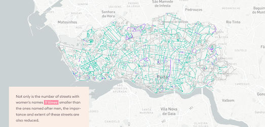
The Gendered Streets of Porto
January 07, 2023
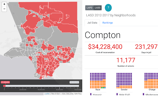
The Cost of Locking Up Americans
January 06, 2023
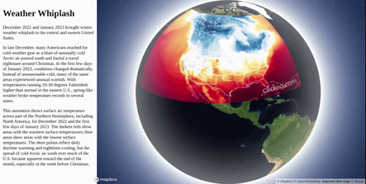
Weather Whiplash Animated Map
January 05, 2023
The Land of Generation X
January 03, 2023
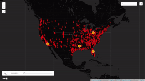
Mapping Police Killings
January 02, 2023
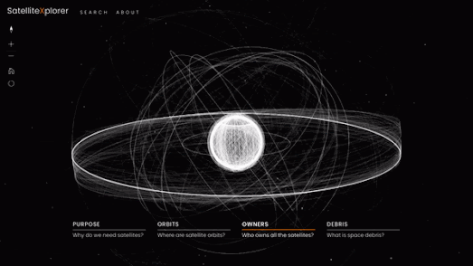
SatellitExplorer
Newer Posts
Older Posts
Home