Friday, November 30, 2018

L'Eau de Pesticide


In France many groundwater aquifers have become contaminated by pesticides. These pesticides come from agriculture and also from amateur gardeners. Some of the aquifers which are now contaminated by pesticides are used for the production of drinking water.

You can discover the levels of pesticide contamination in France's groundwater aquifers using the Data Pesticides interactive map. The map allows you to monitor the levels of pesticide contamination in individual aquifers and to explore the trends of this contamination over time. The markers on the map are colored to indicate the concentration of pesticides discovered in each aquifer. You can click on the individual aquifers on the map to view the concentrations of pesticides measured in the aquifer since 2007. You can also see how these concentrations compare to the national average.

The map includes a number of filters. These allow you to visualize the concentration levels measured in aquifers in different years. They also allow you to visualize the concentration levels of different pesticide types and compounds found in aquifers throughout the country.

Mapping UK Pub Closures


There used to be four pubs within a five minute walk of my house. One pub remains. Two of them are now small supermarkets. The other has become a private residence.

My neighborhood in East London isn't different from any other part of the UK in terms of the dramatic number of public houses closing. According to the Office of National Statistics nearly 1 in 4 pubs have closed in the last 10 years. In 2008 there were around 50,000 pubs in the UK. In 2018 only about 39,000 pubs remain.

You can find out how the numbers of pubs have changed in your local area on the ONS's Change in Pub Numbers Map. This map shows the percentage change in the number of pubs in every UK local authority area. If you click on an area on the map you can discover the exact percentage change in the number of pubs in the last 10 years.

Despite the number of pub closures the ONS reports that the turnover of pubs and clubs has remained about the same since 2008. They also report that the number of jobs in pubs has risen 6% in the last 10 years. The ONS suggests that this shows that the "remaining pubs and bars appear to have soaked up the custom from those pubs that have closed down".

You can learn more about the pub trade in the UK over the last 10 years in the ONS article Economies of ale: small pubs close as chains focus on big bars. As well as the map linked above the article includes an interactive which allows you to find out how many pubs have closed in your area, how many pubs there are per 10,000 people and how this compares to the national average.

Thursday, November 29, 2018

Drone Panoramas of Camp Fire


The Camp Fire was California's deadliest and most damaging wildfire in history. The fire is estimated to have caused $7.5–10 billion in damage to property. More importantly it also killed 88 people.

An interagency UAS task force, led by the Butte County Sheriff's Office, has now captured 360 degree panoramic imagery of some of the destruction caused by the Camp Fire. Licensed UAV pilots were used to capture the aerial photographs, which will be used to assist in damage assessment and to help understand how the fire spread so quickly.

You can view the 360 degree panoramas on this Mapbox Fire Panoramas map. You can also view the panoramas on Butte County's own interactive map Camp Fire Information. The Butte County map also includes video footage of some of the areas affected by the fire.

The California Department of Forestry and Fire Protection has released an interactive map which shows which buildings have been destroyed or damaged by the Camp Fire. The Camp Fire Structure Status map plots the latest field damage inspection reports for buildings in areas affected by the Camp Fire.

New York's Music Map


Online ticket reseller Vivid Seats has mapped out the most popular music genre and the most popular music act in each New York zipcode area. The Most Popular Music Genres in New York map colors zipcode areas to reveal each area's favorite type of music. If you mouseover an area on the map you can also see the area's favorite musical artist or group.

Vivid Seats hasn't provided any information about how they have determined the popularity of different music genres in each area. I assume the data is based on the number of tickets bought for each type of music genre through the Vivid Seats website.

Back in 2015 the Wall Street Journal used jukebox data to create a similar interactive map which showed the most popular songs in New York neighborhoods. The NYC Jukebox Heroes: Musical Map uses data from TouchTunes jukeboxes to show what were the most played songs in different New York boroughs.

If you click on a zip-code area on the WSJ interactive map you can view the top ten most played bands and the top ten played musical artists. Back in 2015 the residents of Manhattan’s East Village loved listening to Beyonce. According to Vivid Seats these days they prefer the more guitar based sounds of Radio Head. However Beyonce will be happy to hear that she is still very popular in parts of Queens and Randalls Island.

Latin music seems to have particularly loyal fans. On both maps the 11368 zipcode area in Queens reports that Romeo Santos is the most popular artist. The Racial Dot Map of America might help to explain why Latin music is so popular in certain areas of New York. I'd hate to be accused of making assumptions about the musical taste of New York neighborhoods based on racial stereotypes but the Racial Dot Map might also provide some insight into why rock is most popular in certain neighborhoods and rap/hip-hop in others.

A Toponym Map of Berwickshire


Packs of wolves once hunted in the forests of Berwickshire. The wolves have long gone but they have left their mark in the county in the name of a small stream,which is called Wolfcleugh Burn (a cleugh is a narrow gorge or chasm with high rocky sides).

The University of Glasgow's Berwickshire Place-Name Resource allows you to explore and learn more about the names of villages, towns and other locations in the Scottish Borders county of Berwickshire. The resource will be of particular interest into anyone who is interested in toponyms and the definitions and meanings of old British place-names.

The Place-Name Resource allows you to search for place-names in the county using a number of different methods. You can search for place-names alphabetically. Alternatively you can search using a string (for example entering '*hall' to find all place-names ending ....hall). You can also search using the element glossary which allows you to search by different common elements found in Berwickshire place-names.

Once you have completed a search of the Berwickshire Place-Name Resource you can view the results on an interactive map. Clicking on an individual marker on this map will open an information window providing details on the selected location. These details include its entry in the OS Name Book. If you are interested in the meaning of a place-name then the 'elements' section allows you to view a definition (where available) of any unfamiliar parts of the place-name. For example both Kimmerghame (cow's bridge) and Birgham (a settlement beside a bridge) contain derivations of 'brycg' - which means bridge.

Wednesday, November 28, 2018

The Medieval Murder Map of London


London in the 14th Century was a dangerous place to be. The murder rate in early 14th century London was about 15-20 times higher than an English town with an equal sized population today. A new interactive map shows that market areas in London were particularly dangerous.

The University of Cambridge's new London Medieval Murder Map plots the locations of 142 murders which took place in the capital in late medieval London. The map uses data from the Coroner's Rolls. The coroners and their sheriffs in medieval London investigated violent deaths and published the results in the Coroner's Rolls. Nine of these Coroners' Rolls, covering the City of London, from the first half of the 14th century have survived.

The London Medieval Murder Map reveals that around 68% of homicides in medieval London occurred in public commercial spaces, such as markets and squares. There are two main homicide hotspots on the map. One stretches from St Paul's to St Mary's le Bow in the Cheapside area of London. An area which was full of stall and shops. Another murder hotspot seems to radiate around Leadenhall Market.

You can filter the murders which are shown on the map by the gender of the victim, the type of murder weapon used, by date range and by crime scene (public or private spaces). Over one third of the murders were carried out using a 'long knife'. Most men in London in the 14th century would be armed in public with a sword or knife. The majority of the victims of murder on the map are men. One thing the map doesn't show is that men were also the most likely perpetrators of these crimes. 92% of the homicides shown on the map were carried out by men.

Another thing not shown by the map is when homicides most often occurred in medieval London. 31% of the murders shown on the map happened on a Sunday. The one day of the week when most people didn't have to work. 77% of the murders occurred in the evenings between the times of 5 pm and 10 pm.

Tuesday, November 27, 2018

Send Street View Christmas Cards


It's nearly time to send your Street View Christmas cards. To help you create your seasonal custom panoramic cards you can now use Street View Postcards -  a new creation tool from Map Channels.

Here's my finished Street View Xmas card. If you want to create your own custom made card then you can use Map Channels' Street View Postcard tool. Using Street View Postcard you can make a Christmas Card for any location on Earth, as long as it has Street View imagery on Google Maps.

Register with Map Channels and you can decorate any Street View image with your own message, with animated falling snow and other Christmas decorations. When you have finished your Street View Christmas card you can share the link to the card with your friends or you can embed it in your own website or blog.


You can also create a personalized Street View message using It's a Message. This Google Maps application helps you create and send a personal holiday greeting from your own choice of Street View.

Once you select a Street View location and add your own personal message this app creates a stylized Street View scene, with animated snow and your greeting. The app pans and zooms around your chosen Street View image, accompanied by some nice soothing Christmas related music. Once you are happy with your personal Christmas Street View scene you can send the link to your friends.

Where on Mars


Yesterday NASA successfully landed the InSight probe on the surface of Mars. (Is there) Life on Mars is an interactive map of the red planet, which has been updated to show the location where NASA's InSight robot landed on Mars. InSight has landed on the Elysium Planitia, a large, flat and featureless plain, which is close to the planet's equator and perfect for landing spacecraft. It is also the perfect location for InSight's mission to explore the planet's core.

The actual name of the robot 'InSight' is short for Interior Exploration Using Seismic Investigations, Geodesy and Heat Transport. InSight has three main instruments. A seismometer, which will measure submartian seismic activity or Marsquakes beneath the surface of the planet. A heat probe, which will be buried 5 meters into the ground and which will measure how heat rises through the planet. Thirdly, InSight is also equipped with antennas designed to measure how much the planet wobbles on its axis. This will help to determine the size and density of the planet's core.

The (Is there) Life on Mars interactive map explores some of the questions around whether life exists on Mars. InSight will hopefully help us to answer this question as well. Earth’s rotating molten iron core generates the magnetic field that shields life from harmful radiation and stops Earth's atmosphere from shooting off into space. At some point Mars lost its magnetic field and its atmosphere. Learning more about Mars' inner core will help scientists understand how and why Mars lost its magnetic field. InSight may also help us learn more about conditions under the surface of Mars and whether life might have survived on Mars by retreating beneath the surface of the planet.

If you want to know what Mars might look like with an atmosphere then you can use the (Is there) Life on Mars map to explore a red planet which still has water. The map's Water Layer allows you to view water on the surface of Mars based on the planet's elevation data. Using this layer you can add lakes, seas and oceans to Mars and turn the red planet partly green (read the 'details' for an explanation as to why water on Mars wouldn't appear blue).

Monday, November 26, 2018

The Map of Scientific Collaboration


Olivier H. Beauchesne has created an interactive map which shows the international collaboration of scientists around the world. The map plots the connections between scientists and researchers in different cities as seen in scientific journals and papers ("for example, if a UCLA researcher published a paper with a colleague at the University of Tokyo, this would create an instance of collaboration between Los Angeles and Tokyo").

The Map of Scientific Collaboration reveals how scientists collaborate across borders around the world. As Beauchesne notes it also reveals some interesting patterns within individual countries. For example Paris seems to play a central role in French science. No matter where scientists live or work in France they all seem to collaborate with another scientist in Paris. In comparison the UK seems to have a less centralized scientific network. This is perhaps a result of the major Oxbridge universities being located outside of London.


Ironically, despite the global collaboration of scientists demonstrated in the Map of Scientific Collaboration, most people around the world won't actually be able to read the scientific papers from which the map was created. Unless they know about Sci-Hub.

Sci-Hub is an online repository of pirated scientific academic papers and articles. It allows researchers and students to access expensive pay-walled academic content. Content that is usually only available from expensive academic journal publishers. This pay-walled system can be prohibitively expensive, especially for struggling students and researchers from developing countries. It has been claimed that the popularity of Sci-Hub in countries such as India, Indonesia, Pakistan and Iran proves that Sci-Hub is providing access to scientific research to those who wouldn't otherwise be able to afford it.

In an article on the Science website, Who's Downloading Pirated Papers?, John Bohannon has created an interactive map showing where pirated scientific academic papers and articles have been downloaded from Sci-Hub around the world. In order to make the map Bohannon contacted Alexandra Elbakyan, the Sci-Hub creator, to request the geographic location of every user who has downloaded an academic paper from Sci-Hub. In order to protect the privacy of Sci-Hub users the data was aggregated to the nearest city.

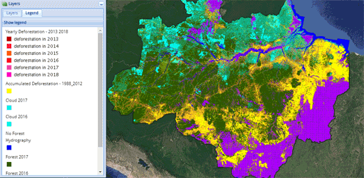
The Destruction of the Amazon Rainforest


The deforestation of the Amazon rainforest in Brazil last year reached its highest rate for ten years. Nearly 8,000 sq km of rainforest was destroyed between August 2017 and July 2018. The Brazilian government says that illegal logging is to blame for the huge rise in deforestation. The future outlook for the Amazon rainforest looks to be even worse. The newly elected president, Jair Bolsonaro, has promised to lower fines for illegal logging and to reduce the power of the government's environment agency.

You can view how logging has affected the size of the rainforest on TerraBrasilis PRODES. TerraBrasilis PRODES is produced by the Brazilian National Institute for Space Research (INPE) to visualize its environmental monitoring data. Since 1998 the PRODES project has been monitoring, by satellite, deforestation in the Amazon region and has published information on the annual deforestation rates.

The interactive TerraBrasilis PRODES map allows you to view the accumulated areas of the Amazon which have been affected by deforestation between 1988 and 2012. It also allows you to view the yearly deforested areas for each separate year from 2013 to 2018. If you click on the pie chart icon on the map you can view the yearly deforestation rates in the Brazilian rainforest in a series of charts and graphs. A table view also allows you to view the annual deforestation rate in each state in the country and for Brazil as a whole.


If you are interested in the future of the Amazon rainforest then you should refer to Infoamazonia's interactive Forest Cover Through Time map. This map shows Infoamazonia's projections for the extent of the rainforest's cover up until it is almost completely destroyed (which it predicts will occur in the year 2260). Just select the date buttons above the map to view the projected forest cover for any specific year.

Illegal logging isn't the only cause of deforestation in Brazil. The Silent Forest project has been started by a team of Brazilian and foreign scientists to assess the extent and impact of forest degradation in the Amazon rainforest. As a result of this monitoring the project has released an interactive map to show Contributing Factors to Degradation in the Brazilian Amazon Rainforest. The map shows the extent to which fire, logging, hunting and fragmentation are all leading to the destruction of the rainforest in Brazil.

You can learn more about the Amazon rainforest on National Geograhic's Amazonia Under Threat. Amazonia Under Threat explores the various ecosystems which once thrived in the rainforest. It also maps the effect that people and human industry are having on the delicate ecosystems of the Amazon region.

Saturday, November 24, 2018

Building a Bike Friendly Berlin


Earlier this year Berlin passed a mobility law designed to encourage safe cycling in the city. The law requires that all major and minor roads should have separated bike lanes, the creation of 100,000 parking spaces for bikes and the redesign of 30 accident hotspots every year.

In order to help facilitate safer cycling in Berlin the city has released FixMyBerlin. This interactive map is designed to inform the public about the planned cycling improvements in Berlin and to help show where it is already safe to bike in the city.

The map includes a Happy Bike Index layer which shows which roads are currently the least and most safe to cycle on. You can view the bike friendly rating of all Berlin's roads by selecting the Happy Bike Level layer on the map.

If you switch the map to the Planung view then you can view Berlin's planned cycling improvements. Different map icons are used on the map to show what stage each improvement has reached. These indicate whether the project is just in the conception stage, in the planning stage, currently being built or if the project has been completed. Users of FixMyBerlin can sign up to receive updates on any of the mapped cycling improvements. If you sign up for a project you will be kept informed every time the project is updated.

Friday, November 23, 2018

Black Friday Cyber Monday Live Shopping


Shopify's BFCM Live Map visualizes real-time sales across the world made over this weekend on the popular e-commerce platform. As you watch the BCFM Live Map customer orders are animated as great circles on a 3D globe showing you where sales are being made.

This isn't the first real-time retail tracking map I've seen. Obviously these kinds of maps don't have much real practical use, beyond marketing the companies themselves. Nevertheless they can be fun to watch for a couple of minutes. The Shopify map includes a 'Sales per minute' and 'Orders by minute' running totals which do provide an impressive overview of the number of sales made through Shopify. Updates also appear under the map with details about some of the sales being made around the world - as they happen.

Mapping the Rise of Populism


This week the Guardian newspaper has been running a series of articles exploring the rise of populism across the globe. The newspaper claims that over the last 20 years populist political parties have tripled their support in Europe.

In Revealed: one in four Europeans vote populist the Guardian has mapped the populist vote share in European national elections since 1998. Using the map's date slide control you can navigate to view the populist vote share across Europe for any year since 1998. The Guardian argues that the map shows how populism has made "inroads in western Europe’s major powerhouses in the past three years".

You can view the Guardian's full series on the rise of populism at The New Populism. The Guardian's quiz How populist are you has been particular popular among many of the people I follow on social media. The quiz tests how how left or right wing your political views are and how populist they are. It then tells you which political leaders around the world you are most similar and least similar to.

Thursday, November 22, 2018

A Short History of Industry in Latvia


Industrial Heritage for Tourism is an interactive map of historical industrial sites in Estonia and Latvia. The map provides a guide to early industrial factories, mills and other industrial sites which are now open to visitors in both countries.

You can filter the locations featured on the interactive map simply be selecting an icon from the map menu. The categories of industrial heritage centers shown on the map are mills, water towers, factories, lighthouses and railways. I really like the categorized map markers on the map which make it easy to select an industrial heritage site by type of center. I also like the 360 degree panoramic images which allow you to take a virtual tour of each location.

What I don't like about the map is that it seems designed to deter you from visiting any of the sites in person. Strangely for an interactive map designed to promote tourism Industrial Heritage for Tourism doesn't seem to want to help you physically visit any of the locations. The map doesn't provide addresses, driving directions or opening hours for any of the historical sites. The calendar section does have contact numbers for a very few of the industrial heritage sites. However, if you do want to visit any of the featured locations, it looks like you will have to do a bit of Googling first to find the site's official website (if there is one).

Wednesday, November 21, 2018

Drowning Cities


Flood Vancouver is an impressive visualization of how rising sea levels could affect the city of Vancouver. The Flood Vancouver 3D map allows you to manually adjust the level of the sea to visualize which parts of the city would flood at different sea levels.

You can adjust the sea level on the map by clicking on the up and down arrows on your keyboard. The 3D buildings on the map will change color depending on their status. The yellow buildings are unaffected by the rising sea level. However the buildings turn pink when the level of the sea starts lapping at their lower floors. When the buildings turn red on the map it is time to man the lifeboats.


If you like drowning cities then you will definitely like the Island of Berlin. This visualization provides a dramatic (if not exactly accurate) model of how global warming could effect Berlin.

The Island of Berlin uses WebGL to create a 3D model of Berlin. The model depicts Berlin as surrounded by a vast sea. Using the slide control you can raise the level of this sea to view which areas of Berlin would remain above water at different sea levels. Obviously Berlin is not an island surrounded by sea, so this visualization may not be entirely accurate.


Almost 20% of Singapore is reclaimed land. The country is therefore very worried about the likely effects of rising sea levels. In order to illustrate the possible impact of sea level rise last year the Straits Times released a virtual reality visualization called Singapore Underwater.

Singapore Underwater users virtual reality to show how Singapore might look in the future if global warming leads to rising sea levels. Singapore Underwater explains the reasons why sea levels are rising around the world. The visualization also looks at how Singapore might try to mitigate against rising seas and the possible impact of land loss and saltwater contamination of the country's farmland & reservoirs.

Singapore Underwater is best viewed with a VR headset but can be viewed on a desktop, tablet or mobile device

Putting Sikh Soldiers on the Map


During the First World War over one million Indians served overseas. At least 74,187 Indian soldiers gave their lives in the war. Although the Sikh population was less than 2% of the total population of British India at the time of the First World War they made up more than 20% of the British Indian Army. The contribution of Sikhs to the First World War is commemorated in a new interactive map.

Soldier Map - Empire, Faith & War maps the records of 8,000 Sikh soldiers who fought in the Great War. Most of the data for the map comes from the Commonwealth War Graves Commission’s casualty database, which records the names of the 1.7 million men and women of the Commonwealth forces who died during the First and Second World Wars.

Sikh soldiers are shown on the map at their place of birth. Soldiers whose birthplaces aren't known have been placed on the map at India Gate in New Delhi, the British-built memorial to Indian soldiers who died in the period 1914 to 1921. If you click on a soldier's marker on the map you can read details about where and when they served, where they were born and where they are commemorated. Some soldier's markers may also contain links to a story page created by citizen historians who have discovered more information about  an individual soldier's life.

Also See

Mapping the Fallen of World War I

Tuesday, November 20, 2018

Mapping Sustainable Forestry Projects


explorer.land is a new interactive mapped based story telling tool from OpenForests. The platform is designed to allow organizations around the world to share information about their sustainable land based projects with the wider public.

The explorer.land interactive map allows anyone to search for different sustainable land based projects around the world, discover more about each project's aims and discover the latest project news. Users can search for sustainable land projects on explorer.land by type of project, by country or by name. When you select an individual project you can view the project's location on the interactive map. Individual markers on the map allow you to explore geographical areas that the project wishes to highlight and posts that the project has pinned to the interactive map.

The map sidebar provides extensive details about each selected project. These details include an overview of the chosen sustainable land based project, their latest news and contact details for those who wish to learn more about the selected project.

explorer.land is one of many social & ecologically diverse forestry projects developed by OpenForests.

How Green is Your City?


The UK's Office for National Statistics has released two interactive maps which show how much greenery there is in every street in the Welsh towns of Cardiff and Newport. To create the two maps in How Green is Your Street the ONS analyzed every pixel in every Street View image of the two cities. From that analysis they were able to map green every single street is, in both cities.

The maps show how green each street is by overlaying a 3D height chart on top of the city's roads. The higher the chart then the greener the street. You can also click on any street on either map to view a percentage 'green' score for the street and its level of greenness compared to every other street in the city.

The ONS analysis is very similar to MIT's Treepedia project, which also analyses Google Maps Street View imagery in order to determine a 'Green View' score for city streets.


MIT Sensable City Lab uses Google Maps Street View images to assess the amount of tree canopy cover that exists in an ever growing list of cities around the world. They then use this data to give each of the assessed cities a 'Green View Index' score.

Each city on Treepedia is given an overall Green View score. If you select a city on Treepedia you can view an interactive map which shows the green score for each individual street. Colored circles on the map provide an overview of the tree canopy cover that is available at locations across the city. If you select one of the colored circles on the map you can view the 'Green View' score given for that location and view a Street View image of the address.

Monday, November 19, 2018

Mapping Poverty in Victoria, Australia


774,000 Victorians live in poverty. That is more than 1 in 10 of the entire population. Rates of poverty are even higher in some neighborhoods. For example in Meadow Heights more than 1 in 3  people are living in poverty.

The Victoria Council of Social Services and the economic modelling firm NATSEM have launched an online map which visualize the poverty rates in each Victoria suburb. VCOSS Poverty Maps allows you to view overall poverty rates for each suburb and to view the poverty rates by gender, age, employment status, housing tenure and household type.

One thing that the map doesn't reveal is that more than one-third of adults living in poverty in Victoria have a disability. Another statistic not shown on the map is that 1 in 6 children in Victoria also live in poverty. These facts are revealed in the full report, Every Suburb. Every Town. Poverty in Victoria (PDF).

Mapping Every Homicide in Toronto


The Toronto Star has released an interactive map which shows the location of every homicide in the city for the last 15 years. The map uses data from the newspaper's own library database crosschecked with the police's homicide data.

Homicides on the Every Toronto homicide in the past 15 years interactive map are shown using color-coded map markers. The homicides shown on the map can be filtered by date range and by type of homicide. If you select a homicide on the map you can view the name of the victim, the date of the homicide and the method. For homicides committed this year the map also includes details on the status of the case and, where available, the name of the perpetrator and the result of charges.


CBC Toronto has used data from Toronto police to map where bikes were stolen in Toronto from 2014 to 2016. The Toronto Bike Theft Map reveals that downtown Toronto experiences the most bike thefts but other neighborhoods, such as Willowdale West and Lansing-Westgate have also seen a rise in bikes being stolen since 2014.

The map includes a number of options which allow you to filter the map by year, type of bike and the type of location where they were stolen from (e.g. apartment, outside, house). When you select a type of bike or type of location the map automatically updates to only show the bike thefts which match your selected type. The actual number of bike thefts matching your type is also displayed.

The accompanying article explores the data and reports on the neighborhoods which have seen the most bike theft crime and the types of location which are seeing a rise in bike crime. It also includes some handy tips about how you can secure your bike and help protect it from being stolen.

Exploring Fictional London


Authorial London is an interactive map of references to London locations which can be found in the works and biographies of the writers who have lived there. The map allows you to explore the places where authors lived in London and the locations which they wrote about.

The map uses different colored markers to show London locations where the featured writers lived & worked (yellow) and the places that featured in their works of literature (red). This enables you to compare on the same map the locations where an author lived with the places that they wrote about. So, for example, if you select to view the London locations of Charles Dickens you can see that he lived mostly in west London but wrote mainly about poorer locations in the south and the east of the city.

You can also select to view the works and biographies of individual writers on the map. Alternatively you can select more than one writer to view where their lives or the places that they wrote about converged in London. You can also select to view all the instances where writers have written about the same location. Select 'Places' from the map sidebar and you can then choose individual London neighborhoods to view all the times that the neighborhood has featured in the literature of London.

Saturday, November 17, 2018

California Air Pollution & Smoke Maps


The EPA has published a handy guide which provides advice on how you can minimize your risk from smoke and air pollution in California. Fire and Your Health suggests that you avoid the smoke as much as possible. If recommended you should stay indoors, run your air conditioner (if you have one), and pay attention to local air quality reports.

The Environmental Protection Agency's AirNow website has a map of the USA showing the latest Air Quality Index scores across the whole country. The map shows that huge areas of the state are currently experiencing dangerous levels of air pollution. However the static map is a little hard to read. You should therefore refer to the Current Air Quality Index (AQI) Conditions for Californian Cities which provides a list of the latest AQI ratings for all the major urban centers in California.


The New York Time's Tracking the Dangerous Smoke Plume map uses the latest estimates of surface-level smoke from the National Oceanic and Atmospheric Administration. The map is being updated every six hours. You can view the same surface-level smoke estimates on NOAA's interactive map, NOAA HDRR Smoke. NOAA's map also allows you to view the latest vertically integrated smoke forecasts and fire detection data.

NASA's Earth Observatory has released an animated map showing how black carbon from the Camp Fire has been moving across Northern California. In Camp Fire Spreads Foul Air in California NASA explains that black carbon is particularly harmful as the particles in black carbon are small enough to enter the lungs and bloodstream.

Thursday, November 15, 2018

How Big Are California's Fires?


NBC News has released an interactive map which allows you to compare the size of California's wildfires with the size of your home town. California's wildfires are as big as 16 Manhattans allows you to overlay the outline of the Camp Fire, the Woolsey Fire or the Hill Fire on top of any other location on a Leaflet powered map.

If you enter a location into NBC's map you can see the outline of any of the three California wildfires overlaid on top of the entered location. The map also informs you of the size of the selected fire, the size of the entered town and how many times bigger (or smaller) the fire is than the chosen location.  According to NBC News yesterday the Camp Fire was the size of 88,000 football fields or around eight Manhattans.

3D Zurich


A 3D city model is available from Open Data Zurich. This model allows you to add 3D buildings to your interactive maps of Zurich.

You can see the 3D buildings in action on an interactive map on this codepen example, which loads the 3D building layer into an Esri map. Once the 3D building layer loads onto the map you can zoom in and out and rotate around the city's buildings. If you select one of the three 3D building layer models listed on Open Data Zurich you can view which formats the model is available in (including an Esri file).


If you enjoy exploring Swiss cities in 3D then you might also like Geneve 1850. In the nineteenth century Swiss architect Auguste Magnin created an amazing 3d model of the walled city of Geneva. You can visit the model at the Maison Tavel in Geneva. If you can't visit the model in person you can still explore the 3D interactive map version of Geneve 1850 instead.

Geneve 1850 is an epic online interactive model of 1850's Geneva. The map allows you to immerse yourself in and explore Geneva as it looked in the mid-nineteenth century. You can explore the city at street level, wandering around old Geneva on the ground. Alternatively you can take a bird's eye view tour of the city, flying a few feet above the city's rooftops. A menu provides a long list of important landmarks in the city which allows you to quickly navigate to different places in the city. Information points on the map also allow you to read about the history of the city's most iconic buildings.

Wednesday, November 14, 2018

Drowning American Homes


In the year 2050 the island of New Orleans will introduce a new twice daily ferry service carrying passengers across the Pontchartrain Sea between the island city and the mainland port at Baton Rouge. In the year 2060 the island will rename itself New Venice.

From the year 2100 the city will be colloquially remembered as New Atlantis.

Climate Central and Zillow have released a new study exploring the risk to new homes from rising seas. At the moment property developers are largely ignoring the threat of global warming and continue to build on areas that in the future will be at risk from flooding. Ocean at the Door claims that 10,000 new homes (built after 2009) will be at risk of flooding every single year by the year 2050.

Buzzfeed News has created an interactive map which visualizes how the USA could be affected by rising seas in the year 2050. If you enter an address into the map you can view a visualization of where the sea level might be under different climate change models. The Is Your Home at Risk of Flooding map also allows you to see how many local homes are at risk of flooding. If you click on the map you can find out how many local homes have been built in flood risk zones since 2010, how many local homes are at risk of flooding and the combined value of all these homes at risk of flooding.

Preventable Health Risks in the USA


Smoking, Obesity & Drinking is an Esri story map which visualizes the rates of three preventable health risk factors at the county level in the USA. It includes choropleth maps which reveal the rates of smoking, obesity and excessive drinking in every American county. Smoking, Obesity and Drinking is also a consummate lesson in how the story map format can be used to lead the user by the hand through complex visualizations of data.

Smoking, Obesity & Drinking uses bivariate (and trivariate) maps to try to examine the relationships between smoking, obesity & excessive drinking. Bivariate maps are used in the story map to identify areas where two or more of these three health risk factors might be anomalously high (or low). One disadvantage of bivariate maps is that they can be difficult to read. The wider range of colors representing combined values introduces more complexity, especially when compared to more simple single variable choropleth maps. However the Smoking, Obesity and Drinking story map overcomes any confusion that these bivariate maps might cause by first walking the user through each of the three health risk factors individually, each on their own single variable choropleth maps.

Not only does Smoking, Obesity & Drinking explore each of these three risk factors separately on its own choropleth map it also singles out and highlights those counties in which these factors are especially prevalent. Therefore when the bivariate maps are introduced the user has already been led through how to read much of the data. The story map also then proceeds to lead the user through the anomalous joint health risk factors revealed by the bivariate maps themselves.

In its conclusion Smoking, Obesity & Drinking introduces yet another degree of complexity by attempting to show all three health factors on one trivariate map. To try to make this trivriate map legible three foundational color hues are used to represent each of the three health risk factors. Even so it is still nearly impossible to create a comprehensible legend in a two dimensional space explaining the full range of values represented by the mixing of these three colors. Smoking, Obesity & Drinking overcomes this final problem with the clever solution of annotating the map itself, explaining some of the regional hues revealed on the trivariate map of American preventable health risks.

Tuesday, November 13, 2018

California Wildfire Damage Map


The California Department of Forestry and Fire Protection has released an interactive map showing which buildings have been destroyed or damaged by the Camp Fire. The Camp Fire Structure Status map plots the latest field damage inspection reports for buildings in areas affected by the Camp Fire.

The map uses different colored icons to indicate the scale of fire damage to individual buildings. The red markers indicate buildings which have been over 50% destroyed. The black buildings are those which are lucky enough to have suffered no visible damage. The map is only a preliminary assessment of the fire damage caused by the Camp Fire. The map will be updated as fire inspections continue. Currently Cal Fire estimate that 6,522 residences and 260 commercial properties have been destroyed by the Camp Fire.

You can find a link to the Cal Fire evacuation map and the latest incident reports about the Camp Fire at the Cal Fire Camp Fire Incident website.

This Warming Planet


If you want to know what kind of temperatures you can expect from global warming then you might want to check out this new interactive map. Bread for the World's August 28, 2100 is a map showing the predicted temperatures around the world up to the year 2100.

If you mouse-over any location on the map you can view the near surface air temperature for that location as predicted by NASA. A dynamic graph running along the bottom of the map will also show you the predicted temperatures at your selected location for every year until the end of this century.

The map shows near surface air temperatures around the globe for 1950, 2017 and 2100. The data comes from NASA's Earth Exchange Global Daily Downscaled Projections which predicts daily temperatures across the globe until the year 2100. If you are interested in how this data was mapped then you should read Visualizing Near Surface Air Temperature, a blog post written by one of the map developers.

August 28, 2100 is just the latest in a number of maps which visualize the environmental conditions we can expect in the year 2100. You might also be interested in:

Air Pollution in 2100 - air pollution predictions for the year 2100
Climate Impact Map - mapping rising temperatures around the world over the rest of this century
Heatwaves: Number of deadly heat days - predicted extreme heat events from now until 2100
Sea Level Rise Viewer - NOAA's sea level rise prediction until the year 2100

Shadow Mapping


Septima Skyggekort is an interactive map which visualizes the shadows cast by Denmark's buildings at any hour of the day and for any day of the year.

The map was created using the OpenLayers mapping library using height data from Styrelsen for DataForsyning og Effektivisering, the public data agency of the Danish government. The height data appears to come from a Lidar survey of the whole of Denmark. This means that you can use the map to view the length and positions of shadows for any building and for any tree in the whole country. Just use the two slider controls on the map to select the day of the year and the time of the day you wish to see visualized on the map.


Norway's The Shadow Visualization Demo is another impressive demonstration which shows dynamic shadows on an interactive map. This map uses digital terrain model data and building height data from OpenStreetMap. Because the map knows the height of the terrain this map not only shows the shadows of buildings but the shadows cast by hills and mountains as well.

Again you can use the slide controls to select any time of day and any day of the year.


In New York you can use the New York Times' Mapping the Shadows of New York City interactive map to visualize the shadows cast by the city's famous sky scrapers (and all of its other buildings as well.)

The Times says that most Manhattan neighborhoods will remain in shadow for at least half of all daylight hours. They also claim that the amount of time a location spends in shadow during daylight hours can affect everything from apartment rental prices to the flow of foot traffic on the city's streets.

The map uses building height data provided by the city. With the help of the Tandon School of Engineering at New York University the NYT used this height data to calculate the total number of minutes that a given point spends in shadow over the course of a day.

If you are interested in creating your own shadow map then you might be interested in SunCalc.js, a javascript library for calculating the position of the sun.

Monday, November 12, 2018

Mapping California's Wildfires


NASA's Earth Observatory has published two satellite images of the California wildfires captured by its Landsat 8 satellite. Camp Fire Rages in California includes images of the Camp Fire (shown above) captured on November 8th. The article also includes a more zoomed out image which shows the smoke from both the Camp Fire and the Hill & Woolsey fires spreading out into the Pacific.


Yesterday the New York Times mapped out how the Camp Fire and the Woolsey fire have been spreading. The NYT's Tracking Where the Fires Are Spreading includes two mapped visualizations of each fire.


The Times has overlain the fire footprint of each fire on top of a Google Map. These fire footprints are colored to show the new areas that the fires reached yesterday (colored red) and the areas previously burned. For both the Camp fire and the Woolsey fire the Times has also created a footprint comparison visualization. These comparisons place three footprints of each fire in a sequence showing how the fires have grown over the previous three days.

If you want the latest news about California's wildfires then you might be interested in Esri's Smoke from Wildfires map which shows the National Weather Service smoke forecast for the next 48 hours. Esri has also released a special California Wildfires Map which is providing near real-time information about the traffic conditions on the state's major roads. This map also contains the fire perimeters of active fires and fire reports from the National Interagency Fire Center.

The San Francisco Chronicle's California Fire Tracker map provides information on all the wildfires currently burning across California. The map shows fire perimeters and the latest air pollution particulate reading from the smoke. The map also has links to the newspaper's latest news on all the fires and to their fire disaster guide.

The Map of Meaning


Jordan Peterson's Maps of Meaning: The Architecture of Belief explores how humans and culture's construct meaning. Fernando Bresciano has been so inspired by Paterson's ideas that he has attempted to illustrate some of these theories in his own illustrated Land of Meaning. The Land of Meaning is an illustrated map of some of the archetypal meanings which can be found in life, in legends and in myths. It can even be used to explore the spiritual journeys which were undertaken by religious leaders, such as Christ and Buddha.

The Land of Meaning includes a story map feature which takes you on a guided tour of the various mapped archetypal explanations. This is a great way to introduce yourself to the ideas illustrated in this map of meaning. If you use the forward and back arrows you can navigate step-by-step through each of the archetypal meanings shown on the map. An information window opens to provide a brief explanation of the mythical archetype which is illustrated at this point on the map. You can also open these explanations simply by selecting the information markers on the map.

The map also contains a number of journeys or paths through the Land of Meaning which have been taken by historical or religious figures. It also includes the plot paths taken by well known myths or fairy tales. If you open the 'Myths' section in the map menu you can select from a number of individuals (including Jesus and Buddha) or from some well known mythical & nursery tales. Choose one of these individuals or stories and a path will appear on the map. This path attempts to show how the selected individual's life or story's plot follows a path through some of the archetypal meanings illustrated on the Land of Meaning.

The Land of Meaning can also help to explain the world's main political belief systems using Paterson's Maps of Meaning. Open the 'Ideologies' section in the map menu and a map of ideologies will be overlain on top of the Land of Meaning. This overlay maps where different political ideologies sit on the Land of Meaning and attempts to explain each ideology's core beliefs in terms of the archetypal meanings illustrated on the map.

Mapping the Norse World


The Norse World is an interactive map showing the locations mentioned in medieval Norse literature. The map is intended to be a resource for students of medieval Swedish and Danish literature and history. It provides an invaluable insight into what places were written about and how places & countries were perceived and visualized in Old Swedish and Old Danish in the Middle Ages.

If you select a marker on the map an information window opens listing all the known appearances of the selected location in medieval Norse literature. You can select the place-name itself in this list to learn more about the location and what type of locality it is. You can also select from any of the medieval texts in which the place-name appears. This will load a brief introduction to the selected medieval Norse text.

You can also use the search function to map individual works of Norse literature. For example if you search 'Ivan Løveridder' you can view all the locations around the world which appear in this medieval verse romance on the Norse World interactive map.


The medieval Icelandic family sagas are prose histories describing the lives of the first few generations of settlers in Iceland in the late 9th, 10th, and 11th centuries. The Icelandic Saga Map allows you to read each of the Icelandic Sagas alongside an interactive map showing the locations of all the places mentioned in these historic tales.

When you select an individual saga from the Icelandic Saga Map homepage you are presented with the text of the story alongside an interactive map. Locations in the saga are hyperlinked to the map. Therefore as you read the saga you can select place-names mentioned in the text to view its location on the interactive map. Alternatively you can click on the locations tagged on the map to jump to the parts in the texts where they are mentioned in the Sagas.

When reading an individual saga you can use the Sagas menu (top right) to also overlay the locations mentioned in any of the other Sagas on the interactive map.

Sunday, November 11, 2018

Mapping the Fallen of World War I


A Street Near You is an interactive map showing the home addresses of men and women who died while serving in the First World War. There were an estimated 8 million military deaths in the war and the map shows the location records for nearly 410,000 of them.

A Street Near You is a powerful and sober visualization of the numbers of individuals who lost their lives in World War I. If you enter an address into the site you can view the names of all the people from your neighborhood who fell during the war. For example, if you search my neighborhood of West Ham in the East End of London, you will find that nearly every house experienced the loss of at least one family member.

If you click on a person's marker on the map you can view more details on the individual selected. These details include the name, regiment and the date of death.


The Royal British Legion is hoping to commemorate every Commonwealth serviceman and woman who died in World War I. Every Man Remembered allows you to commemorate relatives who died in the First World War or leave a commemoration for someone that hasn't yet been given a tribute.

Every Man Remembered includes a Google Map showing the resting places of Commonwealth soldiers around the world. If you select a cemetery on the map you can view details about the individual servicemen and women from the First World War who are buried or commemorated there. If you select an individual serviceman or woman from the map you can read details about their service and life.

If you have information about a Commonwealth serviceman or woman who died in the war you can add your information and photos of them to the records.


Canada's Global News has mapped the home addresses of the Canadian soldiers who lost their lives in the First World War. Mapping Canada’s war dead, house by house includes interactive maps for many Canadian cities. This includes maps showing the home addresses of soldiers in Toronto, Vancouver and Winnipeg.

Saturday, November 10, 2018

California Wildfire Maps


Esri's Smoke from Wildfires map visualizes the National Weather Service smoke forecast. Using the map's slide control you can view the NWS smoke forecast for the next 48 hours. The map also shows the fire perimeters of active fires. Esri has also released a special California Wildfires Map which is providing near real-time information about the traffic conditions on the state's major roads. This map also contains the fire perimeters of active fires and fire reports from the National Interagency Fire Center.


The San Francisco Chronicle's California Fire Tracker map provides information on all the wildfires currently burning across California. Fires are shown on the newspaper's map when they are larger than 500 acres, have caused damage to property, or when people have been injured or killed as a result of the fire.

The fire perimeters and hot spots shown for each wildfire are based on infrared and thermal imaging from Satellite imagery. These perimeters are coarse and not real-time. They should therefore only be used as a rough guide to the extent of a wildfire. The California Fire Tracker also allows you to view current air quality data on the map. This layer is near real-time (it is updated every 30 minutes) and shows concentrations of air pollution particulates.

The map also includes links to the newspaper's latest news on all the fires and to their fire disaster guide.