Skip to main content
Search
Search This Blog
Maps Mania
Posts
Showing posts from March, 2022
Show all
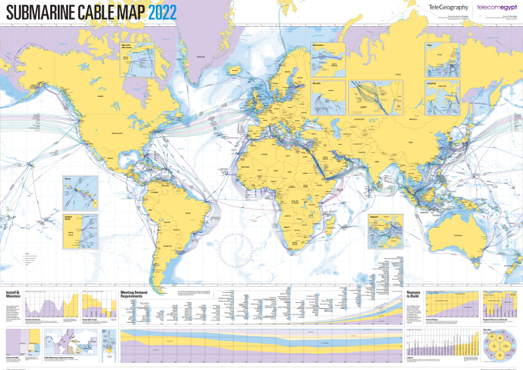
March 31, 2022
The 2022 Submarine Cable Map
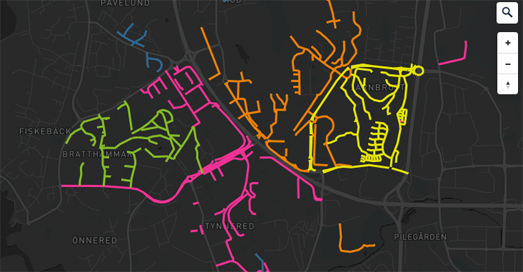
March 30, 2022
The Fantastical Streetnames of Gothenburg
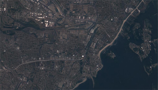
March 29, 2022
A River Trickles Through It
March 28, 2022
This is NOT a Map
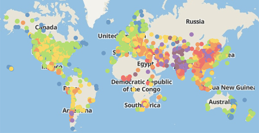
March 26, 2022
The World's Most Polluted Cities
March 25, 2022
Florida's Black Snow
March 24, 2022
The Last Frost of Winter
March 23, 2022
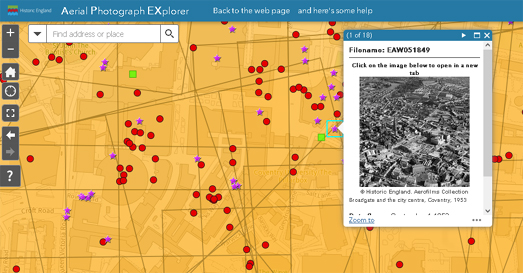
Historic England from the Air
March 22, 2022
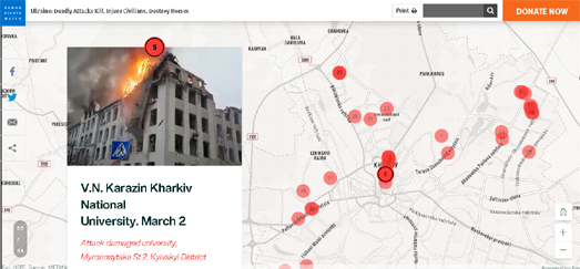
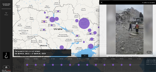
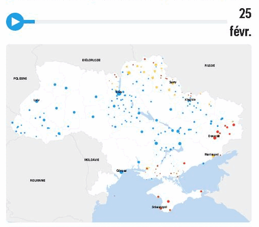
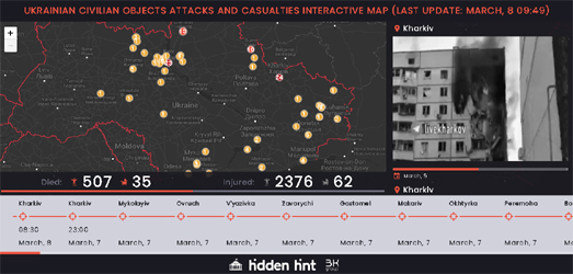
Mapping Russia's Attacks on Civilians
March 21, 2022
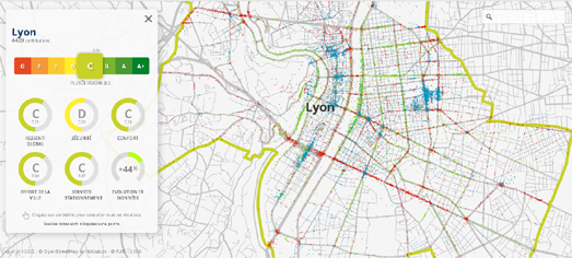
The National Cycling Barometer
March 19, 2022
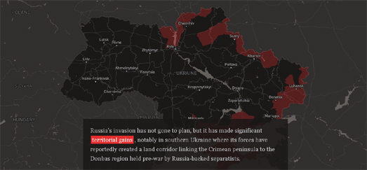
Russia's Failed Invasion of Ukraine
March 18, 2022
Mapping Russia's Civilian Attacks
March 17, 2022
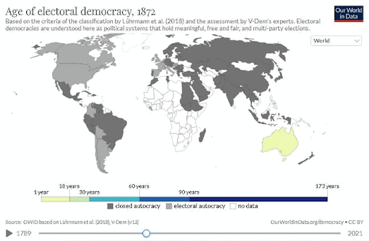
How Old is Democracy?
March 16, 2022
The Russian Roundabout
March 15, 2022
Mapping the Russian Advance
March 14, 2022
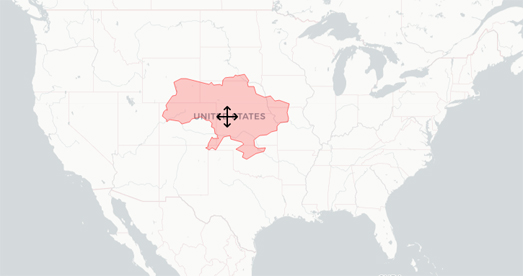
How Big is Ukraine?
March 12, 2022
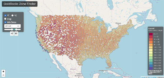
Finding Your Goldilocks Zone
March 11, 2022
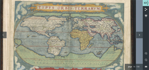
The Digital Atlas Ortelius
March 10, 2022
Wheredle
March 08, 2022
Ukrainian & Russian Casualties
March 07, 2022
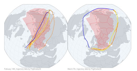
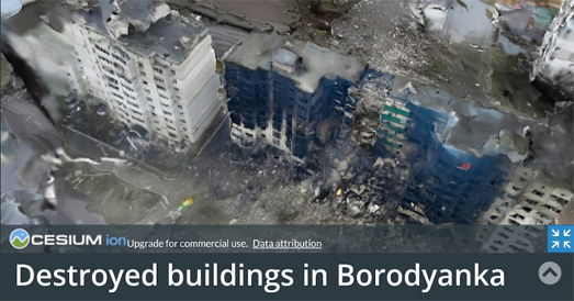
Russian Bombing in 3D
March 05, 2022
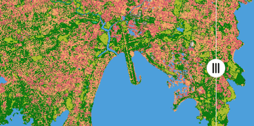
The Australian Land Cover Map
March 04, 2022
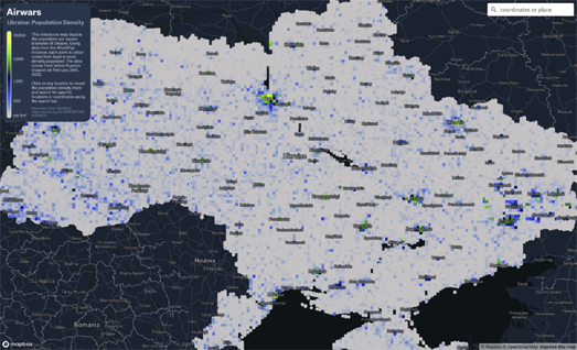
The Ukraine Population Density Map
March 02, 2022
Mapping & Seizing the Oligarchs' Assets
March 01, 2022
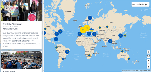
The World For Ukraine
Newer Posts
Older Posts
Home