Skip to main content
Search
Search This Blog
Maps Mania
Posts
Showing posts from July, 2022
Show all
July 30, 2022
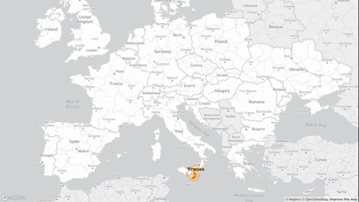
How Far Can You Travel in 5 Hours?
July 29, 2022
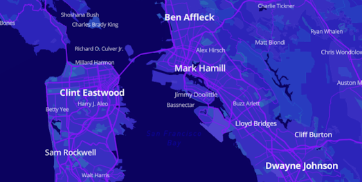
Who Was Born Near You?
July 28, 2022
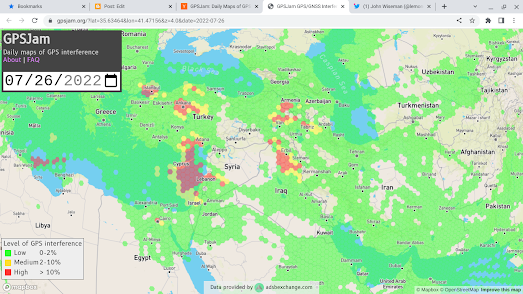
GPS Jamming
July 27, 2022
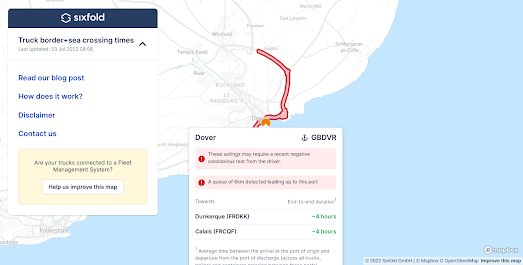
Give Me Geodata
July 26, 2022
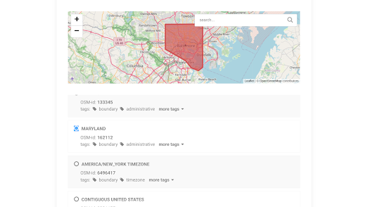
Redistricting America
July 25, 2022
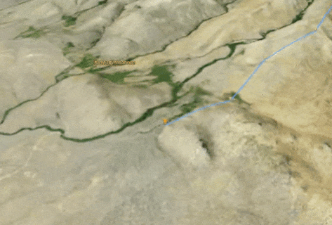
Digging to China
July 23, 2022
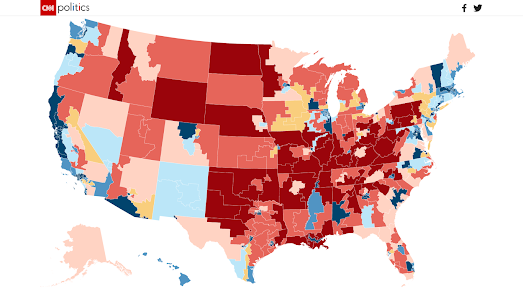
The Brexit Temperature Map
July 22, 2022
Detecting Wildfires from Space
July 21, 2022
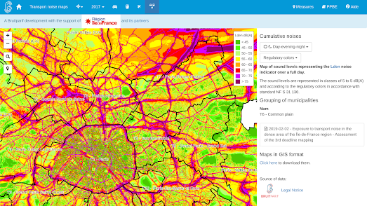
The Paris Noise Pollution Map
July 20, 2022
The (Not So) Great Salt Lake
July 19, 2022
The Pokemon Dinosaur Tour
July 18, 2022
Extreme Weather Warnings
July 16, 2022
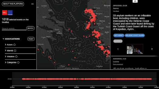
Mapping the EU's Illegal Attacks on Migrants
July 15, 2022
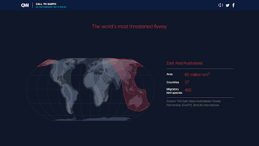
The World's Most Threatened Flypath
July 14, 2022
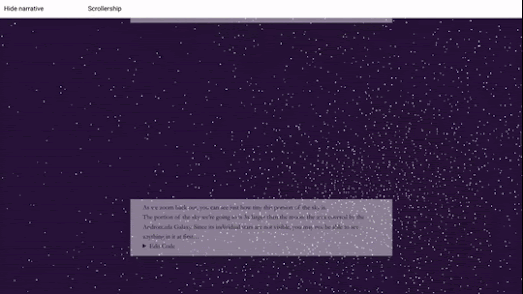
A Billion Star Map of the Milky Way
July 13, 2022
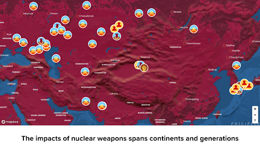
Mapping 2,000 Nuclear Detonations
July 12, 2022
In a Galaxy Far, Far Away
July 12, 2022
The Migratory Journeys of Birds
July 11, 2022
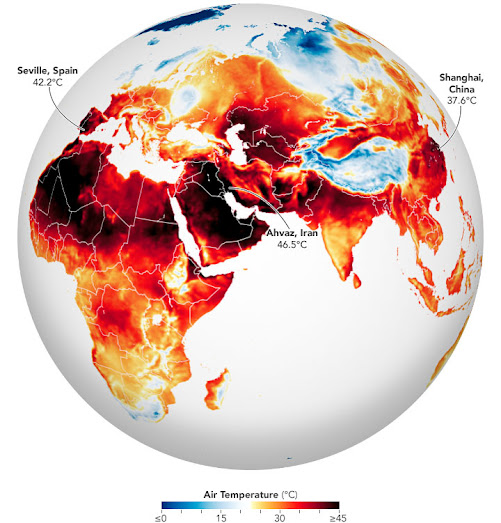
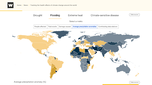
Mapping the Health Effects of Climate Change
July 08, 2022
Climbing the Sierra Nevada Mountains
July 07, 2022
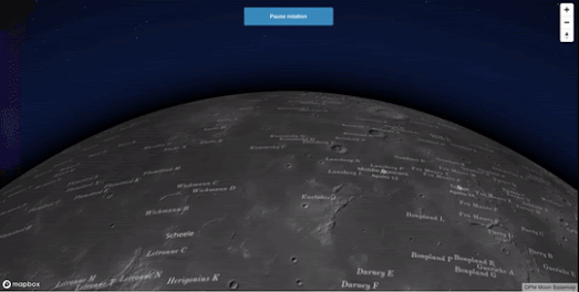
Mars & Moon Globes
July 06, 2022
The Energy Industry Map
July 05, 2022
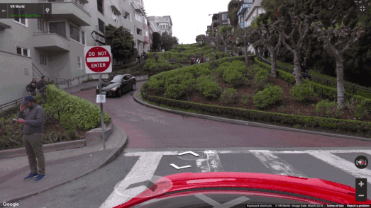
The World's Crookedest Street
July 04, 2022
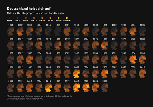
Small Multiples of Global Heating
Newer Posts
Older Posts
Home