Saturday, January 30, 2021

Mapping the Eternal City

In 1748 the Italian architect and surveyor Giambattista Nolli published an ichnographic plan of Rome. Nolli's 'Great Plan of Rome' was remarkable for a number of reasons. It was easily the most accurately surveyed and drawn map of the city to have ever been published. It was also one of the first ichnographic maps of Rome. Before Nolli all the maps of Rome produced since the Roman Empire has almost always been drawn from a bird's eye / oblique perspective.

The Interactive Nolli Map allows you to explore Giambattista Nolli's exceptional map for yourself in close detail. The original Nolli map includes around two thousand numbered locations around the city. These numbers refer to the map index which names each of the numbered sites. On the Interactive Nolli Map these numbers have been made interactive. When you click on one of these numbers on the map an information window opens providing information on the selected feature.

The Interactive Nolli Map also includes a story map introduction to Nolli's Great Plan of Rome. Under the 'Curated Essays' heading you can find a link to The Nolli Map as Artifact, which is a guided tour of the illustrations around the edge of the original map. A number of other essays are also linked under the 'Curated Essays' menu but these essays don't appear to have been completed yet.

Friday, January 29, 2021

Mars in 3D

Ares is an interactive map which uses NASA elevation data to create a 3D map of Mars. Using the map you can explore the red planet at will, climbing in and out of craters like an energetic Mars rover. 

In December Mapbox released Mapbox GL JS V2. This latest build of Mapbox's interactive mapping library includes the option to view the Earth's terrain in 3D using a global Digital Elevation Model. The Ares Mars map works in a similar way - except it uses aerial imagery of Mars draped over the Mars MGS MOLA DEM.

There has been a flurry of Mars maps over the last few months in anticipation of next month's landing of the Perseverance rover on Mars. NASA's 2020 Mars mission will land the rover in the Jazero crater on the 18th of February. You can find some of these other interactive maps of the red planet by checking out the Mars tag on Maps Mania.

Virtual Tourism

Do you remember vacations? 

In the past, before the global pandemic, once or twice a year people would often take a break from their normal work in order to travel and relax. They would sometimes spend this time visiting far away places and exploring famous landmarks in person. 

Sadly this freedom to travel, which many of us enjoyed in the past, no longer exists. Which means we now have to explore the world virtually from within the confines of our tiny Covid bubbles. 

If you are wondering where to spend your virtual vacation this summer might I suggest a little online trip to the Mediterranean and to the ancient port city of Marseilles. On this journey allow yourself to be guided around the city by Marseilles 2021. Marseilles 2021 by La Phase 5 is a wonderful virtual mapped tour around some of the amazing sights of the French city of Marseilles. 

Marseilles 2021 consists of a custom designed map on which a number of the city's most memorable landmarks are highlighted using numbered markers. Click on a marker and you can visit the location virtually with a custom 360 degree panoramic 'Street View' image. These attractions include the Chinese Garden (pictured above), the Opera House, the Fort St John and the Villa Valmer. Each of the panoramic images includes a little 'information' button which, when clicked, will provide a short guide to the selected landmark. 

Of course one of the highlights of every vacayion is the exotic nightlife that you can enjoy by exploring a city at night. Some areas of Marseilles can be a little dangerous at night so it is wise to take a guided tour with someone local.

Google Night Walk is an amazing narrated Street View tour of Marseilles at night. Google Night Walk takes you on an immersive journey through the lively Cours Julien neighborhood of Marseilles. The tour includes an audio narrated guide by Julie and Christophe, two urban storytellers, who help explain the living history of the city. Many of the custom Street View panoramas in the tour are also enhanced by sound experiences recorded at the same time as the panoramas.

Thursday, January 28, 2021

Covid Risk Maps

The New York Times has released an interactive map which shows the risk level of catching Covid-19 in every U.S. county. The See Covid-19 Risk in Your County map uses data from Covid-19 tests and reported cases to show the risk assessment of catching Coronavirus at the county level. 

Individual counties on the NYT map are colored to show the current risk level. If you hover over a county then you can view the number of average daily cases in the county and the average number of cases per 100,000 people. Even though the number of daily cases in the U.S. has fallen a little during January you can see from the map that in the majority of the country the risk of catching Covid-19 is still 'extremely' or 'very' high.


Another way that you can assess your local risk of catching Covid-19 is to consult the Harvard Global Health Institute's COVID Risk Level map which shows the severity of the Covid-19 outbreak at county level across the United States. The map reveals which counties have a green, yellow, orange or red risk level, based on the local number of new daily cases.

On the map counties that have fewer than one daily new case of Covid-19 per 100,000 people are colored green. Counties with one to nine daily new cases are colored yellow. Counties with between 10 and 24 new cases are colored orange and counties with 25 new cases per day are shown in red. The map also allows you to view the Covid-19 risk levels at state level.

Alongside the map the Harvard Global Health Institute has released recommendations and guidance about how counties should respond to the Covid-19 outbreak risk levels. If a county is shown as red on the map then stay-at-home orders are absolutely necessary. Counties shown as orange are advised to have stay-at-home orders and test and trace programs. If a county currently has a yellow risk level then a rigorous test and trace program is advised. Counties which are shown as green should continue to monitor with testing and contact tracing.

Trippy Rorschach Maps

Take a look at the following map and tell me what you see. If you see a bat or a butterfly then we may need to discuss your childhood in a little more detail.

Landschach is an interactive map which creates a Rorschach test pattern from elevation data in Mapbox's map tiles. The map was created by Mapbox's Damon Burgett. Essentially Landschach places four different maps on one page. Each of the maps is rotated 90 degrees to the previous map to create a kaleidoscope type effect. The result is that the map creates patterns very similar to the ink blot patterns used by psychologists in Rorschach tests. 

The colorful map patterns used in Landschach were created in Mapbox Studio. Essentially the vector-terrain contour data was stylized in Mapbox Studio by applying a sin wave to the elevation values.


This isn't the first time that Damon has created a Rorshach map. His Rorschach Satellite map creates a similar kaleidoscope effect using Mapbox aerial views. If you like a pattern created with either Rorschach Satellite or the Landschach map then you can copy and paste the map URL to share a link to your view.

We haven't finished yet! You might also like #rorschcam, which applies the same kaleidoscope effect to New York webcams from the New York City Department of Transportation.  This one doesn't have a map but the webcam images are live, so now we have a moving real-time kaleidoscope view of New York's streets. 

Who would have thought that New York's streets could have got any weirder?

Wednesday, January 27, 2021

Historical Country Borders

The Historic Country Borders map allows you to explore the historic rise and fall of empires and countries around the world since 2000 BC. Using the map's interactive timeline you can select any date in history from 2000 BC to 1994 AD to view the borders of the world's countries at that time.

The map uses data from aourednik's historical basemaps to show country borders during the different stages of the world's history. This data comes with a few warnings. One warning draws attention to the fact that the borders of the past can be just as disputed as modern borders - if not more so. Another warning highlights that the historical borders of different civilizations in the past may not have been drawn with exact precision and the territories of different historical civilizations may very well have overlapped each other. 


The History of International Borders is another fascinating map showing how country borders around the world have changed - in this case since the end of the Second World War. The History of International Borders map allows you to select dates between 1946 and 2016 to view the international borders during that time. Change the date and the map will automatically update to show the country borders as they existed during that period of time.

If you select the 'Show lifetime of polygons' option this will highlight those countries on the map whose borders have changed since World War II. The countries shown in green had stable borders during that period, while the countries colored pink have borders which have changed.

One problem with this map is that the country labels don't change with the changing borders. So (for example) what is now the Democratic Republic of Congo should be labelled Zaire on the map between 1971 & 1997, and Czechia and Slovakia should more accurately have the one label, Czechoslovakia, before 1993. 


The animated map above shows the changing borders of Europe, the Middle East and North Africa during the Twentieth Century. It is a pretty good illustration of how geo-political developments demand frequently updated maps.

I created this animated map using Mundipedia. Munipedia is an interactive map which shows country borders for different dates in history. Enter a date into Munipedia and you can view how the world looked in that year. For example enter the year 1984 and you will see a divided Germany, split into East and West Germany. Skip forward a few years and in 1990 the map shows just the one Germany.

Not every single year is covered by the map. The legend above the map tells you the date currently being shown. The map also only covers modern history, starting as it does in the year 1899.


Running Reality is yet another interactive map which is trying to build a map of the world over time. Using Running Reality you can view a map of any location in the world at any time during its history. In this way you can see how towns and cities have grown and fallen over time. You can also learn more about the people who lived there and the buildings in which they lived and worked.

To see how Running Reality works you can zoom-in on an individual city and then use the timeline to see how the city has changed over time. For example if you zoom in on New York and set the timeline to 1600 you will see no roads or buildings. Adjust the timeline to 1700 and a few roads and buildings can be seen in Manhattan. Advance another 100 years (to 1800) and the city has spread north as far as Greenwich Village and small developments have appeared in Brooklyn.

The map doesn't just show roads and physical topography. related to the date selected. It also shows buildings and people related to the visualized date. These buildings, places and people are interactive. Click on a person or buildings marker on the map and you can learn more about the person or building. So for example, if you click on a person, you might be able to learn when they were born and died. Click on a building and you might discover when it was first constructed.


Chronas is one more interactive map which aims to provide a view of historical events across the globe and through time. This interactive map visualizes Wikipedia entries by date and by location and also shows country borders for different dates in history.

Chronas not only maps historical events but also provides a mapped overview of country boundaries for any given date. If you select a year from the time slider (running along the bottom of the map) the map will update to show how the world's borders existed at the chosen time. If you then click on a country or geographical area on the map a Wikipedia article on the selected historical region will open in the map sidebar. For example, if you select the year 573 AD from the time slider, you can select the Visigoths region on the map to learn more about these nomadic tribes during the first millennium.


The Ancient History Encyclopedia's Map of the Ancient World is an interactive map of the world from around 6,000 BCE to 270 BCE. The map plots historical civilizations and places by date. Change the date and the map changes to show the rough borders of the civilizations and peoples of your selected time

The map carries a disclaimer that it is "only complete in the Mediterranean until around 270 BCE". However the map isn't limited to this period and location. If you only use the back and forward arrows to navigate the map then you might not realize that the map actually does include data for the rest of the world. You can also move forward in time beyond 270 BCE (although the map doesn't yet continue past the Roman Empire).

The Privatization of East Germany

Before the reunification of Germany in 1990 there were over 8,000 state run enterprises in the GDR. The VEB (Volkseigener Betrieb) were publicly owned enterprises which were created after the second world war, during the period when there was a mass national nationalization of the private sector in the then Communist run half of Germany. 

Just before the fall of the Berlin Wall, in 1989 around 80% of East Germans were employed by a VEB. After the reunification of Germany the VEB enterprises were placed in the control of the Treuhandanstalt, an agency which was established to oversee the privatization of these thousands of state owned enterprises. The Treuhand broke up, sold and liquidated these enterprises bringing an end to many well known and established East German products.

What Became of the VEB is an interactive map which plots the fate of the thousands of VEBs in East Germany after the reunification of Germany and the establishment of the Treuhandanstalt. Individual enterprises are shown on the map using circular markers. The size of these markers represent the number of employees of the VEB. If you hover over a circle on the map you can view details of the company, including its name and what to the enterprise after reunification.

If you enter a town or city name into the map you can view an interactive satellite view of the town showing the location of all the local VEB enterprises during the era of the GDR.

Tuesday, January 26, 2021

How Well Do You Know Mercator?

The Mercator Map Projection has some very well known problems. Invented in 1569 by Flemish cartographer Gerardus Mercator the map is very useful for navigating - particularly at sea. A straight line on a Mercator projection map is a line of constant true bearing, which makes it very easy for navigators to plot straight-line courses. Unfortunately because the linear scale of a Mercator projection map gets bigger with latitude geographical areas get distorted as you move away from the equator. For example on a Mercator map Greenland and Africa appear to be the same size even though Africa is in fact much larger than Greenland.

You probably already knew that. In fact I'm guessing you are already an expert on the problems of creating two dimensional maps of a three dimensional world. Which is why you should excel at completing the BBC's Mind-Blowing Map Quiz. In this quiz you are asked to answer six different questions - some of them directly related to the distortions caused by the Mercator Projection. 

If you get less than 6 out of 6 in the BBC quiz then you need to study the Mercator Map Projection a little more ...


The Organization of Cartographers for Social Equality believe that the Mercator map projection "has fostered European Imperialist attitudes for centuries and created an ethnic bias against the third world". However they do admit that the Mercator projection is a useful tool for European sailors.

If you want a more balanced account of the Mercator projection then you you should read Tass's excellent introduction to the Flemish Cartographer Gerardus Mercator and his popular map projection. Mercator - It's a Flat, Flat World provides a wonderfully illustrated history of the Mercator projection and its creator, while also examining the benefits and problems of this popular cartographic representation of the world.


Tass's analysis of the Mercator projection includes an annotated guide to Gerardus Mercator's groundbreaking 1569 map, the 'New and More Complete Representation of The Terrestrial Globe Properly Adapted for Use in Navigation'. This guided tour introduces you to the map and provides a close-up examination of some of the map's features. The tour explains why the map is so useful as an aide to navigating at sea. It also explores the extent and limitations of geographical knowledge in the period when the map was made.

Alongside this detailed tour of Mercator's 1569 map 'Mercator - It's a Flat, Flat World' explores why it is so difficult to create an accurate flat two dimensional map of a three dimensional world. It explores the advantages and disadvantages of some of the other map popular projections and it illustrates how the different map projections each distort different areas of the world.

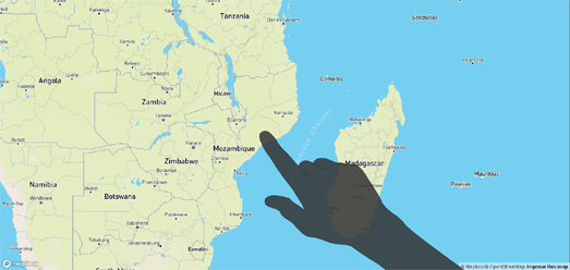
The Shadow on the Map


Since the first release of Google Maps sixteen years ago the user interface tools of interactive maps has changed very little. The '+' and '-' buttons used for zooming in and out on the map has pretty much been a constant feature. As has the use of a search box (so that users can quickly find a location on the map) and map layer buttons (so that users can switch between satellite and road map views). 

Over the years the designs of these navigation tools have adapted and changed a little but the basic UI has remained essentially the same. Another user interface feature which has changed very little in the short history of online digital maps is the design of the mouse pointer. It is therefore surely time to revolutionize the appearance of the humble mouse pointer - to change the boring small white arrow into something larger and more dynamic. 

Let me introduce you to Willy Maps' Shadow Arm.Shadow Arm is an interactive online map on which the traditionally arrow mouse pointer has been replaced with the shadowy outline of an arm, hand and pointy finger. The result is a map with far more visual impact. A map where much more emphasis is placed on the location being identified by the map user. The mouse pointer even changes to a flat hand when the user is panning the map so there can be no misunderstanding that a location is being pointed to while the map is being moved.

I'm guessing that Shadow Arm was released at least partly as a joke. However, as an ex-teacher, I can assure you that the Shadow Arm map could be a useful tool for the smart board during whole class teaching. 

Monday, January 25, 2021

Who is Against Vaccinations?

A survey conducted by Carnegie Mellon University’s Delphi Lab suggests that more than 25% of Americans would not get vaccinated. If 1 in 4 people refuse to be vaccinated then the USA will struggle to ever escape from Covid-19 lock-downs.

While the survey is extremely worrying it is also helpful as it can help the CDC target where they need more education campaigns. You can explore the results for yourself on an interactive map created from the data by MIT Technology Review. Do your neighbors want to get vaccinated? is a choropleth map which shows the percentage chance that a person in each county in the USA will want to get vaccinated. 

If you live in Arlington county, Virginia then there is a 92% chance that your neighbors will want to get vaccinated. However if you live in Terrebonne, Louisiana then there is only a 48% chance that a neighbor wants to get vaccinated.

BTW if you are in any way doubtful of the need to vaccinate yourself against Covid-19 then you might want to view the latest data on the Johns Hopkins' Covid-19 Dashboard. One year ago the dashboard showed that 17 people had died from Covid-19. Just 12 months later and the number of deaths from this deadly virus now stands at over 2 million.

175 Years of the Dufour Map

The Topographic Map of Switzerland, also known as the Dufour Map, is the oldest official map series of Switzerland based on accurate geometric measurements. In 1845 the Federal Topographic Bureau, led by Guillaume-Henri Dufour, began publishing a map of Switzerland divided into 25 sheets. The original map was published at a scale of 1: 100,000.

To celebrate the 175th anniversary of the Dufour Map the Swiss Federal Office for Topography has released an interactive version of the original Dufour Map.The interactive map allows you to explore in detail the wonderful topography of the Swiss Alps and lakes and closely examine the wonderful mapping of the Swiss Office for Topography. 

The interactive map includes a number of markers with links to stories about the origins and impact of the Topographic Map of Switzerland series (in Swiss) These links include: a personal account from a cartographer about the dangers of surveying in the mountains; an account of a death and broken leg while surveying the Säntis mountain; information on how tall mountain peaks were targeted for triangulation by creating high signal points out of felled fir trees; explanations about the expensive surveying equipment used to map the country, and an explanation of how the height of Switzerland's mountains were calculated.

Saturday, January 23, 2021

The Map with a Pearl Earring

Many museums and art galleries around the world now use interactive mapping interfaces to allow visitors to explore individual works of art online. Presenting paintings as zoomable images provides a unique perspective which gives the viewer the opportunity to study a work of art in impressively close detail.Using the navigating methods of panning and zooming (which users are familiar with from using Google Maps), art lovers can study a painting at their leisure.

The level of detail revealed by an interactive painting interface is only limited by the resolution of the image and the number of zoom levels provided by the interface. If the original painting has been photographed in megapixels then the interactive painting interface can allow the user to zoom in on the smallest strokes of the artist's brush.

The Girl With a Pearl Earring is one of Vermeer's most famous works. Last year The Mauritshuis art museum in the Netherlands asked Hirox Europe to photograph Vermeer's masterpiece at the level of 4.4-microns per pixel. Such a detailed image of the painting allows the museum to assess the surface condition of the painting, observe cracks in the paint, and help evaluate past restorations of the painting.

You can evaluate the painting for yourself on Hirox Europe's interactive map of The Girl With a Pearl Earring. This interactive map allows you to view the painting in unprecedented detail. Zoom in on the painting and you really can see individual the cracks in the paint. 

The image of the painting captured by Hirox Europe is about 10,118 megapixels. Ten areas of the painting were captured in even more detail using a Hirox 3D microscope. Using the Hirox interface you can explore these ten areas as a 3D map. Doing this reveals the topography of the painting so that you can actually see the height differences of the paint used on different areas of the portrait.

Friday, January 22, 2021

The Covid City Exodus

In the last few weeks I have read a number of reports estimating that the population of London has fallen by as much as 300,000 during the Covid epidemic. Part of this fall can be blamed on Brexit (many foreign-born workers have left the UK during the last year) however it is also widely believed that the rise of home working has encouraged many people to move out of the capital.

When people are not so tied to the office they may have become less keen to pay the higher costs associated with living in a city. During lock-down the social and cultural benefits of large cities have also largely disappeared and may have made the idea of rural living far more attractive. But is there any evidence for the anecdotal stories that many people are abandoning city living. One place to look for this evidence could be in the changing cost of rental properties in both urban and suburban locations.

There is certainly some evidence of this exodus from cities in Apartment List's National Rent Report. The report explores how rental prices rose and fell in American cities during 2020. The report shows that some of America's most expensive rental cities have seen a sharp drop in rents, while more affordable cities have seen a modest increase in rental prices. 

The National Rent Report interactive map illustrates the large drop in rents in cities such as New York, Los Angeles and Chicago. On the other hand a number of more traditionally affordable cities, such as Boise and Memphis have seen modest increases in rents over the duration of the Covid epidemic. 

AdvisorSmith has also been analyzing the trends in U.S. rents over the course of 2020. In Cities Where Rents Are Rising and Falling the Most the business insurance company lists and maps the ten cities where rents rose the most in 2020 and the ten cities where rents fell the most. 

San Francisco and Mountain View, California are both among the list of top 5 cities which have seen the largest fall in rents. Boston and New York are also in the top ten cities experiencing the largest rental decreases. AdvisorSmith note that these cities contain lots of professional and technical workers. Of whom many have taken to working from home during the epidemic.

It does appear from the rise and fall in city average rents that many people have taken the opportunity to move further from the office to somewhere with cheaper rents. It may not be as simple as saying that many people are moving out of cities because of Covid. Not all workers are able to work from home and not everybody can easily move homes. It will be interesting to note over the next few years whether working from home becomes more common and more widely accepted and whether this leads to a fall in the number of people living in our largest cities. 

Thursday, January 21, 2021

Global Shipping Traffic

VesselFinder is an interactive map which shows in real-time the live position of over 100,000 vessels around the world. The map uses AIS and satellite data to track and map the locations of boats and ships on both inland rivers and on the world's oceans & seas. 

On the maps different colored markers are used to show different types of marine vessels. Yellow markers show the locations of cargo ships, orange markers indicate tankers and purple markers show yachts. If you click on individual markers on the map you can often view detailed information about the selected vessel (purple yachts tend not to have any background information).

Looking at the VesselFinder map today you can clearly see there are a large number of yachts taking advantage of the trade-winds to make easterly crossings of the Atlantic (the line of purple vessels on the map above).


MarineTraffic is another popular interactive map which allows you to view the live position of ships around the world. The MarineTraffic live ship tracking map includes an option to view a density map of the world's shipping traffic. If you select the 'Density Maps' overlay on MarineTraffic you can view an overlay which shows the accumulated recorded data of all vessels on MarineTraffic over recent years. 

The density map (shown above) of global shipping reveals the world's major shipping lanes and also the areas of the world that the major shipping companies avoid. The reasons why some areas of the world's seas and oceans don't see as much traffic as others can vary from geo-political reasons to the dangers of piracy and local sailing conditions.

If you zoom in on the coastline of North Korea on MarineTraffic you can see that there don't seem to be many ships breaking the international trading sanctions. The coastline of Somalia is another area which often has less dense marine traffic than other coastlines. The reason that ships avoid Somalia is presumably to do with the dangers of piracy.

Bernie Sanders at the White House


Bernie sits outside the White House

A picture of Bernie Sanders sitting in a pair of mittens at President Joe Biden's inauguration quickly went viral yesterday. The picture shows Sanders sitting cross-legged and wrapped-up against the cold in the bleachers on Capitol Hill waiting for Biden to be sworn in.

While the fashionistas of social media focused on the stunning outfits worn by the likes of Lady Gaga and Michelle Obama some of us were more impressed by the casual attire modeled by Mr Sanders. Bernie's combination of an olive-colored winter jacket with brown and white knitted mittens was at once daring and inspired and ensured that the still glamorous elder statesman stole the show. 

Soon after Bernie's appearance at the inauguration a 'Bernie sits' meme suddenly started to flood social media. Pictures of Bernie sitting in his mittens were Photoshopped into different locations around the world. 

You can join in by creating your own memes with the Bernie Sits application. Just enter a location into Bernie Sits and the app will superimpose a picture of Bernie sitting in his woolly mittens on top of that location's Street View image from Google Maps.

Wednesday, January 20, 2021

The Interactive Map of World Fiction

I am really interested in some of the attempts people have made to organize works of fiction into two dimensional mapped spaces. In November's #30DayMapChallenge I even created a very small Island of Fiction map demo myself to explore how fictional authors could be mapped onto the fictional territories of a fictional island. 

Most interactive maps of books that I have seen have used the idea of genres as the guiding taxonomic principle, determining where individual works of literature are placed on the fictional map. My own Island of Fiction map mapped fictional authors onto five genre states, 'Crime', 'Horror', 'Science-Fiction', 'Romance' and 'Fantasy'.

TheLibraryMap also uses the idea of fictional genres as its organizing principle. TheLibraryMap is an interactive map of over 100,000 books which are organized based on 'the genre and topics of each book'. On the map individual books are colored by 'genre and topics'. Unfortunately TheLibraryMap doesn't have a map key so you will need to guess which color represents which genre of literature. Individual books on the map are also sized differently - but again without a map key we are left to guess what the size of each circle represents (total sales maybe?).


TheLibraryMap provides no information on how each book was placed into its genre. Usually with such a large taxonomic interactive map entities are mapped using machine learning. But I have no idea if that is the case here. It would be really interesting to know more about how the books were organized on TheLibraryMap. It might explain for example how existential novels by Camus and Sartre end up sitting so near on the map to fantasy novels such as 'Throne of Glass' and 'Red Queen'. 

The HathiTrust Digital Map is a very similar interactive map which allows you to browse and explore the 14 million volumes in the HaithTrust's repository of digitized texts. This map not only provides a visual interface with which you can navigate the books in the HaithiTrust digital library it also includes a fascinating discussion about how the texts are organized on the map. A discussion which explores how organizing digital texts may require a whole new system of library classification.

The Library of Congress Classification system categorizes books into different broad subjects and then by sub-classes within each of these subjects. The HathiTrust Digital Map uses an entirely different method of classification. On this interactive maps texts are organized by the similarity in the vocabulary of individual texts.

The 'Read' section of the HathiTrust Digital Map takes you on a story map tour of some of the interesting patterns that have emerged by organizing this Digital Library by vocabulary similarity. The story map shows you how this classification system diverges or resembles subject based classification systems, such as the Library of Congress Classification system. It also explores some of the new 'clusters' of books that emerge when you classify by vocabulary similarity. New clusters of texts which have some syntactical similarity but which under a subject based classification system would be classified far apart.

This story map tour also provides a great illustration of how a digital map of a library can actually use a number of different library classification systems at the same time. On the HathiTrust Digital Map the texts are organized spatially by their similarity in vocabulary. However as you progress through the story map the texts are also organized by language and then by subject matter by applying different colors to the markers of books in different categories. In this way the map is able to pick out interesting clusters of texts which have similar vocabularies within subject classes, texts which have widely different vocabularies but are still in the same subject class or texts which have similar vocabularies but are in different subject classes.

Tuesday, January 19, 2021

Which Football Team Should I Support?

Back in 2015 an interactive map called Which Team Should I Support used a Voronoi layer to divide England and Wales into areas assigned to the closest English Premier League teams. This map could therefore be used to quickly see which football team's ground was closest to your home in England and Wales. 

That map is now very out of date (some of the teams on the map have since been relegated from the EPL and it omits teams who have since been promoted). The 2015 map also only included Premier League teams and of course many people in the UK live closer to football teams which are not in the EPL. 

Luckily Automatic Knowledge has just released three interactive Voronoi maps which show which football team people in the UK live nearest to: 

  • The Premier League map shows which EPL team you live closest to 
  • The Top Four Leagues map shows which English top 4 tier football team you live closest to 
  • The Tiers 1-8 map shows which team in the top 8 tiers of the English football leagues you are nearest to

Alasdair Rae has written up an interesting blog post about these three maps. In Which Football Team is Nearest Me Alasdair looks a little more closely at the Voronoi catchment areas of English football teams. In particular he has worked out the total number of people living in each of the Premier League team's Voronoi polygons and in each polygon for the top 8 tiers of English football. 

In terms of the EPL Southampton are the team with the most people living closest to their stadium. 12.6% of the English population live in the Southampton Voronoi polygon. At the other end of the league, Chelsea have the smallest number of people living closest to their stadium. Only 1.7% of people living in England live in the Chelsea Voronoi polygon.

Monday, January 18, 2021

Video Maps of the Attack on Washington

Last week Parler, the controversial social network much loved by QAnon morons and right-wing domestic terrorists, was hacked. Very poor security on the Parler website meant that hackers were able to download every message, photo, and video posted to the site. 

Using data from the Parler hack Kyle McDonald was able to create the Parler Video Uploads interactive map. Kyle's map shows the location of videos posted to Parler across the world. Click on a video's dot on the map and you can also read the date stamp of the video. This date information (taken from each video's Exif data) has enabled people to start mapping videos from the Capitol Building insurrection on January 6th.

For example Patri10ic's Y'all Qaeda interactive map actually allows you to watch videos posted on January 6th in and around the Capitol Building in Washington D.C.. These videos all seem to be hosted on YouTube, therefore it is possible Patr10tic created the map from trawling YouTube rather than from the actual Parler hack. 

The Washington Post has also used videos uploaded to social media by some of the right-wing traitors to create a truly harrowing account of the Capitol siege. A 15 minute video called 41 Minutes of Fear recounts and explains what actually happened during the siege. To make the video the Washington Post used video, facial recognition software, text messages, photographs and a digital 3D map of the Capitol Building to reconstruct the events of this fascist attack on American democracy.

41 Minutes of Fear uses video footage and plans of the Capitol Building to provide an historical record of the events inside the Capitol Building after the insurrectionists managed to bypass the amazingly lax police security at the Capitol.The video shows how lawmakers came within close contact of the angry mob and were incredibly lucky not to have been harmed by Trump's army of Anti-American Nazis.

The Relaxing World of Slow TV

Back in 2011 the Norwegian public service broadcasting company NRK broadcast live and non-stop the 134 hour long voyage of the cruise liner Hurtigruten, as it sailed around the Norwegian coastline. On the NRK website as well as watching the amazing live footage of the cruise you could also keep track of the position of the liner on a live real-time Google Map.

Slow television is the term used for these types of live 'marathon' television shows covering an ordinary event in its complete length. The Hurtigruten cruise wasn't the first 'slow television' broadcast by NRK (it had previously broadcast a number of films of complete train journeys). However the Hurtigruten broadcast in particular received a huge international following on the NRK website.

There is something extremely relaxing and meditative about most slow TV events. At a time when many of us are feeling more stressed and more confined than ever before I feel that watching slow TV can be an amazing way to unwind and adapt to the slower pace of life which Covid-19 is forcing upon so many of us.

If you need to relax then might I reccomend the Slow TV Map, a fantastic interactive map providing links to slow TV videos which have been filmed around the world. My smart TV is currently showing a ten hour hour long broadcast of a journey on the incredible Wuppertal Suspended Monorail in Germany. If suspended monorails aren't your cup of tea then you can use the Slow TV Map to discover calming videos of hikes in nature, beautiful car journeys, amazing train journeys, relaxing canal trips and aerial flights. The map even includes a filter control which allows you to filter the map to only show particular types of slow TV.

Saturday, January 16, 2021

Make Your Own 3D Animated Map

Mapbox GL Director is a useful and fun tool for creating custom 3D map animations with Mapbox's new impressive 3D terrain features. The tool provides a very easy to use interface for creating custom map animations with Mapbox's 3D terrain, sky and camera features.

Mapbox GL Director consists of an intuitive interface which allows you to choose any location on Earth as the basis of your map animation.You can then choose two different camera angles of your selected location and Mapbox GL Director will create the HTML code for an animated fly-by between your two camera angles.

Mapbox GL Director includes a number of options which allow you to change the appearance of your animated map. You can adjust the level of the terrain exaggeration (to make hills appear larger or smaller). You can also adjust the direction and angle of sun-light (to change the terrain shadows). 

When you have finished creating your 3D animated fly-by you can download or cut-and-paste the HTML code which will create your own animated Mapbox map. In order to publish this map you will need your own Mapbox account token and you will also need to host the map yourself.

Mapbox GL Director exports the HTML and JavaScript code for your created map. It is therefore perhaps most useful for people who are already familiar with creating maps with Mapbox GL and just want an easy interface for quickly creating animated 3D maps. I can't help thinking that there would be a very large market for a Mapbox GL Director wizard which included an option to export custom user created animated 3D scenes as animated GIF's.

Friday, January 15, 2021

2020 - The Hottest Year on Record

The Washington Post reports that 2020 has tied with 2016 as being the hottest year on record. In fact the last seven years have been the hottest seven years since reliable weather measurements began. According to the National Oceanic and Atmospheric Administration, Britain’s Met Office and Berkeley Earth 2020 was a few tenths of a degree cooler than 2016, while NASA say that it was very slightly warmer. 

In 2020 Rivals Hottest Year on Record the Post lists some of the extreme weather events in 2020 that were caused by extreme global heating. These include the unprecedented wildfires experienced in Australia, the United States and the Siberian Arctic. The Atlantic experienced a record hurricane season and around the world more tropical cyclones occurred last year than in any previous year. These extreme weather events are of course just a preview of the far more extreme events we can expect over the coming years.

The Post's article is illustrated with an animated globe which spins to highlight how much higher temperatures were at locations around the world last year compared to average temperatures in the 1800's. This globe includes a heat map layer which visualizes the rise in 2020 average temperatures. As the globe spins cities are shown on the map with labels revealing how many degrees temperatures were higher last year when compared to those of the 1800's.

The Sound of an Epidemic

Life has definitely become a lot quieter for me since the Covid-19 outbreak. During 2020 my social life became almost non-existent. I therefore no longer regularly hear the background noise of music and people that I am used to hearing in cafes, pubs and clubs. In London there is also a lot less plane noise than usual. Unfortunately road noise, which at one point during this epidemic had fallen drastically, seems to be returning to 'normal' levels. 

One thing that hasn't changed for me during lockdown has been my daily walk around my local park. However the soundscape of my local park has definitely changed. Now there is no noise from organized team sports. There are no encouraging shouts from eager players on the field of play or from supporters on the sidelines. There are now no players or fans. However there are lots of people. Before Covid in my local park I would normally see four or five other walkers and a handful of joggers. Now there are hundreds (or what seems like hundreds to me). So now I hear the occasional snatches of passing conservation from strolling couples and single walkers on mobile phones.

All of this is of course anecdotal. I haven't measured the change in noise levels from different sources in my local park and compared them to the noise levels from before Covid-19. I have left that to MIT's Senseable Lab. 

In Sonic Cities Sensable Lab has compared the levels of sound in five famous city parks in cities around the world and measured how their soundscapes have changed during the Covid outbreak.Using the Sonic Cities interactive map you can explore how sound has changed in New York's Central Park, London's Hyde Park, the Public Garden in Milan, Marina Bay in Singapore and Golden Gate Park in San Francisco.

In each park you can view a graph of how noise from human activity, bird song, city sounds and sirens has changed from before and after the Covid outbreak. Each map also includes levels of these noises visualized on top of a walk around the park. The pre-Covid noise levels (for each type of sound) were extracted from the audio of YouTube videos of park walks from previous years. These audio levels have then been compared to recordings captured by volunteers during the epidemic.


MIT are not the only ones making sound recordings during lockdown. The Listening Passport is an interactive map of sounds recorded during Covid-19. The Listening Passport project was originally designed for people in Cornwall, England to record the sounds that surround them during the isolation of lockdown. However the map is actually being used to record the aural soundscapes of coronavirus by people throughout the UK and even further afield.

Anyone can contribute a recording to the map by completing a short form and sharing their location on an interactive map. All recordings submitted to the Listening Passport can be listened to via the project map. Just click on any of the yellow markers on the map and you can listen to the submitted recording.


The Listening Project is not the only map which is interested in recording the sounds of the coronavirus lock-down. Over the last few months many of us have witnessed a dramatic change in our aural landscapes. The huge reduction in air and road traffic has allowed other sounds, like birdsong and the wind blowing through the trees, to come to the fore.

Pete Stollery has created a Google Earth sound map which aims to capture the new soundscapes which have emerged as a result of the huge reduction in normal human activity around the globe. The Covid-19 Sound Map includes recordings from all across the world. These sounds include recordings of now empty city centers, people clapping for health workers, croaking frogs and traffic free streets.

You can add your own sounds to the map by sending recordings and a short explanation of the recording to Pete Stollery. The instructions for how to record your sounds and the form for submitting your recordings are on the Sound website.

Thursday, January 14, 2021

The Story Map of Mars

I suspect that nobody reading this will ever step foot on Mars. Today however you can take a virtual stroll on the Red Planet thanks to the amazing Jazero Explorer.

Next month the Perseverance rover and the Ingenuity helicopter drone will land on Mars inside the Jezero crater. The Ingenuity drone will be used to scout for points of interest which the Perseverance rover will then investigate and study. Perseverance is equipped with a number of scientific instruments which will help it to analyze the geology and environment of the red planet.


You can learn more about the Jazero crater and even explore its terrain for yourself on the amazing Jazero Explorer. The Jazero Explorer is a 3D map of the crater and its immediate surroundings. It is also an amazing story map which provides a fascinating introduction to the Perseverance landing site on Mars.

As you progress through the Jezero Explorer you are taken on a tour of the Perseverance landing site and the Jezero crater. During this guided tour you can learn more about why the crater was chosen as the focus of the 2020 Mars mission, leaning more about the crater's geology, terrain, sediments, channels and river systems. One reason way Jazero was chosen for this mission is because it is has been identified as one of the most promising environments to discover the biosignatures of past microbial life on Mars.

The Jazero Explorer was created by Daven Quinn, who is a structural geologist. For his PhD at Caltech Daven investigated the tectonics and stratigraphy of the Northeast Syrtis Major, Mars. He is currently a research scientist in the Macrostrat lab at the University of Wisconsin.

Wednesday, January 13, 2021

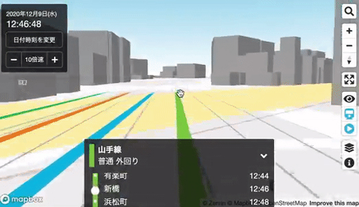
Driving a Train in Tokyo


The very popular Mini Tokyo 3D is a live real-time map of Tokyo's public transit system. The map shows the live position of Tokyo's trains in 3D as they move around the city.

Following trains live on the colorful Mini Tokyo 3D map has always been a lot of fun. It is now an even more amazing experience. Mini Tokyo 3D has utilized Mapbox's new 3D Camera API to give you a first person view as a train moves around Tokyo. 

Select an individual train on the map and you can view it moving around the city. Zoom-in on the map and you can move around the city with a first-hand view, similar to the one experienced by the train's actual driver. If you hover over a train on the map you can view details about its number and when it will arrive at its next stop. If you click on an individual train you can center the map on the train and the map will track the train as it moves around the city.

Mapping the Parler Hack

Parler, the controversial social network much loved by QAnon morons and right-wing domestic terrorists, is having a bad week. Over the weekend Amazon banned Parler from its AWS cloud servers. Now it has had all its data hacked. 

Very poor security on the Parler website has meant that anyone has been able to download every message, photo, and video posted to the site. After the FBI began asking people to identify domestic terrorists appearing in photos and videos of last week's attack on the United States Capitol many Parler users began to hurriedly delete media they had shared on the social network. Unfortunately for them Parler's terrible security means that hackers have also been able to download all deleted posts. 

Even more unfortunately for worried domestic terrorists Parler's lax security doesn't end there. For example Parler didn't take the very basic step of deleting all Exif data from media uploaded to Parler. This means that many of the photos and videos posted to the social network include data on the date and location of when the media was captured. 

This has meant that people have been able to map Parler Video Uploads. For example, this interactive map shows the locations of videos posted to Parler across the world. Zoom in on your home town and you can see the locations in your town where people have taken videos and uploaded them to Parler (the location data comes from where the video was shot not where it was uploaded from). Click on a video's dot on the map and you can also read the date stamp of the video. 

This time and location data from uploaded videos could be very useful to the FBI. For example the FBI could use this data to track all the media uploaded to Parler last Wednesday at the U.S. Capitol. Or they could just ask Gizomodo, who have already mapped GPS data from videos posted to Parler on the day of the insurrection in Washington.

If I had posted a video or photo to Parler from Washington D.C. during the domestic terrorism last Wednesday I would be very worried that the FBI would use my unique identifier number to then map out all my other media posted to Parler. Doing that could very easily reveal the home address of an insurrectionist to the FBI.