Skip to main content
Search
Search This Blog
Maps Mania
Posts
Showing posts from September, 2021
Show all
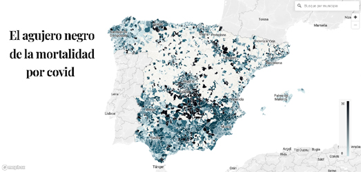
September 30, 2021
Mapping Mortality Rates from Covid
September 29, 2021
Map Projection Playground
September 28, 2021
Mapping Internet Speeds
September 27, 2021
German Election Results
September 25, 2021
High Vaccination, Low Hospitalization
September 24, 2021
Your Probable Future
September 23, 2021
1914 Street View of New York
September 22, 2021
The La Palma Volcano Eruption
September 21, 2021
America's Falling Prison Population
September 21, 2021
Canadian Election Maps
September 20, 2021
The Russian Election Map
September 18, 2021
The Traffic Simulation Game
September 17, 2021
Brussels' Grand Canal Plan
September 16, 2021
Norwegian Election Maps
September 15, 2021
Two Months of the Dixie Fire
September 15, 2021
Denver's KKK Members
September 14, 2021
Global Heating Predictions
September 14, 2021
The Anti-Democracy Party
September 13, 2021
Mapping 9/11
September 13, 2021
The Human Development Index
September 11, 2021
The 1864 Bird's Eye View of Glasgow
September 10, 2021
The Urbanization of France
September 09, 2021
The Sounds of Caracas
September 09, 2021
Interactive Train Sets
September 08, 2021
The Average Seasonal Colors of the USA
September 08, 2021
The Battle of Medusa Map
September 07, 2021
Talking About Climate Change
September 07, 2021
Singapore 2030
September 06, 2021
The Human Slavery Map
September 06, 2021
The Life Expectancy Map
Newer Posts
Older Posts
Home