Mapping Mortality Rates from Covid
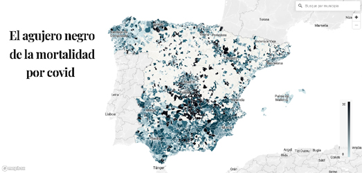
El Confidencial has published an interactive map which visualizes the mortality rate from Coronavirus across Spain. The map in The Black Hole of Covid Mortality reveals that there have been quite large differences in the mortality rates across different Spanish municipalities.
The article accompanying the map does a good job at dismissing some of the possible reasons for the large differences in mortality rates from Covid-19 across the different regions of Spain, without ever really tying down the real reasons why some municipalities have fared far worse from Covid-19 than others.
My first thought was that the differences might be related to age. However El Confidencial discovered that "the municipalities with the most deaths per inhabitant do not coincide with those with older populations". I also wondered if the differences in mortality rates may be related to population density. However El Confidencial was only able to obtain mortality rates for municipalities of more than 500 people. Therefore the overall picture revealed by the interactive map is skewed a little because large areas of Spain (those with the lowest population densities) don't show any mortality rate data on the map.
In both the USA and the UK average income levels has had an impact on infection rates. This may be because those on the smallest incomes are less able to furlough, are more likely to rely on public transit and more likely to work in occupations which require face-to-face interactions with the public. 
Spanish newspaper El Pais has mapped out the average income per person across the whole of Spain.
The Map of Spanish Incomes, Street by Street shows that there is quite a stark divide between the
north and south of the country. A comparison of El Confidencial's mortality rate map with El Pais' average income map doesn't reveal an exact correlation between income levels and mortality rates from Covid-19. However a comparison of the two maps does suggest that mortality rates in some of the poorest municipalities in Spain are particular high - especially in the south and in the north-east of the country.


Comments