Sunday, March 31, 2024

Highly Artificial Locations

screenshot of the HAL 2000 interactive map zoomed in on New York

Today, a revolutionary new AI-powered map has been released that goes beyond traditional navigation. The new map-based search engine Highly Artificial Locations leverages cutting-edge artificial intelligence to transform how users experience and interact with the world around them.

Highly Artificial Locations is more than just a map; it’s an intelligent companion that empowers users to explore and understand their surroundings like never before. 

This AI-Powered Map Offers Unprecedented Features:

AI-Powered Search: Ask Highly Artificial Intelligence any question. The question could be related to geography or local knowledge but you can ask the map just about anything you want. Search for landmarks, hidden gems, local businesses, historical sites, or even the best places to find a specific type of cuisine.

Real-Time Updates: Highly Artificial Intelligence utilizes real-time data to keep users informed about traffic conditions, business hours, and even public transportation schedules. 

Hyper-Personalized Recommendations: Based on user preferences and past behaviors, Highly Artificial Locations suggests points of interest, hidden gems, and alternative routes tailored to its understanding of your individual needs.

But don't just take my word for it. Go ahead and ask Highly Artificial Locations some questions and discover for yourself the future of map and location search. 

FYI: Highly Artificial Locations gives oral responses so be sure to turn on your speakers.

Saturday, March 30, 2024

The Easter Bunny's Egg-cellent Adventure

This year the Easter Bunny has been on a whirlwind world tour, hopping from continent to continent and hiding eggs in some of the most amazing places on Earth! Take part in the world's largest egg hunt today by visiting the Tripgeo Global Egg Hunt.

Are you ready to undertake a global egg hunt? If so grab your basket and get ready to embark on a virtual adventure of some of the world's most famous locations. Using Google Maps Street View your hunt will involve exploring the streets of global cities, including London, Florence and San Francisco, searching for the Easter Bunny's hidden eggs.

There are six cities for you to explore:  

London
Nimes
Tallinn
Florence
San Francisco
Venice

In each of these cities your task is to hunt down the hidden Easter eggs on Street View. Pay attention to the GP-EGGS display above the Street View panoramas. The color and the size of the eggs in this display are clues as to how close you are to discovering each egg's hidden location. The position of each egg on the display is a clue as to which direction you will need to travel.

Friday, March 29, 2024

The Islamic State Attack Map

a map of Islamic State's global activities

In the last 12 months the Islamic State has claimed responsibility for 1,121 attacks around the world. Just last week the terrorist organization claimed that four of its members carried out the attack on concert goers at the Crocus City Hall, Moscow, leaving over one hundred people dead.

The Islamic State Worldwide Activity Map is attempting to track IS's global activity and to make this information readily available. The map visualizes where the group is operating around the world while also providing an historical overview of the group's activities. The map can be searched by category, keywords and by the various names assumed by IS. The map time-line control allows users to also filter the map by date-range.

The data for the Washington Institute for Near East Policy's map is drawn from primary sources. These include IS's own press releases, government announcements, and court documents. According to the Institute's analysis of the map, One Year of the Islamic State Worldwide Activity Map, since the map's launch in March 2023 Islamic State has claimed responsibility for killing or injuring around 4,770 people. 

Thursday, March 28, 2024

The SpaceX Starlink Map

animated globe showing the 5,601 Starlink satellites orbiting the Earth

StarLinkMap is a new real-time animated map of the 5,601 satellites currently orbiting the Earth as part of Starlink's huge satellite internet constellation.

Starlink's megaconstellation of satellites, built and operated by SpaceX, provides high-speed broadband to even the most remote corners of the globe. Launched in 2019, Starlink boasts over 5,000 satellites in low Earth orbit (LEO), and eventually plans to expand to over 42,000 satellites. Starlink satellites orbit Earth at a much lower altitude than traditional communication satellites. This lower orbit translates to significantly reduced signal latency, meaning that they can offer faster internet speeds.

The StarLinkMap shows the real-time location of all 5,601 satellites in the Starlink constellation. Select any one of these 5,601 satellites on the map and you can view its number and the path of its orbit. Even if you select the 'Live' view you can see the individual satellites orbiting the Earth. However, if you select the '16x' speed option, it is much easier to see the satellites moving relative to the Earth. 

As well as the interactive real-time map SarLinkMap includes a dashboard which provides a wealth of information about Starlink, including information on the launch of the last Starlink satellite and when the next satellite is due to be launched.


You can also follow the orbits of Starlink satellites on the Satellite Map. This map also consists of a 3D globe of the Earth showing the real-time location in space of all Starlink satellites. 

A search option on the Satellite Map allows you to find any individual satellite on the map by name. You can even use the 'Settings' menu to filter the satellites shown on the map by individual SpaceX launches. The settings menu also allows you to switch between the 3D globe view and a 2D Mercator map projection.

As well as visualizing the huge Starlink constellation in real-time the Satellite Map also shows the locations of Oneweb and GPS satellites.

Wednesday, March 27, 2024

Solar Symbology

an animated US map of the April 8th solar eclipse
The one thing that you are guaranteed to see before a solar eclipse is lots of maps. With just over a month to go before April 8th's total solar eclipse new solar eclipse maps are being released almost daily. 

The Spanish Language television network Univision has released an interactive map which is very similar to the Bloomberg eclipse map (see below) but is even better. Like Bloomerg's map the Univision 2024 Total Solar Eclipse map uses solar symbols to show how much of the sun will be obscured according to both time and location.

As you can see in the animated screenshot above the map uses animated solar symbols to show the sun's obscuration by time for different locations across the United States and Mexico. The Univision map improves on the similar Bloomberg visualization by including a timeline control. The Bloomberg map automatically animates through the April 8th solar eclipse. The simple addition of a time slider control on the Univision map means that users can select to view the extent of the eclipse at any time for themselves.
 
a solar eclipse map with small sun symbols showing the extent of the eclipse visible across the US

Over on the Esri blog Kenneth Field has introduced his new Total Eclipse map. Kenneth's map uses small symbols to visualize the extent of the eclipse possible at different locations across the United States. Each symbol on the map shows the 'the moon’s position at the time of maximum obscuration' providing a fantastic visualization of the extent of the eclipse visible across the whole country. The map also includes a dark band which shows the path of totality across the US.

animated US map showing the extent of the solar eclipse visible at different locations
Bloomberg's How to Find the Best Cities to Watch the Solar Eclipse also uses solar symbols to visualize the extent of the eclipse visible at different locations. On this map the symbols are actually animated to show the passage of the moon across the sun as seen from different cities in North America.

The Bloomberg article also includes a drop-down menu which allows you to select a city to view an animation simulation of the moon's obscuration of the sun at that location on a larger scale. Other maps show the degree of obscuration visible across North America and the possibility of cloud cover at different locations.

Tuesday, March 26, 2024

Mapping SpaceTime

I recently stumbled upon Time Map, an interactive map which attempts to show points of interest around a location by walking time. Enter a location into the Time Map and a venue category (eg pizza restaurants) and the map will display a series of concentric circles around your location, each of which represents a minute of walking time. 

All the nearby points of interest are overlaid on top of these circles showing you at a glance how long it will take you to walk to each location. If you click on any of the displayed venues a map is then displayed with detailed walking directions to the venue from your entered location.

Václav Volhejn has a problem with this kind of time radius map. The circles displayed actually show equal distances from a point and not equal travel times. Real world obstacles, such as buildings, rivers, and train lines mean that we can't always travel in a straight line between two points. So in reality it is going to take us different lengths of time to walk to different locations even if they are all on the same 5 minute walking time radius.

a map of Los Angeles distorting between showing distances and time.

Which is why Václav has invented Spacetime maps. Spacetime maps distort space to show travel times rather than distances. This might sound a little complicated (because it is) but you can get an idea of how the map works in the animated screenshot above, which is switching between showing distance between points to showing travel times between different locations.

Of course cartographers are used to using isochrones for visualizing time on maps. An isochrone is a line on a map that connects all the places you can get to within a certain amount of time. Because of the physical barriers to straight line travel isochrones are very rarely circles.

Václav Volhejn's YouTube video introducing his map has a neat explanation of what he is doing 'One way to think about it is we are going to bend the isochrone back into circles'. 

It is a neat explanation but unfortunately this distortion of the physical space means that Václav's Spacetime maps are not as easy to read as isochrone maps. Václav accuses iscochrones as being as 'boring af'. Which I think in a neat way brings us to the conclusion that Václav's Spacetime maps is a fun experiment. An experiment which is probably not going to replace the isochrone as the best way to visualize travel time.

Monday, March 25, 2024

The World Air Quality Report 2023

world map showing annual PM2.5 levels in 7,812 global cities

IQAir has released its annual World Air Quality Report. The 2023 report reveals that last year only seven countries met the World Health Organizations' PM2.5 air pollution guideline.

The IQAir Annual World Air Quality Report is a yearly analysis of global air quality, compiled by the Swiss air quality monitoring firm IQAir. The report gathers data on PM2.5 (which is particulate matter with a diameter of 2.5 micrometers or less) from thousands of ground-based monitors around the world. This data is then used to assess air quality on a national and regional level.

The IQAir website features an interactive map alongside the 2023 report. This map allows you to explore the annual PM2.5 levels in 7,812 cities around the world. The map also shows how each city ranks globally compared to all the other analyzed cities. For example New York had the 2,627th worst air pollution last year with an average PM2.5 level of 11.6 (the WHO guideline is a PM2.5 level of 5).

The seven countries who met the WHO PM2.5 air pollution guideline were Australia, Estonia, Finland, Grenada, Iceland, Mauritius, and New Zealand. The top five most polluted countries in 2023 were Bangladesh (with an annual PM2.5 level more than 15 times higher than the WHO annual guideline), Bangladesh, India, Tajikistan and Burkina Faso. The report also revealed that in 2023 for the first time Canada had the worst air pollution in North America (largely due to the increased number of wildfires). 

Saturday, March 23, 2024

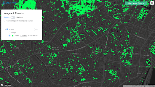
The Future for Trees

an animated map showing the current distribution of the Evergreen Oak in Europe and how that distribution might change during this century

Like many people a few years ago I realized that not only is climate change happening but that human beings as a species are doing next to nothing to prevent its escalation. I do believe that the worst excesses of climate change are still preventable. I just see very little evidence that we are making the changes necessary to stop global heating, or even slow our ever increasing rush towards climate crisis.

I've recently noticed that a growing number of mapped visualizations are also no longer focused on the possibility of climate change but more on how the environment will almost inevitably be impacted. For example the Vision for Adapted Crops and Soils Explorer has released an interactive map which visualizes how different crops will be affected by climate change in Africa. The visualization maps out where in Africa climate-resilient crops will likely have bigger and smaller yields thanks to global heating.

Of course crops aren't the only flora which will be affected by climate change. The natural habitats of tree species (like all plant species) will be seriously impacted by global heating. Which is why Our Forests Tomorrow has released an interactive map which shows where different tree species in Europe might struggle to survive after global warming and where they might need to migrate in order to survive.

The interactive map in Our Forests Tomorrow allows you to select from 67 different European tree species and see where in Europe they are likely to struggle to survive and where they might thrive thanks to global heating. The maps are based on the EU-Trees4F study, which analyzed the potential distributions of 67 tree species under climate change.

There are other responses to what I think of as environmental existentialism. Acknowledging that your elected representatives are proving spectacularly ineffective at addressing the climate crisis does not need to be defeatist. It can instead be the first step towards the Dark Mountain

Friday, March 22, 2024

FlightRadar's New GPS Jamming Map

FlightRadar's GPS jamming map showing high levels of GPS interference around the Black Sea

Yesterday the live real-time global plane tracking website FlightRadar released a new interactive map which detects and tracks interference and jamming of GPS signals across the world. The map uses a simple to understand colored overlay to show in near real-time areas around the globe currently experiencing levels of interference to global navigation satellite systems.  

GPS jamming involves intentionally blocking or interfering with GPS signals using a device called a GPS jammer. GPS jammers transmit radio signals on the same frequency as GPS satellites, making it difficult for GPS receivers to pick up the real GPS satellite signals that they need to function. A GPS device receiving a jammed signal will therefore be unable to determine its location and/or become inaccurate.

As you might expect GPS jamming is often experienced in conflict zones. For example in 2022 Space reported that Russia was jamming GPS signals during its invasion of Ukraine. It has also been widely reported that since the recent joining of NATO by Finland and Norway the Baltic region has seen a marked increase of GPS jamming (undoubtedly by Russia).

FlightRadar's new GPS Jamming Map analyzes NIC (navigation integrity category) data to determine where in the world GPS signals are currently being jammed or experiencing interference. NIC is a metric used to determine the quality and the consistency of navigational data received by aircraft and this metric indicates the reliability of an aircraft's position data. FlightRadar uses the NIC values of planes around the world to determine where GPS jamming or interference is currently affecting GPS signals.

Thursday, March 21, 2024

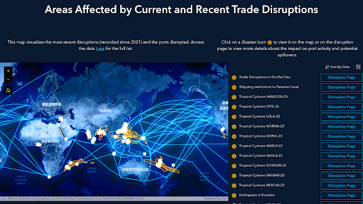
The Sea Trade Monitor

map of the world showing maritime trade routes and recent disruptions caused to maritime trade

PortWatch is a new platform which monitors disruptions to global maritime trade. The platform uses real-time data on ship traffic and maritime trade to provide an alert system on trade disruptions likely to impact shipping trade routes. 

Recent attacks by Houthi rebels on ships traversing the Red Sea have helped to highlight how marine trade is vulnerable to geopolitical instability.. These attacks have forced many shipping companies to reroute vessels around the southern tip of Africa, adding significant time and expense to maritime trade. 

Disruptions to international sea trade can have major economic consequences. In March 2021, when the container ship the Ever Given got stuck in the Suez canal, one of the world's most crucial waterways was blocked for several days. The blockage impacted the movement of a wide range of goods, from consumer products to essential supplies like oil, and it was estimated to have cost billions of dollars per day in lost trade. 

screenshot of the PortWatch Spillover Simulator

The possible global impact of disruptions to maritime trade is why the International Maritime Fund and Oxford University have partnered to release their new PortWatch maritime trade platform. The platform includes an interactive map of Recent Maritime Trade Disruptions. This map plots incidents which have caused disruptions to maritime trade and the ports which have been affected by these disruptions. 

The disruptions mapped by PortWatch include geopolitical conflicts (such as the disruptions caused to trade in the Red Sea by the Houthi rebels) and disruptions caused by severe weather events (such as the ongoing disruption to traffic through the Panama canal due to severe drought conditions).

The Portwatch platform also includes an interactive Spillover Simulator, which allows anyone to simulate a disruption to a particular maritime port and view the likely effect of the disruption on economies around the world. The simulator models the effects of specific port disruptions on the global maritime transport network, on the port's trading partners, and on the supply chain network.

If you want to monitor real-time ship traffic (which can be very useful in visualizing the real-time effects of specific disruption events to maritime trade) then you can use the interactive maps provided by MarineTraffic and VesselFinder.

Wednesday, March 20, 2024

The most mis-mapped US states

According to the 55,387 players of the online game 'Find the Location of ...' Texas, California and Virginia are the most well-known states in the United States. Based on the results of this popular mapping game North Dakota, Missouri and Wyoming are the least well-known states

FlagWhiz.com's map game Find the Location of ... requires players to position the outlines of states onto a near empty map - which only contains the place-name labels for the 48 states of the contiguous United States. The game is fun in itself but FlagWhiz.com has also spent some time analyzing the results to discover which are the most mis-mapped states by players of the game - revealing some interesting insights into which US states are the most and least known - at least in terms of where they are located.

In each round of 'Find the location of ...' you are given the outline of a US state. You simply need to drag the state onto its correct position on the map based on the position of its capital city. Once you press 'done' you are shown by how many miles you missed the state's correct location on the map.

FlagWhiz.com has now posted a chart to Reddit showing the results of the 55,387 games played so far. The chart organizes the 48 contiguous states by the average number of miles each state was mis-mapped by the game's players. Texas was the least mis-mapped state with an average mis-mapping 27.05 miles. The most mis-mapped state was Wyoming, which on average players got wrong by 90.67 miles.

The chart has received its fair share of criticism on Reddit. With many posters making the point that the quiz is more of a test of how well players know the names of the state capitals than a test of the geography of US states.

Tuesday, March 19, 2024

A Total Scrolly Eclipse

In three weeks time, on April 8, people across large parts of the USA will be able to watch a total solar eclipse. The path of totality, where the Moon's shadow completely falls during a total solar eclipse and where the view of the sun is completely obscured by the moon, will travel around 4,000 miles over North America from the Pacific Ocean west of Mexico, through 15 U.S. states, to the Atlantic off Canada.

You can follow the path of the total April 8 solar eclipse on the Washington Post's new scrollytelling solar eclipse map. As you scroll through Follow a mile-by-mile map of the total solar eclipse you travel north-westwards on a satellite strip map of the eclipse's path. 

The journey starts on the western seaboard of Mexico at 2:07 p.m. As you scroll along the path of the eclipse major towns and cities along the path of totality are highlighted on the Post's strip map. These locations are indicated using reference lines with information on the time of totality at each highlighted location and the chance of clouds. The distance traveled is regularly updated along the bottom of the satellite strip map.

Also see: 

Where to Watch April's Solar Eclipse
Solar Symbology

Monday, March 18, 2024

Mapping the History of the Railway

Martin Brake has created a number of interactive maps which visualize the historical development of transport networks in Germany, London, Paris and Barcelona. His Timemap Timelines project provides an animated map for each featured city which shows how its transit network has grown over time. For example the screenshot above shows the development of the London Underground between 1858 and 1947.

Using the timeline control on each map you can navigate to any year to view a map of the city's transit network at that point in history (including trains, trams, lightrail, subways and funiculars). As well as the individual city maps Timemap Timelines includes an animated map which shows the development of the whole rail German network over time.

Martin warns that 'all the data is not correct'. I found out while creating my own animated map The First 50 Years of the London Undergound that it isn't always easy to determine the exact dates of when individual transit lines were opened and that different historical sources might give different dates. For my map of the history of the London Tube I relied heavily on Wikipedia. I have had to make several revisions to the map since its first publication thanks to a number of keen eyed observers spotting errors in the dates. I suspect that my map is still not 100% accurate.

You can view animated maps of other rail networks being constructed around the world on the amazing Citylines. Citylines is a collaborative platform which is busy mapping the public transit systems of the world. Using Citylines you can explore interactive maps visualizing the local transit systems of hundreds of cities around the globe. You can also use Citylines to explore how each city's public transport network has grown over time. 

My favorite feature of Citylines is the ability to view a city's transit network developing through time. Each city's transit system map includes a date control, which allows you to view the extent of the local transit network for any year in history. Press the play button on the map and you can view an animated map showing how the city's transit system has developed through history. 

Via: WeeklyOSM

Saturday, March 16, 2024

Visit a Virtual Medieval Farm

a short flythrough of part of the virtual reality model of Havrå

Havrå is a collection of 36 medieval buildings in Western Norway. It is now a living museum which allows visitors to explore a traditional Norwegian cluster farm, a traditional community settlement where multiple individual farms and their houses were built close together.

If you can't visit the Havrå living museum in person you can now explore the farm in virtual reality instead. The Norwegian Institute for Cultural Heritage Research (NIKU) has created an incredible high-resolution 3D model of the farm using over 12,000 images of Havrå. The 3D model Tunet på Havrå (the farmstead on Havrå) can be explored using your mouse or by using keyboard hotkeys (click on the '?' in the bottom right-hand corner of the screen for navigation instructions).

NIKU has created a number of other virtual models of important Norwegian cultural sites of historical importance. You can find links to the 3D models, which include the Steinvikholm medieval castle and the medieval church of Hedrum, on the NIKU NIRA Gallery.  

Friday, March 15, 2024

The 100 Most Segregated School Districts in America

In the United States school district boundaries drawn onto economically and racially segregated neighborhoods ensure that most poor and non-white students receive a much worse education than students in the more affluent school districts.

Back in 2016 NPR examined how school funding in the USA is used to ensure that the rich get the best schools. They created an interactive map which visualized how much each school district in the USA spends on school funding. Why America's Schools Have A Money Problem colors each school district based on the level of school spending in the district per student.

a map of the USA showing the amount of money spent per student in each school district

The map shows that local funding is usually dependent on the levels of local property taxes. If a district has a number of successful businesses contributing a lot of money through property taxes then the school district is more likely to have higher levels of school spending per student. In essence schools in affluent areas are likely to be much better funded that schools in less-affluent areas.

Now the think tank New America has released a new interactive map which allows you to explore school district segregation by race and poverty levels. The Crossing the Line map identifies the 100 most racially segregated neighboring school districts and the 100 most segregated neighboring school districts by school-age poverty rates. It highlights those areas in the USA which have the starkest segregated school districts by race and by poverty level.

a map of the USA highlighting the 100 most racially segregated neighboring school districts

Birmingham, Alabama has some of the most segregated school district borders in the country. Birmingham City School District and Mountain Brook City School District are the two neighboring districts which have the starkest racial segregation in the USA, based on the 'percentage of students of color enrolled'. These two school districts are also the fifth most segregated by the school age poverty rates in each district.

New America argues that because of America's long history of racist housing segregation there is now a marked trend of lower property values in 'communities of color'. Because school funding is usually dependent on the levels of local property taxes those school districts in areas with lower property values spend less per student than those in more affluent areas. According to New America on average the "districts serving more students of color collect $2,222.70 less in local revenue per pupil than the predominately white districts". 

Thursday, March 14, 2024

Flip Off the World with Street View

The UK Houses of Parliament being flipped off on Street View

AI and Street View seems like the perfect match. Last month panoramai released a fun tool which allowed users to change the appearance of Google Maps Street View images based on their own AI prompts. The app became so popular it had to be turned off because of the costs being incurred by the developers (you can still browse the example images created with the app).

Now a new Ai and Street View project has been released. Only this time the Ai doesn't stand for 'artificial intelligence', but is actually the first name of the famous Chinese artist Ai Weiwei. Because Ai Weiwei has collaborated with Avant Arte to release an interactive mapping tool which allows you to create an image of any location in the world being flipped off on Street View.

Since 2017 the artist Ai Weiwei has taken self-portraits of his own hand giving the middle finger to various iconic landmarks and institutions around the world. The result is "Study of Perspective", a powerful photographic series of Ai Weiwei flipping off some of the world's most iconic global centers of power and cultural importance.

Now thanks to Middle Finger you can join in the fun. Using the Middle Finger interactive map you can navigate to anywhere in the world (that has Street View imagery) and create your own image of a location being flipped off. After you have created your custom Street View image you can then download the image or share it on social media.

Wednesday, March 13, 2024

Climate Resilient Crops

map showing the potential yield of groundnut across Africa under a high emissisions model of climate change

The Vision for Adapted Crops and Soils (VACS) has released an interactive map which visualizes how different crops will be affected by climate change in Africa. The visualization focuses on climate-resilient crop varieties in order to help identify the most promising crops for the changing climate.

The VACS Explorer maps out where in Africa climate-resilient crops will likely have bigger and smaller yields under two different climate change models (Low Emissions and High Emissions). On each crop map areas likely to experience increased yields of a crop after climate change are colored green, while areas where yields are expected to fall are shown in orange. If you hover over an area on the map you can discover the exact percentage of the expected increase or fall in yields of the visualized crop.

It is also possible to view which varieties of different food groups will have the highest increase in yields across all of Africa (legumes, vegetables, cereals, seeds & nuts, and roots and tubers). For example if you select to view vegetables then different colors are used for tomatoes, eggplant, okra and Joseph's coat, to show where each of these vegetable varieties will be the crop with the largest increase in yields as a result of climate change. 

Tuesday, March 12, 2024

Real-time Air Pollution Alerts

an animated map of global aerosol alerts

In February the Copernicus Atmosphere Monitoring Service (CAMS) launched an Aerosol Alerts service to provide warnings about upcoming air pollution. You can view an animated map of today's alerts on the Aerosol Alerts interactive map.

Aerosols are tiny particles that are suspended in the air, which can come from both natural and human-made sources.  Natural sources of aerosols include dust storms, wildfires, volcanic eruptions, and sea spray. Human-made sources of aerosols include air pollution from vehicles and factories, and the burning of fossil fuels. 

The CAMS Aerosol Alerts service provides forecasts of the largest aerosol events (such as forest fires, dust storms and anthropogenic pollution episodes) up to three days in advance. The alerts service provides a valuable tool for anyone with a keen interest in the air quality conditions in their area. The information can be used to make decisions about whether to stay indoors or to take other precautions against possible poor air quality. Anybody can sign up to receive customized alerts from CAMS Aerosol Alerts covering their geographical area and aerosol areas of interest. 

If you are interested in current air pollution levels in your area you can also use IQAir's interactive maps. The IQAir Earth Air Pollution Map is a real-time interactive map of worldwide air pollution. The map includes an animated wind layer and an animated heat map showing the level of air pollution around the world based on the Air Quality Index (AQI).

The air pollution data for AirVisual Earth comes from thousands of EPA monitoring stations around the world. Data for the map also comes from owners of AirVisual's own air quality monitors across the globe. You can see where all these measurements come from on AirVisual's World Live Air Quality Map. This map shows the real-time readings from over 9,000 worldwide locations.

Plume Labs map of current air pollution levels around the world

Plume Labs' World Air Quality Map is another real-time map of air pollution around the world. This map is driven by data from Flow personal air pollution sensors and from other recognized sources of air quality.

The World Air Map updates every 15 minutes showing air pollution levels around the world recorded by Plume Labs' distributed air quality sensors. Zoom in on a city on the World Air Map and you can view a street-by-street visualization of local air pollution levels. The map also includes a link to view a weekly or monthly forecast of air pollution levels in the chosen city. 

Monday, March 11, 2024

Virtual Rewind Machines

animated satellite imagery showing some urban development in the Summerline West neighborhood of Las Vegas since 2014.
urban development of the Summerline West neighborhood in Las Vegas since 2014

Esri's World Imagery Wayback is a virtual rewind machine which allows you to create animated GIFs of locations showing how they have changed over time.  The World Imagery Wayback interactive map provides access to satellite imagery captured over a period of years, currently stretching back to February 20, 2014.

Using the map you can center on any location in the world. You then need to simply press the play button to automatically create an animated timelapse GIF from a series of satellite images captured over the years since 2014. If you then select the download button you can save your animated timelapse creations.

a satellite timelapse of canal side development in East London
East London canal-side warehouses replaced by expensive flats

Google's Earth Timelapse site is another fantastic tool for visualizing changes to our planet over time. Earth Timelapse gives you access to a global interactive map featuring historical satellite imagery from the past 37 years. 

Earth Timelapse includes an 'embed current view' (under the share button) which allows you to embed the map into your own website or blog. However if you want to capture a timelapse GIF from Earth Timelapse you will have to use your own screen-recording utilities.
mining development in Alberta, Canada

The Landsat program has been capturing satellite imagery of the Earth since the early 1970's. This means they now have access to over 40 years of satellite imagery, which is a wonderful resource for documenting changes to our planet.

Landsat Lens allows you to explore how the Earth has changed by comparing Landsat satellite imagery from six different years. The map allows you to search for any location on Earth and then overlay satellite imagery of your selected location from 1975, 1990, 2000, 2005, 2010 & 2015.

Saturday, March 09, 2024

Not Everyone Commutes by Car

map showing the preferred mode of transport for travelling to work in cities around the world

In Canada and the United States 95% of journeys to and from work are made by car. Elsewhere in the world people often walk, cycle or use public transport in order to get to work.

Cities Moving is a research project by the Complexity Science Hub of the University of Vienna, which analysed the mode of transport most commonly used for commuting to work in 794 cities in 61 countries around the world. The study categorized commuting journeys using three different modes of transport: Active Mobility (eg walking and cycling), Bus or Public Transport, and Cars.

Even outside the US it would be wrong to suggest that the car isn't often the most used mode of transport for traveling to work. However as you can see from the graphs below comparing the modes of transport used in US cities compared to the rest of the world there is far more use of public transport (shown in blue) and active mobility (yellow) outside of America.

side-by-side graphs showing the difference the mode of transport used for commnuting journeys in the USA and the rest of the world
The study's published paper Large cities are less efficient for sustainable transport: The ABC of mobility concludes that outside of the US city size has a significant impact on the mode of transport chosen for work. The longer commuting distances often associated with larger cities make active mobility (walking and cycling) less popular, and the study found that in larger cities there is an increased use of public transport.

Friday, March 08, 2024

Global Climate Change Impacts

map showing likelhood of drought in the US under different climate models

We have just experienced the warmest February on record. That makes it nine months in a row which have broken all previous record global temperatures. This means that over the last twelve months the world has exceeded 1.5 °C global heating compared to pre-industrial temperatures. The goal of 1.5 °C was set by the 2015 Paris Agreement because scientists believe that global heating above 1.5°C will result in significant climate change impacts.

The National Academy of Sciences has created three interactive maps to show how this global heating will increase the chances of extreme heat, drought and flood events around the world. The three maps use data from Probable Futures in order to identify the areas of the world that will probably be worst affected by climate change.

In Where will climate change hit hardest? PNAS has mapped out what different levels of rising temperatures will mean in terms of deadly heat, debilitating droughts, and destructive floods around the world. The maps reveal that huge areas of the planet will be affected by multiple extreme climate events, for example areas of Pakistan will "face the simultaneous threats of life-threatening heat and disastrous floods".

You can click anywhere in the world on each of the three interactive maps to view a chart of the likelihood of extreme climate events at the selected location under different levels of global heating. For example if you click on Phoenix, Arizona on the Devastating Drought map you will see that at 3 °C of global heating the probability of a year-long extreme drought is projected to be more than 40%.

The National Academy of Scientists aren't the only ones to have mapped out the likely effects of climate change. In New Climate Maps Show a Transformed United States ProPublica shows how different parts of the U.S. are likely to be affected by global heating. The ProPublica map shows where extreme heat will become commonplace, where growing food will become very difficult and where dangerous 'wet bulb' conditions will become the norm.

The New York Times has also released an interactive map which attempts to explain how global heating will effect the climate where you live. If you enter your county into Every Place Has Its Own Climate Risk. What Is It Where You Live? you can find out which climate risks will become the most extreme in your area.

Thursday, March 07, 2024

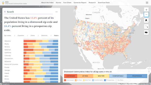
The Distressed Communities of America

Map of the US showing the levels of well-being at zipcode level

The Distressed Community Index from the Economic Innovation Group reveals the levels of economic well-being in all US neighborhoods. The Index uses seven different metrics to give every zipcode area a score out of 100, ranging from the most prosperous (0) to the most distressed (100).

You can explore which neighborhoods in your city are the most and least distressed on the 2024 Distressed Community Index Interactive Map. On the map individual zipcode areas are colored by their DCI rank. If you select an individual zipcode area on the map then the information window updates to reveal how the area scores in each of the seven different DCI metrics. The information window also compares how the selected zipcode area compares with all the other zipcode areas in its state.

The 2024 DCI map is based on data from 2017 to 2021. According to Axios the data reveals that the "share of people living in prosperous communities has risen most in the mountainous states of the West, most notably Idaho, Montana and Utah. By contrast, Louisiana, Oklahoma and New York state showed significant growth in the share of the population living in distressed ZIP codes".

The DCI interactive map also includes a number of 'stories' which explore different aspects of well-being revealed by the data. These include an analysis of life expectancy in different areas of the US, and how inequality can be masked at the county level.

Wednesday, March 06, 2024

There are 2,773 stories in the Naked City

a choropleth map showing The City articles by New York neighborhood

The 1960's procedural police series the Naked City used to conclude every episode with the line: "There are eight million stories in the naked city. This has been one of them." If there are eight million stories in New York then The City has got quite a long way to go before it is finished reporting on them. So far it has managed to find only 2,773 stories in NYC.

The City asked ChatGPT to find and map all the locations mentioned in The City since its founding in 2019. The result is Where AI Mapped Our Stories, an interactive map of the 2,773 locations mentioned in 4,159 articles in The City. The map features two main views: a choropleth view - showing the number of stories in The City by neighborhood and a marker view plotting the exact 2,773 locations mentioned in The City since 2019. 

If you live in New York then this second 'Individual Stories' view is a great way to find the stories in The City which are closest to your home. In fact you can click on any of the individual markers on this map view to be taken directly to the story on The City website.

According to ChatGPT's analysis The City has covered "a broad cross-section of our city". However it does seem that some neighborhoods, such as eastern Queens and Staten Island, have not featured as often as many other New York neighborhoods.

If you are interested in running a similar geographical analysis of a large dataset then you can read more about the process undertaken by The City in using ChatGPT to map its stories in the article We Asked an AI to Map Our Stories Across NYC.

Tuesday, March 05, 2024

Attacks on the Press Map 2023

world choropleth map showing journalist imprisonments by country

More journalists have been killed in the Israel-Gaza war zone in the last three months than have ever been killed in a single country over the course of an entire year. In fact according to the Committee to Protect Journalists' annual report, Attacks on the Press, nearly 75% of journalists killed around the world in 2023 died in Israel’s war on Gaza.

You can explore the results of the CPJ's report for yourself on the Attacks on the Press 2023 interactive map. This story map takes you on a guided tour of the report's findings into the continuing attacks on the liberties and lives of journalists around the world last year.  

Israel and the Occupied Palestinian Territory saw by far the largest number of journalist killings last year. Of the 99 journalists killed around the world last year, 72 were Palestinians. China, Myanmar, Belarus, Russia, and Vietnam were responsible for jailing the most journalists, many of them without trial.

As you scroll through the CPJ report the map zooms into a number of individual countries to highlight some of the global regions with the worst records of imprisoning or killing journalists. You can also select to explore the map for yourself. 

A choropleth layer on the map shows the number of journalists in state custody in each country and scaled circular markers show the number of journalists killed in each country. You can hover over the choropleth layers or scaled markers to reveal the number of journalists imprisoned or killed in a country and you can click on the choropleth layer or circular markers to reveal the names of the journalists imprisoned or killed in each country.

map using clustered markers to show the threats to journalists in European countries

Mapping Media Freedom is another organization which is dedicated to tracking attacks on the free press. Mapping Media Freedom maps threats to the media throughout the European Union and neighboring countries. It is a joint initiative from the Index on Censorship, the European Federation of Journalists and Reporters Without Borders. The map uses clustered markers to show the locations of crowdsourced reports of threats, violations or limitations faced by journalists, newspapers or other media.

You can filter the reports shown on the map by location, date range or category. The categories include different types of censorship and limits to press freedom. They also include the option to filter by gender, type of journalist and the source of the threat to media freedom.  Israel's attacks on Palestinian journalists appears to fall outside the scope of Mapping Media Freedom's European focus

Monday, March 04, 2024

Can you Draw Europe?

satellite map of Europe

Huge Quiz's Europe Country Drawing Challenge has quickly become my new favorite online game. This is despite the fact that I am absolutely terrible at it and have yet to achieve anything other than a totally embarrassing score.

The premise of the Europe Country Drawing Challenge is very easy. All you have to do is draw European countries on top of a satellite map of Europe. For each country you draw you are awarded points based on how much of your drawn area contains the actual country named and how much of the actual country is contained in your drawn area.

Despite its simple premise the game is very challenging. I look at maps of Europe most days of the week, however it turns out that I have a very bad knowledge of basic European geography. I won't even admit to how many European countries I have managed to get 0 points for while playing the Europe Country Drawing Challenge (meaning that I failed to actually draw around any part of the named country).

One excuse I have is that I have been playing the game using a track-pad. I find it very difficult to draw on the map without suddenly veering wildly off course at some point - especially if I'm having to draw a relatively large country. A lot of people in the game comments also say they couldn't play the game on Android, so this game probably works best on a desktop computer - and with a mouse.

BTW - if you live in the USA then you might want to play Time's See How Well You Can Draw All 50 States game instead.

map of the Nottingham tram system

You may remember that at the end of last year the London Tube Memory Game briefly became very popular. The object of the game is to name as many London Underground stations as you can on an unlabeled map of London. 

Such was the game's popularity that many other versions of the game have since been released, requiring you to name the stations on the transit networks of other global cities. Metro Memory currently has games for 19 cities around the world. 

There is now also the Nottingham Tram Station Guessing Game. This game requires you to name as many of the 50 Nottingham tram stations as you can. Every time you type the name of a correct station its marker changes from red to green on the game's interactive map.

Another fun new online map game is Name that Nation. In this very simple game a country is highlighted on an interactive globe and you simply need to name the country. You can play global or regional versions of the game. So if your world geography is a little poor you can try to play a more localized game (for example try naming the ten North American countries).  

You can find hundreds of other online map and geography games using the Maps Mania games tag.

Friday, March 01, 2024

Cities Need Trees

map of tree density in Tokyo
Tree density in Tokyo

New York needs 113.9 million more trees in order to become carbon neutral.

Picterra has calculated which cities around the world have the most and least trees. Using their own geospatial AI detection platform with tree counting software and forestry monitoring tools Picterra has mapped and counted the number of trees in 26 global cities. It has then calculated how many more trees each city requires in order to offset the city's CO2 output.

In Mapping the urban jungle: Which global cities need trees the most? you can explore interactive maps of each of the 26 global cities analyzed. These maps show the locations and distributions of trees across each city. This data has then been used by Picterra to calculate how many more trees each city requires to offset the population's carbon dioxide (CO2) emissions.

map of tree density in Rotterdam
Tree density in Rotterdam

According to Picterra's analysis Tokyo has the most need for more trees to offset its CO2 output. The city's population density and relative current lack of trees mean that the city needs another 2 billion trees (which Picterra estimate would require a total of just over 1.25 million hectares of land) in order to offset the population's CO2 output.

At the other end of the scale, of the 26 global cities analyzed, Rotterdam is the city which is presently nearest to offsetting the population's carbon dioxide output. Rotterdam only needs a measly 50 million more trees in order to become carbon neutral.  London requires 48.2 million more trees and Paris needs 53.4 million.

In the United States you can use American Forests' Tree Equity Score map to discover the level of tree canopy cover available in nearly 200,000 neighborhoods across the country. In the UK the Woodland Trust's Tree Equity Score UK map visualizes the amount of tree canopy cover available in thousands of UK neighborhoods.