Skip to main content
Search
Search This Blog
Maps Mania
Posts
Showing posts from 2021
Show all
December 31, 2021
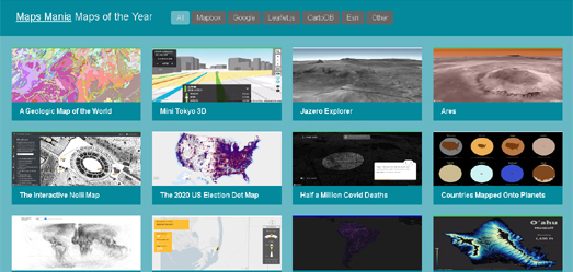
The 50 Best Maps of the Year
December 31, 2021
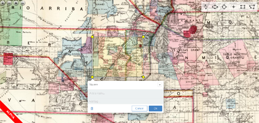
Real-Time Map Annotations
December 29, 2021
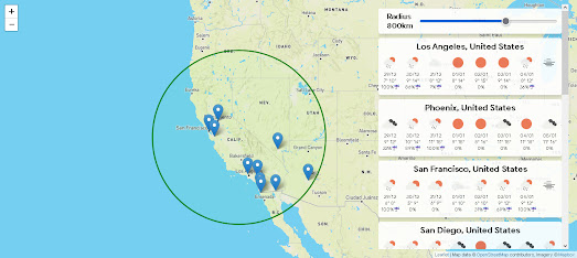
Mapping the Weather Around Me
December 28, 2021
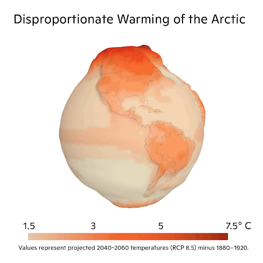
Mapping the Polar Heat Cap
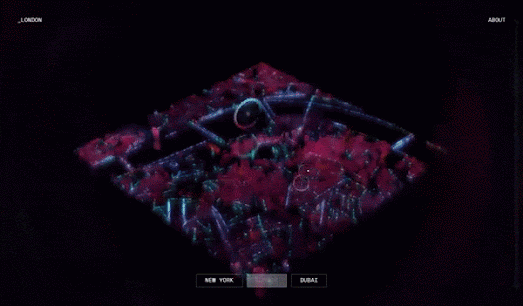
December 22, 2021
Hologram Cities
December 20, 2021
Mapping the Global Climate Crisis
December 18, 2021
Santa's Wish Tracker
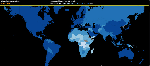
December 17, 2021
Vaccine Rollouts by Country
December 16, 2021
Searching for the Big Bang
December 15, 2021
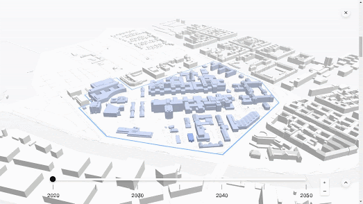
Mapping Future Construction Plans
December 14, 2021
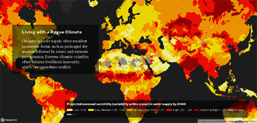
Mapping Climate Change Conflicts
December 13, 2021
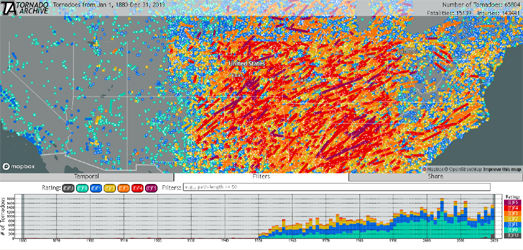
Mapping 100 Years of Tornado Data
December 11, 2021
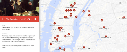
Movie Maps
December 10, 2021
Civilian Casualties in Gaza
December 08, 2021
Destroying the Rainforests
December 07, 2021
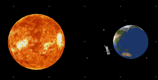
Taking an Earth Selfie
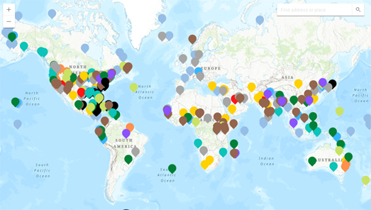
December 04, 2021
The Refugee Map
December 03, 2021
The 30 Day Map Challenge Round-Up
December 02, 2021
Speaking French in Canada
December 01, 2021
Weather Stripes
November 30, 2021
Violent Conflicts in the Republic of Texas
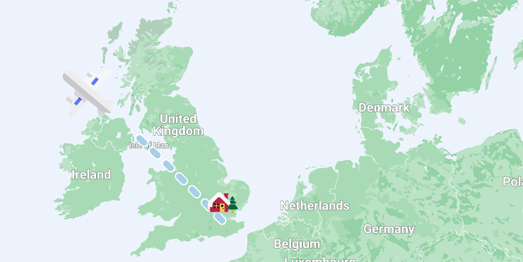
November 29, 2021
Mapping for Christmas
November 27, 2021
Sea View
November 26, 2021
LiDAR Data Reveals Illegal Logging
November 25, 2021
Navigating by Nose
November 24, 2021
The Geography of a Dollar Bill
November 23, 2021
The North Sea is Very Busy
Newer Posts
Older Posts
Home